Statistics & Probability | Instructor: Suman Ganguli

Category: Course Activities (Page 1 of 4)

Personal Data Project – Instructions

Please hand in your spreadsheet with your Personal Data Project by Thursday, May 27. Submit either the share link or the spreadsheet file on Blackboard, under the “Personal Data Project” Assignment.

Your spreadsheet should contain the following:

  • your recorded data
  • summary statistics: mean, median, max, min, standard deviation
  • frequency table and frequency histogram
  • optional: time series plot (data over time)
  • a short paragraph describing your project:
    • background: what variable you chose, why you were interested in that variable, and your method for recording the data;
    • some comments on the summary statistics, including any patterns you notice in the frequency distribution and/or the time series plot

You can consult my Personal Data Project spreadsheet and use it as a model.
Quiz #3: take-home quiz due Sunday (April 25)

Quiz #3 is another take-home assignment, due this Sunday (April 25). You can download the pdf with the quiz exercises from OpenLab Files. For this quiz, you only need to submit written solutions (i.e., no spreadsheet this time).

Submit a single pdf with your written responses to the Quiz #3 Assignment on Blackboard.

Before (or while) working on the quiz, you may find it useful to review the class recordings and/or whiteboards, in particular for the class sessions where we discussed the probability experiment of flipping a coin 3 times.

Also, please also work on the HW sets, in particular Topics 3.4 and 4.1. We discussed 3.4 in class yesterday, and we will discuss 4.1 (and also 4.2) on Monday.

Gapminder: Data & Scatterplots

Please visit and explore the Gapminder website which I will show in class after spring break:

  • the homepage Gapminder.org has links to various features on the site
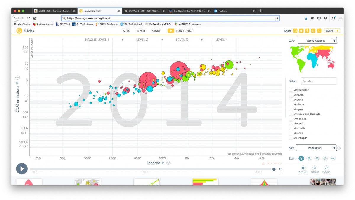
  • the Tools page has an interactive scatterplot tool which I will show in class:

GapMinder has a LOT of data that is available for download, and so is a very good source for project topics and datasets.  They provide datasets for 519 (!) different “indicators” listed alphabetically–everything from “Adults with HIV (%, age 15-49)”) to “Yearly CO2 emissions (1000 tonnes).”

Browse through the list to get some ideas for project topics (clicking under the “Download” column downloads the data in an Excel file; clicking under “View” opens a Google spreadsheet with the dataset.)

Here is a scatterplot I will show in class titled theΒ “Wealth & Health of Nations“, as measured by life expectancy (a measure of a country’s health) vs. GDP per capita (a measure of its wealth):

gapminder

GapMinder actually shows a time-lapse animation of scatterplots, showing how this paired data set evolved over the past 200 years.

(In fact, they produced a video called “200 years that changed the world” in which Hans Rosling, the medical doctor and statistician who created GapMinder, provides commentary on this time-lapse data.  Rosling became widely known through his TED talks. His first one, from 2006, is titled “The best stats you’ve ever seen“–it’s worth watching!)

« Older posts