John Madea excerpt of his book Laws of Simplicity titled emotions spends a lot of time talking about how emotions affect context and how our designs should trigger emotions. I find this read a very good one personally. He starts with the popular phrase of “form follows function” a quote from Louis Sullivan that has been taught to death in our curriculum (but for good reason) and spins with “feeling follows form.” The phrase (I think) means that feelings or emotions are conveyed through a certain form. For example the author describes an email his daughter sends him; the email reads “I love you” but the message is not interpreted as simple as that because of the way it’s written. Writing I love you all caps with and a pink font still says I love but for the person reading it bears more of an impact and it’s more genuine than the typing in in the browsers standard type face. Maybe even humorous provided the context and the relationship between the folk communicating. It attempts to capture the nuances in spoken communication. Thus feeling follows form as demonstrated in this example.
I have to say though that this created some cognitive dissonance for me. Minimalism has been a way of life for me. Forms follow functions is just as good as a quote from the bible to a Christian for me. I may have been mistaken but it seems John Madea was telling me to embrace the opposite. Instead of stripping something down to the bear necessities we should now decorate it’s design with the hope of triggering emotions? I read on. He further explains that modernist design led to objects looking clean which he claims is similar too to the design principles traditional Japanese design. But object of Japan design essentially have a “soul” which forces a natural connection between itself and the user. That’s a powerful message because as a designer you want everything you create to make a difference in the life of the user and that’s what Madea is saying about emotion in design. It gives the artefact a soul which people will feel and care for over a lifetime.
I really like the design in the dark stalkers series specifically the promotional art done by Kinu Nishiura. It’s sort of a comedic spin on classic hollywood monsters which normally frighten me but I find these very charming

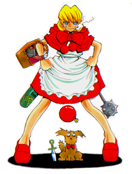
My favorite character in the DS series. She’s clearly inspired by little red riding hood but she definitely won’t let herself get eaten by a wolf.
When I see this character I feel two emotions. At first she seems to be a harmless little girl, very adorable too. Then when she pulls out grenades from her dress and grins with madness you’re like “oh damn! This character is hilariously awesome!” I’m very attached to this character.


