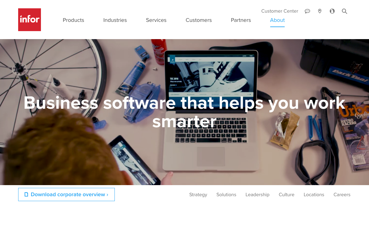
Infor.com is always changing. The major and most notable changes to customers and visitors are the UX/UI changes to our site. The site has been around for a long time and thanks to Hoo&Loop, our templates are constantly being redesigned and developed to make each visit an experience. The above screenshot is from our updated company About page and shows the direction Hook&Loop is going with Infor’s online presence: modern, bold, responsive, and informative. With thousands of pages, however, it’s not as easy as flipping a switch. There’s a lot of user testing, reading analytics, and reiterating designs based on findings.
Part of my job includes designing the web templates that many pages use and also single pages like the Blogs and Social page (the updated Blogs and Social page is not live yet but will be soon. It is a perfect example, however, of a page that desperately needed an update). A major problem some of these templates and pages are facing is that they’re not at all responsive. This means that they are not optimized to be viewed on different screen sizes like mobile, tablets, or small desktops. When designing these templates, I must design each breakpoint: 320px for mobile, 768px for tablet, 1024px for smaller desktops, and 1520px for larger desktops. Unfortunately, I cannot show screenshots from some of the current work I am doing because none of it is live yet. Designs have been approved and currently under development.
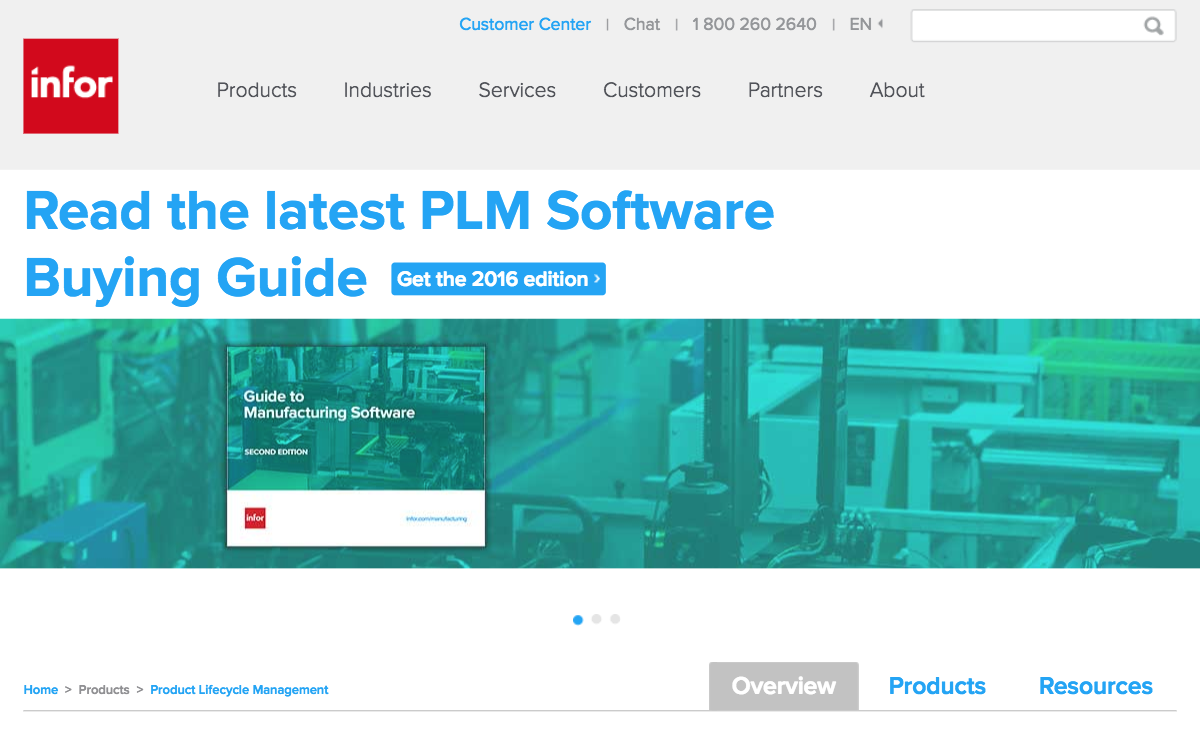
Below is a screenshot of our Product Lifecycle Management software page. As you can see, this page doesn’t even have the updated Infor navigation menu. Also, if you try to resize the window, it is not responsive. There is a lot of work to do left on the website. It’s very rewarding for me that I get to help in updating some of the designs, even if I’m not developing them.
