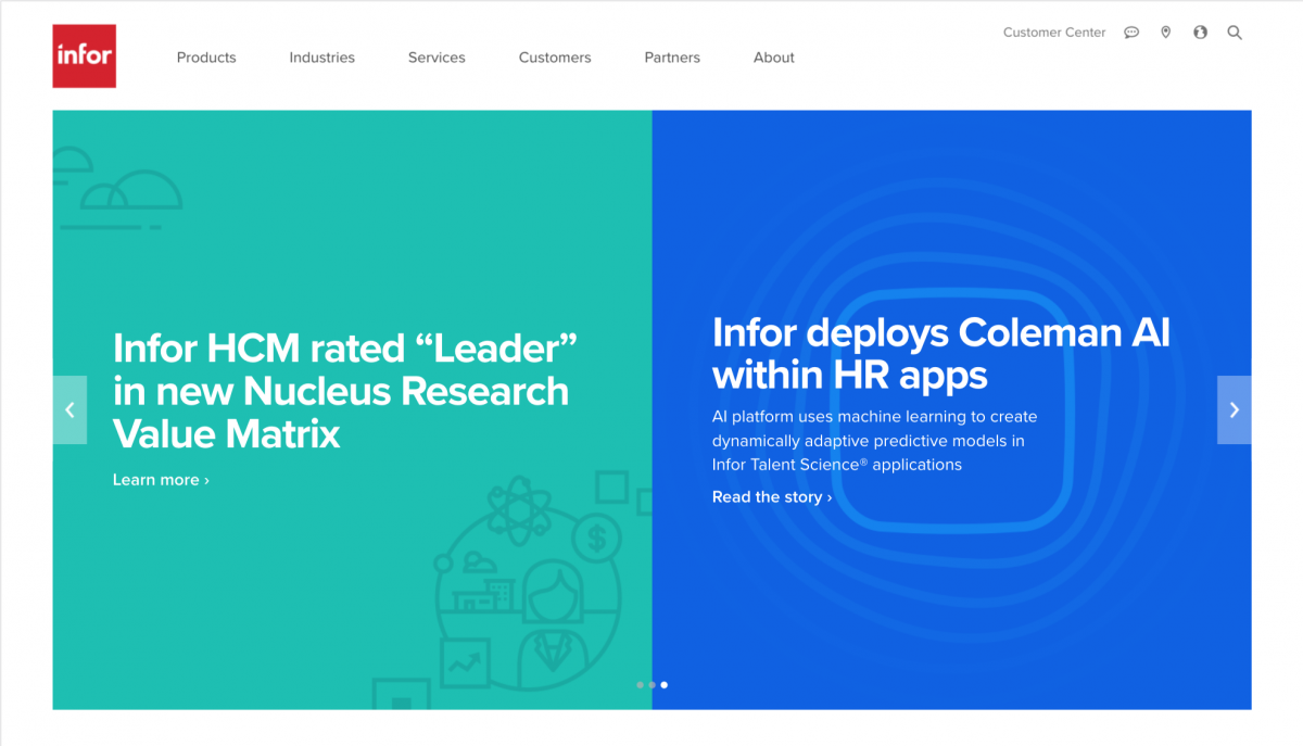
One of my main responsibilities at work is to make the homepage banners a person first sees when visiting infor.com. They change about twice of week, usually on Tuesday and Thursday. They’re used to promote press releases about a company using Infor’s software, different Infor events, or updates on Infor’s new software.
The banners I make are either illustrations or from sourced stock photography. We have pretty strict branding guidelines when it comes to the illustrations, but have a little more wiggle room for photography. As a designer, I have to be actively conscious about the colors I’m using in illustrations (we have a limited color palette) or the colors in a photograph because two or three images sit side by side. The colors of the banners need to harmonize.
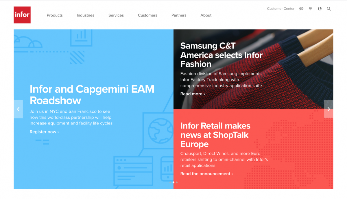
I also have to keep in mind where the copy is going to sit on the banners. I don’t put the text on these images, the text is inputed and generated by our website. There’s a lot of testing before the final image is sent out to verify if the text is legible. If it isn’t, I have to make adjustments before it can be approved by the art director.

I do have lots of other things I work on besides these banners, but they are probably my least favorite thing. It’s just very tedious and sometimes time consuming work when I’m trying to find the right photograph. I rather be designing our web templates. However, I must say that this responsibility has taught me a lot about design, color theory, and branding. I can immediately see a photograph and tell myself, “Yeah, that’s on brand,” or notice when a small detail on an illustration is off. It’s been valuable experience.

