Assignment Overview: Applying Color and Typography to Your B+W Personal Logo Exploration
Objective: In this assignment, you will expand upon your existing black-and-white (B+W) personal logo exploration by introducing color and typography. The goal is to refine your personal brand identity through the strategic use of color and typography, creating a distinctive and visually compelling logo that represents you effectively.
Key Learning Outcomes:
- Understand the principles of color theory and typography in the context of personal branding.
- Develop the ability to select and harmonize colors that align with your personal brand identity.
- Gain experience in choosing typefaces that convey your personality and message.
- Create a finalized personal logo that seamlessly integrates visual elements, color, and typography.
Assignment Tasks:
1. Color Exploration: a. Research color psychology and its relevance to personal branding. b. Develop a color palette that reflects your personal brand identity. Consider mood, emotions, and individuality. c. Apply these colors to your existing B+W personal logo exploration, experimenting with various combinations to find the most effective one. d. Create a color style guide detailing hex codes and color usage guidelines for your logo.
2. Typography Selection: a. Explore typography options that match your personality and brand message. Consider factors like readability, uniqueness, and alignment with your personal identity. b. Pair typefaces thoughtfully to complement your logo design. c. Create a typography style guide that includes font names, weights, and usage guidelines.
4. Refine Your Personal Logo: a. Incorporate the selected color palette into your B+W personal logo exploration, ensuring consistency and harmony. b. Apply the chosen typography to your logo, making sure it enhances the overall design. c. Experiment with variations, layout adjustments, and sizing to achieve balance and visual appeal. d. Provide a rationale for your color and typography choices, explaining how they represent your personal brand identity.
5. Presentation: a. Prepare an engaging presentation showcasing your personal logo design, color palette, and typography choices. b. Include before-and-after comparisons to illustrate the impact of color and typography on your logo. c. Be prepared to present your work to the class, discussing your design decisions and how they reflect your personal brand identity.
Assessment Criteria: Your assignment will be evaluated based on the following criteria:
- Creativity and originality in the application of color and typography.
- Alignment with your personal brand identity, values, and message.
- Effective use of color theory principles.
- Appropriate typography selection and pairing.
- Quality and clarity of the presentation.
Submission Requirements: Submit your 5 top favorite logos from the B+W exploration as a JPG (1080 x1920 pixels) containing your logo design, color palette, typography choices, and a rationale (200-300 words) on your color and typography choices. in the comments section of this assignment.
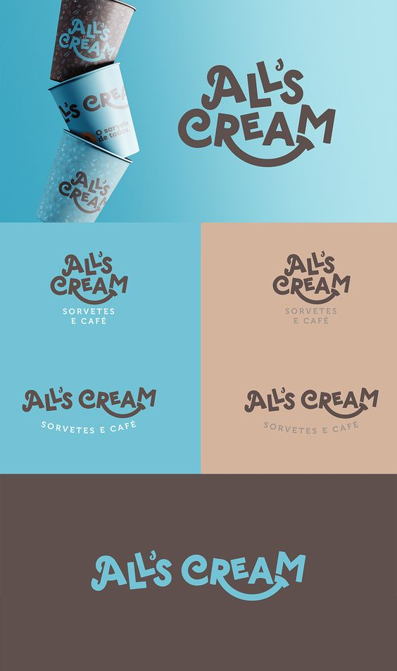
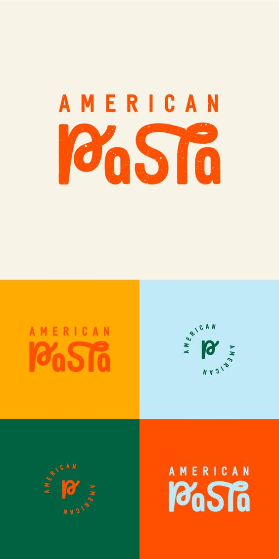
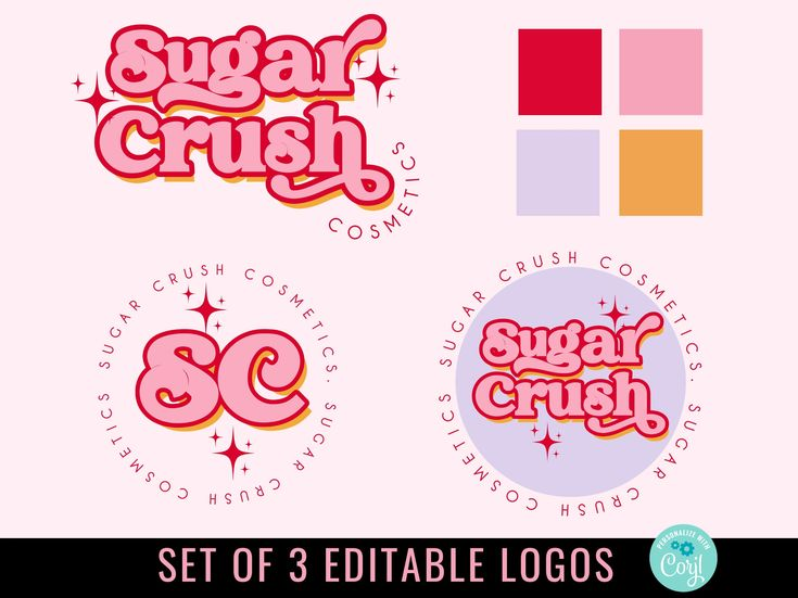
Examples
Prepare to present your work to the class during the designated presentation session.
Due Thursday 9/28
This assignment offers you the opportunity to further develop your personal brand identity and design skills while creating a unique and meaningful logo that represents you authentically. Enjoy the creative process and make your personal brand shine!


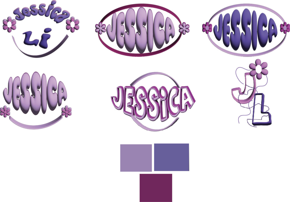
For my color logo, I decided to use different shades of purple. I designed my logo name to be three-dimensional to make it pop out more to capture people’s eyes. The type that I use is called Hofisem and Ziclets. I chose purple because purple is my favorite color, and my mood board theme is purple. I want to use my logo to promote positivity. Bright colors promote positive emotions, whereas dark colors evoke negative feelings. Also, bright colors shows significant contrast, improving reading and legibility.
 “>
“>
Of my eight B&W logos, I present five that I though were diverse enough to stand on their own, yet similar enough in meaning to be interchangeable. I think for me, I like the idea of my logo being interchangeable with itself. My bird in flight, me, is the foundation of each design and is apparent in all five logos. I chose greenish yellow, yellowish green, and black as my color scheme. These colors represent the Sun, the Earth, and Mystery.
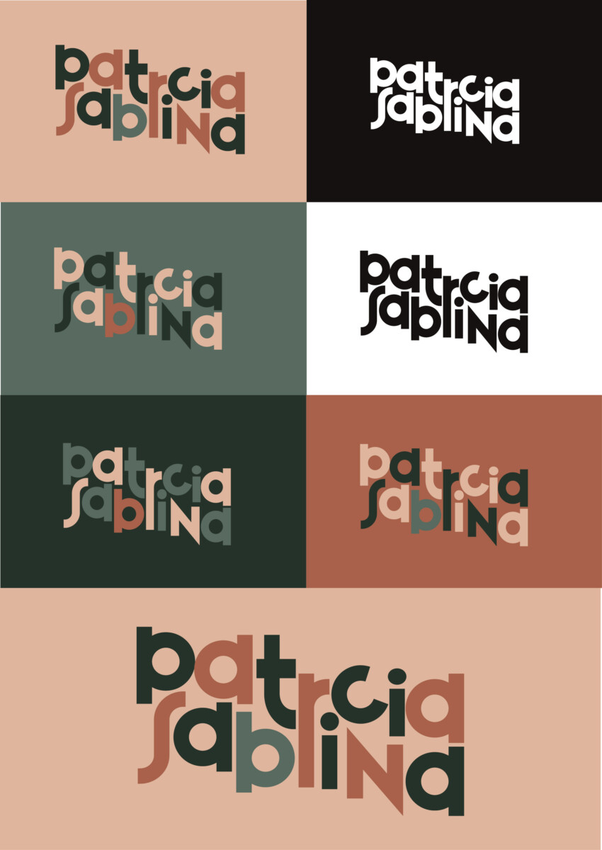
I decided to go with this logo based off my frist and middle name. I like that I can play around with the color pop aspect and it would be easy to transition the logo with the seasons. It has a elegant aspect to it while retaining some fun elements. I chose a sanserif type and added my own embelishments.
 “>
“>
i decided to go with this logo because i feel it would be able to grab peoples attention more in a way that the other logos i did wouldn’t. i also decided to go with the handwritten look so it would look completely different.
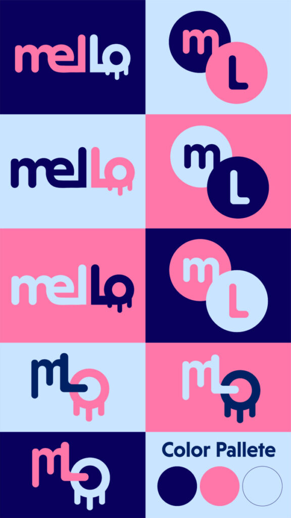
In the making of the colored logo versions I decided to go with 3 different kinds of logos. The logos I choose seem to go very well with each other having curves, circles and letters m, L & o. When picking these colors I definitely wanted navy blue. Navy blue is my favorite color so it’s a must for this project! At first I went for only blue’s but the result was disappointing. It was hard deciding what colors would go well with navy blue since I did end up playing with many different colors. There were many colors that I loved so this was VERY HARD. The 2nd color I choose was light blue. Light blue and navy blue blends so well so I immediately used it. Also it is said that blue represents trust, loyalty, sincerity, imagination and freedom. The 3rd color was the hardest however when I tested out pink I immediately fell in love with it. Pink is associated with love, sweetness, childhood and femininity. I feel that the color pink goes very well with the logos & vibe.
 “>
“>
For my color choices, it was really hard to pick out. I took out most of the logos and added color to it. For the computer one, I went for the gray color because most computer monitors are black and grey. Which to me were really bland colors. I later on added the cream color because the more older models of computers used this and to me, it looks really nice. As another logo, I wanted to do just key caps from an old keyboard so i made different versions that matched the colors of the computers. I think the keycaps alone as a logo looked nice but when paired with the monitor, it seemed more fitting. A mascot, typography, and logo all in one. For the others, I just added simple colors like red, yellow, and green to symbolize the buttons on the corner of windows on the pc. In one of them, I took out the sphere thing and only had the gradients. Prof helped me with that one and I liked the vision for it as it was more easy to look at. And finally, the subway inspired ones were colors used from the actual lines they run on. I made up the letter Y’s color because it doesn’t exist. But it’s not just any random color. I used brown as a homage to the J and Z line that I take everyday. I grew up taking it so I used it for inspiration.