Assignment Overview:
In this assignment, you will embark on a creative journey to design a personal logo that represents your unique identity and style. The focus of this task is to explore the use of black and white elements to create a visually striking and versatile logo. By using Adobe Illustrator, you will have the opportunity to refine your vector design skills while developing a logo that can be adapted for various applications.
Assignment Objectives:
- Conceptualize Your Personal Brand:
- Reflect on your personality, interests, and aspirations to develop a clear concept for your personal logo. Consider the message and values you want it to convey.
- Research and Inspiration:
- Explore existing personal logos and other relevant design examples to gather inspiration. Analyze their use of black and white elements and consider how they communicate effectively.
- Sketch and Ideation:
- Start the creative process by referencing your logo thumbnails you have drawn in the previous assignment. This step allows you to brainstorm and visualize different concepts before moving to digital design.
- Adobe Illustrator Exploration:
- Utilize Adobe Illustrator to translate your chosen sketch into a vector-based logo. Experiment with shapes, lines, typography, and various black and white design elements.
- Balance and Composition:
- Pay close attention to the balance, proportion, and overall composition of your logo. Ensure that it remains visually appealing and communicates your intended message.
- Typography:
- If your logo incorporates text, carefully select and manipulate fonts to complement the design. Explore different typography styles that enhance the overall aesthetics.
- Detail and Precision:
- Use Illustrator’s tools to refine your logo with precision. Fine-tune anchor points, curves, and lines to achieve the desired level of detail.
- Scalability and Versatility:
- Ensure that your logo maintains its clarity and impact when resized. Test it at various scales to confirm its versatility.
- Black and White Aesthetics:
- Embrace the challenge of working with only black and white elements. Experiment with contrasts, shades, and patterns to create a visually compelling logo.
- Presentation:
- Prepare a visual presentation that showcases your logo design. Include variations, if applicable, and present it in a clear and professional manner.
References:
Assignment Requirements:
- Create your personal logo in Adobe Illustrator. Save your work in vector format for future use.
- Include a brief written description (200-300 words) explaining the concept behind your logo, and how it has evolved so far from your mood boards and sketches while reflecting design choices you made, and the intended message it conveys.
- Submit your assignment in the comment section of this assignment.
Grading Criteria:
Your assignment will be evaluated based on the following criteria:
- Concept and Originality: The uniqueness and relevance of your personal logo concept.
- Execution: The quality of your vector design and attention to detail.
- Composition: The overall balance and visual appeal of your logo.
- Typography: If applicable, the effective use of typography in your logo.
- Presentation: The professionalism of your visual presentation and written description.
Submission Guidelines:
- 1920×1080 (Widescreen) JPG with 8-10 Black and white logos
Important Dates:
- Assignment Due Date: 9/21
Additional Resources:
If you have any questions or need assistance during the assignment, please don’t hesitate to reach out. Feel free to explore additional resources on Adobe Illustrator techniques and logo design principles to enhance your skills.
Designing a personal logo is an exciting opportunity to express your identity through graphic design. Enjoy the creative process, and I look forward to seeing your unique logo exploration!


For my logo design, the concept that I went for is a floral design with a playful typeface. I wanted to include flowers in my logo because I love nature and I love being outside and being adventurous. My logos have evolved from my sketches as I can design more digitally and combine ideas to see how it looks on a screen. The mood board helped me create a theme and the color for my logo. My logo’s intended message is to show people who I am and my personality. As I play with the designs for my logo, I am still exploring different typefaces and whether I should use my full name or initials for my logo design.
The concept behind my personal logo is that of a winged creature, that flies, much like the falcon, and like the falcon, my winged creature does battle in the air. I chose the look and feel of my personal logo to be that of a prehistoric pictograph. It represents energy, space, life and love. Two versions of my personal logos have rectangles around them. The concept behind one is that of a domino. The other is that of a card of chance. A third version has two circles around it to indicate money, coin. The concept behind the two-winged creatures together is unity, love. Another version is set in an oval. I thought of the ancient runes when I created this one. In fact, all of my other versions sprung from this design, including the three without frames. All of my images have some symbol of the Sun within its composition. All are also designed with the “logotype” of my first and last name and Ku in the middle. I experimented with four font styles, HWT Tangent, Berlin San FB Demi Bold, Acumin Variable Concept, and Eras Bold. The evolution of my personal logo from sketch to mood board to this point of eight black & white versions, involved me selecting, combining, and editing symbols and images I know to represent my light, my experiences and my understanding. I then carefully re-packaging and presenting this precious self-knowledge in a design that reflects me. However, my ultimate aim in doing so is the hope that my logo resonates with humanity.
I wanted a type heavy logo that conveyed how i want people to see my brand. Incorporating my love for minimalism but trying to step out of my comfort zone and add little touches that speak on my hidden traits. I wanted to play around more with customizing fonts that i was drawn to or trying to draw out my own. This is a process that has been a struggle but im eager to push through and figure it out. My mood board is very visual heavy and i want my logo to refelct that while staying true what i want it to portray without resorting to images or icons as the main focus of the logo.
https://openlab.citytech.cuny.edu/lulucomd2300fall2023/files/2023/09/DJ-NONSO-1.pdf
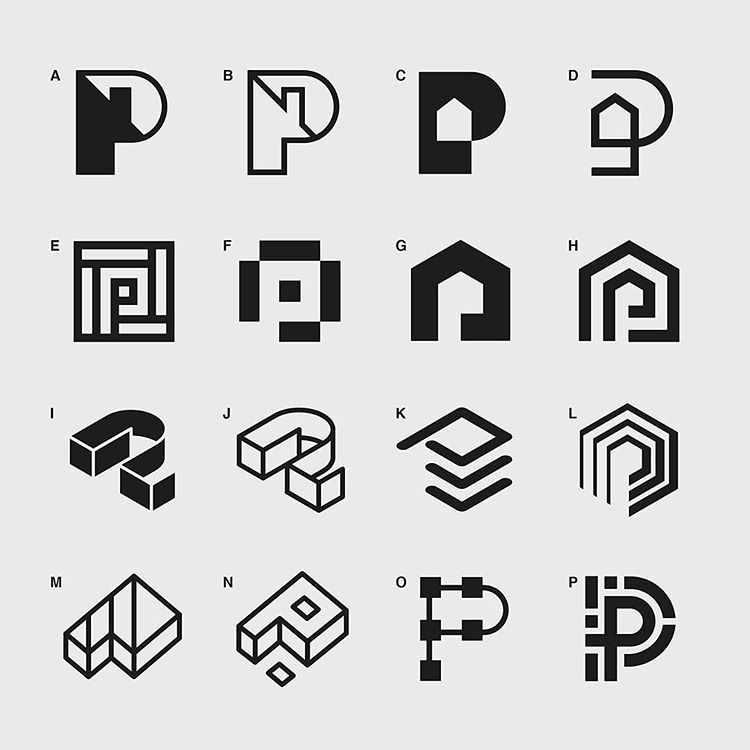
i decided to use the pencil tool to go over the ones i really do like and the reason why i picked these ones were because they were the ones that really grabbed my eye
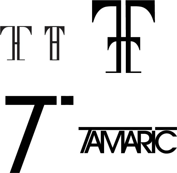
I have two different logos designs because one is what I’d actually choose for my logo and the other logo idea is something I created for this class. The logo with the gothic type is cool and interesting because the logo combines the initials of my name T and H in a subtle way, while also keeping the letter T the more dominant letter you see. I decided to go that route because my friends call me T, so I associate with that letter more. The other logo I feel like represents me more because it feels more simple and the style of it is also simple. There’s not much going on in it. When I design, if possible, I like to keep things simple because I think it has cleaner look.
 “>
“>
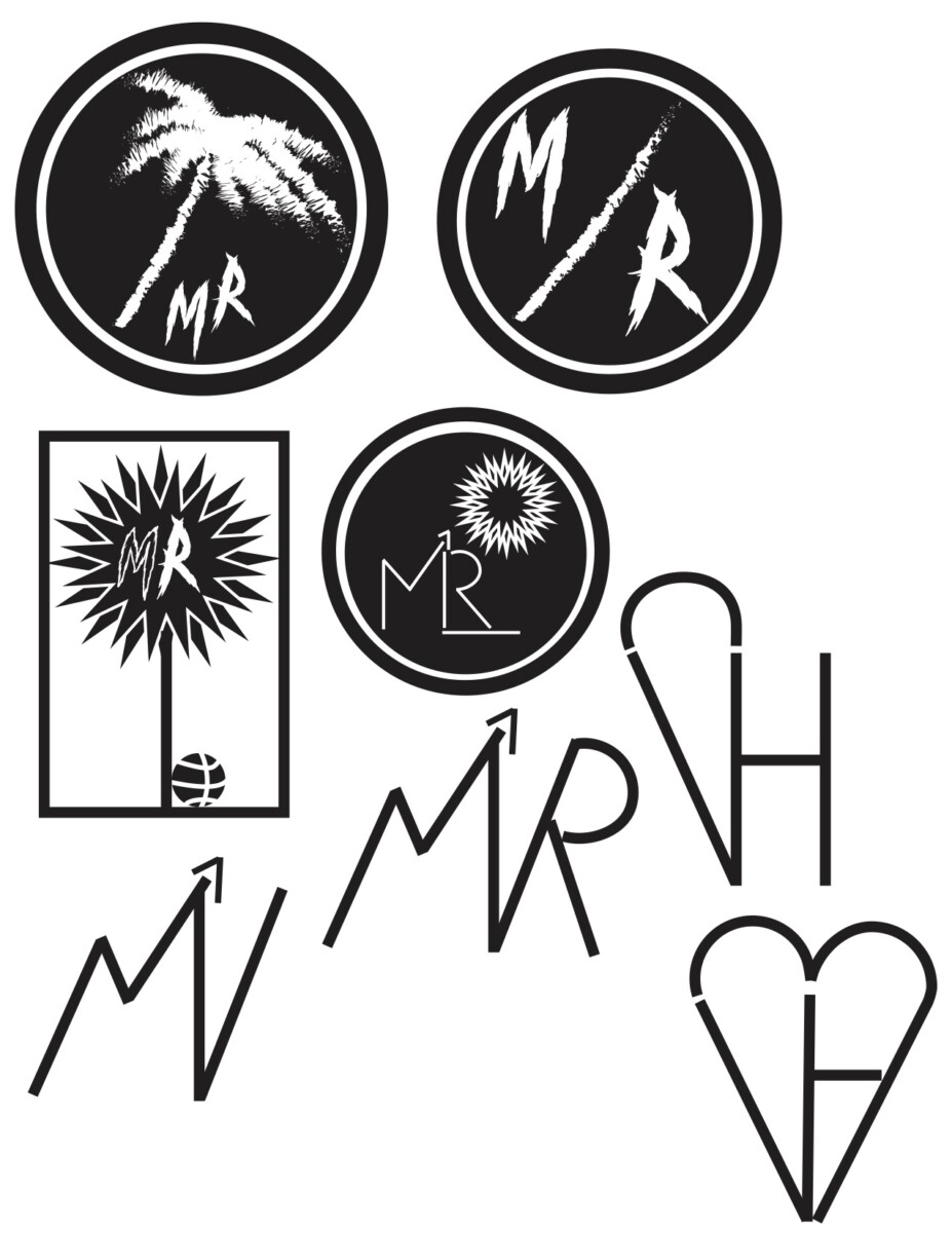
I believe that my logos have similar features between one another but ultimately have one goal in trying to represent calm movement. My logos can be seen to have my initials in a rough font yet to have the design be a calming underlay. The hidden arrow in the M was another way to represent moving forward in life and to move on to better. These logos would be represented in the color green because it resembles life, safety, and health. Green is also my favorite color. I believe I can further upgrade my logos to be a bit more simple and still get my point across to the buyer or viewer. The logos have progressed from my mood board a decent amount starting from my SGB logos to just the M/R logo to having a different background instead of just font. This is so my viewers have a better grasp of the logo and don’t have to think too thoroughly to understand it. I want my logo to also represent people who want to be competitive and strive to better themselves. I wanted my logo to catch the viewers eye so I included a palm tree to resemble relaxation, vacation, and growth.
 “>
“>
part two
I kept the same logos from my previous but got my idea out more when adding and making them onto illustrator. Making them and seeing them on screen gives me a better idea of which logos I truly want to keep and progress as we move on from the assignments. I also caught myself adding color already when making them but I also want to keep black and white as well. But the logos I used colors on are the ones I will work on more. I don’t see myself using the middle column unless its the the third one on the row, But like I mention, I want to keep this nyc and internet theme or one of the two.
 “>
“>
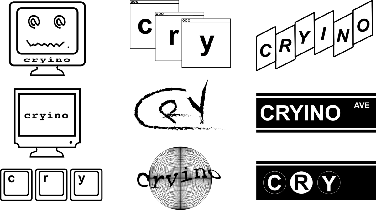
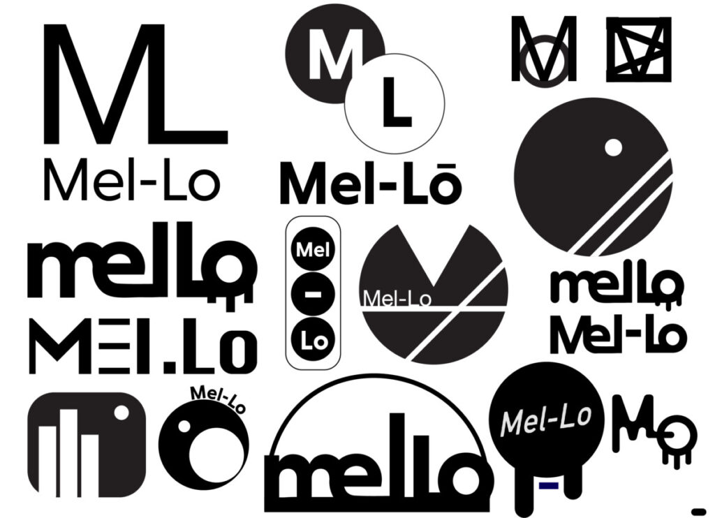
In the making of doing these logos digitally I noticed how different my logos came out compared to the logo sketches I made by hand. I didn’t use majority of the logos i’ve made for the sketches because I see them as ugly and i’m glad I did because my ideas have evolved. I noticed how I really liked curves and circles compared to my original intent based on my mood board, which was a more symmetrical cube/square like feeling. Personally I really like the logos that have the dripping effects because it kinda looks like paint or graffiti. I like it because it gives it a bit of street vibe. It blends well with NY since graffiti is something I see in my everyday life. The top middle one also reminds me of the subway trains. It’s simple but it works. In the beginning of doing these logos I was honestly very lost I wanted them simple but I didn’t know how to make something simple and look good. So I started to play around with the typography and shapes and ended up with these results.
 “>
“>