Don’t know why the fonts I used for those that are colored aren’t showing. :/
Author: Anthony D
Anthony Delbrun – May 5th
Final Idea – Snoop Doggy Dogg when he started evolving as a rapper under the tutelage of Dr. Dre and how his persona changed over the years via Album Covers.
HotNewHip.com: https://www.hotnewhiphop.com/the-art-of-doggystyle-how-snoop-doggs-cover-shaped-album-art-for-26-years-news.95121.html
Biography.com: https://www.biography.com/musician/snoop-dogg
Theknow.denverpost.com: https://theknow.denverpost.com/2012/03/02/snoop-dogg-fillmore-denver/46410/
FromTheStage.com: https://fromthestage.net/snoop-dogg-involved-in-a-serious-fight-with-wwe-superstar-in-a-rare-video/
Anthony Delbrun – April 28th
When something is mainstream, it means it is gaining a lot of views to the point where everyone is doing it. The particular something is very popular that people are making big businesses out of that particular something. Sadly, that particular something out grows the popularity and it does not become mainstream anymore. Things that are not mainstream anymore becomes underground, meaning it is not trending but it is still popular and is possible to make something out of it. Something that is underground can potentially become mainstream if it is appropriate to the public’s eye.
When it comes down to contemporary design, being mainstream means that a product will most likely be re-invented in a unique way or help inspire other designers to design something similar of the mainstream product. An example would be rapper Snoop Doggy Dogg when he started evolving as a rapper under the tutelage of Dr. Dre and how his persona changed over the years.
The part where Steven Heller talks about copyright I kind of understand what he was saying. Copyright means protecting a person’s work. This means whatever content the person created cannot be used or published by anyone else without the consent of the originator. When it comes down to copyright, a lot of stuff on mainstream have a better chance of being recognized easier. The possibility of something being stolen is at a much lower risk, however it can still get an imitation.
Source(s):
Biography.com: https://www.biography.com/musician/snoop-dogg
Theknow.denverpost.com: https://theknow.denverpost.com/2012/03/02/snoop-dogg-fillmore-denver/46410/
FromTheStage.com: https://fromthestage.net/snoop-dogg-involved-in-a-serious-fight-with-wwe-superstar-in-a-rare-video/
Anthony Delbrun – April 21 (Part 1)
Anthony Delbrun – March 31st
. How is the word “image linked to should be linked to the root imitari?
. “We know that linguists refuse the status of language to all communication” by analogy-from the “language” of bees to the “language” of gesture-the moment such communications are not doubly articulated, are not founded on a combinatory system of digital units as phonemes are.”
But isn’t language the root of all communication? Meaning any type of communication whether it be symbols, sign-language or speaking a different language involves some sort of language.
. This article somewhat contradicts the previous article that discussed linguistics.
. I think the sign is the spaghetti and tomatoes. Signifier is the image.
Anthony Delbrun – March 24th
The first advertisement was made by Gillette back in 2017 around the time when the #MeToo movement was already established. This ad is gender stereotypical because it showcases that all men are “toxic”. This controversial ad received tons of backlash and had cost the company that made Gillette to lose $8 million.
The second advertisement is from Burger King back in April 2019. This ad is racist because it mocks the Chinese culture by having western people using chopsticks to eat their burgers.
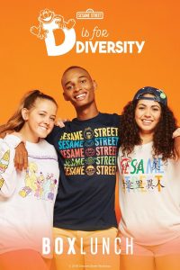
The third advertisement (and personally my favorite) is created by “Box Lunch” with the collaboration of Sesame Workshop from 2018. This ad shows diversity because it show cases three people from different walks of life getting along with each other. It also shows that no matter where you’re from or what you look like we can all be friends.
Anthony Delbrun – March 17th
The article “Understanding Media: The Extensions of Man”, Marshall McLuhan describes technology and media as “extensions of man;” meaning that techonology and media are beneficial to a human’s life. Well, to an extend I do agree. Technology and media have made human life so much easier that certain tasks people do such as mowing the law, communicating with people from far away places and many more are smooth sailing. When McLuhan mentions the word “medium”, he refers to as “any extension of ourselves” in which shapes our associations and actions.
While technology and media do help improve the everday lives of people to an extend it can also be a detriment. They both can be addicting and can hurt our communication skills. Technology and media can hurt our physical health such as eyestrain and it can take away certain jobs like, highway tolls, DVD rent stores and etc. Back then when I went out in public I saw more social interaction with people than today. Almost everywhere you go you see people glued onto some sort of technology. Some people have gotten lazy due to techonology as some people would rather buy majority of things online than to buy them at a store.
McLuhan mentions in his book, “The medium is the message.” I think he means that whatever form of media we use, it would always be the people in these media who would bring the message. Some people may not have the intellect to send the message properly or when using the medium may not have any sort of knowledge. The thing is that McLuhan wants us to control technology, not the other way around. He wants us to continue gaining information and spread our knowledge to the world by any means necessary.
Anthony Delbrun – March 10th
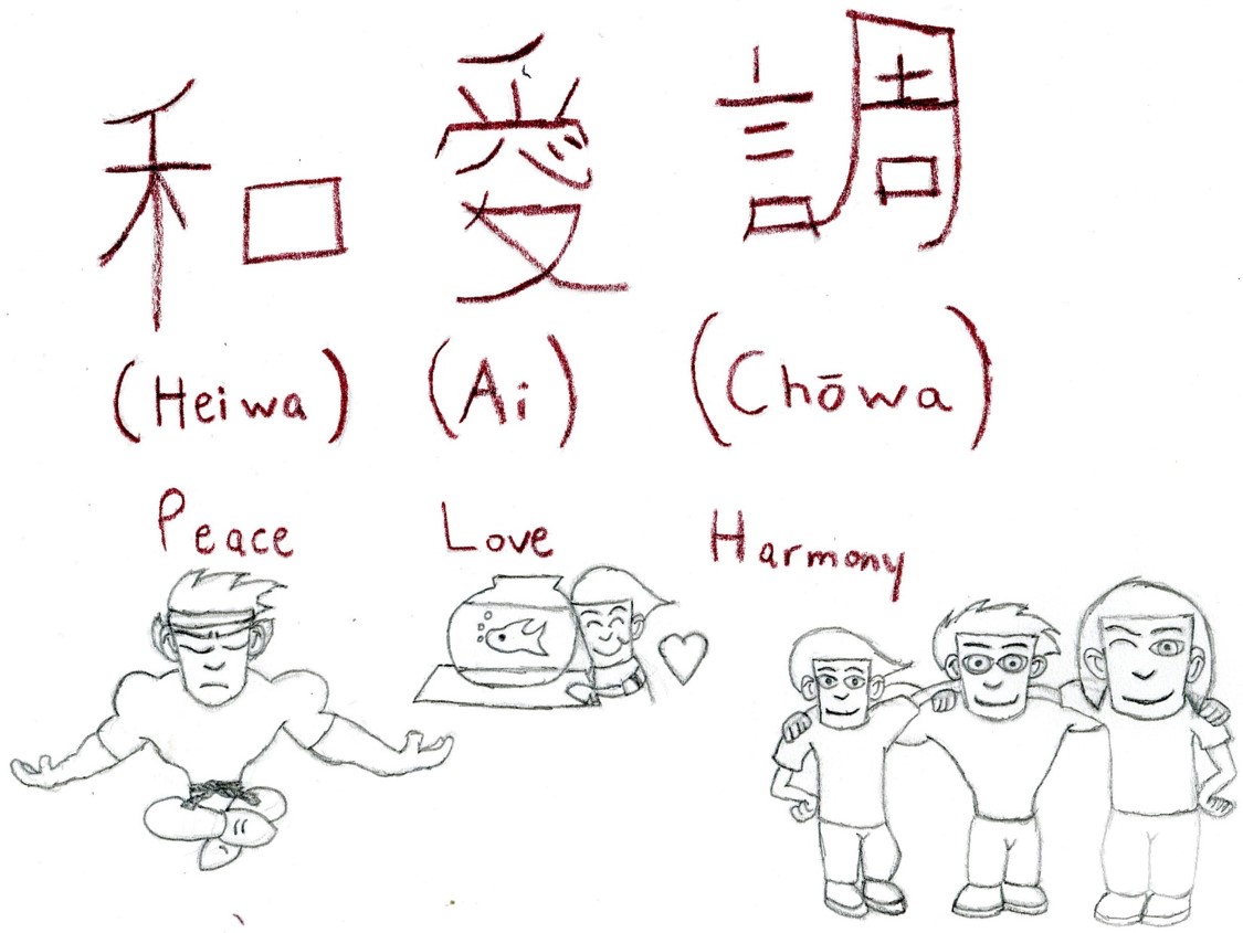
 To answer the question, “How should one design?” one should design something they love doing and something people would be able to understand. This design I created is a visual-linguistic example that was shown in class last week. The Japanese symbols mean Peace Love and Harmony. I even drew characters from my career project to give you a visual understanding if you don’t know what those words mean.
Anthony Delbrun – February 25th
Art has been around for a very long time. Art comes in all forms from shapes and sizes. In the three readings each of the authors describes the different elements art can have in them. The reading “Gropius Bauhaus” it explains one of the elements in art which is color, can have some meaning that relate to us on the inside. Color in art usually represents emotions but can mean something else.
The second reading, “Typophoto” by Laszlo Moholy-Nagy, he makes talks about Typography and Photography. Typography deals with communication of words and Photography is communicating visually. He also makes a prediction on how Typography and Photography would evolve in the future and benefit society. Nagy sees Typography and Photography as another form of art and how during the Bauhaus those forms of art helped him to spread his point across.
The third reading, “On Typography” by Herbert Bayer, Bayer describes Typography as a “service art” and not “fine art”. I don’t know what “service” and “fine” has to do with art but my guess is “service” deals with commercial based while “fine” is doing it for fun. Every art has key elements and the main ones are Line, Color, Shape, Form, Value, Space and Texture. I’m guessing the key elements that are lacking in art of the past are definitely color and maybe space.
Anthony Delbrun – February 18th
Reading the passages I love how each of the authors predicted the benefits technology can bring to the world to make our everyday lives easier. As the decades went by technology has gotten advanced that it inspired potential artists. Some people use technology for the world while others would use technology for the wrong doings. In “Filippo Tommaso Marinetti, The Founding and Manifesto of Futurism (1909)” the author wanted to use technology for war and violence.
The reading “Aleksandr Rodchenko, Varvara Stepanova, Aleksei Gan, Who We Are: Manifesto of the Constructivist Group (c. 1922)”, was interesting. I think what the author was trying to do is to show the readers that graphic design can be used in the real world to bring service for society. Example, we have train stations for trains to stop into the stations to drop off/pick up passengers. Each station has a different design so the people that designed the station used graphic design to their disposal to create something magnificent. It always baffled me how those stations were created.
This reading “El Lissitzky, Our Book (1926)”, takes me back into my freshman days of high school when my art teacher was telling us about this book. What my art teacher was telling me and my classmates was that technology has come a long way to help us all. Back in El Lissitzky’s time he didn’t had much of these luxuries we have now. She also explained how Lissitzky predicted technology would become easier to gain information quicker without having to rely on books. This reading also brings me back to a “Boy Meets World” episode where Mr. Feeny was upset how everyone has the technology to their benefit but abuse it. He made a comparison on how the student’s time period it takes seconds to release a website while in Gutenberg’s time period it took months to release a book. Lissitzky would be pleased that technology is having people gain information quicker but disappointed to how it puts books to shame and how some people abuse it.


