COMD3504 - Section OL01 - Fall 2020

Month: October 2020 (Page 3 of 6)

Assignment 6, Aracely

This weeks readings were very clear and informative. It helped me think about how to do a good design.

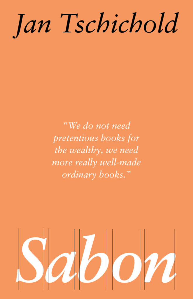
In Jan Tschichold’s reading about “The New Typography”, we can appreciate simplicity. He talks about the importance of not having a lot of ornaments, the beauty of a design appears when we start designing simple things; in that way we do not overwhelm the eyes of our audience.

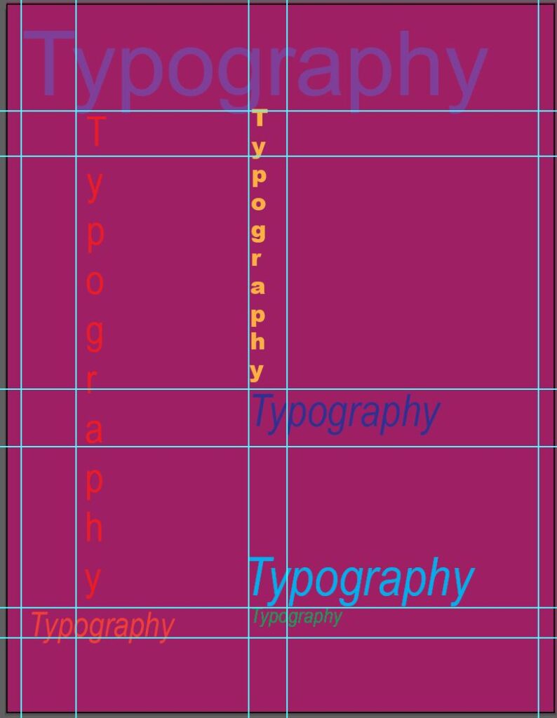
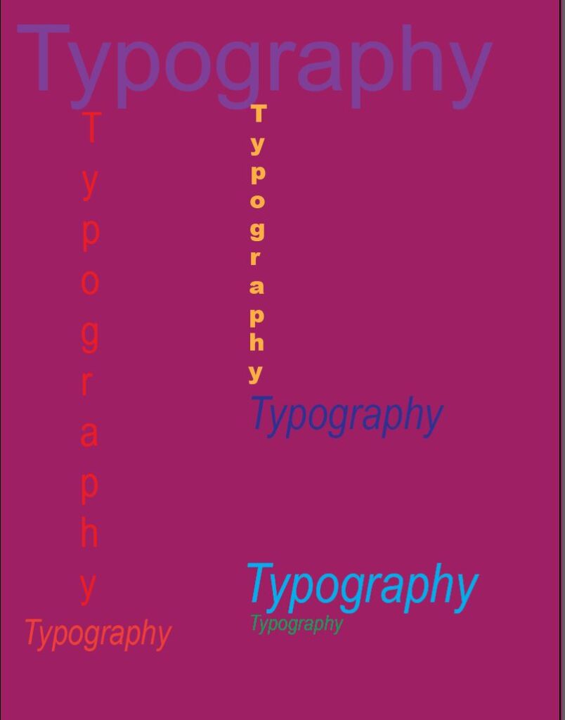
Karl Gerstner, on the other hand, merged art with science and developed a new way to design. He talks about the importance of designing with contrast, for that reason, he developed “the morphological box of the typogram” which contains the parameters a good design has to follow. Gerstner also talks about the grids and its importance in design because it helps with the composition.

In Grid and Design Philosophy, Josef MĂĽller gives a good example of how to use the grid and he also talks about Constructivist design. This type of design converts design laws into practical solutions. At the end of the text MĂĽller says, “Every visual creative work is a manifestation of the character of the designer. it is a reflection of his knowledge, his ability, and his mentality”; this was one of my favorite parts of the readings.

Assignment for Oct. 19- Briana Burton

Typography is embraced by many artists. As typography became more popular it became more advance. In the article “The New Typography” Jan Tschihold who was a trained classical typographer state that it was done for clarity. He made the comparison between the old and new typography. Grids are important to typography. It gives a sense of foundation to the design. Karl Gerstner spoke about designs and fundamentals such as typeface, size, and the overall design concept. Based off these articles I came up with a design using the key aspects of typographic design.

Assignment Oct. 19 Gabe Morales

For this week’s readings, design was the most important factor. Jan Tschichold was a designer who basically invented using grids when working on designs. They mention that the grid is an “invisible backbone” and it gives purpose to the design. In Gerstner’s reading, he described the grid as “complicated to anyone not knowing the key.”

This poster I designed was from a project about Jan Tschichold and his work. I decided to use a font he created called “Sabon” and included a quote of his. I designed this poster in a way that was reminiscent of his work at Penguin Publishing, since he worked there for a long time and even helped establish the covers for their books. I included my grids in the first image to show its impact and that I had intentionally designed with purpose like the designers advised in the readings.

Assignment Oct 19- Muna A

Reading these three short texts have made me fully realize and understand how one should design. Jan Tschichold is one of my favorite typographic designers, his simple yet bold design style is fascinating. 

In Jan Tschichold’s “The New Typography” it discusses how a typographical design should be full of clarity and not too overwhelming too look at. In that case, I strongly agree because imagine looking at a design work where your eyes wander from one place to another not knowing exactly what to read first or to stop at. It makes it very difficult to understand the concept of the whole layout. I’m the text, it shows a typographical design layout where there was lots of type scattered with different typefaces and ornaments. It was honestly terrible to look at, it did not give negative space a chance. Tschichold himself then redesigned it and made it very clear and simple which I’m very sure it was appealing for the audience to look at. He removed the ornaments giving the layout white space, lessened the amount of typefaces and used bold font for important text details. 

Another text was Josef Müller-Brockmann’s “Grid and Design” shows us how using a grid can keep chaotic, messy, and irrational design elements under control. We still use grids as today and it shows how effective it is. Basically, in the design world, designers should always keep in mind these very important things. Design layouts should not be overwhelming and chaotic for the viewers to understand, it is okay to give more white space instead of ornaments. It’s also fine to use less typeface rather than five and it’s fine to use the most useful way in designs which is the grid. 

« Older posts Newer posts »