Futuristic Movement as the Major Theory of the Readings
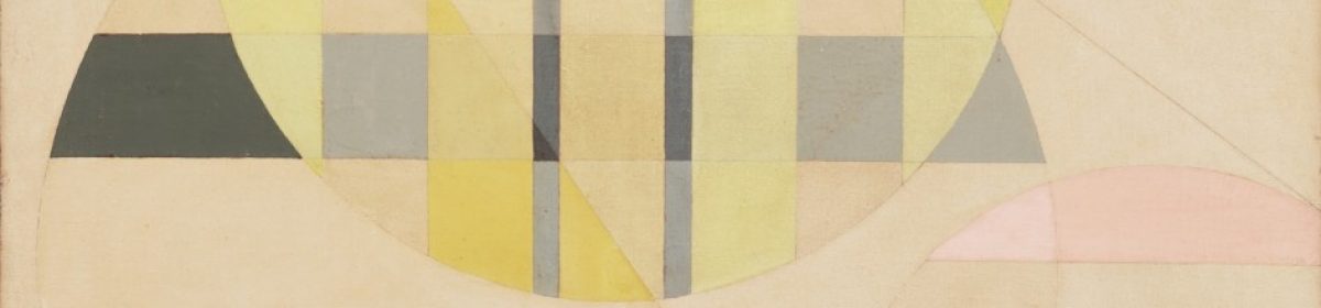
The major concept outlined in graphic design and art is concerned with the futuristic movement. The futuristic movement concentrates on associating natural beauty and humanity (Lissitzky 30). In the past 40 years, an artist influenced by Moholy-Nagy’s is Peter Halley’s Neo-Geo paintings in 1962 (Art Work Story np.). The development of the telephone painting prefigured an entire range of modern art which was inclusive of Warhols factory-produced screen paint, minimalists’ serial works. One of Halley’s artworks depicting futuristic movement is Red Cells with a Conduit Of 1962. The painting portrays the geometrical formation through symmetrical aspects by use of colored lines intersecting at a right angle.
The artist uses innovative avant-garde in the manner of social-artistic as it had materialized as a motivation to involve the artist in the promotion and development of graphic designs. Alexander Rodchenko, El Lissitzky and Moholy-Nagy and Victor Margolin had examined the engagement and changing the relationship between the social ideal along with political realities they confront. This is seen in Halley’s painting of Red Cells with a Conduit. Additionally, Halley’s painting could be explained through the concepts of David Harvey on the heterotopia in which the art can be described in terms of spaces and places. In this perspective, Halley represented his work in terms of spaces and places to define his mean theme in the red cell painting. For example, he created spaces (topia) that were used in the development of interior cell and the conduit section. The spaces could be classified based on the uniformity of the cells such as isotopia or heterotopia for the conduit section because of uniformity (Harvey no pages). Hence, it becomes easy to understand the paintings and why it has varying subsections.
Finally, Halley employs the same tactic as Moholy-Nagy where this picture displays asymmetrical formed by the two vertical black lines (Moholy-Nagy. The typography of the painting is red in the background and a horizontal line near the bottom that contains the two symmetrical short black borders that reaches the middle of the painting (Art Work Story np.). according to typography in a picture creates a new design and look that audience can interpret in a new tempo as is created through paint, brush rather than use of technology (Moholy-Nagy 34; Rodchenko 23). However, this art is not per Barthes indication that required iconic message and linguistic signs. Yet, the picture takes underground mainstream as it evolved that helps the views have a sense of sight and touch (Heller 101). Also, in the movement of Neo-Geo, Halley referred to Jean Baudrillard in the aspiration of hyper realization as it was a realm of progressivism to assign the value of reality to the society.
Work cited
Art Work Story. “Artworks and Artists Of Neo-Geo.” N.d. Web https://www.theartstory.org/movement/neo-geo/artworks/
ART. “Neo-Geo – History and Concepts.” ArtWorkStory. Nd. Web https://www.theartstory.org/movement/neo-geo/history-and-concepts/
Barthes, Roland. Rhetoric of the Image. na, 1993.
Borevitz, Brad. “Super-Abstract: Software Art and a Redefinition of Abstraction.” read_me: Software Art & Cultures. Arhus, Denmark, University of Aarhus (2004): 298-312.
Halley, Peter, et al. Peter Halley: maintain speed. Distributed Art Pub Inc, 2000.
Halley, Peter. Peter Halley – Paintings from the 1980s. Conference Publication. 2017. Print.
Harriet K. Stratis, Salvesen Britt. The broad spectrum: Studies in the materials, techniques and conservation of color on paper. Archetype Publications, London, UK (2002).
Harvey, David. Spaces of hope. Vol. 7. Univ of California Press, 2000.
Heller, Stephen. “The Underground Mainstream Steven Heller “Graphics.com Interview: Steven Heller” graphics.com. 2007”
Kemp, Virginia Millner. “Theoretical Concerns In the Geometric Abstractions of Peter Halley.” (2009).
Lee, Patricia. Sturtevant: Warhol Marilyn. MIT Press, 2016.
Lissitzky, El. “Our Book.”.” Sophie Lissitzky-Küppers. El Lissitzky: Life Letters Texts. London: Thames and Hudson (1967).
Moholy-Nagy, László. “Typofoto.” Malerei, fotografie, film 8 (1925).
Prince, Mark. “Adventures of the Black Square.” Art Monthly 384 (2015): 22.
Rodchenko, Aleksandr, Varvara Stepanova, and Aleksei Gan. “Who We Are: Manifesto of the Constructivist Group.” Aleksandr Rodchenko: Experiments for the Future. Edited by Alexander N. Lavrentiev. New York: Museum of Modern Art (2005): 143-145.
Şener, Fatma, and Meltem Erdoğan. “Global Journal on Humanities & Social Sciences.” (2016).
Wallis, Brian, et al. Art after modernism: Rethinking representation. The New Museum of Contemporary Art, 1984.