Rana Abdelnaby November 25

The mainstream vs. underground concept is relevant in contemporary design. Heller indicates that the mainstream is a progressive entity due to changes underground culture established by some designers in outsiders (Heller 101). In this way, the contemporary society tweaks the underground culture with the trending issues, and slowly the mainstream becomes the trend itself. Most of the culture is adopting commercial advertisement design.

The design of commercial advertising such as Ketchup uses both visual, linguistic signs and coded iconic message to promote its products. In this way, it fits in the mainstream as the underground captures the consumers by engaging them to their values in the market (Kumar et al. 301). Hence, the underground realm of outsiders who focuses on the design comes out with their own way of creating an advertisement or poster that might either criticize or promote a product (Screti 8). Therefore, the punk and grunge movement unhinges the dominant mannerism and methods used in the mass culture to embrace almost everything.

The underground design that influences the work at hand is leeching off the alternative of culture. The reason is that the underground has been appropriated from the mainstream. In contemporary society, it is termed as “culture jamming,” but in the past decades, it was known as “avant-gardists” (Heller 100). It will shape the mainstream through the fundamental forms associated with advertising the commercials through engaging the art into the advertising aspect. It occurs that not only was the futuristic and constructive art masterwork designed due to cultural change and trending events but involved advertising about new ideas (Clements 27). Hence, in shaping the mainstream, the promotion of commercial advertisement of products expands further to the visual language of an edge through social media as an adopted mainstream of advertising.


Works Cited

Clements, Paul. The Creative Underground: Art, Politics and Everyday Life. Routledge, 2016.

Heller, S. “The Underground Mainstream.” Armstrong, H.(Comp.), Graphic Design Theory: Readings from the field (2008): 98-101.

Kumar, V., et al. “Undervalued or overvalued customers: capturing total customer engagement value.” Journal of service research13.3 (2010): 297-310. Retrieved from https://www.researchgate.net/publication/247744906_Undervalued_or_Overvalued_Customers_Capturing_Total_Customer_Engagement_Value/link/55a0ff1908ae967fb3ea8758/download

Screti, Francesco. “Counter-revolutionary art: OBEY and the manufacturing of dissent.” Critical Discourse Studies 14.4 (2017): 1-23. Retrieved from https://www.academia.edu/35065119/Counter-revolutionary_art_OBEY_and_the_manufacturing_of_dissent?auto=download


Assignment for November 25

Our next reading will be a short essay by Steven Heller, from 2008, entitled The Underground Mainstream. Here is a PDF: Heller_UndergroundMainstream2008

Your response to this text will be a minor variation on our usual format. You’ll type a 1-page response, ap. 300 words, in 12 point Times New Roman, double-spaced. You’ll also include a short bibliography. These should be uploaded as a PDF.

The goal for using this format is to promote research for your final poster and presentation.

Please respond to the following prompt:
How, according to Heller, is the concept of mainstream vs. underground relevant in contemporary design? Where do the designs or the designer that you’ll be addressing for your final presentation fit into this dichotomy? What sort of underground designs influenced the work in question, and in what ways has it, or will it eventually, shape the mainstream. Use at least 3-4 sources from the library to support your response. Include citations.

*Assignment for November 18*

Your assignments for next week are to complete your 2nd paper, and to read two short texts.

The paper, as you know, is a response to Roland Barthes’ Rhetoric of the Image. The objective for this paper is to analyze the rhetorical elements of a recent advertising image.

Select a print ad that uses photographic imagery, then deconstruct the elements of the ad. Describe the image in as much detail as possible, examining the characteristics of the objects, models, and environment in the image, as well as layout, typography, interaction of picture elements, image quality and composition. Make your best attempt to articulate the meaning of the image, using Barthes’ terms. Consider the denotative and connotative aspects, the use of anchorage and relay, the 3 messages contained in the image, the semantic and lexical components, etc. Think in terms of the effectiveness of the advertisers’ rhetoric, and the ideological metalanguage employed.

Again, this response will be submitted as a 750-1000 word typewritten paper, double-spaced in 12 pt. Times New Roman. Include images of the advertisement under consideration and any other relevant illustrations. All references and quotations, including image sources should be properly cited in MLA format.

The readings are essentially unrelated to the paper. You may find it helpful to complete them after the paper. They are as follows:

Paul Rand, Good Design is Goodwill (1987): Rand_Goodwill

Denise Scott Brown, Steven Izenour & Robert Venturi, Learning from Las Vegas: The Forgotten Symbolism of Architectural Form (1972): Venturi_LasVegas

Please budget your time this week to complete the paper with enough time remaining to also complete the readings.

Jeremy Eisner Oct. 28th & Nov. 4

OCT 28TH:

Humans and technology are thought to have a symbiotic relationship with each other. Technology and media are meant to help humans do things that they cannot normally do. The media is meant to deliver a message to the people using technology that can spread the same message across the world. If you are sending a letter, the letter is just a piece of paper, but what is written is an extension of your personality. If you are writing a book, the book is just a collection of paper put together, but it is your voice that is found throughout the book. However, not everything that we create will benefit us in the long term.

Technology and media work for us, but one day it may be possible that it will replace us in describing the messages we want to convey without us. Since technology does what we cannot do as well as a machine or at all, we use it as a form of progress. Despite this, technology does not some developing after we have enough help from them. It is meant to solve one question, “How do we make the task more efficient?” . After a while, the only way for technology to keep solving that question is to do the task entirely on its own. We can see this today with the developments of self checkout in places like grocery stores that aim to make the user experience quicker and easier, but they take jobs away from regular cashiers who cannot keep up. Another example may be the advanced testing of drones that aim to eventually replace mailmen and women in bringing your mail to your door.

Overall, the development of electric age technology has more of a negative impact in my opinion because of the long term effects of developing machines as smart as we are. As people, and even more so as designers, technology should be something that we tell what to do. As media is an extension of our voice, technology should not do anything to change that.

NOV 4TH:

Target

Here we see a target ad that seems to be a sale for back to school products. We see four children, and we can see that two of them are white. This ad is trying to convey that it does not matter who you are, there are back to school stuff for all kids alike. (https://frequent-ads.com/target/target-weekly-ad-L9OtbIrojN-0)

Here we see an old navy add that is very similar to the target ad. We have a group of four people collecting gifts for black friday. What makes this one somewhat controversial is the use of pairing black and white people as couples.Especially since it seems the couple, or seemingly close friends, on the right are still teenagers. (https://9to5toys.com/2018/11/05/old-navy-black-friday-ad-50-off-sitewide-cardholder-benefits-1-socks-more/)

BILLBOARD - Verizon Wireless

Our last ad is a billboard created by verizon to advertise their brand. We see a large group of diverse workers of many races of both men and women, working together to help bring you quality cell phone experience. If that is actually true is another story entirely, but for the purposes of the ad, it has shown that you can rely on all of these people to have a strong network. (https://flic.kr/p/5iHYmU)

Assignment for November 11

Our reading for next week is Roland Barthes’ 1977 essay, Rhetoric of the Image. Here is the PDF: Barthes-Rhetoric-of-the-image

The second 2-3 page paper will be a response to this article, and will be due on November 18.

The goal of this paper will be to critically examine a contemporary advertising image in a manner similar to Barthes’ approach in this article. You will be expected to employ the logic and terminology that Barthes uses in this text.

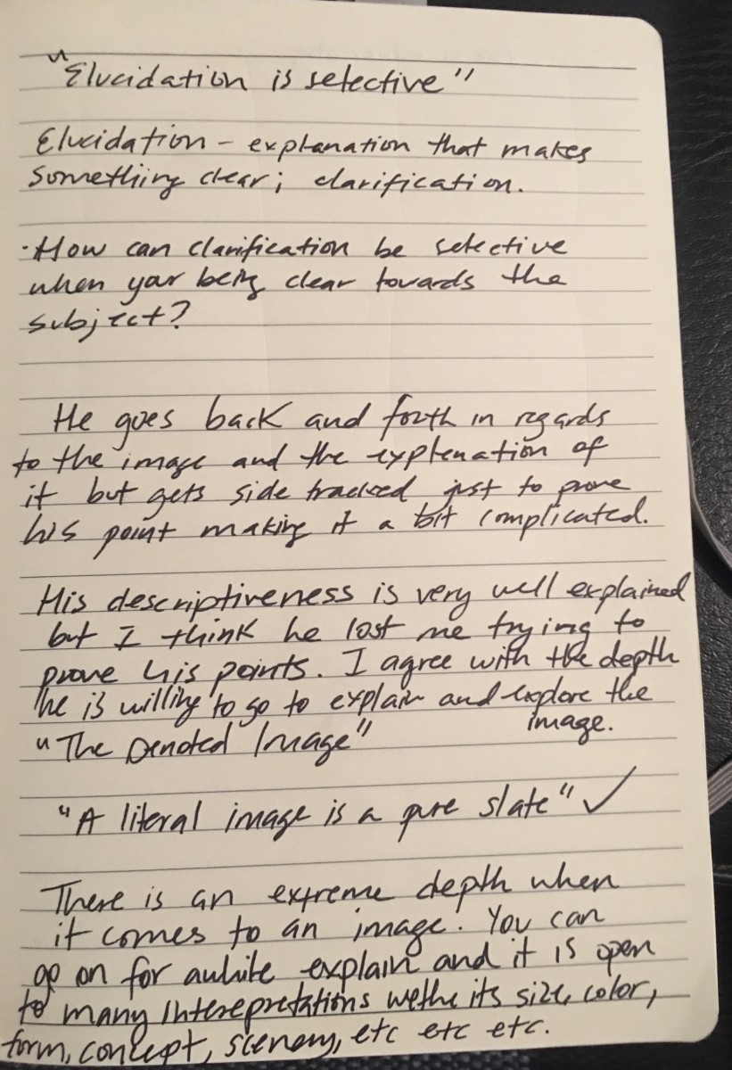
As you read, please make note of all important terms (ie. polysemy, linguistic sign, connoted, denoted, etc.), especially if their meaning is unclear. Attempt to define important terms. Make note of important points that you don’t completely follow. Write these terms as a list, by hand, in your research journal, then take a snapshot and upload. This will be your post for the week.

Please also select the advertisement that you would like to address for your essay. It should be an advertisement built around a single photograph. A full page print ad is preferable. We’ll talk about ideas in class on the 11th.

Limmer U Barber Nov 4th

Benetton Group – Unhate Campaign

The campaign features a range of world leaders kissing, including the likes of Obama, Merkel and Sarkozy. According to the company behind the ad, the theme focuses on the kiss as it’s a universal symbol of love. The ad ran across many countries on large billboards during its 2011 launch which as you can imagine caused a lot of raised eyebrows. This wasn’t the first time the group had launched controversial ads before, in fact, their previous ads showed a priest and nun kissing. Controversy for this ad campaign arose in many different ways. The first was the use of the world leaders without their consent. In fact, one of the ads features Pope Benedict XVI kissing a top Egyptian imam which was quickly removed after being condemned by the Vatican.

Lung Cancer Alliance USA 

recently unveiled a series of controversial service announcements proclaiming that just about everybody “deserves to die”, if they have lung cancer. Intended to challenge those who believe lung cancer victims deserve to suffer because they’ve brought their illness upon themselves, LCA and Laughlin Constable created a series of advertisements that tackle the bias and stigma attached to those battling this atrocious disease. Hit the thumbs for a look at these disputable ads used by Lung Cancer Alliance USA. And, peep this crazy video found below.

British ice cream manufacturer Antonio Federici

hit the news headlines again with a new print advertising campaign banned because of religious sensitivities. The 2010 campaign for Gelato Italiano shows a heavily pregnant woman dressed as a nun standing in a church holding a tub of ice cream, with the text, “Immaculately Conceived … ICE CREAM IS OUR RELIGION”.

In another ad from the campaign two male priests are poised for a kiss with ice cream, with the text, “We believe in salivation”.

UK’s Advertising Standards Authority, Antonio Federici said the idea of “conception” represented the development of their ice cream. They said their decision to use religious imagery stemmed from their strong feelings towards their product (they cited the text “ICE CREAM IS OUR RELIGION”) and also from their wish to comment on and question, using satire and gentle humour, the relevance and hypocrisy of religion and the attitudes of the church to social issues. They believed the small number of complaints the ASA had received represented a very small proportion of the readership of the publications. They did not believe offence had been so deeply felt as to affect their right, as marketers, to free expression and that offence caused to a small minority should not affect the ability of the wider public to see their ad. They believed that, as a form of art and self-expression, advertising should be challenging and often iconoclastic.