Monica Jeune Nov 4th

Black vs White

Race/Gender

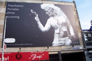
A racial motivated ad by Sony for the release of their white PlayStation. The color white dominates over black. Its cleaner, sleeker, more fierce and stands out. A white alternatively dressed women  presses and grabs the chin of a black woman forcing her down on her knees. The one in white grabs attention and power. The image portrayed is of subordination, and to stand out (her outfit says it all) the one in black wears a black button shirts as if to imply conformity. I have also noticed , the image above isn’t a standard black and white image , each women is colored to most saturated extremes, pure black and white. If it weren’t for the lighting on the darker side of the side the woman would blend in seamlessly. White stands out! I do also note the fact it’s women, as if to imply white women are “better” and have a more alluring appeal.

PopCluture (2)

Cultural Identity

This ad appeals to the  Millennials and those in Generation Y. The language used is eye catching especially for a magazine (a formal print), although this ad is appealing to a certain demographic. The ones behind the ad, know who their consumers are. The “texting” language and use of hyperbole is a direct take form how their consumers speak/text in their everyday lives, their a relatable, offbeat, and hipster brand.

Native American (1)

Race

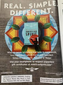
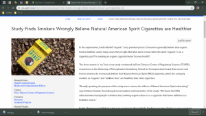
The cigarette company used Native American appeal to attract consumer by way of using the name “American Spirit”. The tobacco must be really good.”If they smoke it and  have a have a good time, I probably will too”. – random consumer. Although the “real” ingredients are  listed it subtle implies that the cigarettes are made with some magical Native essence, maybe even special ancient  native herbs. There is commonly held notion of peace, tranquility, traditional, health,ancient and spirituality when people think of natives. It appeals to the idea of a better cigarette. American spirit cigarettes are are implied to be healthier as well which is crazy but it’s just because of the branding , I found an article to prove it:Healthy
Rana_Abdelnaby_November 4th

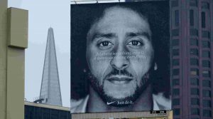
Nike is undoubtedly one of the biggest companies when it comes to sportswear and sports brands. Known for their sports footwear, clothes and accessories, The ad was plastered on billboards all over America with the tag line “Believe in something. Even if it means sacrificing everything”. The line being a nod to Kaepernick’s previous actions of not standing for the national anthem in protest over the treatment of ethnic minorities.The Problem: After Kaepernick refused to stand for the national anthem, many viewers became angry at him and viewed him as anti-American. The fact that Nike was using him in their ads made many people believe Nike was also anti-American. This sparked a lot of controversies online with many social media users destroying their Nike products while posting the hashtag #JustBurnIt.


LUSH is a UK based handmade cosmetics manufacturer that has stores all across the UK and USA. In 2018 LUSH released their spy cops campaign across all their UK stores which raised many eyebrows.The Problem: The main issue with this campaign is that it came across as very anti-police to most of the general public. In fact, there were reports of people complaining and becoming very aggressive in the stores, resulting in LUSH having to call the police. Due to the negative reception of the ads.


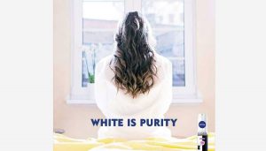
Nivea is a German skincare brand that is known for manufacturing antiperspirants, face creams, and plenty of other cosmetics. To promote one of their new invisible antiperspirants, Nivea decided to use the tagline “white is purity” on their social media campaign. The ad featured a woman wearing a white top while looking out the window with the slogan in bold blue letters.The Problem: As you can probably see from the advert above, the choice of words for this campaign were very poorly chosen. To make things worse, they specifically aimed the campaign at people in the Middle East which caused many people to call the advert racist.

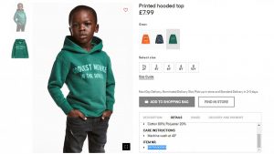
H&M landed in hot water at the start of the year, when it featured an ad with a black child wearing a hoodie bearing the slogan “coolest monkey in the jungle.” The image went viral, and was slammed on social media, including by The Weekend, who announced on Twitter that he would no longer be affiliated with the brand. H&M later apologized.


Obed Ledezma – November 4th

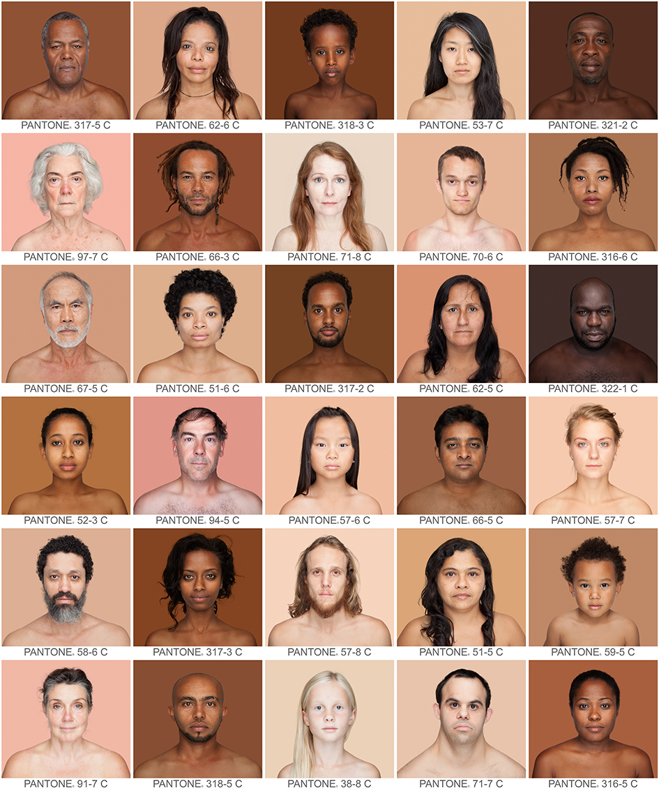
Humanæ by Angelica Dass is a project and ad campaign that focuses on the idea of race as a social construct, rather than a biological one. I think this is a good representation of diversity because it represents every one of all ranges of complexions. She has already taken about 4,000 photos. https://news.artnet.com/art-world/4000-skin-colors-in-pantone-squares-1254683

Zuri is a makeup brand from the sixties catered to Black women. I think this is a positive ad because at the time makeup lines were very limited for Black women. There is also the upliftment of Black beauty in this ad. (Pinterest – ADs from the 60s)

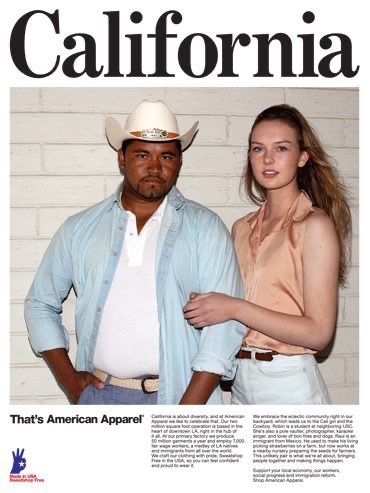
Although the brand is dead American Apparel was known their controversial ads. I think this is a negative ad because of how tone-deaf they were especially with the usage of the real Mexican farmer being used as a prop. There are currents of exploitation in this ad. To a lot of people, it seemed odd given how much the company has done for the Latino community. https://gawker.com/5911787/american-apparels-hottest-new-accessory-farmers

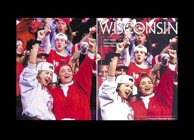
I wanted to incorporate university brochures because I remember during my college application process I used to see a lot of this. There were many examples where they would only add one Black person into their application brochures to make the school seem “diverse or inclusive”. https://www.rug.nl/about-us/how-to-find-us/huisstijl/toepassingen/informatiedrukwerk/poster?lang=en

This brochure is from the University of Wisconsin. They photoshopped a Black person into their application brochure to make their school seem more diverse of students but failing terribly. The school received a lot of backlash for this back in 2003. https://www.snopes.com/fact-check/photo-finish-2/

Dennis U. November 4

Why i pick is to show how the destruction of the classroom look like. Not only that but to show that without schools how are kids supposed to learn. This photo helps to show that people need to do something and help with the cause to repair the school.

The second photo examples the lost of the family. This is sad because it shows the kid and the mom lost someone in the family. Also, in the photo has the father to show that’s all they have to remember of him.

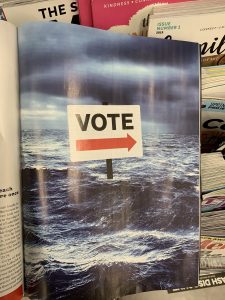
This artwork is a more political because it takes about the climate change. Reading the magazine it gives detail how certain part of the world has been flood or harsh climate. However, the vote is also talking about even though there is an election it can’t change the problem. This is a statement to show that people need to aware what goes on in the world.