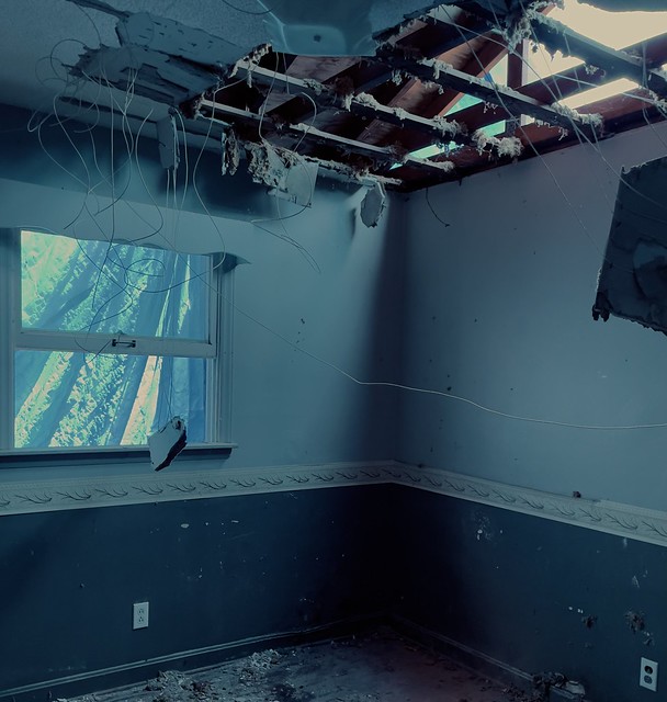
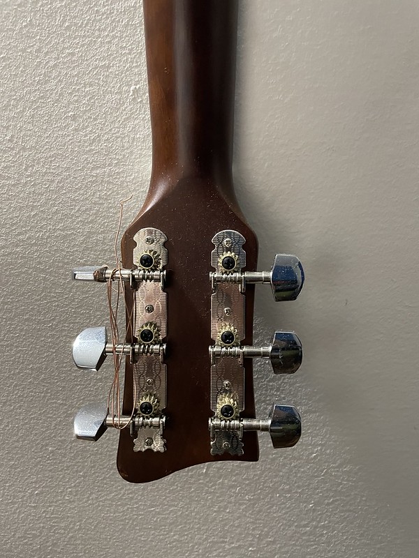
In my series, the outlying concept is age and and rebuilding community. With these photographs, the sense of old and new community are seen and guided toward that concept through use of color and light. I set up objects around old environments in appropriate lighting to demonstrate age. I went around a new community taking photos of signs and art. I took some inspiration from the classic David Lynch series “Twin Peaks”; it’s use of color and frame is really interesting. I took photos each week whenever I went out to the community. There are some photos that I took in North Carolina where I am now, and there are a lot of broken down houses ready to be built back up, bringing up the theme of age and rebuilding community. Overall it was fun to do this assignment, I enjoyed the creative vision that came to me while doing it.
Author: Jacob Cadavid
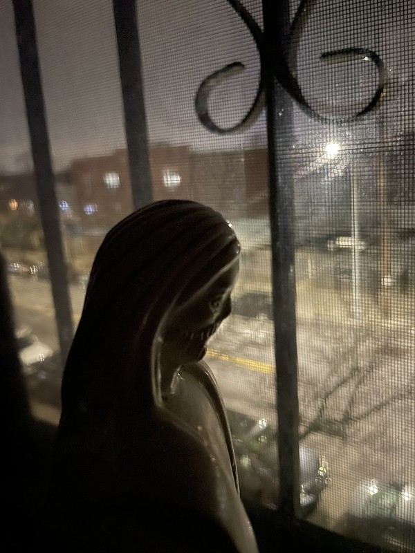
This recreation of one of Gordon Parks’ photographs, ‘Red Jackson’ is of a Harlem gang leader looking out into the streets. I chose this picture because it can have more than one meaning to it. In todays world everyone is stuck looking out into the world instead of being in it, and like the true story of this photo, the gang leader looks out to the violence and oppression going on, much like today. I also was struck by the use of light and shadow, the light from the sun on the outside shines in on the leaders face, leaving the rest of the photo dark and black, the contrast adds layers to the composition. In my recreation I used a statue of Christ the Redeemer, it was coincidental that it was in my house. There was light coming from a street lamp shining on the surface of the statue. Like the original I tried to make the contrast of the outside light and darkness of the room.

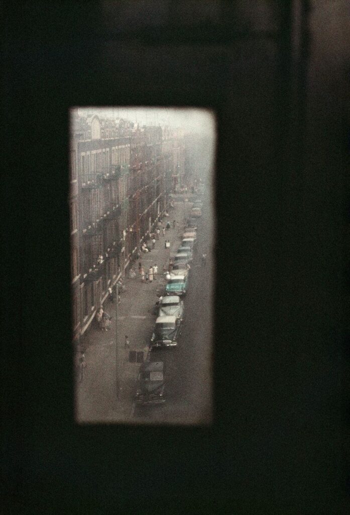
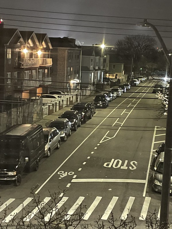
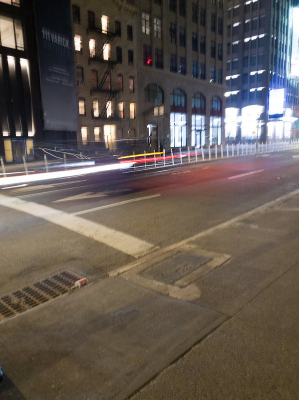
Second recreation of on of Gordon Parks’ photograph is ‘The Atmosphere of Crime’ where he illustrates the scene of crime in New York, San Francisco, Chicago and Los Angeles. This picture caught my attention because of the framing and angle; the first thing that you notice is the border of the frame, it looks like the photo was taken out of a small crack or peephole, but the contents of the composition stands out more. The use of diagonals in the photo lead the eyes down the photo. The use of color makes the viewer focus on the content, as well as the blur and vignette around the edges brings the eyes to focus on what is being showcased. My recreation has similar angles, I wanted to recreate the angle of cars and the sidewalk, the use of lines and diagonals is seen a lot in my photo. The bike lanes lengthens and messes with the proportion, therefore making the photo appear long.









Recent Comments