Author: seth balloqui
What is the concept behind your series? How has the idea taken shape or changed as you set out to begin shooting?
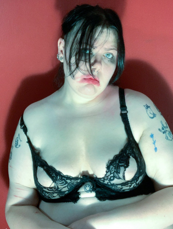
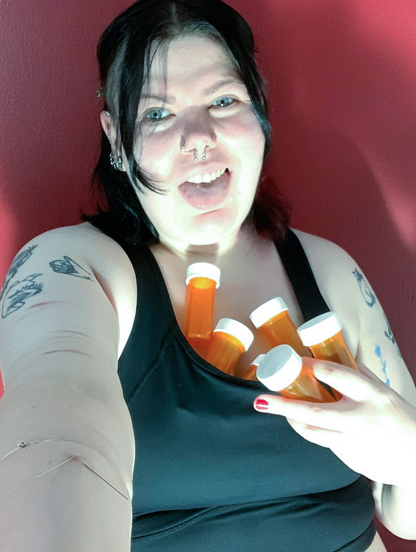
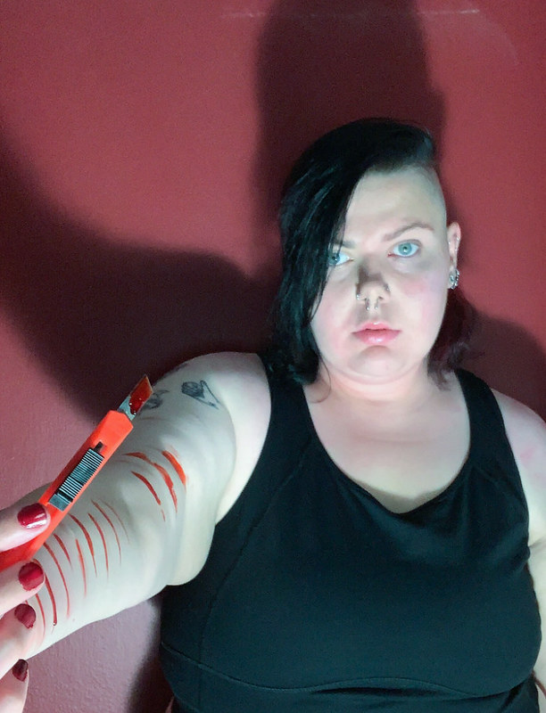
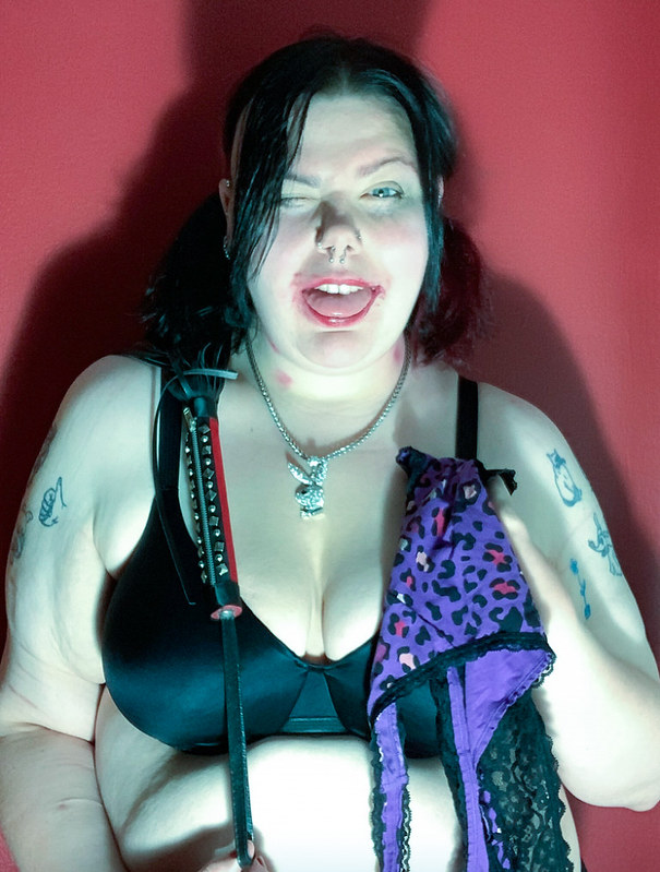
After passing through a few other ideas involving other similar themes that either didn’t work out compositionally or were a little too dark, I started thinking about the possibility of creating the concept of a world through “Patron Saints” of darker issues such as self harm, drug use, homicide, and other things of a similar nature.
What inspired you to pursue this idea? What particular photos are you thinking about (from class or from anywhere else in your life) as you’ve begun shooting? Do you have any painting, design, or other non-photographic visual references in mind for the project? Are there any particular styles that you are attempting to emulate?
The main three things that inspired my idea was the concept of Patron Saints and their aesthetics in the Catholic Church, Greek Mythology (or Mythology in general), and Grimes’ work, especially her albums Art Angels and Miss Anthropocene. A lyric from Jack Off Jill’s song When I Am Queen inspired one of my characters as well (the Patron Saint of Self Injury). I wasn’t exactly looking at any specific references, more so just going off of the idea of Catholic prayer cards. I wanted my photos to look like prayer cards that were shot in hell- something uncomfortable to look at.
How did the first week shooting go? Did you encounter any difficulties or setbacks as you began to shoot? Have any parts of your series proved more difficult than anticipated? Have you had any great successes in your first week of shooting? What has gone better than expected? Have you been surprised by the outcome of any shots? Which images are you most excited about?
Despite the original ideas falling through, shooting the Patron Saints series has actually been a breeze! I’m having a lot of fun with the concept and conception of these characters and the world I’m building. Nothing has been extremely glaring in terms of issues while shooting. I’m very excited to tackle difficult topics using art and reclaiming the aesthetics of a religion that ruined my life.
Which images is your group most excited about? Are there particular qualities of those images that you can pinpoint or define? Can anyone in the group clearly state why they’re reacting to these particular images?
I’m mostly excited about the Patron Saint of Self Injury for it’s “shock value” and use of fake blood, the Patron Saint of Domestic Violence for its use of makeup (hearts surrounding the black eye, displaying that people who are usually abused in relationships are still in love with the person), and the Patron Saint of Drug Use, for it’s more personal nature to me and the way I portray it using actual needles I’ve used and actually stabbing the needles into my skin to create a more real effect.
According to your group, which aspects of your pictures need to be improved or refined? Are there any technical issues that need to be resolved? Are there ways you could improve your exposure, your composition or your framing? According to your group, where should you focus your energy in the coming weeks? What would members of your group like to see added, changed, removed, etc.? How will you go about doing this?
There was a lot of debate about the color of the background of the photos. Half liked the red and half liked the idea of black or white. Lighting and final composition were also discussed, and I’m not married to the ideas concerning light and composition in the final project, maybe even doing portraits for each Patron Saint instead of prayer cards. My group thinks I just need to fine-tune the more technical aspects of my series, maybe even playing with different costumes, lighting, and backgrounds. I might also even add some Patron Saints as well.
What is your agenda for shooting in the next couple weeks? When will you be shooting next? How many more shooting sessions will be necessary to complete your project? Remembering that you’ll need time to edit your images, what are your dates for shooting?
My goal is to do one-two saints per day, leaving two days free for my sister’s wedding. The makeup and fake blood I use stain REALLY easily so I’ll probably do those images first. I’ll probably start shooting late tomorrow just so I can get more ideas together. I’ll probably need about 7-8 more shooting sessions with two days to edit the final images. My goal is to shoot for a full week starting tomorrow and then letting my sister get married before going back to edit photos.
This fashion photo from 1949 taken in Paris was the first photo I decided to recreate! Something that great about Parks was that he was very versatile when it came to the subject of his photography- fashion, social commentary- he pretty much did it all! I was drawn to this photo because of the candles in the original’s background (we love a good Phantom of the Opera moment) and because I love how annoyed this model looks, whether she means to or not. I wanted to make the background of the photo more modern, so I chose my good ol’ lava lamp and a red candle to help recreate a small portion of the background. I decided to tackle this photo from the lens of body positivity, especially since many models back in that time were skinny and I’m not (big shock, call the press). She probably felt super beautiful in that dress, so I wanted to wear something I feel super beautiful in! Taking this photo was also extremely empowering when I first took it, because shortly before I took it, my three year relationship ended because SOMEONE DECDIED TO GET TWO OTHER WOMEN PREGNANT (look I know I’m oversharing but I’ve cried about this every day since it happened okay let me vent a little I deserve it) and I was made to feel ugly and unworthy of love. But I realized I was HOT AS HELL taking these! While the light source is mostly the candles in the original, I’m only allowed to light one candle at a time due to a prior incident, so I decided to abandon that idea because I would like to not accidentally commit arson again! As this was the first photo where I actually planned everything out, I decided not to worry too much on the specific details of the photo- although I did pay homage to the candles, and tried to recreate the same face, pose, and angle. I think the photo is a pretty cool representation of what we could possibly see in Vogue or any other better fashion magazine!
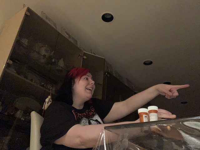
The original photo by Parks’ tackles the idea of race, and I believe the photo speaks about how black people are so conditioned to believe that white people are better, they will choose white people over themselves. While I’m not black (another big shock), I did want to keep the theme of choice in the photo, especially in the context of making the wrong decision for yourself, and decided to tackle mental health with this photo. As someone with severe Bipolar Disorder, Borderline Personality Disorder, Panic Disorder, and PTSD (isn’t that quite the fun mix!) I often have to rely on medication and therapy to be able to function correctly. However, especially during severe manic episodes, I tend to convince myself that I don’t need my medications, and I tend to go off of them without rational thought or care. During these periods I can experience psychosis and after a while I’m forced to go back on my medication, and it’s a cycle. With this photo, I wanted to represent how I tend to “choose” my mania and psychosis over my medication, just because my brain and my mental illness lead me to believe that I’ll be fine without it. In the photo, I’m rejecting my medications in favor of my psychosis, representing this through my hand blocking my medications from my own view, and pointing to “someone” who doesn’t exist out of frame. While I did take some shots where you can see I’m pointing and talking at an empty chair, I felt they did not stay true to the final composition, and decided to choose this one. I like how ominous the original looks, and wanted to capture that look. I lit the room in a way that it would be extremely shadowy where I was in frame. I also tilted the camera upward like he does in the original photo, as that angle gives the photo a little bit of a off balanced feel. I tried to stay true to the composition, tone, and mood of the original photo as I possibly could.
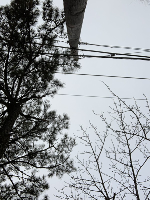
Pro tip to anyone else who wants to recreate this photo: don’t do it in a back alley of a park where your now ex-fiancée is blocking you from the public’s eye because people WILL THINK you’re doing a drug deal and the weapons aren’t helping. The original photo was the first photo where I was able to come up with the idea for what I wanted to do with it, and I’m proud of how it turned out! The original photo is of a woman doing some recreational archery at a summer camp in 1943, and she looks absolutely confident and badass. I decided to recreate that confident and badass look while also addressing the issue of women’s safety and self defense. This photo was taken around the time where there was a lot of discussion about the safety of women and femme presenting people in everyday life, sparked by this tragic story, which I believe added to the determination I had to add that voice into my recreation. I feel like I turned a photo of a young woman having fun into a powerful statement about how, even in broad daylight, women/femme presenting people cannot feel safe doing anything due to the climate of the world we live in. This photo is also extremely personal to me, as I took the photo in spot where I experienced minor sexual violence as a teenager, and a spot where many of my friends experienced similar things. I kept the angle of the photo as similar to the original as I could as I felt that angle was extremely powerful and even a little threatening, and I even kept the background of the trees similar to not only stay true to the original photo, but also to give a sense of isolation, and feeling alone and scared even in broad daylight. I love how Gordon decided to portray a black woman like this in the original 1943 photo too, as it showed a powerful black woman outside of the “angry black woman” stereotype.
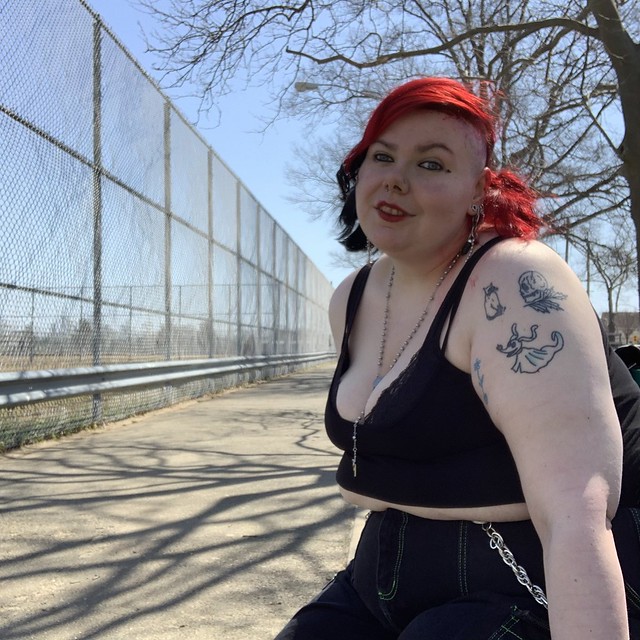
The original photo is a beautiful photo of Marilyn Monroe in 1959. Fun fact: I originally took this photo first, right after class on the day we got this assignment, and I thought the originals came out great!- Until my mom pointed out to me that my nipples were completely out, and that I would have to retake these as my titter tots had decided to make an appearance. When I got to the park to retake these, I definitely triple checked to make sure Thelma and Louise were in their proper place before I began to shoot. I wanted to recreate this photo as close to the original as possible, as Marilyn Monroe is really hot in this photo, and I’m also really hot in this photo. The original photo is filled with sunshine and confidence, and that’s what I wanted to capture with myself. I’ve come a long way in terms of self love, and I wanted this recreation to be a celebration of myself as the original can be seen as a celebration of her.
me, Yanping, and Sajjadul chose these as my best four to color correct!
are we supposed to upload our favorite shots to OpenLab for this assignment?? I don’t even know man I’m just following everyone else I’m only here to take pictures and look hot the rest of it is just following directions.
Also I made a video and I’ll be DAMNED if it doesn’t get any views so here’s the link to that: https://flic.kr/p/2kChHyD
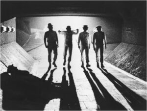
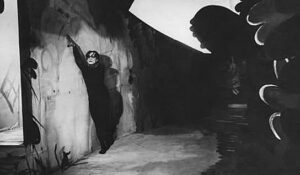
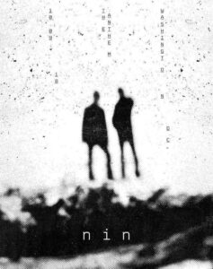
LOOK OK I love shadows and I love examples of shadows anyways I wanted to share some of my favorite light/shadow images because I’m the worst.
A Clockwork Orange
Cabinet of Dr. Caligari
Korn’s self titled album cover
(my personal favorite example)
Nine Inch Nails Washington DC Show poster designed by Jesse Draxler
Films shown in image, if anyone is curious!
Repo! The Genetic Opera
House of 1000 Corpses
The Angela Chapters (Vomit Gore 5)
The Human Centipede
Saw
Sweeney Todd

















Recent Comments