LOOK OK I love shadows and I love examples of shadows anyways I wanted to share some of my favorite light/shadow images because I’m the worst.
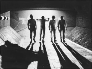
A Clockwork Orange
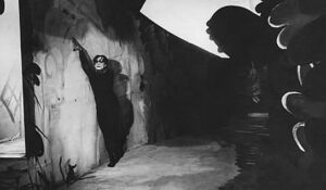
Cabinet of Dr. Caligari
Korn’s self titled album cover
(my personal favorite example)
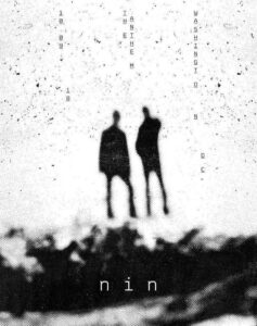
Nine Inch Nails Washington DC Show poster designed by Jesse Draxler


Very cool images! I like them all
Very cool indeed! Very nice references for low, hard light. Definitely creates a sinister mood like some of the Moriyama images from class. Still, don’t be afraid to go for more of an abstract, minimalist approach, really concentrating on the light itself.