Tag Archives: Type & Media

My Zine ideas

My zine is going to be about two things that I feel people should know about me in general. I’ll be talking about me becoming a graphic designer as a young lady wearing a headscarf. It’s sad but true that people who are “different” in our society are not accepted, or are treated differently than others. I honestly think that this issue has a big affect on my life, because as much as I love studying design and  wanting to become a designer ASAP, I always feel that there is something stopping me because of my headscarf.

I’ll also be talking about my dream of becoming a leadership trainer. Since 2011, the Unicef Tap Organization has become a big part of my life. I think it is very important that we help the less fortunate get access to clean water, and it’s also important that we feel the quality of the water we use and not take advantage of that, because there are many who die everyday because of the lack of water, or clean water.

I was thinking of making two zines in one, but I thought about it, and I think the best thing for me is to collaborate the two topics together, because when they do come together, they lead to one thing, and that is me.
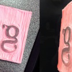
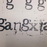
Carving and printing

This was a cool assignment. For this classwork project, we had to use our speedball carving knife to carve a letter onto the carving pad. I was given the letter “g”, which was told to me that it’s one of the hardest letters to practice on. The way I carved it was by tracing out the letter, and carving everything else that was not needed. The end result was the letter “g” popping out. I was pretty satisfied with my first attempt.

carving

After carving we starting inking the rubber pad and ‘printing’ them on paper. Because the letter g is lower case, and descends at the baseline, it should be a little below the line. But I didn’t realize my mistake until long after many attempts. But soon I got the hang of it. I tried making words with some of the letters my classmates made. Read it and laugh. 1555275_430007697101967_1884743526_n

I learned plenty from this project. I got a hold of the speedball knife, and how to use its different blades to cut through the pads. I also learned a lot about typography. There lots of different fonts and typefaces that are used in many of the designs we see today, mostly Arial or Helvetica. Now if we’re going to get into details, theres ways to set up the type. I mean kerning, which is adjusting the space between characters, leading, which is the distance between the baselines, and tracking, which is the distance between letters. There is also a lot more to say about baseline, the meanline, the x height and many other things that I’ve learned.