Category Archives: Uncategorized

Carving and printing

This was a cool assignment. For this classwork project, we had to use our speedball carving knife to carve a letter onto the carving pad. I was given the letter “g”, which was told to me that it’s one of the hardest letters to practice on. The way I carved it was by tracing out the letter, and carving everything else that was not needed. The end result was the letter “g” popping out. I was pretty satisfied with my first attempt.

carving

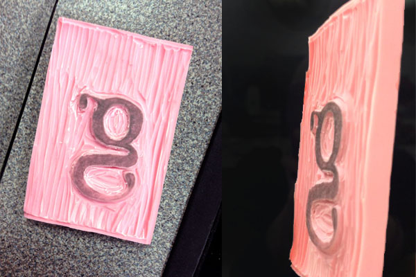
After carving we starting inking the rubber pad and ‘printing’ them on paper. Because the letter g is lower case, and descends at the baseline, it should be a little below the line. But I didn’t realize my mistake until long after many attempts. But soon I got the hang of it. I tried making words with some of the letters my classmates made. Read it and laugh. 1555275_430007697101967_1884743526_n

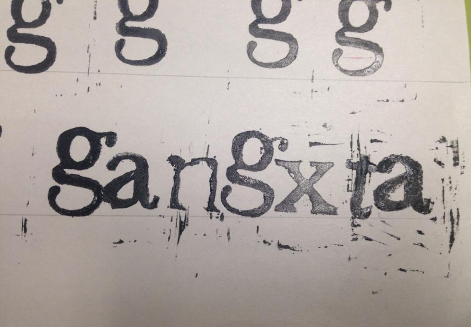
I learned plenty from this project. I got a hold of the speedball knife, and how to use its different blades to cut through the pads. I also learned a lot about typography. There lots of different fonts and typefaces that are used in many of the designs we see today, mostly Arial or Helvetica. Now if we’re going to get into details, theres ways to set up the type. I mean kerning, which is adjusting the space between characters, leading, which is the distance between the baselines, and tracking, which is the distance between letters. There is also a lot more to say about baseline, the meanline, the x height and many other things that I’ve learned.

View From My Window sketches and description

1508152_426724960763574_1701018190_n

The first thumbnails are sketches of what seemed Stable from what I’ve seen outside my window. By stable, I mean that a person sees that there is one focused image. The first image is just a tree, the second image is just the moon, and the third image is just a side-view of a house. The tree, moon, and house are the figure part of the image, the audience focuses only on them. On the other hand the negative portion of the image is the ground, which is what supports the figure. When you think about the shapes used in the thumbnails, you can easily tell that the house uses lines to create a geometric shape, while the tree uses organic lines, where the lines naturally flow to make an image without necessarily using straight lines. The moon also uses organic lines, because it is actually drawn as a curved line to create an arc.

1743732_426724944096909_567175779_n

In the second drawings of thumbnails, I sketched Ambiguous images. Ambiguous meaning there is more than one focused image. So, in the first sketch, I simplified what I saw, and maybe added something. I drew a regular house not adding any details to it, then I added a few flying birds (that I didn’t actually see, because what are the odds) so that I can make the audience focus on them as well. And thats one reason I didn’t add details to the house, so that it won’t be as attractive and it wouldn’t make the audience ignore the little birds. The second thumbnail changed the position that I was initially and saw the view, that again I simplified. I I were to draw everything I saw there would be so many things, the audience might just skip it. So I drew a big tree that was in front of a back yard. you can say that the tree was my foreground, the backyard was by middle ground, and the house or the top of it was my background. Lastly, I drew the street which, once again was simplified. I drew the sidewalk, the crosswalk sign, and I disturbed the ground by drawing the two white  cross lines so that a person can also notice it other than the figure.


I apologize if my pictures seem dark, I was trying to be cool and use a charcoal pencil…