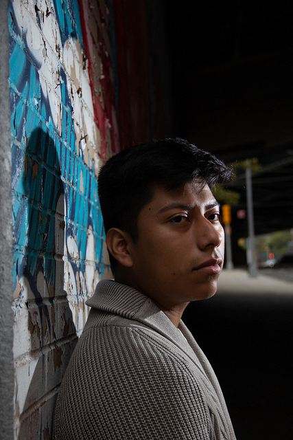
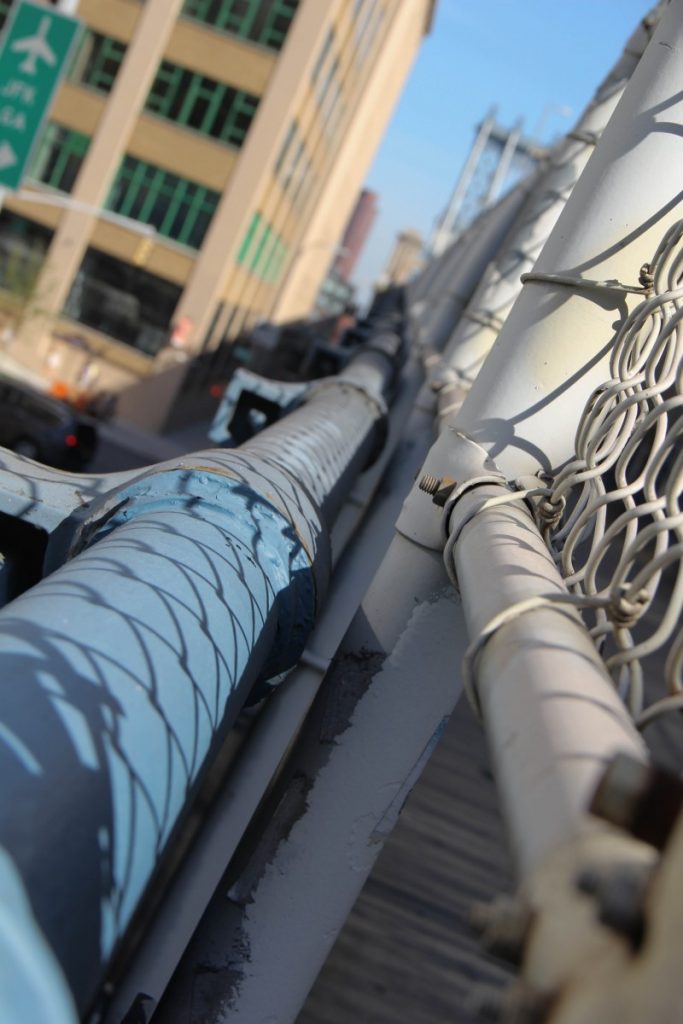
For this photo I decided to make sure the major light source was coming from the side. I love the contrast the darks and lights create. I chose to frame Irvin a little off center, with the street in the background to give the photo more context. Irvin and the background blend together, but the mural adds an extra pop to the picture. The shutter speed was 1/125 and the ISO was 100.
Author Archives: Isabella Gomez
Learning Log # 2
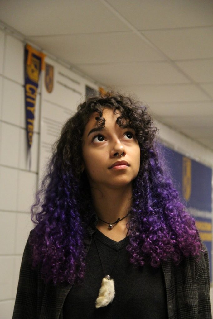
I love the lighting in this photo, the shadows are very light and not very overpowering. The way that Cat is centered makes her the subject of the photo, and takes the importance away from the background. I also notice the depth of field in this photo, the background looks very blurry and shallow which places more emphasis on the forefront.
Homework # 2 (Photoville)
Photoville was definitely an interesting experience. First of all, the location and set up is beautiful. I love the idea of going into each of these separate trailers and entering a new, immersive photo exhibit. Something that I was very fond of was the representation of people of color. Museums and exhibits have always lacked content from artists of color. But Photoville felt very new and refreshing, in this aspect.
Something that I also looked forward to was the “Altar” exhibit. As someone of Puerto Rican descent, its pretty dope to see something that is very prevalent in my culture celebrated through photos. The photos celebrated what I assumed was Yoruba religion, and even had an altar set up. I liked the idea of immersing people in this sacred space, something that lots of people have never experienced.
I also loved the photos of life in NYC. They definitely captured the essence of this city.
As of lately, I’ve been super into tintype photos. So I was very excited when I saw that they were offering tintype portraits at Photoville. But it was $85 for a 4 x 5 portrait, so I decided to pass. Maybe next time though!
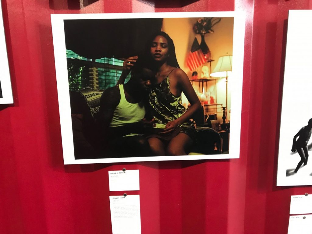
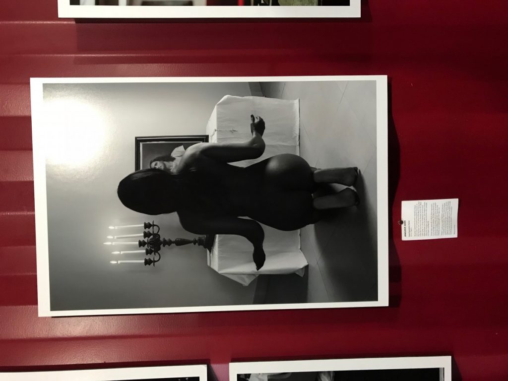
These are two of my favorite photos from Photoville:
I love the first one because of the mood it invokes. The contrast of the cool and warm tones, and the shadows in all the right places. It’s just a beautiful photo, of a couple in a powerful embrace.
The second photo was definitely my favorite. I love the use of lights and darks. It contrasts greatly, just like the subject matter. The photo has a sensual feel to it, which contrasts with the religious subject matter in the forefront.
Learning Log #1 (Isabella Gomez)
Homework # 1 Joey Lawrence (by Isabella Gomez)
Joey Lawrence has a very intriguing body of work. Lawrence takes portraits of people from different countries, and explores their culture and character through photos. His photos are taken in such a way that they empower the subject of the photo. Taken from specific angles, and with paying close detail to composition as well, he creates some incredibly strong visuals.
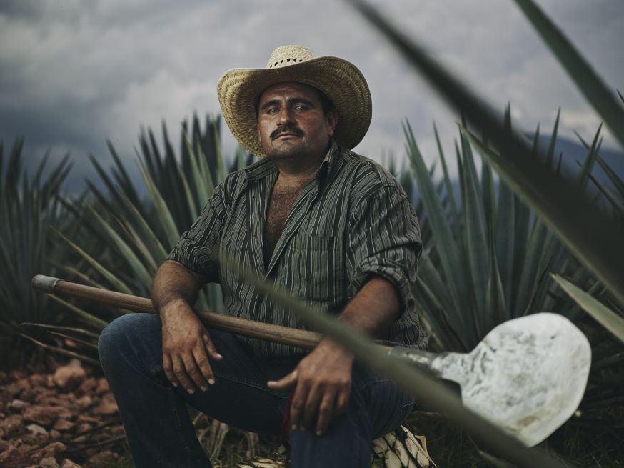
Something that Lawrence also takes into consideration is the role of the environment in the photo. He chooses to take photos in areas that have cultural relevancy to its subject. Some photos were taken in East Asia, where importance is placed on the ocean. I chose this photo of a Mexican man in an Agave field. It can be inferred that this man harvests Agave nectar, he is surrounded by the plant and wears the traditional uniform. He is placed in the frame in such a way that, he is important, strong, and empowered. The Agave leaves break some spaces in the photo in a way that is very effective. The color palette creates a dreamlike tone that looks like a still from a film. Overall, very beautiful and powerful work.

