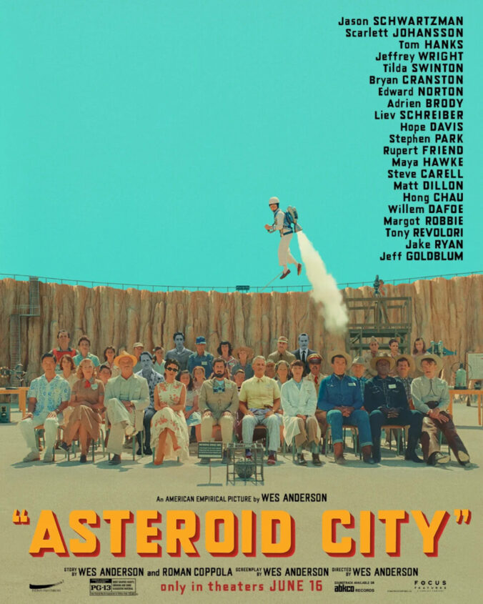
Wes Anderson is most well-known for his symmetrical shots and pastel color pallete. I want to talk about how Wes Anderson uses his style to invite his viewers to his world. He keeps his technique consist through his films and his promotional assets such as trailers and movie posters. For example, in the movie poster for Asteroid City, the poster is perfectly cut in half right in the middle of the 10 people lined at the front. The designer then places copy in the negative space at the top right half of the poster so it draws attention to viewers.
About This Course
COMD 3504 – OL01 (8505)
Summer 2024
Faculty Contact: Mary Beth Kilkelly
mkilkelly@citytech.cuny.edu
Search
Student Posts
- Jamil (16)
- Tais chicaiza (15)
- Orlando Melendez Ramos (15)
- Jennifer Uzhca (15)
- Brittany Greene-Lee (14)
- Gabriel Celik (10)
- Karissa Young (10)
Recent Comments
- MB Kilkelly on Packaging Design (Jamil)
- MB Kilkelly on Principles of UX/UI Design
- MB Kilkelly on Reflecting on Edward Hopper’s Influence (Jamil)
- MB Kilkelly on Enduring Legacy of the Black Power Movement (Jamil)
- MB Kilkelly on Miles Davis: “Birth of the Cool” (Jamil)
Acknowledgments
This course is based on the following course(s):
Leave a Reply