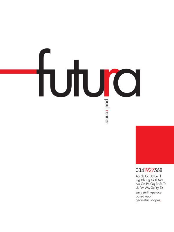
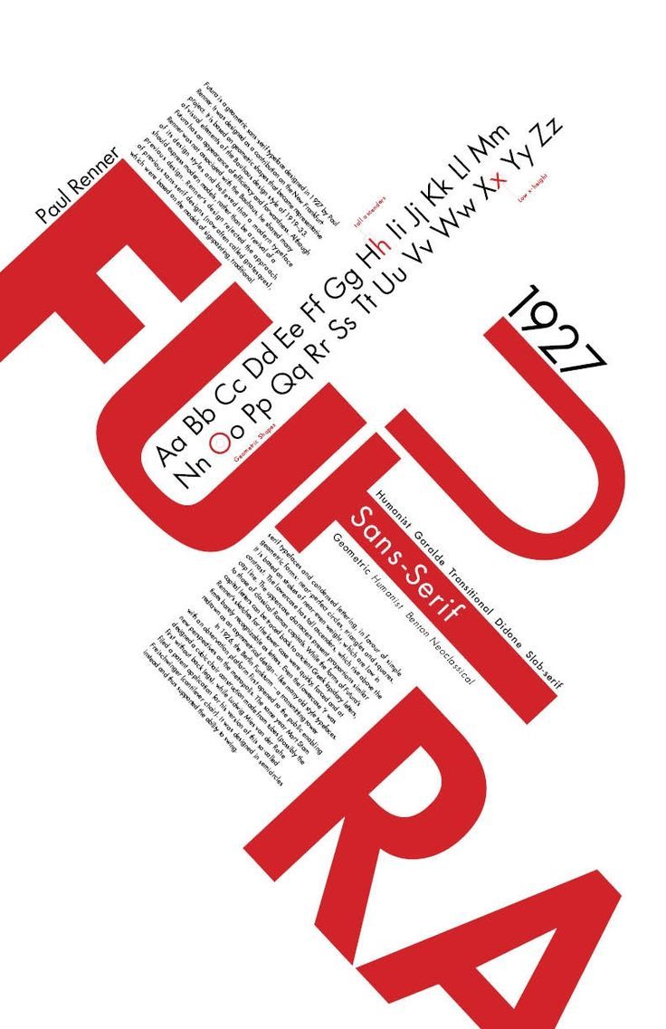
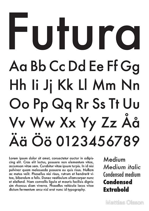
Futura and Its Timeless Form
Typography has to be one of the most important, foundational cornerstones of graphic design. It’s a tool that we use to communicate ideas and meaning. There are countless typefaces that we use to do this but one of these typefaces that has had a seemingly unsung impact is Futura. Created in 1927 by a type designer named Paul Renner, Futura has carried the torch for many of the Bauhaus principles and endures on after nearly a century.
I think a reason Futura is still so relevant and remains in use today is mainly to do with its geometric form and elegant simplicity. When you really look at it, it’s just basic shapes ––circles, triangles, rectangles––all put together in a way that makes it look sleek and very legible, simultaneously. Despite It being a very old typeface, it works! And that’s why we’re still using it.
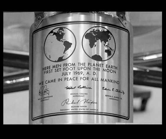
The images shown above I think really encapsulate what Futura was designed for as well as its impact. It communicates clean lines and a bold, balanced form. It communicates functionality and a classic appeal. It is also famously the typeface that made it to the moon during Apollo 11’s 1969 moon landing.


Oh yes, great, beautiful, balanced Futura. It truly is a wonder. At any weight!
Recommending to all fans of Futura to explore the made intentional use of white space. For fine artists, what can you bring from Futura’s geometry and generous use of white space — negative space? — maybe simply “space” — to fine art images?
Thanks for this post.