Today, I spent some time reflecting on UX/UI design and why I’m inspired by a lot of the work I see. I think it’s fascinating how User Experience design principles literally shape the way users interact with digital products. The aim is to make the experience more intuitive and enjoyable. After taking my first UX/UI Design course last semester, one of the key takeaways I got from it was the emphasis on user-centered design. Putting the user at the heart of the design process ensures that overall needs and limitations are always considered. I think this is important because so much of what is designed, anything from children’s toys all the way up to and including medical equipment, aren’t always inclusive of everyone. We should also keep accessibility standards in mind where inclusion is concerned. Also, User Experience and User Interface design go hand in hand. The entire second half of the semester was basically a crash course in Figma and how to put different design elements together to achieve visual hierarchy and aesthetic appeal, which also contributes to overall usability.
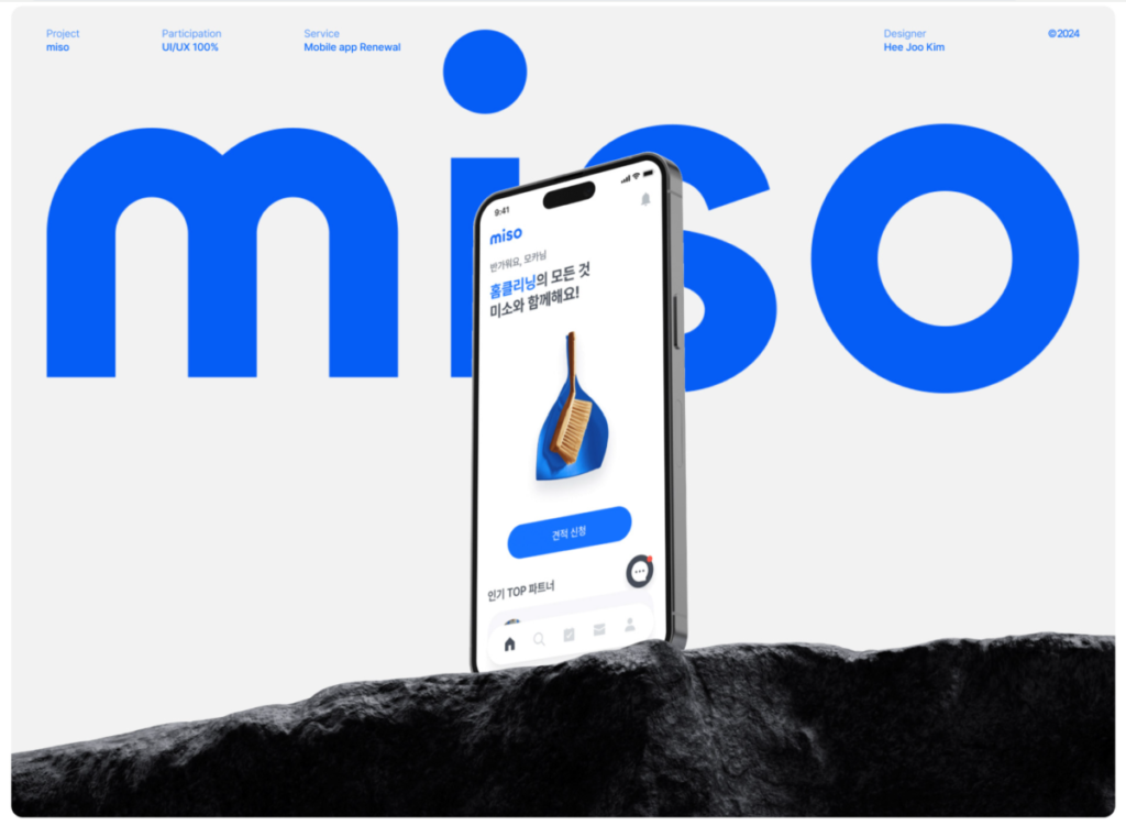
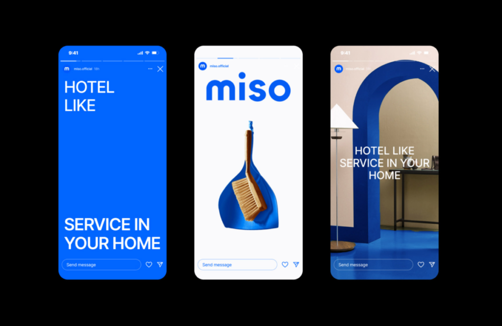
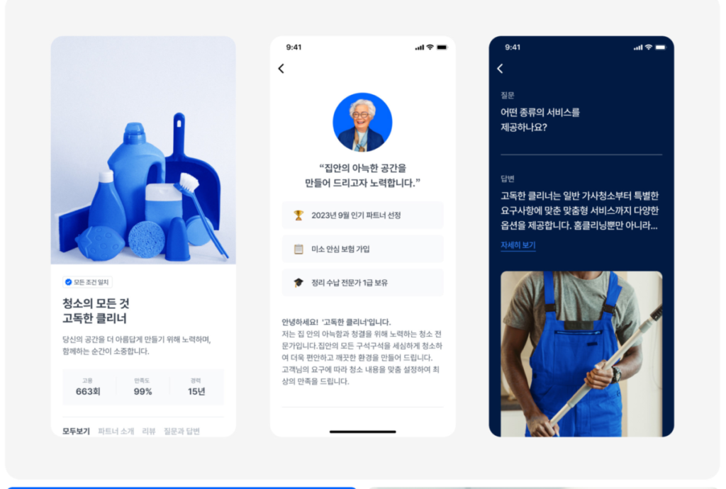
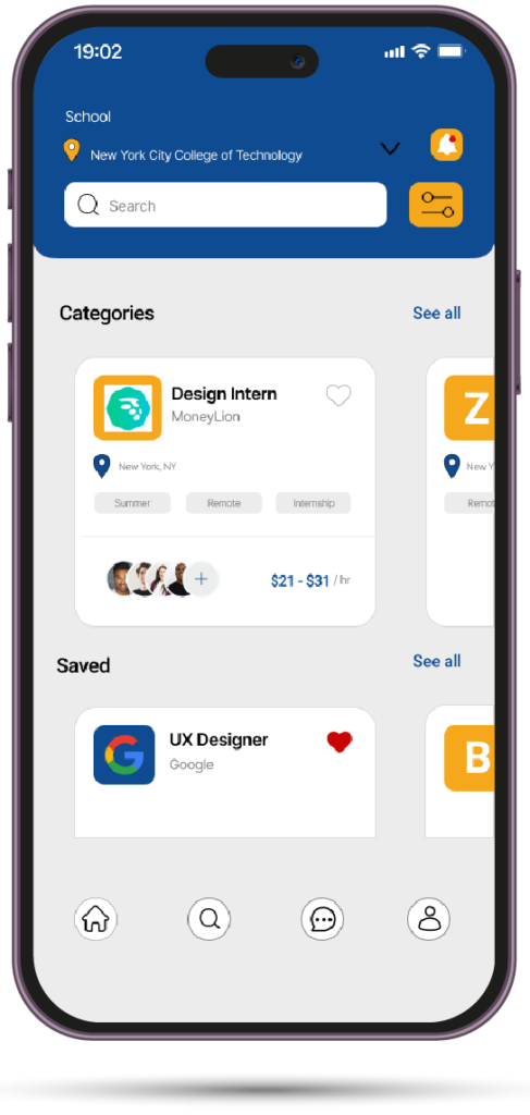
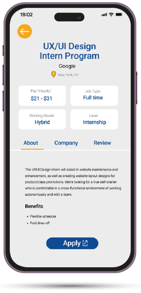
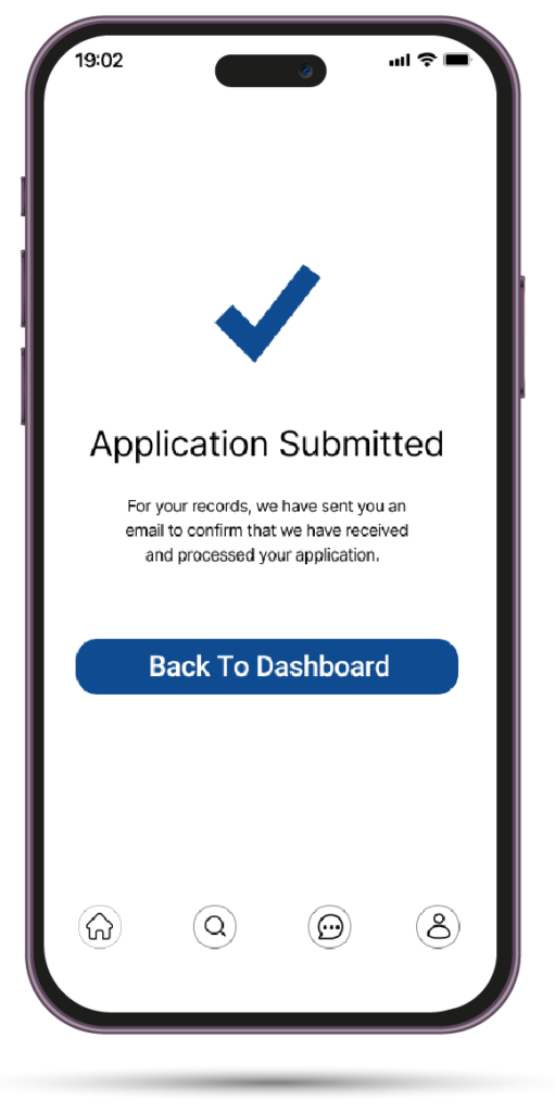
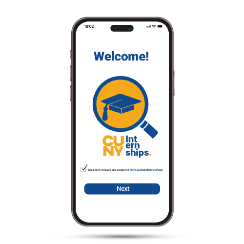
Pictured above is a UX design project that I saw on Behance that I think has very good visual appeal. I don’t understand Korean, but you don’t have to know the language to see that the overall design is clean and consistent throughout, demonstrating cohesiveness and ease of use. The one below was my final project for the UX Design course. I came up with a concept for a CUNY app where City Tech students could search for and apply for required internships. I think it came out pretty good. This may have been the inspiration I needed to go into UX as a career.
Overall, in bringing the focus back to design theory, I think the principles I’ve mentioned aren’t just theoretical—they have practical application that plays a role in shaping and transforming user experiences. As I go on to develop my skills through practice, my aim is to integrate these principles more intentionally in my design process, creating things that are both functional and user-friendly.


Thanks for this post. I agree that focusing on the reader’s, listeners’, audience’s, viewers’ and users’ experience is an extremely smart way to design. I wish I had learned about that approach when I was starting out!