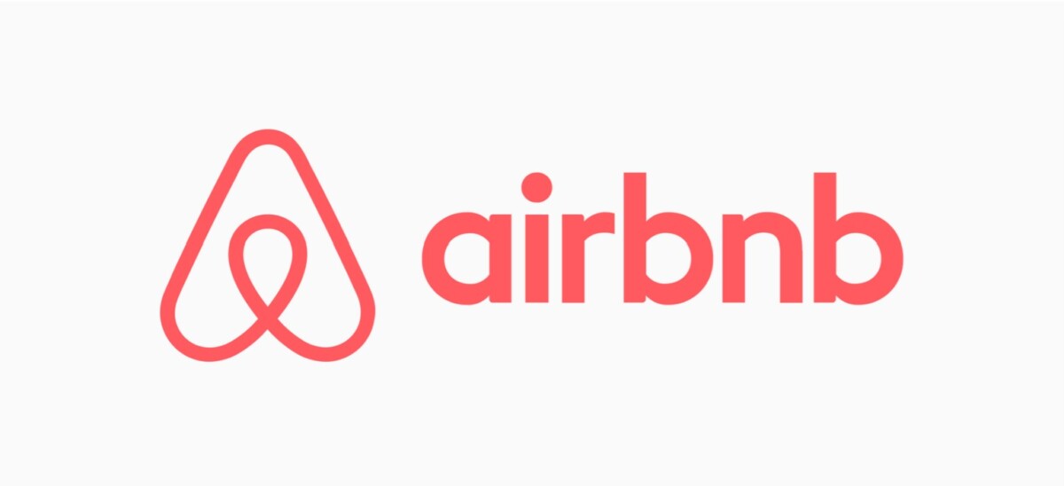
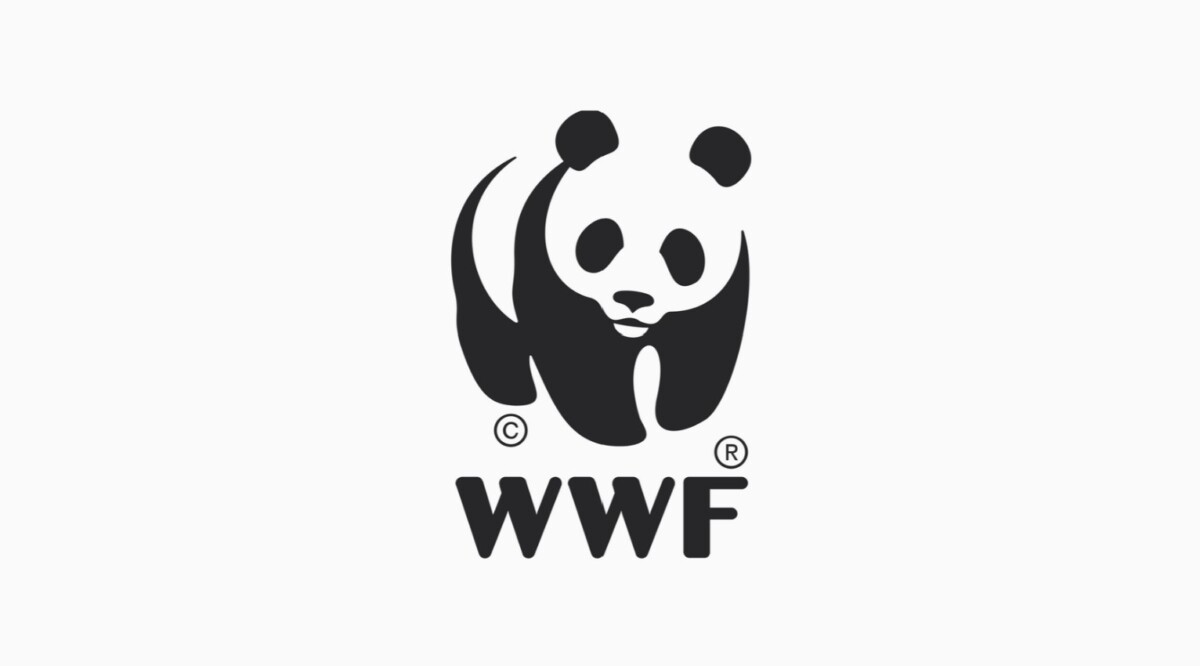
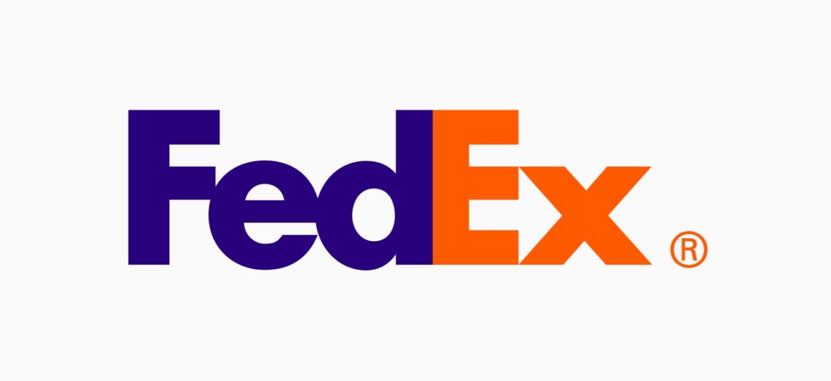
Piggybacking on my last post about minimalism, I think a lot of those concepts are relevant to logo design as well. Logos are a fundamental aspect of brand identity and therefore need to communicate the clearest. Effective logo design is contingent upon minimalism, clarity, and versatility. It’s what the consumer engages with first and foremost and should be immediately recognized as that entities’ brand without any confusion or ambiguity. Take for instance these iconic logos pictured above. These 4 logos I think are prime examples of what I mean by this. From left to right, The Airbnb logo is a simple yet straightforward design, communicating connection and welcoming vibes. The WWF (World Wildlife Fund) logo uses a minimal black and white figure ground image in the form of a panda bear. This works as it ensures that it’s recognizable anywhere. The simple yet iconic Apple logo is recognized for its clean and elegant design reflecting creativity and quality. And lasty, I love the FedEx logo because it cleverly makes use of negative space to form an arrow between the “E” and the “x”, symbolizing direction and speed.
It’s the subtle things in logos that communicate the idea of the brand in a way the doesn’t need to be over explained or overly redundant. I think logos should be simple, but not simplistic. They need to be distinctive, but not overly complicated. A logo should be versatile, but not too inconsistent–– If that makes sense. I’ve always been inspired by logo design because it has pushed me to think deeper about design and be more intentional about what elements I choose to deploy and ask why.


Leave a Reply