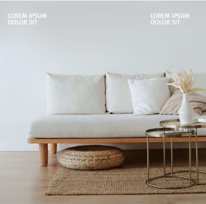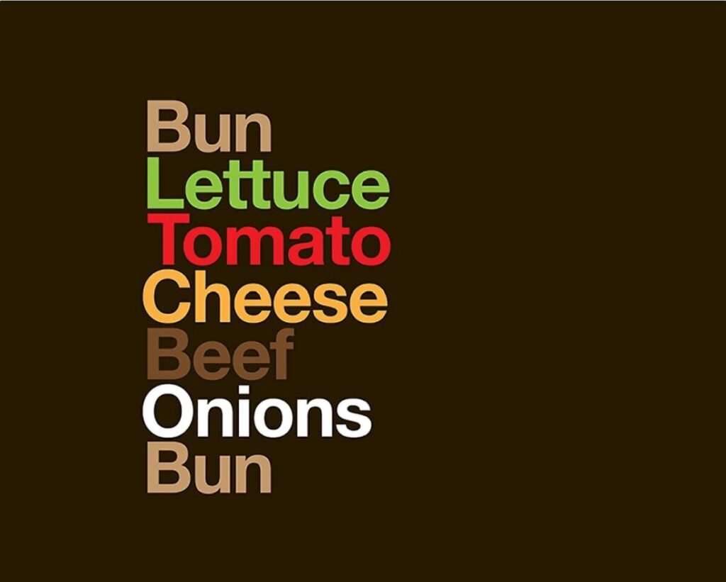


I really think there’s something to be said about the distinction between “simplistic” design and “minimalist” design; and that is that they’re not to be used interchangeably. Simplistic usually implies that something is overly simple. It means something has been reduced to the point that it ignores important nuance and takes away from complex concepts that would otherwise be expressed. Minimalism is the opposite of this in my opinion. Minimalism is an intentional design decision that focuses on keeping things clean and uncluttered. It puts a spotlight on the most essential parts while omitting unnecessary elements. This is what’s referred to as the “less is more approach” and it works.
When I’m having a conversation with someone, and they’re monopolizing it and inundating me with a barrage of information—especially useless information—it causes sensory overload and exhaustion. This is much the same with visual communication. I’m inspired by minimalist design aesthetic for many reasons. But I think one reason may have something to do with a belief that my voice doesn’t need to be so loud or overly verbose in order to effectively say what needs to be said. ––And I think that’s really what minimalism is all about at its root.


Thanks, great ideas to consider.
Scale, speed, clarity, focus — these words come to mind after reading your post. I also think about conservation — of energy, of resources, of focus. (There’s that word again.)
I’ve heard songwriters compare their reduced, concise lyrics to the concise poetry — but all forms can have minimal and maximal styles. (There can be word-jammed songs and epic wordy poems — that we all love.)
I truly appreciate your point about simple versus minimal, or lacking versus full.