Tag Archives: ADV1100

Muted Colors

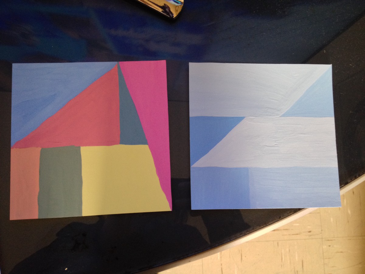
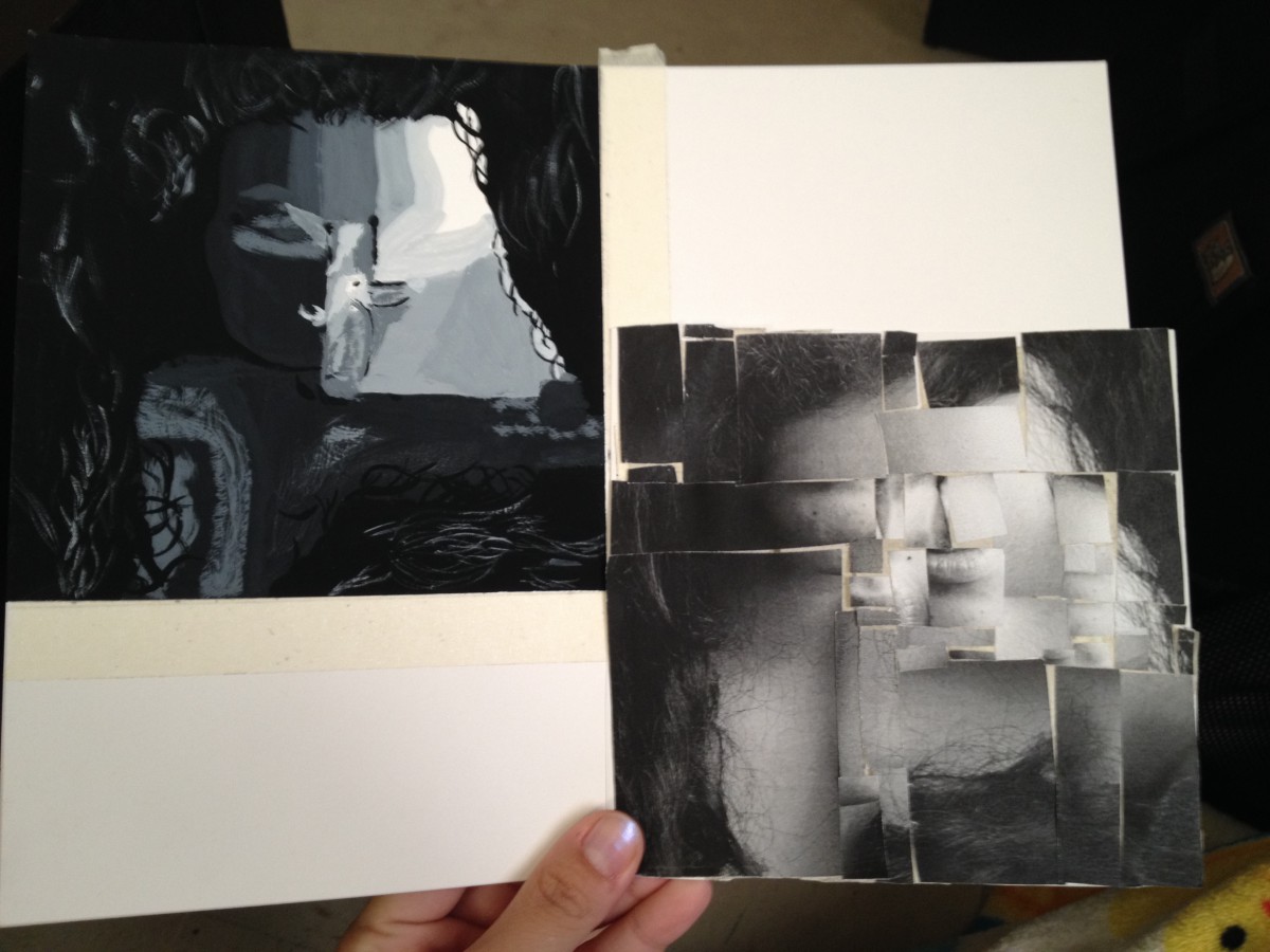
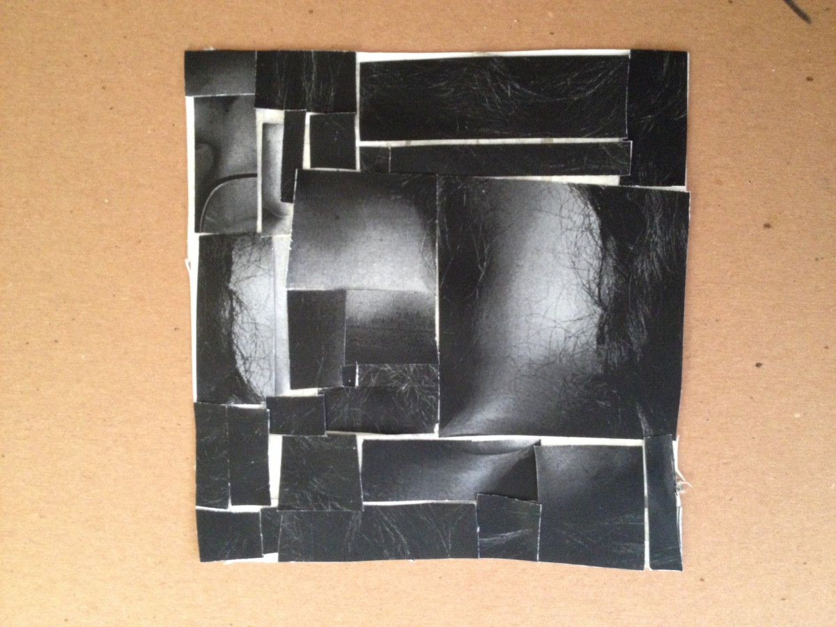
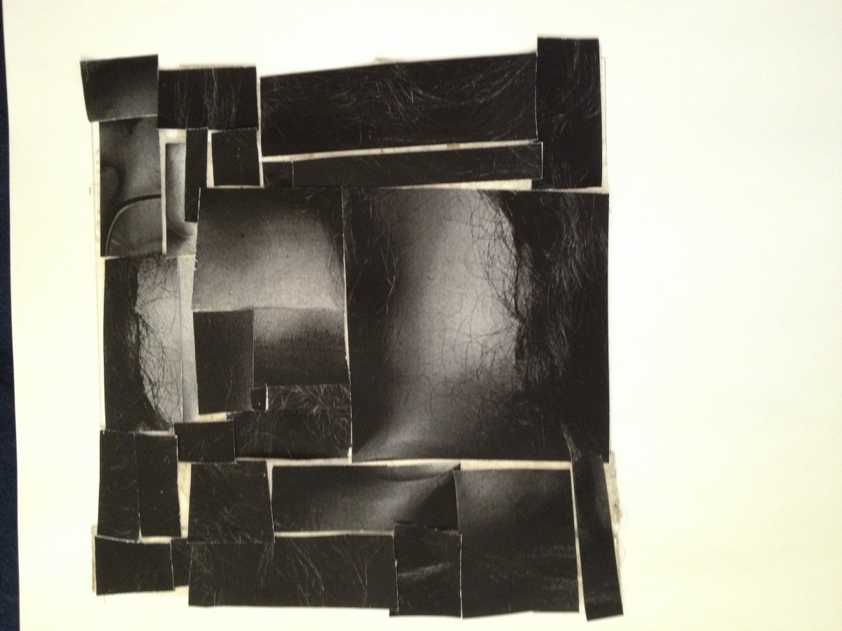
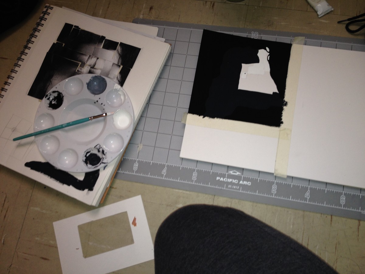
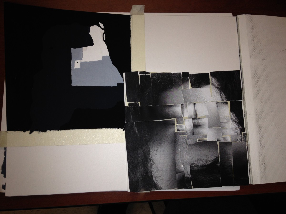
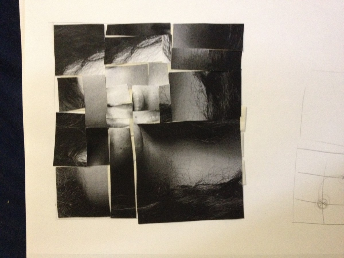
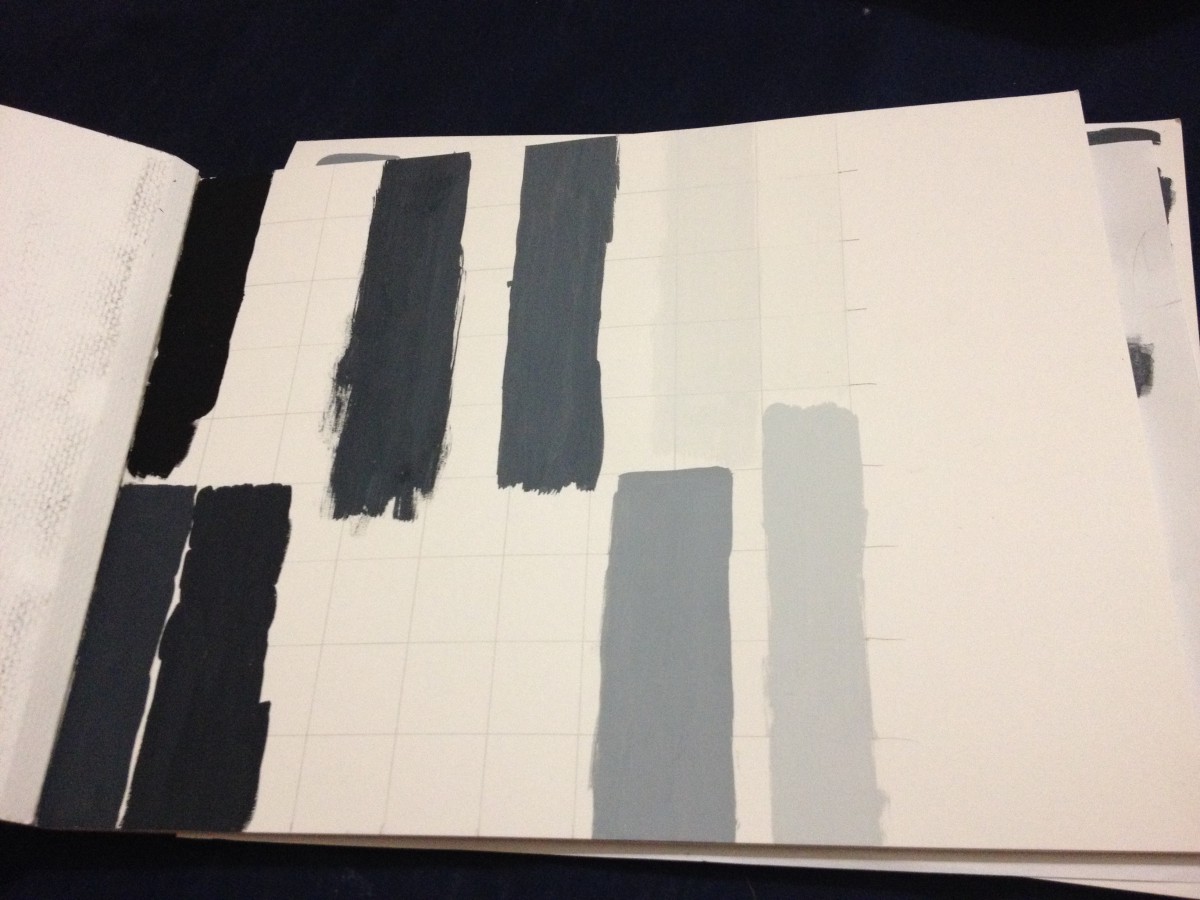
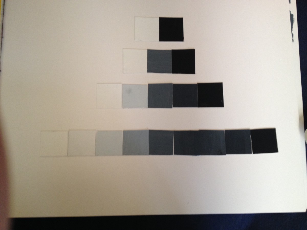
This assignment I had to make muted colors. Doing this assignment actually help me understand colors more. The assignment before this had me very confused, but now I can see which colors are chormatic and which are muted. The painting on the left is board and the one of the left is narrow high key.

photo(2)

Chromatic Gray Studies

This Assisignment was harder then doing the grayscale. I would mix colors and they would come out a completely different color then I expected. I tired my best, and hopefully it came out right. Here are a few photos on it. The first photo is my Narrow low key, and the next it my board. photo 2-1 photo 1-2

Color Triad FreeStudy

photo(1)

Mixing the different colors was actually fun. I think we do not realize how beautiful colors really are. Imagine if the world was just black and white and then one day you saw the color red. You would be amazed. Thats how I felt. I’m comfortable with the painting, but I got abit too comfortable in some sections.

Field Trip To The Artist Space

The artist space was about a man names Richard Hollis. He is a graphic design and have inspired many. He began in the 1950’s and still to this day is working. His work shows how design can effect the way a person looks at a photo or a poster. I took a few photos of front pages, books and posters that caught my eye. The way he designs is as if he did it on the program “Word”. To think that back then they had to go through many steps to make things perfect. photo 1 photo 2 photo 3 photo 4

To think that this was all written with a type writer.

Assignment #3: Experimentation / Iteration

This is my finished product. At first painting was difficult. For me what was difficult was the mixing and getting the right value. This paint get lighter when it dries, so this made it difficult as well. I pulled it together figured out a way to get these values. For the photoshop part of this project, I understood. Although I had to refresh my memory about photoshop, I atleast knew hot to crop, copy, paste and move.

Here are some photos:

photo 1(7) photo 3(3) photo 2(8)


KDeLaCruz_Value_added

*will post up more pictures*

Value Scale

photo 1(5)

Mixing the paints was very difficult. I had to start over about 2 times before I got the feel of what do do. I thought it was easier instead of painting one square, to paint a whole row, switch contained about 4 squares. I was able to pick out which parts I liked. This is the outcome:

photo 2(6)

This helped me understand the scale value more. Hopefully, I am ready to move on.