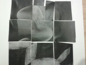
Here are my collages for Project #3
For the first One, i was making my focus the bell shaped figure, surrounded by a dark frame (disregard the gloss around it, the lighting was not the best in the pictures). As for the second one, i went for variety, although it feels a bit lopsided, but i wanna see what others think i should do before i make major changes to it. does it need more or lesss? I would appriciate some feedback.


