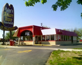
An Arby’s restaurant with a vintage sign in Midland, Michigan (2006) (Source: Wikipedia)
Arby’s is an American fast-food sandwich restaurant chain with more than 3,300 restaurants, which founded by Forrest and Leroy Raffel on July 23, 1964, in Boardman, Ohio. Initially, the founders, Raffel brother decided to use Arby’s as their restaurant’s name because their first choice Big Tex was already in use by an Akron business. Even though Arby’s does not attract as much attention as McDonald’s and Burger King, Arby is famous for its French fries and delicious sandwiches. Arby’s is part of the Inspire Brands company, which also owns Buffalo Wild Wings, Sonic Drive-In, Jimmy John’s and others. Since Inspire Brands acquired Buffalo Wild Wings on February 5, 2018, it has changed its name from Arby’s Restaurant Group, Inc. to Inspire Brands. Therefore, Inspire Brands became the fourth largest restaurant chain group.

The first logo of Arby’s
(Source: 1000 logos)
The first Arby’s logo was a cowboy hat which was designed by the sign makers, Peskin Sign Co. The cowboy hat is the main element of this logo and reflected the wild west cowboy nature. Also, the logo is closely related to the “Roast Beef Sandwiches,” as the text in the cowboy hat, “Arby’s Roast Beef Sandwich Is Delicious.” The dark red-brown hat logo fully captures the leather style of western cowboy and promotes the western roast beef sandwich. The traditional cowboy hat brings the retro atmosphere of this brand.

The second logo of Arby’s
(Source: 1000 logos) 1969-2012
In the 1969s, Arby’s expanded at a rate of 50 stores per year in the Unite State. In conjunction with the company’s growth, Arby’s change its logo. In this version of the logo, the typeface uses serif font, which shows the unique sense of heritage of the brand. Compared to san serif font, the san serif font is casual and fun, which is generally suitable for modern brands. The new logo retains the outline of the classic cowboy hat and shortened the text Arby in red color. The reason for them to use the red color for their logo is that red symbolizes energy, strength, and enthusiasm, which represent the west cowboy style. Also, red can be used to enhance a person’s respiration rate, blood pressure. That is why many fast food companies such as KFC and Wendy’s to use red colors on their logo. Some believe that red can prompt hunger, but studies have not shown that as yet. Overall, Arby’s second logo is more streamlined than its original logo. The modified Arby ‘s logo version of Arby’s has been well received by the public and could be described as quite successful. Therefore, Arby’s did not alter its logo from 1969 to 2012.

The third logo of Arby’s (Source: 1000 logos)2012-2013
In 2012, the Arby’s logo changed to its third version. The logo redesigned the cowboy hat into a 3D model and changed all the letters to lowercase. Two-dimensional san serif typeface contrast with the three-dimensional hats shining with a metallic luster. The release of this logo was done in tandem with Arby’s new campaign slogan “Improve Freshness” and so to indicate they cut meats fresh, the apostrophe became a blade cutting into the s. These changes complicated the logo and were not well received by customers or design critics. This series of changes has lost the charm of the original western cowboy but had a lot more commercial atmosphere.

The fourth logo of Arby’s
(Source: 1000 logos) 2013-present
In response to public criticisms of 2010 logo, Arby’s restored the logo to a 2D model and adjusted the font size to make the red outline of the cowboy hat and font more harmonious. Although there is no change in color, the flavor of the 1969 version of the logo has been restored

In the emergence of multiculturalism has intensified competition in the fast-food industry. As a result, Arby’s sales and profits were declining around 2012. Since Paul Brown, former president of Hilton Worldwide, was named CEO in 2013, he has reversed Arby’s woes. In addition to improving menus and setting new slogans, he also pushed Arby’s hat logo to the forefront of popular culture in 2014 at the Grammy Award show. As shown on the right, the popular singer Pharrell Williams sports an Arby’s style hat. After that, Arby’s tweeted about Pharrell Williams hats “Arby’s : Hey @Pharrell, can we have our hat back? #GRAMMYs” which were reposted 80,000 times and attracted 6,000 new followers for Arby’s band. This type of marketing has helped make Arby’s more popular with broader audience.
Work citation
“Arby’s.” Wikipedia, Wikimedia Foundation, 16 Jan. 2020, en.wikipedia.org/wiki/Arby’s#cite_note-17.
“Arby’s Logo: History and Design Investigated.” Fast Food Menu Prices, 4 Dec. 2019, www.fastfoodmenuprices.com/arbys-logo-history-design-investigated/.
“Arbys Logo.” 1000 Logos The Famous Brands and Company Logos in the World, 1000logos.net/arbys-logo/.
Booth, Barbara. “How Humor Saved Arby’s and Propelled It to the Forefront of Pop Culture.” CNBC. CNBC, 16 Apr. 2019. Web. 21 Feb. 2020.
Harrington, Rebecca. “Here’s Why All Fast-Food Signs Are Red.” Business Insider, Business Insider, 30 Sept. 2015, www.businessinsider.com/why-are-fast-food-signs-red-2015-9.
“How Humor Saved Arby’s and Propelled It to the Forefront of Pop Culture.” Yahoo! Finance, Yahoo!, 16 Apr. 2019, finance.yahoo.com/news/humor-saved-arby-apos-propelled-155626458.html.
Johnson, Joshua. “The New Arby’s Logo: Better or Boring?” Design Shack, Design Shack, 15 Oct. 2012, designshack.net/articles/inspiration/the-new-arbys-logo-better-or-boring/.
Lucas, Amelia. “Arby’s Owner Inspire Brands Buys Jimmy John’s.” CNBC, CNBC, 25 Sept. 2019, www.cnbc.com/2019/09/25/arbys-owner-inspire-brands-buys-jimmy-johns.html.
O’Donnell, Tanya. “Arby’s Logo Design History and Evolution.” Arby’s Logo Design History and Evolution | LogoRealm.com, 23 Feb. 2017, logorealm.com/arbys-logo/.
“The Psychology of Fonts in Logo Design.” ProDesigns, www.prodesigns.com/blog/the-psychology-of-fonts-in-logo-design.
“What We Can Learn From Arby’s Logo History.” Web Ascender, 16 Feb. 2017, www.webascender.com/blog/can-learn-arbys-logo-history/.
PDF version:https://drive.google.com/file/d/1T6l5BSFiBcUVCywJh2zk97gCQ0YX05VX/view?usp=sharing


