Designer Research Ieoh Ming Pei

Ieoh Ming Pei American-Chinese, world-famous architectural designer. He was born on April 26, 1917, in Guangzhou, China. Ieoh Ming Pei spent almost all of his childhood in Guangzhou and Hong Kong, as well as the Lion Forest Garden (Suzhou Classical Garden). After his mother died, Pei’s family moved to Shanghai, and then Ieoh Ming Pei decided to move to the United States. He studied architecture at the University of Pennsylvania, but in order to the pursuit of better structural engineering knowledge, he transfers to the Massachusetts Institute of Technology in Boston, Massachusetts. During the period of study at MIT, Dean Willian Emerson persuaded Pei to study architecture again. In 1940, Pei graduated from the Department of Architecture at MIT and won the American Institute of Architects Gold Medal. After the outbreak of World War II, he worked at the NDRC until 1945. In 1942, Pei married Eileen loo who studies at Harvard’s Graduate School of Landscape Architecture. After the wedding, the Pei couple to Cambridge Massachusetts. After the introduction of his wife, Pei enrolled in the Harvard Graduate School of Design in the summer of 1942. Between 1943 and 1945, Pei and Walter Gropius and two other students E. H. Duhart and Frederick Roth designed several low-cost modern houses and gained popularity for the first time in Arts and Architecture magazine. In 1948, Pei ’s career as a Harvard professor ended, and he moved from the Cambridge town of Boston to New York. At the same time, he was hired to direct the architectural division of Webb and Knapp. In 1960, Pei left Webb and Knapp and founded his own company. In the following days, Pei left many famous buildings, such as the Louvre Pyramid, Suzhou Museum, Museum of Islamic Art, Doha, Rock & Roll Hall of Fame, Bank of China Tower.

Figure 1https://www.architecturaldigest.com/story/im-peis-louvre-pyramid-named-timeless-architecture-aia

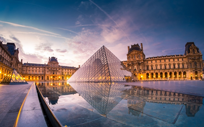
In the early 1980s, French President Mitterrand decided to rebuild the world-famous art treasure, Louvre. Later, Pei received the most important commission in his career that rebuilds the Louvre, which also became one of the company’s secrets. Pei secretly went to Paris to study the Louvre, for which he also specifically studied the historical landscape of French designer André Lenot. After being inspired by French designer André Lento, Pei believes that this historical design was built for living people. Therefore, Pei had the idea of a glass pyramid. He designed the pyramid using ordinary geometric figures and glass on the material to reflect the beauty of the sky. Also, it provides good lighting for underground facilities. However, this design caused an uproar in France, which is believed to the glass pyramid to destroy this 800-year-old ancient architectural style. In the Pei documentary, he said that 90% of people opposed his design, and he was ignored and opposed by people. Therefore, he built a full-scale model in front of the Louvre and invited 60,000 Parisians to visit and vote. As a result, most people changed their original ideas and agreed with this glass pyramid design. Therefore, he built a full-scale model in front of the Louvre and invited 60,000 Parisians to visit and vote. As a result, most people changed their original ideas and agreed with this glass pyramid design.

Figure 2https://theidlewoman.net/2016/10/10/museums-in-suzhou/

Although Pei was born in Guangzhou, his ancestral home in Suzhou, Jiangsu. During his childhood, he also spent some time in the Lion Forest (Suzhou Classical Garden). Suzhou, as Pei’s hometown, 85-year-old Pei readily accepted the commission. The design of the museum combines modern and traditional Suzhou architecture to put the museum between the courtyards which harmonizes the building with the surrounding environment. In the design of the Suzhou Museum, Pei Yuming cleverly used geometric structure, grey lines, and white exterior walls to show the combination of Chinese antique and modern style. The layout of the Suzhou Museum is characterized by a rectangular layout that surrounds the central water channel, which is composed of a central pavilion and organized by a central axis of symmetry. This layout is largely similar to Chinese garden architecture.

As a modernist architectural designer, Pei has more works than theory which shows the art of architecture through practice. He is also good at combining the ancient traditional architectural art and the latest modern technology in one furnace, thus creating his own unique style. Pei Yuming himself said: It turns out that the persistent pursuit of architectural art is an important aspect of his career success.

Work cited

Architectmagazine.com, www.architectmagazine.com/awards/aia-honor-awards/louvre-pyramid-the-folly-that-became-a-triumph_o.

Bear, Rob. “Mapping I.M. Pei’s Major Works.” Curbed, Curbed, 17 May 2019, www.curbed.com/maps/im-pei-buildings-louvre-completed-works.

Heidi. “I. M. Pei’s East Building: Solving Problems of Form and Function. Teacher’s Guide. School Arts: Looking/Learning.” ERIC, National Gallery of Art, 4th and Constitution Avenue, NW, Washington, DC 20565. For Full Text: Http://Www.nga.gov/Education/Teachres.htm., 31 Mar. 1999, eric.ed.gov/?id=ED450024.

Howarth, Dan. “10 Of IM Pei’s Most Significant Buildings.” Dezeen, 21 May 2019, www.dezeen.com/2017/04/26/architect-im-pei-100-birthday-10-most-significant-buildings/.

“I. M. Pei Biography.” Encyclopedia of World Biography, www.notablebiographies.com/Ni-Pe/Pei-I-M.html.

“Suzhou Museum: I. M. Pei’s Contemporary Re-Imagining of a Remembered Past.” Nonagon Style, 5 Sept. 2019, nonagon.style/suzhou-museum-im-pei-contemporary/.

“贝聿铭.” 到百科首页, baike.baidu.com/item/贝聿铭/84461?fr=aladdin.

Logo History: The evolution of Arby’s logo

An Arby’s restaurant with a
vintage sign in Midland, Michigan (2006) (Source: Wikipedia)

Arby’s is an American fast-food sandwich restaurant chain with more than 3,300 restaurants, which founded by Forrest and Leroy Raffel on July 23, 1964, in Boardman, Ohio. Initially, the founders, Raffel brother decided to use Arby’s as their restaurant’s name because their first choice Big Tex was already in use by an Akron business. Even though Arby’s does not attract as much attention as McDonald’s and Burger King, Arby is famous for its French fries and delicious sandwiches. Arby’s is part of the Inspire Brands company, which also owns Buffalo Wild Wings, Sonic Drive-In, Jimmy John’s, and others. Since Inspire Brands acquired Buffalo Wild Wings on February 5, 2018, it has changed its name from Arby’s Restaurant Group, Inc. to Inspire Brands. Therefore, Inspire Brands became the fourth largest restaurant chain group.

The first logo of Arby’s (Source: 1000 logos)

The first Arby’s logo was a cowboy hat which was designed by the sign makers, Peskin Sign Co. The cowboy hat is the main element of this logo and reflected the wild west cowboy nature. Also, the logo is closely related to the “Roast Beef Sandwiches,” as the text in the cowboy hat, “Arby’s Roast Beef Sandwich Is Delicious.” The dark red-brown hat logo fully captures the leather style of the western cowboy and promotes the western roast beef sandwich. The traditional cowboy hat brings the retro atmosphere of this brand.

The second logo of Arby’s (Source: 1000 logos) 1969-2012

In 1969s, Arby’s expanded at a rate of 50 stores per year in the United States. In conjunction with the company’s growth, Arby’s change its logo. In this version of the logo, the typeface uses a serif font, which shows the unique sense of the heritage of the brand. Compared to a san serif font, the san serif font is casual and fun, which is generally suitable for modern brands. The new logo retains the outline of the classic cowboy hat and shortened the text Arby in red color. The reason for them to use the red color for their logo is that red symbolizes energy, strength, and enthusiasm, which represent the west cowboy style. Also, red can be used to enhance a person’s respiration rate, blood pressure. That is why many fast food companies such as KFC and Wendy’s to use red colors on their logo. Some believe that red can prompt hunger, but studies have not shown that as yet. Overall, Arby’s second logo is more streamlined than its original logo. The modified Arby ‘s logo version of Arby’s has been well received by the public and could be described as quite successful. Therefore, Arby’s did not alter its logo from 1969 to 2012.

The third logo of Arby’s (Source: 1000 logos)2012-2013

In 2012, the Arby’s logo changed to its third version. The logo redesigned the cowboy hat into a 3D model and changed all the letters to lowercase. Two-dimensional san serif typeface contrast with the three-dimensional hats shining with a metallic luster. The release of this logo was done in tandem with Arby’s new campaign slogan “Improve Freshness” and so to indicate they cut meats fresh, the apostrophe became a blade cutting into the s. These changes complicated the logo and were not well received by customers or design critics. This series of changes has lost the charm of the original western cowboy but had a lot more commercial atmosphere.


The fourth logo of Arby’s (Source: 1000 logos) 2013-present

In response to public criticisms of the 2010 logo, Arby’s restored the logo to a 2D model and adjusted the font size to make the red outline of the cowboy hat and font more harmonious. Although there is no change in color, the flavor of the 1969 version of the logo has been restored.

Source: CNBC

In the emergence of multiculturalism has intensified competition in the fast-food industry. As a result, Arby’s sales and profits were declining around 2012. Since Paul Brown, former president of Hilton Worldwide, was named CEO in 2013, he has reversed Arby’s woes. In addition to improving menus and setting new slogans, he also pushed Arby’s hat logo to the forefront of popular culture in 2014 at the Grammy Award show. As shown on the right, the popular singer Pharrell Williams sports an Arby’s style hat. After that, Arby’s tweeted about Pharrell Williams hats “Arby’s: Hey @Pharrell, can we have our hat back? #GRAMMYs” which were reposted 80,000 times and attracted 6,000 new followers for Arby’s band. This type of marketing has helped make Arby’s more popular with a broader audience.

Work citation

“Arby’s.” Wikipedia, Wikimedia Foundation, 16 Jan. 2020, en.wikipedia.org/wiki/Arby’s#cite_note-17.

“Arby’s Logo: History and Design Investigated.” Fast Food Menu Prices, 4 Dec. 2019, www.fastfoodmenuprices.com/arbys-logo-history-design-investigated/.

“Arbys Logo.” 1000 Logos The Famous Brands and Company Logos in the World, 1000logos.net/arbys-logo/.

Booth, Barbara. “How Humor Saved Arby’s and Propelled It to the Forefront of Pop Culture.” CNBC. CNBC, 16 Apr. 2019. Web. 21 Feb. 2020.

Harrington, Rebecca. “Here’s Why All Fast-Food Signs Are Red.” Business Insider, Business Insider, 30 Sept. 2015, www.businessinsider.com/why-are-fast-food-signs-red-2015-9.

“How Humor Saved Arby’s and Propelled It to the Forefront of Pop Culture.” Yahoo! Finance, Yahoo!, 16 Apr. 2019, finance.yahoo.com/news/humor-saved-arby-apos-propelled-155626458.html.

Johnson, Joshua. “The New Arby’s Logo: Better or Boring?” Design Shack, Design Shack, 15 Oct. 2012, designshack.net/articles/inspiration/the-new-arbys-logo-better-or-boring/.

Lucas, Amelia. “Arby’s Owner Inspire Brands Buys Jimmy John’s.” CNBC, CNBC, 25 Sept. 2019, www.cnbc.com/2019/09/25/arbys-owner-inspire-brands-buys-jimmy-johns.html.

O’Donnell, Tanya. “Arby’s Logo Design History and Evolution.” Arby’s Logo Design History and Evolution | LogoRealm.com, 23 Feb. 2017, logorealm.com/arbys-logo/.

“The Psychology of Fonts in Logo Design.” ProDesigns, www.prodesigns.com/blog/the-psychology-of-fonts-in-logo-design.

“What We Can Learn From Arby’s Logo History.” Web Ascender, 16 Feb. 2017, www.webascender.com/blog/can-learn-arbys-logo-history/.

PDF: https://drive.google.com/file/d/1T6l5BSFiBcUVCywJh2zk97gCQ0YX05VX/view?usp=sharing

Video Project

https://drive.google.com/file/d/1iq–ux5yU_UQufnLkWUGEm4ci0oMJZAb/view?usp=sharing

After I learned some knowledge about audio and video in the class, I am curious about how to make and edit videos. This video project is the first project to expose me to video.

The video project is mainly to introduce my past projects. The software I used to make this project is adobe premiere. This is my first time to use Premiere, I don’t know enough about the many functions of it. For example, I learned that I can directly import the file format which like indd, .psd, .ai, etc. In fact, I want to learn Adobe Effects more. But compared to Adobe Effects, Premiere is more suitable for editing video, and Adobe Effects is suitable for visual effects in the video.

Also, I have learned the importance of video format, how to export a video. For example, after I finished editing the video with Premiere, I wanted to use the VUE which is a video editing application on the cell phone. And then, I found that it’s easy to process export videos from the computer into the phone, but it is difficult to export a high-resolution video for the computer. Therefore, I learned a way from Google to solve this issue. I create a new project and set the editing mode with high resolution, then I imported my video project. When I exported the video, the frame of the video could be not full of the screen, but the video is high resolution. Therefore, I knew the importance of video format.

JJ Abrams interviews

In both interview videos, I learned about the behind-the-scenes production of Star War. In the first interview video, I think the host is more concerned about the production of the film, and compared with the second video, JJ Abrams does not seem very natural.

In the second video, I think the host is more concerned about the soul of the movie itself which makes JJ Abrams more responsive and emotional.

Field Trip

In the many Art works of the blue exhibition in the Nassau County Museum of Art, the Cao Jun’s painting attracted my eye. The picture uses a combination of different kinds of blue which gives the picture a sense of motion and the first impression of majesty. It can be seen as a turbulent sea wave. The dark blue on the left reflected an atmosphere of tranquility deep in the bottom of the sea, the transition blue in the middle shows the middle of the ocean, and the cobalt blue on the surface of the ocean on the right of the picture. Also, the three different kinds of blue brought me a feeling that the sky reflected in the ocean.

This vase from the Cooper Hewitt. The overall shape of this vase is like a trumpet flower. The body of vase-like a root which brought a sense of realism. The edge on the top of the vase is smooth. The color of the vase and its iridescent effect are intertwined together which gave me the feeling of noble, elegant.

This vase from the Cooper Hewitt. This glass vase attracted my attention with its slender body and unique shape. The green, transparent, slender bottleneck shows the true feeling of the plant. On top of the vase, there is a kind of bud to be bloom with a slightly flared mouth. This unique design makes me feel the real plant growth.

The evolution of Arby’s logo


An Arby’s restaurant with a vintage sign in Midland, Michigan (2006) (Source: Wikipedia)

Arby’s is an American fast-food sandwich restaurant chain with more than 3,300 restaurants, which founded by Forrest and Leroy Raffel on July 23, 1964, in Boardman, Ohio. Initially, the founders, Raffel brother decided to use Arby’s as their restaurant’s name because their first choice Big Tex was already in use by an Akron business. Even though Arby’s does not attract as much attention as McDonald’s and Burger King, Arby is famous for its French fries and delicious sandwiches. Arby’s is part of the Inspire Brands company, which also owns Buffalo Wild Wings, Sonic Drive-In, Jimmy John’s and others. Since Inspire Brands acquired Buffalo Wild Wings on February 5, 2018, it has changed its name from Arby’s Restaurant Group, Inc. to Inspire Brands. Therefore, Inspire Brands became the fourth largest restaurant chain group.


The first logo of Arby’s
(Source: 1000 logos)

The first Arby’s logo was a cowboy hat which was designed by the sign makers, Peskin Sign Co. The cowboy hat is the main element of this logo and reflected the wild west cowboy nature. Also, the logo is closely related to the “Roast Beef Sandwiches,” as the text in the cowboy hat, “Arby’s Roast Beef Sandwich Is Delicious.” The dark red-brown hat logo fully captures the leather style of western cowboy and promotes the western roast beef sandwich. The traditional cowboy hat brings the retro atmosphere of this brand.


The second logo of Arby’s
(Source: 1000 logos) 1969-2012

In the 1969s, Arby’s expanded at a rate of 50 stores per year in the Unite State. In conjunction with the company’s growth, Arby’s change its logo. In this version of the logo, the typeface uses serif font, which shows the unique sense of heritage of the brand. Compared to san serif font, the san serif font is casual and fun, which is generally suitable for modern brands. The new logo retains the outline of the classic cowboy hat and shortened the text Arby in red color. The reason for them to use the red color for their logo is that red symbolizes energy, strength, and enthusiasm, which represent the west cowboy style. Also, red can be used to enhance a person’s respiration rate, blood pressure. That is why many fast food companies such as KFC and Wendy’s to use red colors on their logo. Some believe that red can prompt hunger, but studies have not shown that as yet. Overall, Arby’s second logo is more streamlined than its original logo. The modified Arby ‘s logo version of Arby’s has been well received by the public and could be described as quite successful. Therefore, Arby’s did not alter its logo from 1969 to 2012.


The third logo of Arby’s (Source: 1000 logos)2012-2013

In 2012, the Arby’s logo changed to its third version. The logo redesigned the cowboy hat into a 3D model and changed all the letters to lowercase. Two-dimensional san serif typeface contrast with the three-dimensional hats shining with a metallic luster. The release of this logo was done in tandem with Arby’s new campaign slogan “Improve Freshness” and so to indicate they cut meats fresh, the apostrophe became a blade cutting into the s. These changes complicated the logo and were not well received by customers or design critics. This series of changes has lost the charm of the original western cowboy but had a lot more commercial atmosphere.


The fourth logo of Arby’s
(Source: 1000 logos) 2013-present

In response to public criticisms of 2010 logo, Arby’s restored the logo to a 2D model and adjusted the font size to make the red outline of the cowboy hat and font more harmonious. Although there is no change in color, the flavor of the 1969 version of the logo has been restored

Source: CNBC

In the emergence of multiculturalism has intensified competition in the fast-food industry. As a result, Arby’s sales and profits were declining around 2012. Since Paul Brown, former president of Hilton Worldwide, was named CEO in 2013, he has reversed Arby’s woes. In addition to improving menus and setting new slogans, he also pushed Arby’s hat logo to the forefront of popular culture in 2014 at the Grammy Award show. As shown on the right, the popular singer Pharrell Williams sports an Arby’s style hat. After that, Arby’s tweeted about Pharrell Williams hats “Arby’s : Hey @Pharrell, can we have our hat back? #GRAMMYs” which were reposted 80,000 times and attracted 6,000 new followers for Arby’s band. This type of marketing has helped make Arby’s more popular with broader audience.

Work citation

“Arby’s.” Wikipedia, Wikimedia Foundation, 16 Jan. 2020, en.wikipedia.org/wiki/Arby’s#cite_note-17.

“Arby’s Logo: History and Design Investigated.” Fast Food Menu Prices, 4 Dec. 2019, www.fastfoodmenuprices.com/arbys-logo-history-design-investigated/.

“Arbys Logo.” 1000 Logos The Famous Brands and Company Logos in the World, 1000logos.net/arbys-logo/.

Booth, Barbara. “How Humor Saved Arby’s and Propelled It to the Forefront of Pop Culture.” CNBC. CNBC, 16 Apr. 2019. Web. 21 Feb. 2020.

Harrington, Rebecca. “Here’s Why All Fast-Food Signs Are Red.” Business Insider, Business Insider, 30 Sept. 2015, www.businessinsider.com/why-are-fast-food-signs-red-2015-9.

“How Humor Saved Arby’s and Propelled It to the Forefront of Pop Culture.” Yahoo! Finance, Yahoo!, 16 Apr. 2019, finance.yahoo.com/news/humor-saved-arby-apos-propelled-155626458.html.

Johnson, Joshua. “The New Arby’s Logo: Better or Boring?” Design Shack, Design Shack, 15 Oct. 2012, designshack.net/articles/inspiration/the-new-arbys-logo-better-or-boring/.

Lucas, Amelia. “Arby’s Owner Inspire Brands Buys Jimmy John’s.” CNBC, CNBC, 25 Sept. 2019, www.cnbc.com/2019/09/25/arbys-owner-inspire-brands-buys-jimmy-johns.html.

O’Donnell, Tanya. “Arby’s Logo Design History and Evolution.” Arby’s Logo Design History and Evolution | LogoRealm.com, 23 Feb. 2017, logorealm.com/arbys-logo/.

“The Psychology of Fonts in Logo Design.” ProDesigns, www.prodesigns.com/blog/the-psychology-of-fonts-in-logo-design.

“What We Can Learn From Arby’s Logo History.” Web Ascender, 16 Feb. 2017, www.webascender.com/blog/can-learn-arbys-logo-history/.

PDF version:https://drive.google.com/file/d/1T6l5BSFiBcUVCywJh2zk97gCQ0YX05VX/view?usp=sharing

Audio and Color in Motion

In these two films, the color is black and bright colors are in sharp contrast, and a dynamic effect is added. The colors flow with the music, which enhances the visual experience, gives people a shock, and attracts people to become advertisements. focus. The difference is that Dr. No has a strong sense of the age, because the elements of the age were used, and Apple’s advertising uses the technology elements of own company, which makes the two films give people different feelings.

https://www.youtube.com/watch?v=b6d6iScjHpA

Visual Quote Project

Introduction

The quote for my visual quote project is “And Still I Rise” from Maya Angelou’s third volume of poetry. The theme of the poem focuses on the hopeful determination to overcome difficulties and frustrations. Just as Maya Angelou expressed her strong power in many poems, she would not give up because of her race or gender. Therefore, I chose “And Still I Rise” for my project.

In the first concept, there are two colors in a rectangle. The black color presented Maya Angelou’s awful experiences. The white color presented the light and beauty in her life. And then, I used different font types. There are obvious differences between black and white. “I Rise” is thicker than “And Still” which means strong and powerful. Also, for the font types on the left side, I drew the black line inside of each letter to present the darkness and difficulties that she has experienced in her life.

For the second visual quote project, I changed the layout of the first concept from landscape to portrait because it presents a better visual effect than the landscape layout. I also applied gradient on the black and white background to visually present the different stages of Maya’s life (from “dark” to “light”). After receiving some feedback, I changed the font type of the quote to San Serif and increased the difference in the font-weight between “and still” and “I rise”, which vividly presents that Maya’s strong will paid off and eventually achieved success. Lastly, I added some “scratches” to “and still” to present darkness and difficulties that she experienced early in her life.

1.The final version PDF: https://drive.google.com/file/d/1mA22tEAotWjFsBY7veD8kaShIU3ad-UU/view?usp=sharing

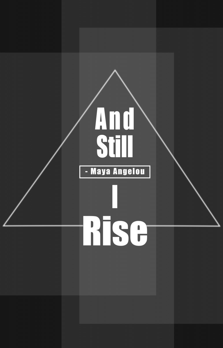
In the second concept, I used a triangle to present the heart of Maya Angelou because it is the strongest shape. I put the “Rise” on the baseline of the triangle wanting to show “Rise” supporting the whole triangle. In the center of the triangle, I put the author in a rectangle which presents the most powerful center. Also, the black and white present the dark and light.

For the second concept, I enhanced the visual effect by changing its background color from white to red. The red color presents the power and energy in Maya’s life. Also, I took a classmate’s suggestion and moved the Maya Angelou attribution below “Rise.”

For the final second concept,I chose the Black and white version.

2.The final version PDF: https://drive.google.com/file/d/1k9mg7-3h2AQZVeWyjZZ3eObUH2iUkswO/view?usp=sharing

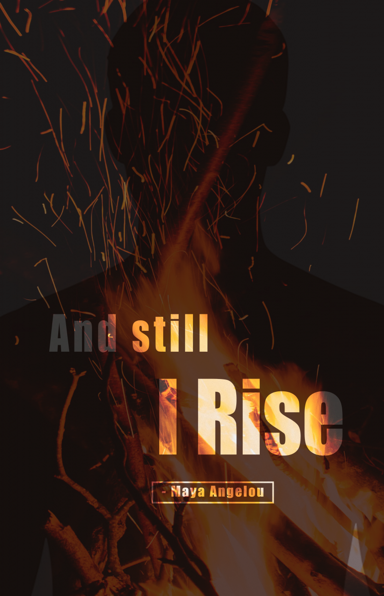
In the third concept, I used a picture of fire for the background and set it as a multiply to create an effect in which the words and fire are intertwined. I also placed the human shadow in the fire with a multiply effect, hoping to create an effect of a reborn.

For the third concept, I took suggestions from the professor and classmates. I corrected a copyright and formatting issue by placing the photo credit, as well as removing the border and dash from the Maya Angelou attribution.

Final third concept 
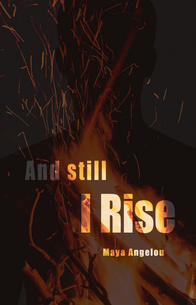
Photo Copy From Pinterst AMOLED Fire Wallpaper

3.The Final version PDF: https://drive.google.com/file/d/1odwamkGMRO2doJhkGXc_dYEKWqO0jC_r/view?usp=sharing