The virtual exhibit I found the most appealing was the “Artists in Their Times: Korean Modern and Contemporary Art – Since the late 1970s,” by the National Museum of Modern and Contemporary Art, Korea. The virtual exhibit took place in Google: Arts & Culture section. I found this exhibit the most appealing because of how imperfect the art was illustrated. It is indeed modern and the texture gives me comfort. It gives me nostalgia because now most graphics or illustrations are very three-dimensional. The art in this exhibition focuses on Korean modern and contemporary art from the 1900s to the 2000s. The exhibit showcases fifteen sections where the audience is walked through different decades to showcase how the art has progressed over time due to the events that followed around. The goal is to show the audience the development of different media used by different artists in their time.
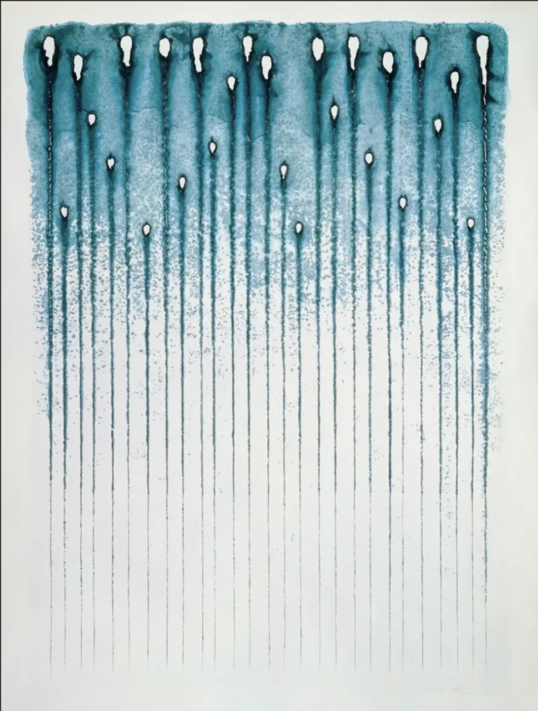
In the 1980s, to create a piece of artwork, artists did not use much material. The three materials that were used were known as jipilmuk (paper, brush, and ink.) One thing I took away from the artwork in this decade was the term hangukhwa. These terms defined the identity of Korean paintings. The medium of ink was already introduced early on, only in this decade, it was expanded. For the piece, Untitled, Kwon Youngwoo used a combination of blue and gray paint mixed with ink and gouache. The mixture eventually infused itself on the Korean paper which created these holes that are seen. Overall, it is an appealing piece. The mixture and the holes on the paper give it a nice texture. I also like the blue-gray color. My favorite color is teal which is why I loved this piece. I trust that the mix of both colors gave the artwork a nice cool earthy tone which makes it feel relaxing and look so effortless. I would hang this in my home if I had a place of my own. The artwork to me signifies as an abstract piece because you can’t identify what it is and that’s what makes it unique itself.

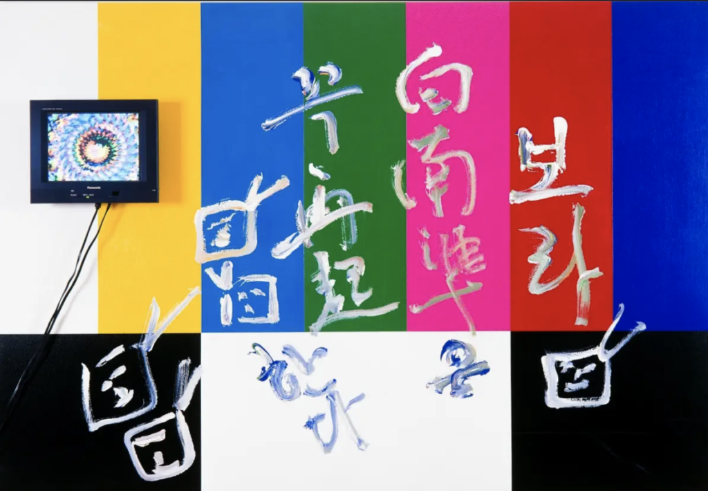
In the 1990s, Korean contemporary art grew in interest daily and became a significant characteristic of art for this period. For this section, the artist showcases their work quite differently. The Korean American artist, Baek Nam-jun’s created a piece called, Rainbow Stripes. The art piece focuses on the cultural characteristics of the East and West and the interactions between each other. Nam-jun pioneered this new art form and called it, “video art,” quite experimental. However, the design is American to me because it reminded me of the 90s in the U.S. Altogether color was bombing all over and it shows that the artist did focus on the cultural aspect of what was going on during this time. Right away, when I look at the work of art I think of television and video. The background in this piece is composed of simple rectangles in various colors, similar to how a TV screen would look. The medium used on top was acrylic. This gives a sense of texture and aggressiveness. I would identify this piece as representational art because you can recognize the background yet, I also get an abstract sense. After all, it connects something visual to the real world.

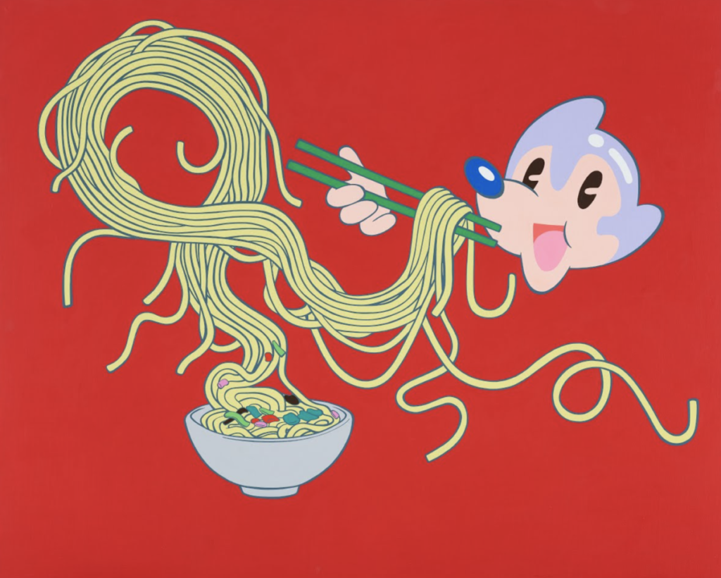
The 2000s was a period of pop culture. There was growth in music, entertainment & film, and fashion. This was a big part of Korean pop culture society. Koreans began to get stronger in their use of media and exposing it in any way they can use it in their daily lives. Artists began to combine one image with another to create new images. Lee Dongi is an artist who created the character Atomaus which is an animated character eating noodles using chopsticks. The character has a familiar face to the Disney character except he has no ears. Usually, I would use a fork but that’s a Western culture and this is Asian Culture. The medium used in the artwork by Dongi is acrylic on canvas. I think the red color in the background gives a nice contrast with the yellow and face of the character. It rapidly catches your eye.

Overall, the virtual tour was effective and I enjoyed the exhibit. This was my first virtual exhibition. I feel that I grasped more attention virtually than I would in person. This is because my attention span can be short or all over the place. Usually, depending on the museum, exhibitions can be big or small. When I go to a museum there is a lot of pressure because you are there for a limited amount of time, they’re so many different exhibitions, and I cannot look at one because there are so many around, it’s hard for me to concentrate. In this case, the website was well organized so if I wanted to learn more about the artist or other artworks they created, I easily clicked the hyphenated links and I was taken to another index. To add, I can visit the exhibition whenever with the hit of a button. I did not feel the pressure to rush through because I was able to view the exhibition at my own pace. All the artwork showcased in this exhibition was vastly individual because each artist had their point of view. It showed the artist in their time and how it affected their choice of media. I would always see art exhibitions from the 1700s-1800s in the U.S. so it was nice to see a different era and the evolution of different cultures and their art.


