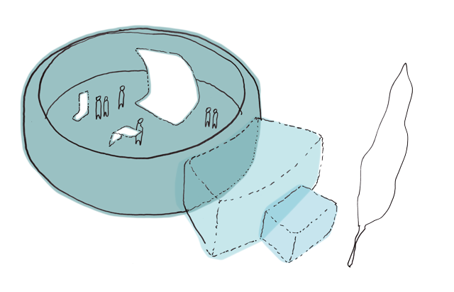
One piece I found interesting on the AIGA site was a concept design of a new modern workspace or studio for todays business. The article details how the private, cubicle office has demised and openness and inclusiveness has emerged in the office setting. Since offices are about employee bonding and collaboration, AIGA has launched an initiative to design a studio for 2015 that takes all that into account. The studio illustrated in particular is completely round and open which allows everyone inside to face one another and push communication and collaboration.
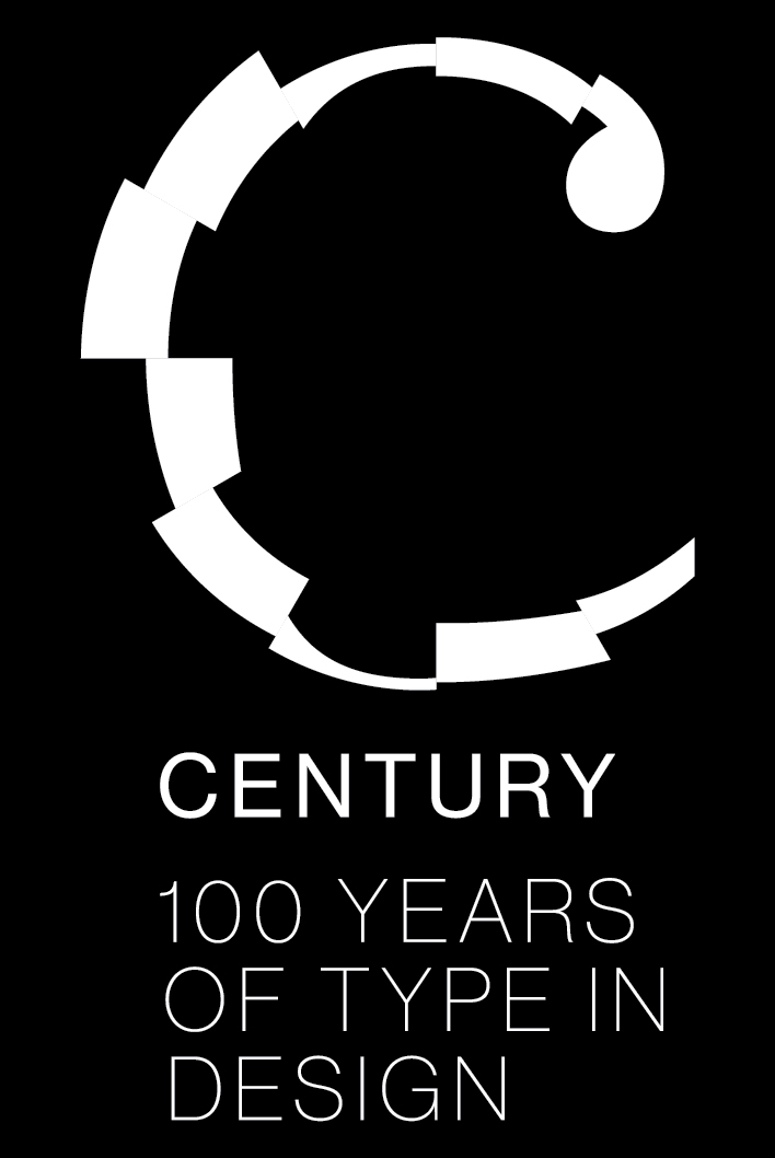
Another interesting graphic design piece I found on the AIGA site was for an exhibition of type put together by AIGA. This poster in particular is black and white with what seems to be the letter C in the middle. What is intriguing about this letter C , after further examination, is that it is made up of completely different fonts and arranged in way to make one letter. You can see the different strokes and weights of the serif and sans-serif fonts and how combining them creates a visually intriguing design in and of itself while still representing a C for the century of type in design exhibition.

