Logo: Starbucks
The starbucks logo has seen a constant tweaking and adjusting of the overall look of the siren that is displayed on all cups and signage. The siren is a mermaid from Norse tradition that dates back to a 16th century woodcut. In 1971 the founders of Starbucks decided to use her image on their signs and cups because it represented water and seafaring, which all tie into the companies Northwest, Seattle seaport roots. The Starbucks founders hope she can remind customers of the companies origins and tell of their past and future through the logo.
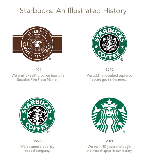
The logo itself has changed various times with the latest iteration being in 2011. They all share the same constant image of the siren in a circle but with different details. The first logo in 1971 utilized brown in it’s color scheme, the 1987 version came to use the green we all relate Starbucks with, removing tea and spice from the logo to just Starbucks Coffee. In 1992 after becoming a public company, the siren’s face was made more visible and most of her legs were cropped out. The logo in use today is a much more simplified and cleaner look to the traditional Starbucks logo. It completely removes the border and and type including the name Starbucks. It uses green and white areas as negative space to give shape to the siren and reinvent the logo from type and illustration to a purely illustrative design.
Image of the logo evolution

Starbucks logo evolution


