Category Archives: Uncategorized

Children and bullying, a breakdown by race

5/20/2015


bullying

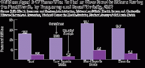
Elidania Santana: This is a bar graph showing the percent of bullying by race. This information is based on a national survey of children. This graph breaks down bullying by race; sometimes or usually/always are the 2 categories shown. Non-Hispanic Blacks have the highest rate of bullied or who were cruel during the past month by 18.1 percent.

Angelys Liriano: This graph is a very interesting graph because it is showing how bulling is increasing. Which is bad thing because it shows how different race act cruel to other children. Non-Hispanic White has the lowest rate of bulling with an 10.8 percent.

How math relates to my career

Hello I’m in Hospitality Management, I have to work with food. Sometimes if the dish I am cooking needs to feed more people and the recipe feeds 2 would need to use math to find how much of every ingredient I need to increase.


How Math Relates To My Major :Business and Marketing

Hey My Name is Stefan Dwayne Maragh and my dream is top pursue business and marketing which to me would be a dream come true. However, the math that I would be willing to take from this class is the consumer and percentage part of the math because it is very important to me that I learn this craft very well and hope to use it in the future if deemed necessary so I would be a big part of my community. Furthermore, I Would also like to say that Math 1190 would be a big step up for me as far as giving me the tools for future reference.

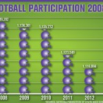
High School Football Participation Up After Decline

This article is about how football effects student. There have been a 10 percent decrease between 2010-2012. There are variety of factors in football and a number one problem is that it can be very expensive.

http://www.athleticbusiness.com/high-school/high-school-football-participation-rebounding-after-decline.html

Graph Assignment

http://www.washingtonpost.com/blogs/the-fix/wp/2015/04/14/the-long-term-power-of-anti-pot-propaganda-in-two-graphs/
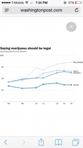
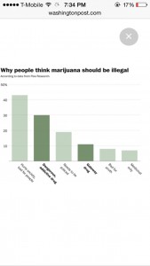
An article written in the Washington Post, titled “The long-term power of the ‘War on Drugs,’ in two graphs” by Philip Bump, explains the different views on drugs. He examines the views on drugs, particularly marijuana, in the 1980s to now. Back then marijuana, had more negative attachments to it then today. It was taboo which he explain through his and friends experience’s with encountering marijuana for the first time. Based on the article in the past there was a higher percentage of people against marijuana for different reason which is explained in the second graph from the article, then toady were there is an even split on marijuana. The first graph that the article used was a time series graph to help determine the increase what each generation from 2006 to 2015 felt on legalizing marijuana. The second graph was a bar graph which displays the six main reason for marijuana to be banned. These two graphs help tell support the shift in legalizing marijuana and the reasonings for it to be banned.image

image

Graph assignment

The example graphs i used were form a blog that had a NY Times posting on it . the graphs indicates how family house hold income can effect the student testing abilities. The data had proven that the students with an higher source of income is more likely to pass the SAT with a higher grades than the student who comes from a not so wealthy home. This graph also can relate to my major because in my career i would be dealing with families that are less benefit and that are effected physical , emotionally, and mentally due to them being less fortunate .

My Laptop was giving me trouble copying and pasting the graph so i just add the link below :

http://economix.blogs.nytimes.com/2009/08/27/sat-scores-and-family-income/?_r=0

Graph frm newspaper/magazine

http://www.city-data.com/crime/crime-Chicago-Illinois.html

The graphs I found were taken out of a Chicago news articles which it demonstrates the amount of crime happening in one of the most dangerous cities in America. It shows murder, rape, burglaries, and other crime activities in Chicago. I chose this graph because it not only relates to my major but it also informs my former classmates at to what is going on in America and it keeps all of us informed on the news. The graphs show how Chicago is well above the American average when it comes to crime, Chicago is considered the most dangerous city in America by many people. Since I couldn’t insert the graph I chose to put the link to the graphs at the top. Check it out.

How mathematics relate to my career

I am unsure as to what I want to do with my life, but I do know it involves law enforcement. So if I do decide to pursue a career in law enforcement, I will need math when I am tracking the various locations of criminals. I will need to know exact locations and how to use geometric shapes to figure out what angle to take attack a criminal.

quantitive reasoning student survey

My name is Anne Duchemin , my major is Marketing Management and I am a transfer from St. Johns University . I am currently still a freshman. I would use to class to utilize my math skills and imply them in marketing strategies that include price, and target market. This class to me is an overview of math i have learned in high school. I use quantitive resigning in everyday life when I’m counting money, or figuring out if my bossed payed me enough for all the hours i worked. In reviewing the syllabus i think the most useful part i will apply to my everyday life is rates. Being a marketing major i need to understand the constant changed of demographics and the economy.

College Tuition Costs Soar: Chart of the Day

Percentage increase in consumer prices, web

Aug. 18 (Bloomberg) — The cost of higher education has jumped more than 13-fold in records dating to 1978, illustrating bloated tuition costs even as enrollment slows and graduates struggle to land jobs.

The CHART OF THE DAY shows that tuition expenses have ballooned 1,225 percent in the 36-year period, compared with a 634 percent rise in medical costs and a 279 percent increase in the consumer price index.

Recent college graduates might be questioning whether they’re getting what they paid for. Unemployment among those 25-to 34-years old rose to 6.6 percent in July, exceeding the 6.2 percent rate for all groups. The jobless rate for that age group averaged 5 percent in the four years leading up to the last recession.

In summary, the graph is trying to portray that costs have risen but not always is something being done.


link: http://www.bloomberg.com/news/articles/2014-08-18/college-tuition-costs-soar-chart-of-the-day