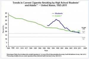
There are many ways that the information from the graph above could be portrayed.For example, a dot graph and a time series graph. A line graph is the most convenient way to portray this type of information because it easily is set up to show the percent of smoking trends amongst teens and adults from 1965-2011. This graph is easily done by plotting the percentage by year for both students and adults for each year. The graph shows that adults have been smoking since 1965 at a high rate and slowly started increasing. Students did not start smoking with a high percentage until 1991 and increased rapidly as well as decreasing after a few years. By 2011, the percentage for adults and students had a 1.1% difference. The graph also shows the pert age expectancy for the year 2020 showing a 4% higher smoking trend amongst students than in adults.
The link to this article is :
http://www.cdc.gov/tobacco/data_statistics/tables/trends/cig_smoking/


Hello, I am a little confused on the graph and what it is trying to convey. This survey was done in 1965 and again in 1991 when all the information was collected, is the graphing showing a correlation between the two time gaps? Is the graph trying to compare the two time gaps? ( which would be kind of hard due to everyone having their own reasons a to why they smoke, how they started, if they kicked the habit and picked it up again…etc. I was hoping to read a little bit more about this however the link does not have adequate detailing.
I think this is very interesting information. The information that stands out the most was when you said by 2011, the percentage for adults and students had a 1.1% difference. That percentage is lower than what I expected.
One trend that a recent NYT article addressed is the relation between electronic cigarettes and traditional smoking. See for instance:
http://www.nytimes.com/2015/04/18/opinion/joe-nocera-peering-through-the-haze.html