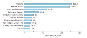
This graph does a great job in showing deaths across many variables. The variables being different causes of death associated with many different forms of cancer. It visually represents the amount of deaths caused by different types of cancer death rates 100,000 people.
I got this graph from (http://www.vox.com/2015/2/18/8052559/how-we-die)


This is a complex graph. There is a lot that you could say about it and a lot you could learn from it. I would be careful about how you used the word “variable”. Gender is just ONE variable. This IS a great graph, but unless this is part of an article, was not the assignment.
good graph. but it only talks about cancer and not the other reasons of death. other then understanding the reason cancer got its name I really did not learn much from this graph or the article for the graph.