
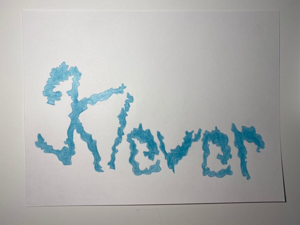
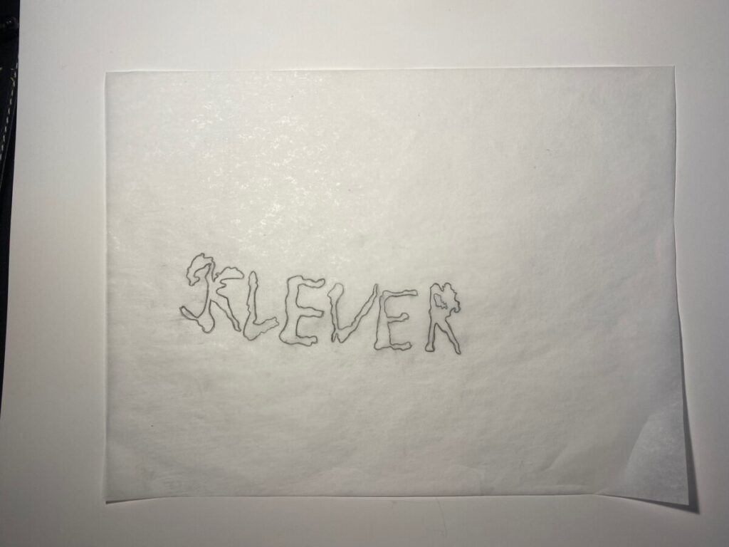


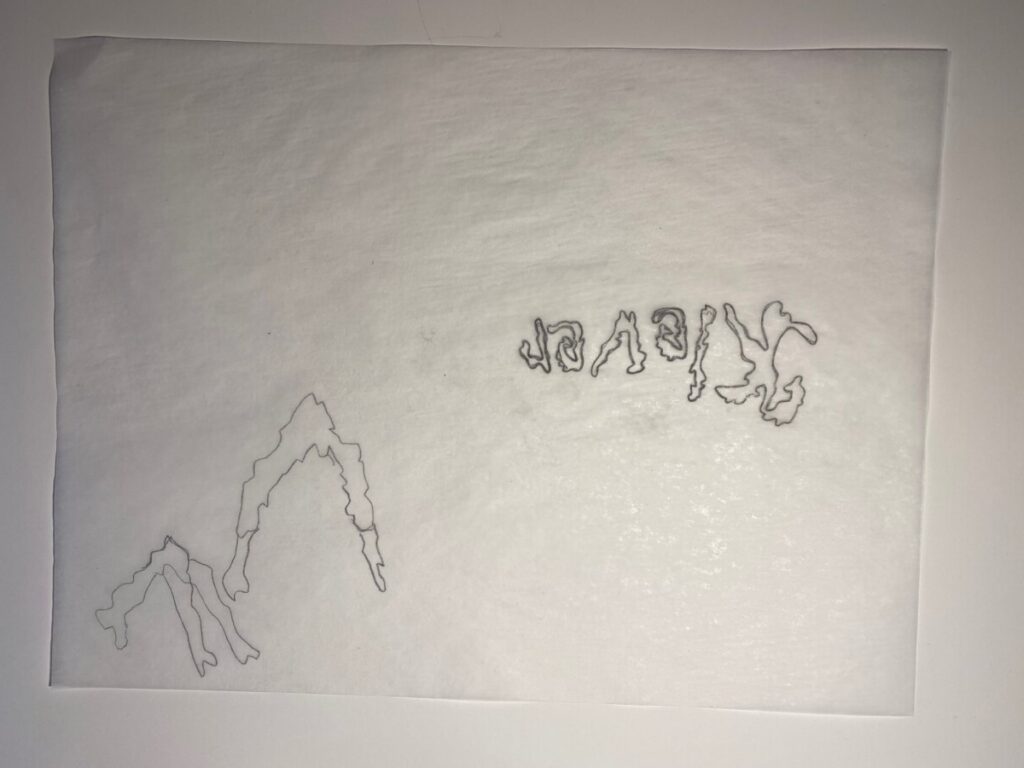
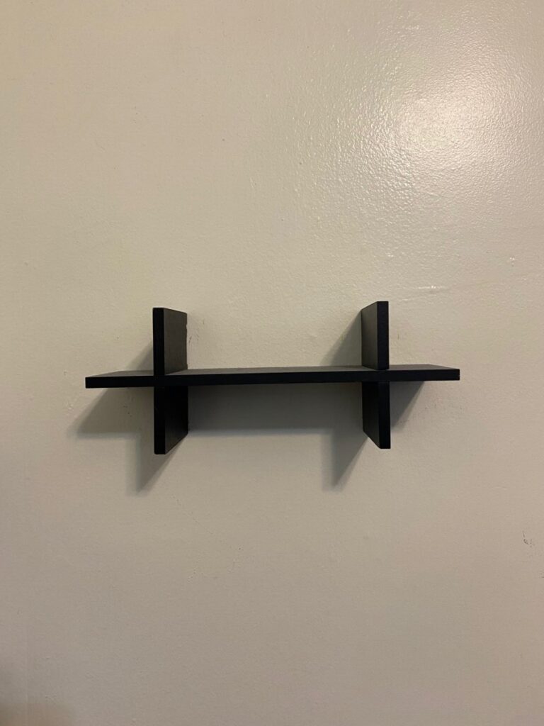

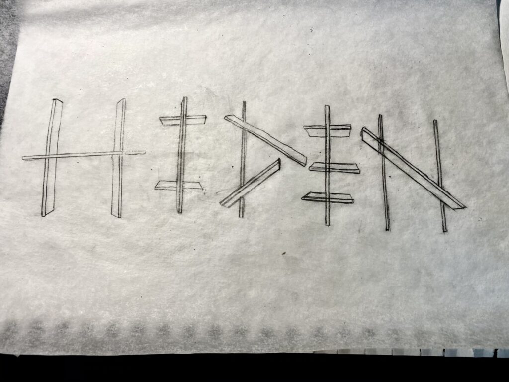
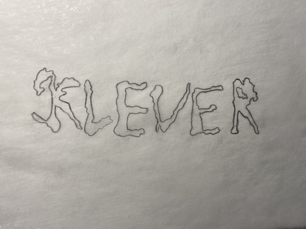
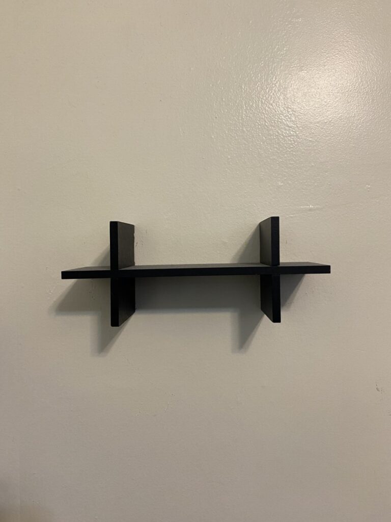
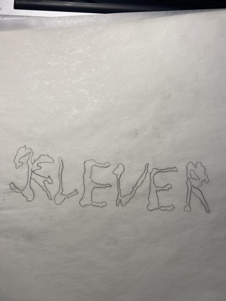
This project was quite difficult. Some of the difficulties I found were keeping the objects original properties in the typeface itself. For example my shelf typeface was made too tall at first, in order to keep it true to its original picture I opted to make a longer version. It pushed me to be creative and see just what kind of type faces I could find with the given image. Some proved harder than others. My blue paint typeface was rather difficult to get letters out of and when I did I had to rework it to lower case as it was more like the paint itself then long capital letters. Then there was the challenge of finding thr right way to portray in in the final, I really wish I had acrylic paint for my final one but I only had a color pencil on hand.
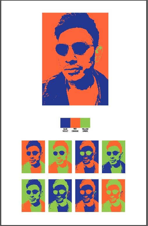
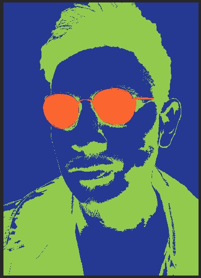
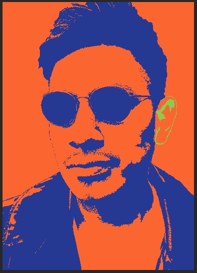
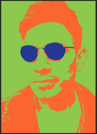
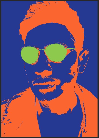
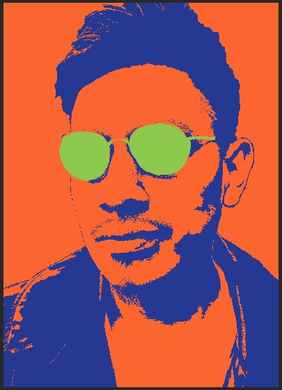
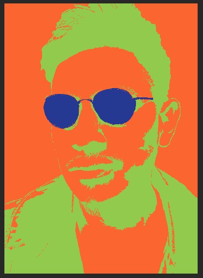
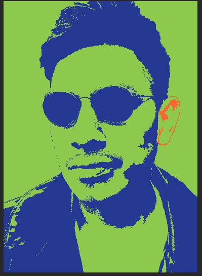
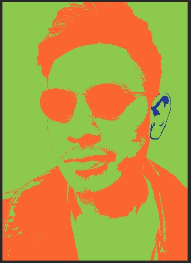
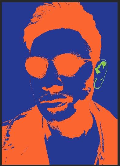
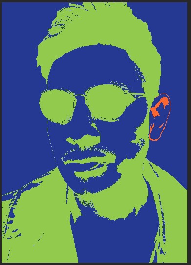
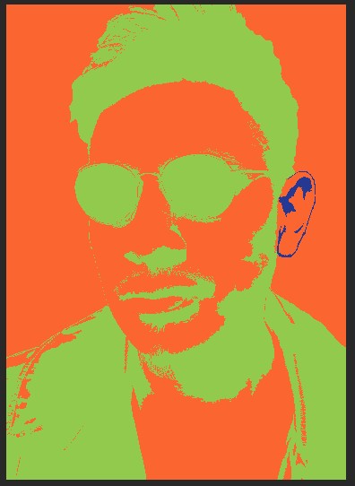
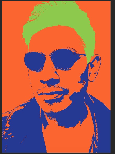
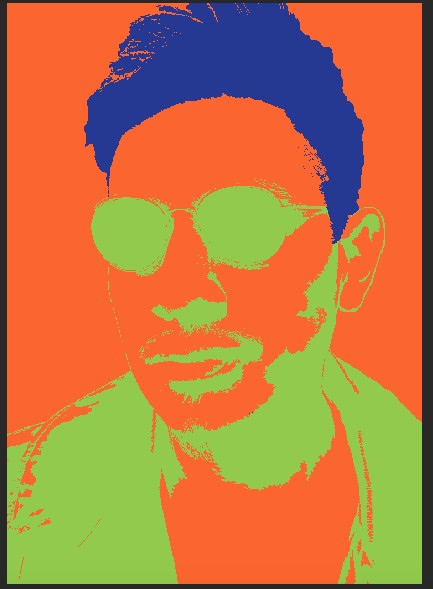
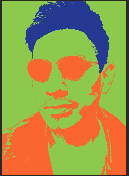
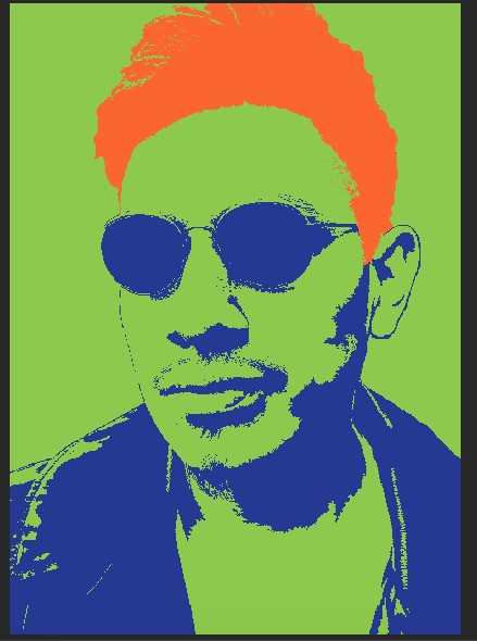
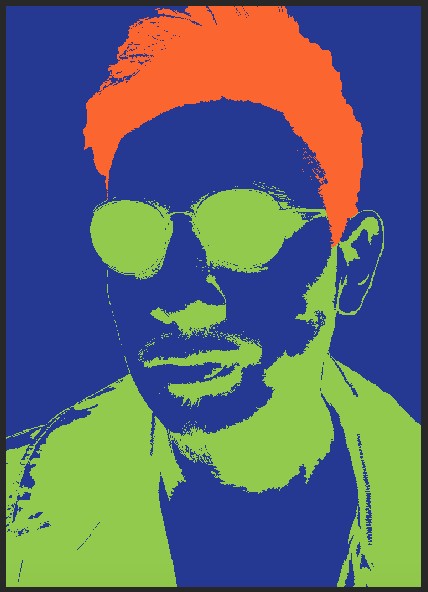
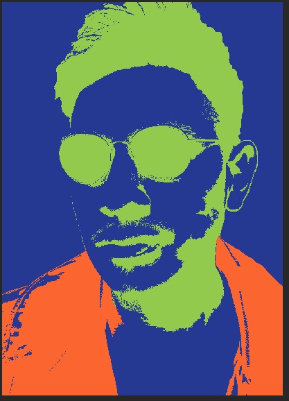
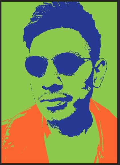
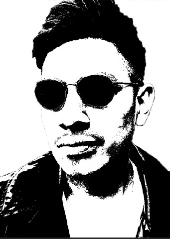
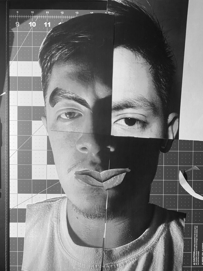
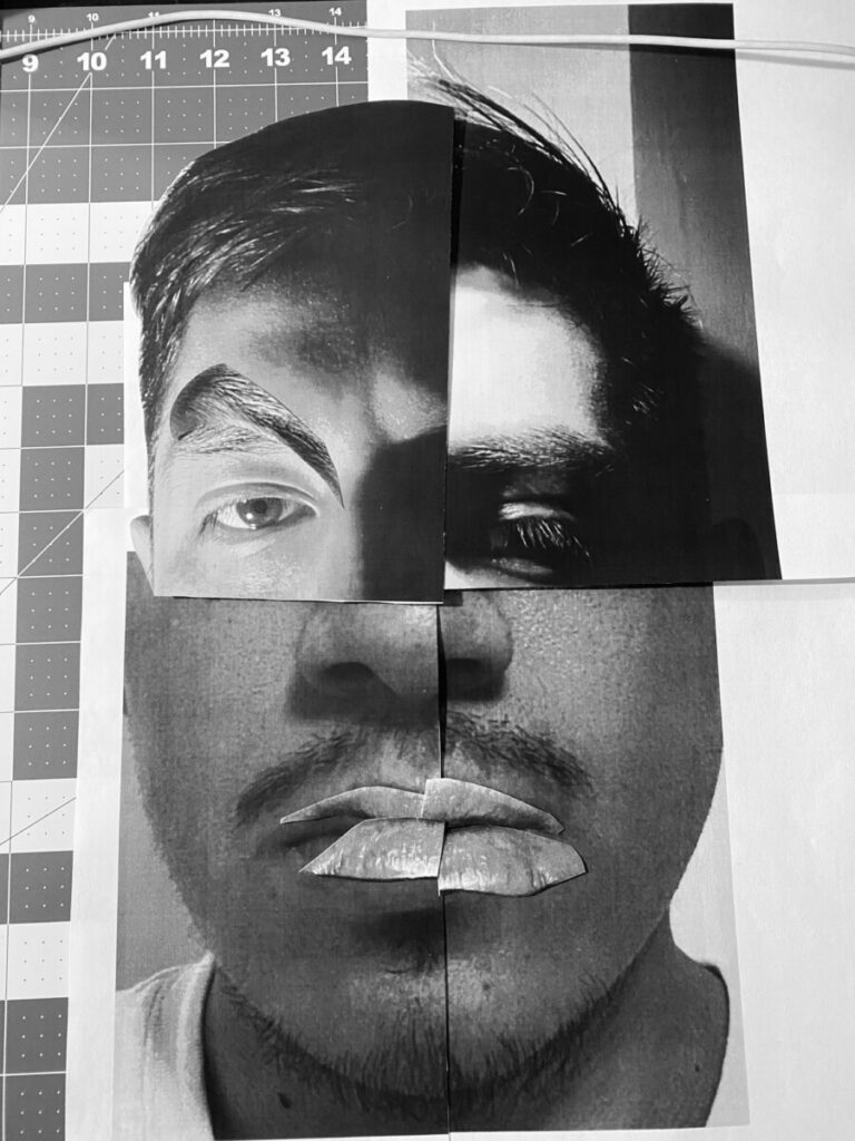
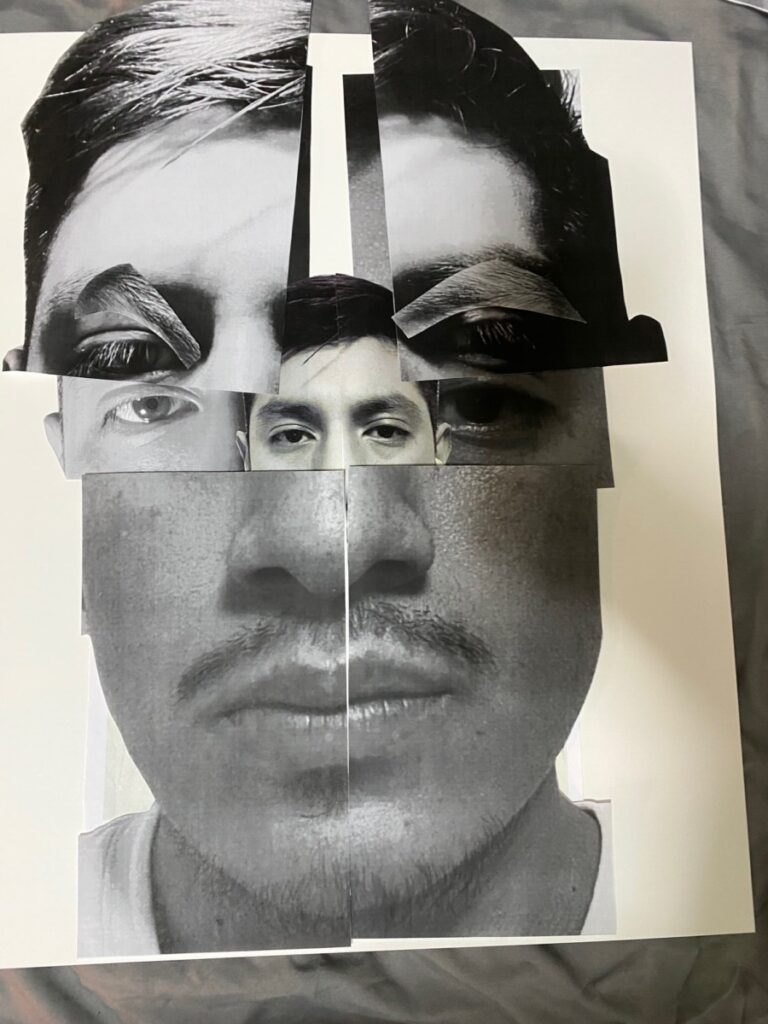
this project was a challenging one for me. the technical side was giving me trouble at certain points. through trial and error i was able to figure out a couple of new tricks to get the job done. i has no previous experience with photoshop so this was a challenge on its own. i think i could’ve maybe picked a better picture, but of all of the pictures i experimented with this gave me the best black and white image. i learned a lot in photoshop in this project and hope that will help me in my future projects. along with the color wheel i feel there was a lot to take away from this project.
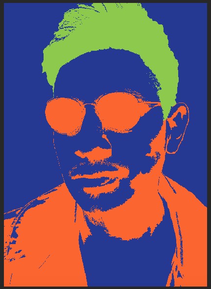


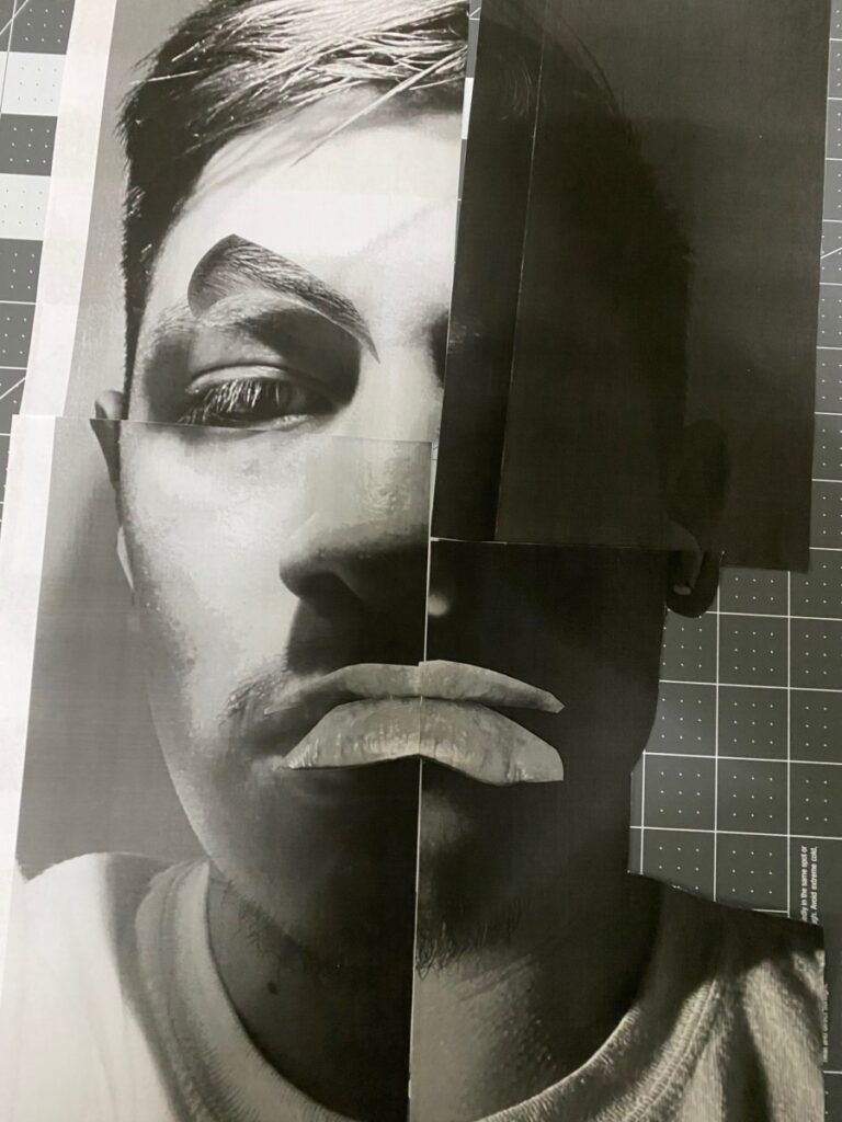
The emotion I chose is anger, when experiencing anger my face moves through the following motions. My face tightens up, beginning with my forehead moving down to my eyebrows. I clench my teeth and my nostrils flare, my eyes attentive & focused at the source of my anger.

The OpenLab is an open-source, digital platform designed to support teaching and learning at City Tech (New York City College of Technology), and to promote student and faculty engagement in the intellectual and social life of the college community.

