Category Archives: Project 5 – imagiNATION

Delivered

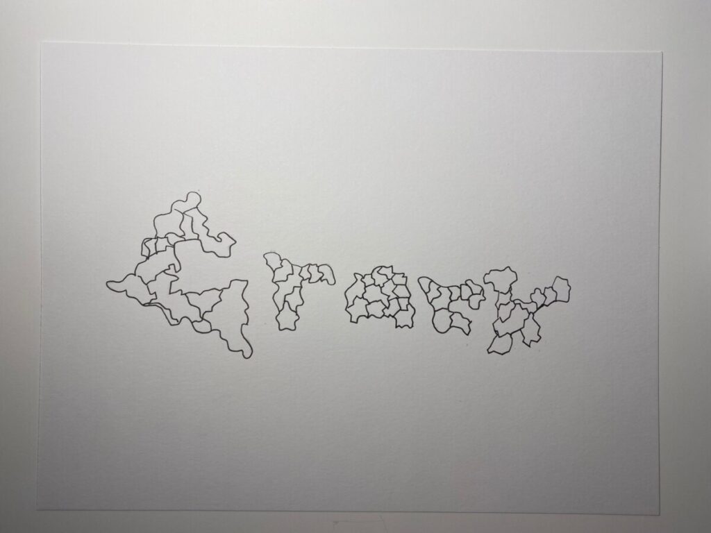
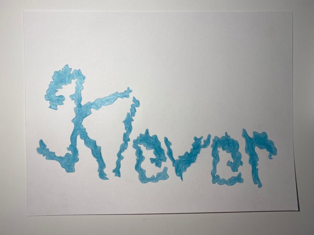
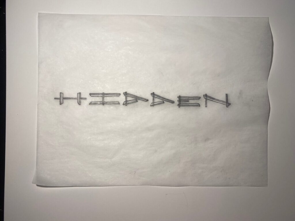
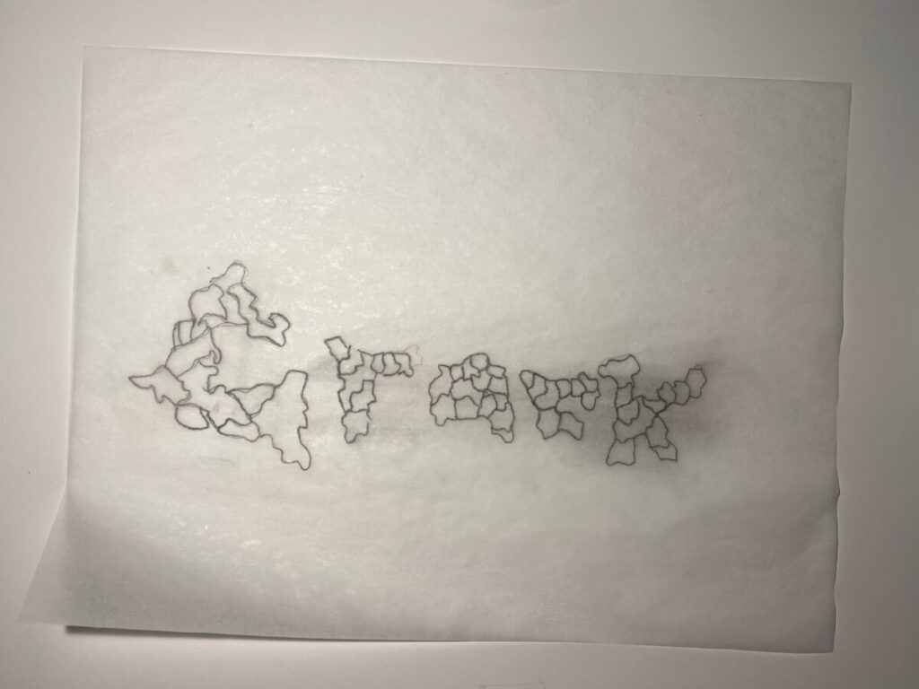
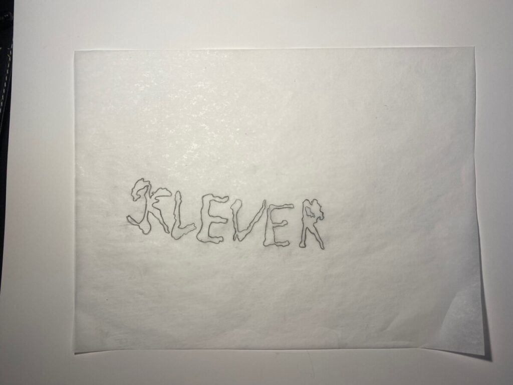
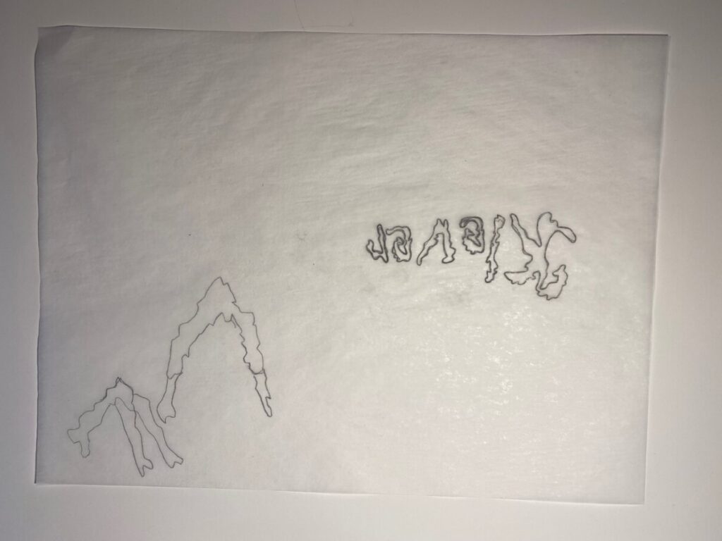
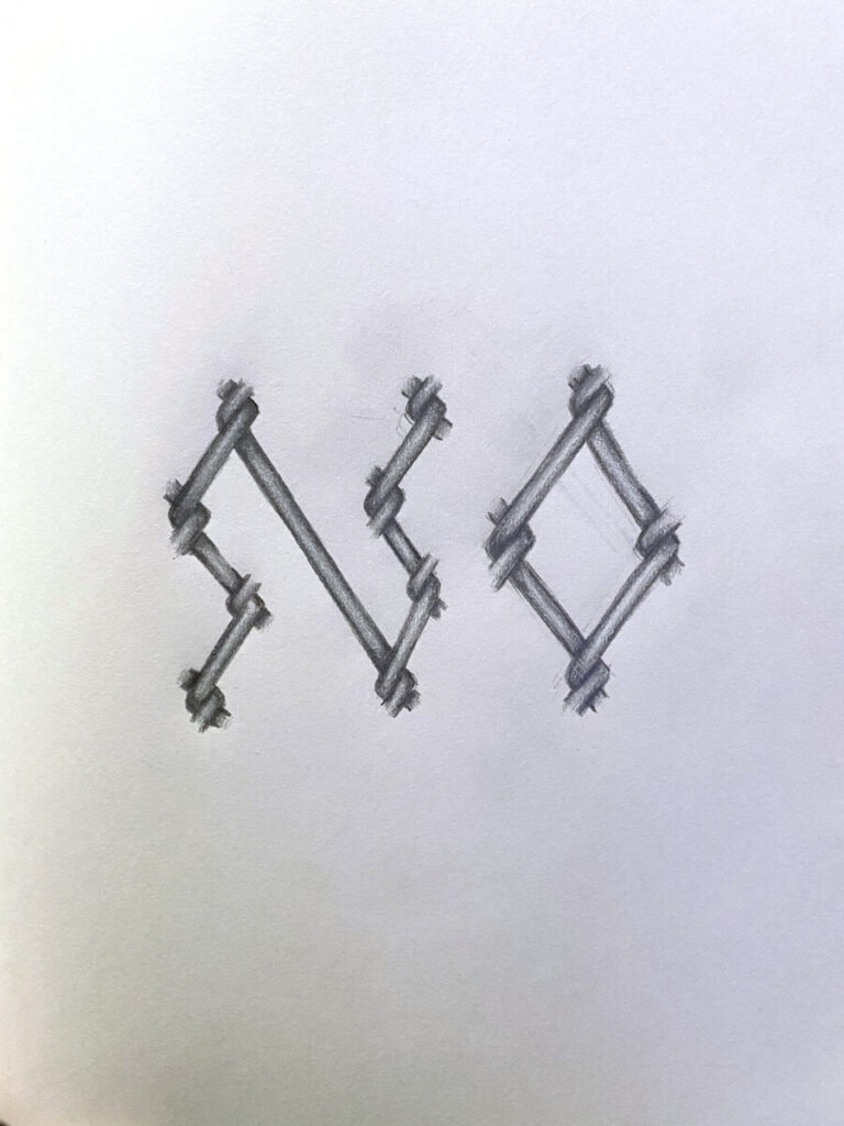
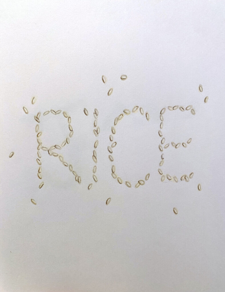
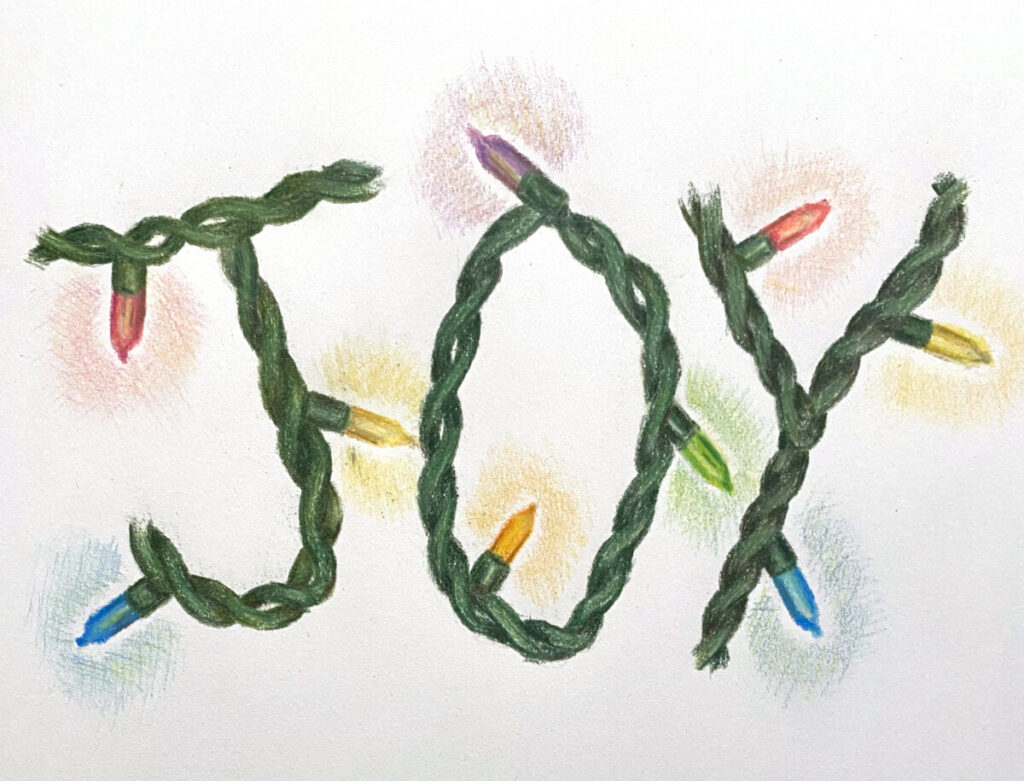
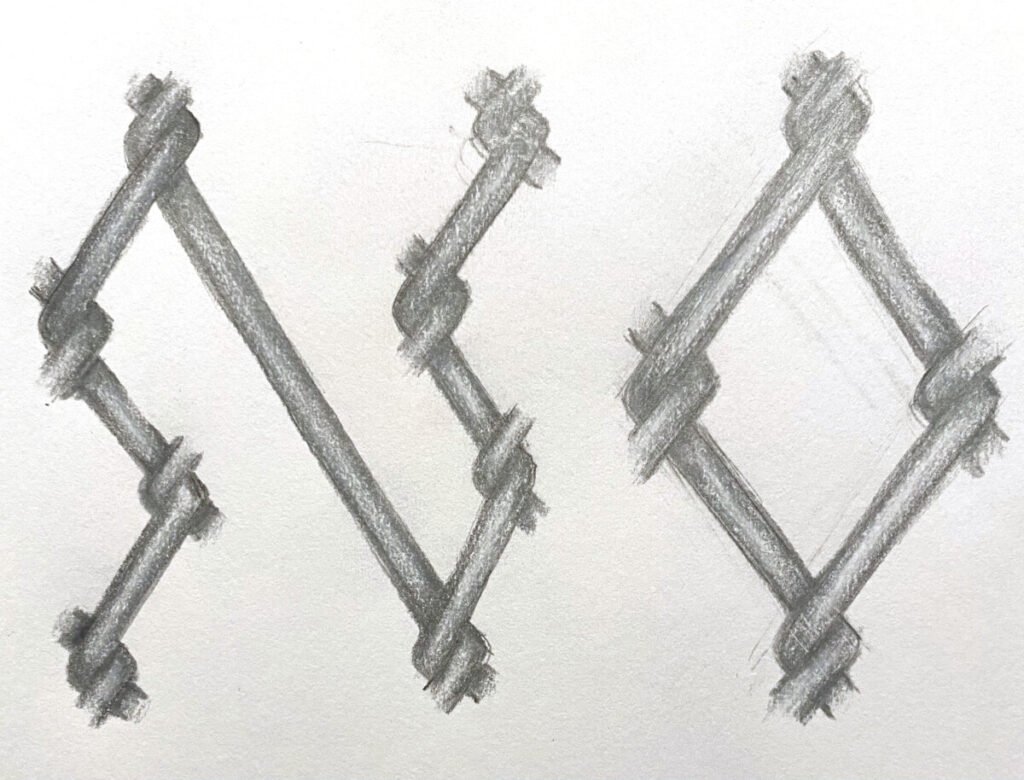
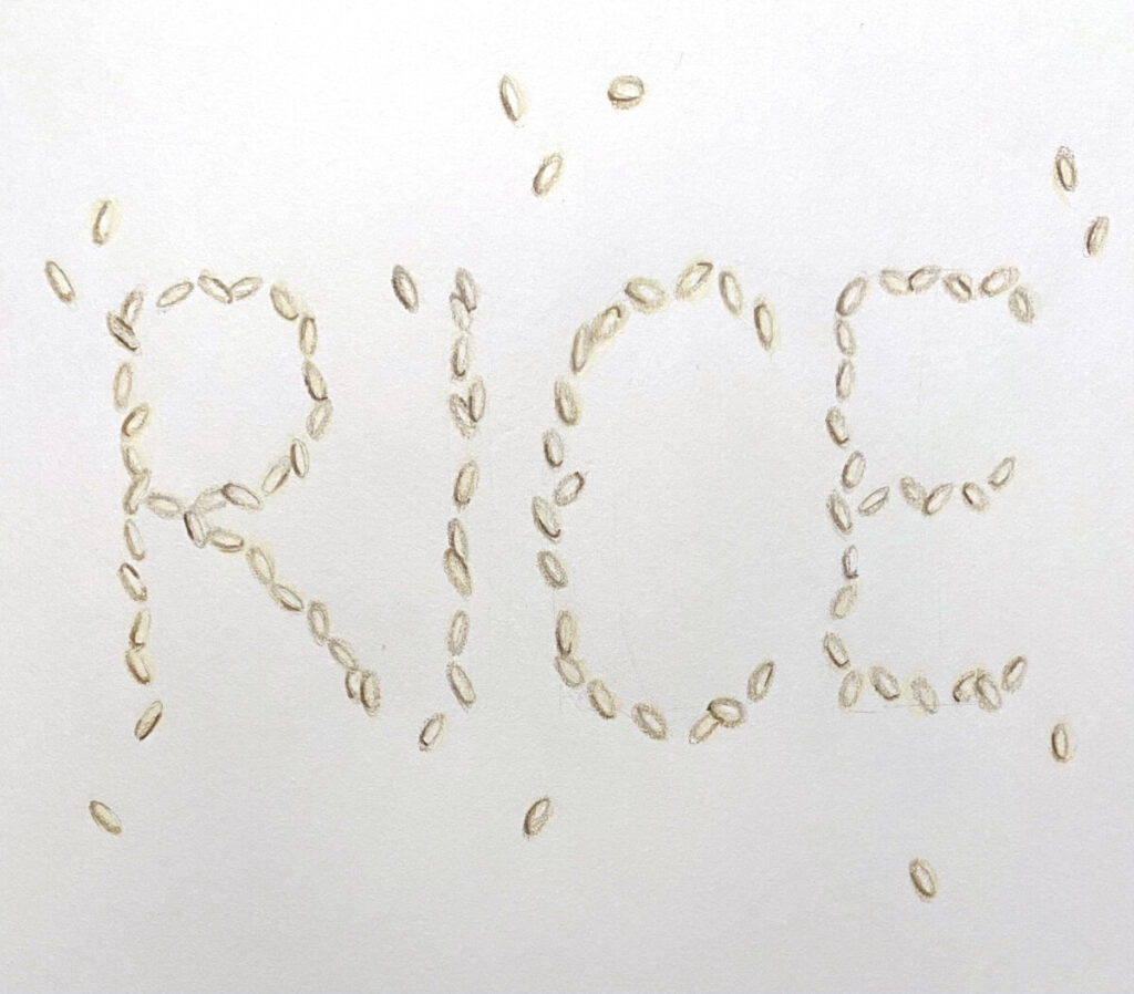
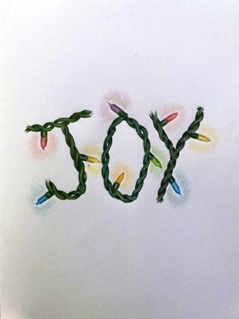
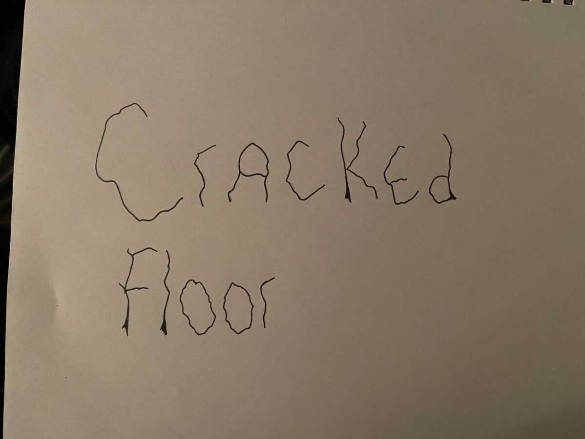
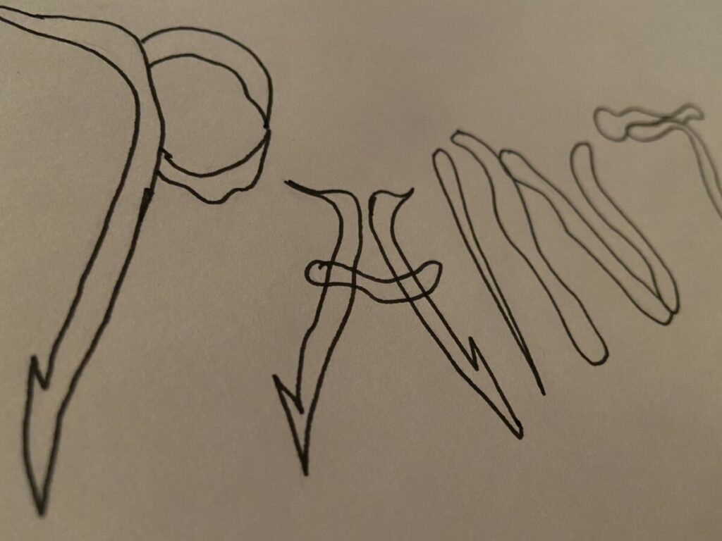
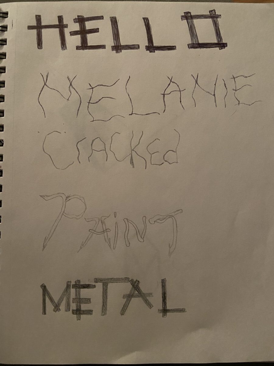
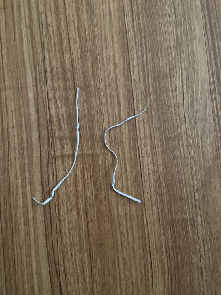
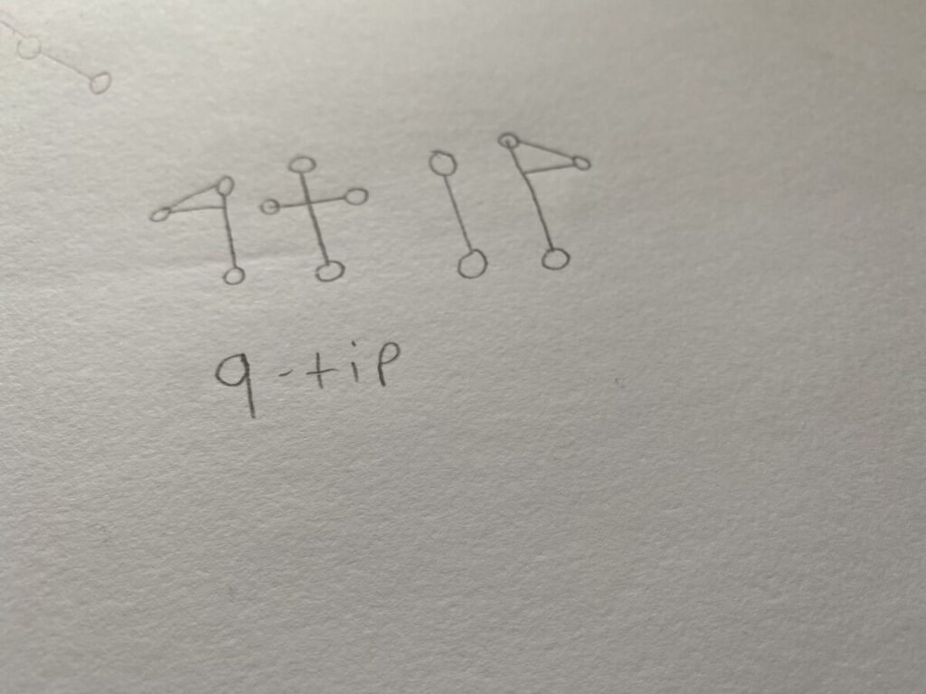
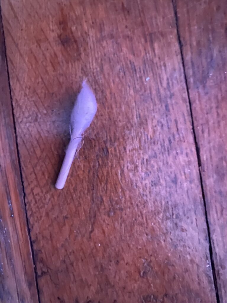
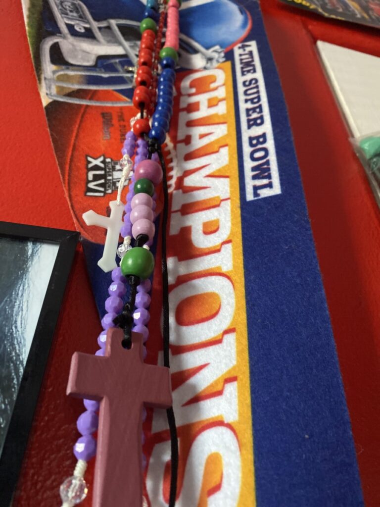
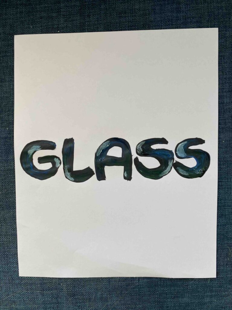
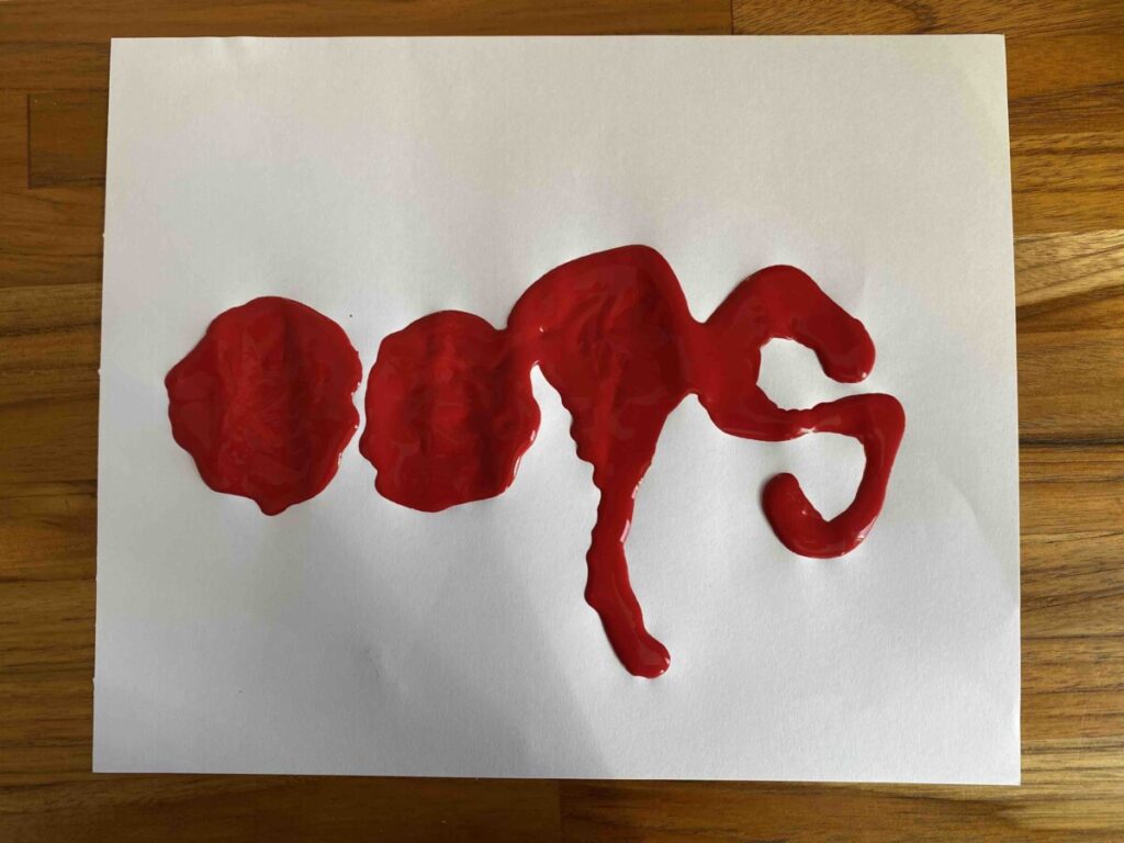
This project was a great way to test some of my ideas in a creative sense. The process revealed my growth from uncertainty in what the concept was to a grasp of what I needed to show. The most difficult part of the project was trying to figure out how I would capture the essence of the pictures via the decorated font. Another difficulty I had was trying to properly manage how much (or how little) space I should use for.. let’s say an ambiguous photo. I would hesitate to figure out which is dominant..the foreground or background? Should I add design around the word? Behind? In front? In the end, I ultimately decided to go with less by decorating only the letters of the word, hence the idea of a decorative typeface. But the part of the process I enjoyed the most was coloring the font to add vibrancy to project. Overall, I feel like I better advanced my skills in creating a simple but practical decorative font.

klever imagination

This project was quite difficult. Some of the difficulties I found were keeping the objects original properties in the typeface itself. For example my shelf typeface was made too tall at first, in order to keep it true to its original picture I opted to make a longer version. It pushed me to be creative and see just what kind of type faces I could find with the given image. Some proved harder than others. My blue paint typeface was rather difficult to get letters out of and when I did I had to rework it to lower case as it was more like the paint itself then long capital letters. Then there was the challenge of finding thr right way to portray in in the final, I really wish I had acrylic paint for my final one but I only had a color pencil on hand.

Step 4: Delivery

Final Thoughts:

The themes from other projects seemed similar to this one on Imagination. For example, the text filling in a shape, (Project 2) and also, exploring color (which is what we did in Project 4). I enjoyed the freedom this project had to explore our imagination, by making a typeface out of our surroundings. The most difficult part for me was to look around for things I can use to make typefaces. However, once I found things and took my pictures, thats where the fun began to create it myself! I sketched out my ideas, from outlining a line drawing, to listing colors I’d use before beginning the final. In my designs above, I used Prisma Color Pencils to make the details as realistic as possible (like my photographs that are also above).

Overall, I never find myself to be a very creative person, so this project was definitely challenging for me. It forced me to look deeper into my surroundings for typefaces that I could possibly create. In addition to finding references in my surroundings, I needed to learn to use them to create typefaces that may not have been there. Once I took on these challenges of my own, being able to create my designs was the rewarding part for me. After all, usually the difficult work is what pays off the most, and I believe this project portrayed that in the best way. It was fun and creative, and overall rewarding!

Step 4: Deliver

As I complete this project I felt at first like this was going to be easy but I was really wrong. I thought making my own type face out of random items would be so simple but it turned out to be sort of difficult trying to come up with a type face made out of something such as paint splatter or a crack on concrete floor. The process of making a new type face is very long and it showed me in a way what graphic designers go through when they are brain storming and trying to come up with new ideas or making something new. What felt a little difficult was trying to find something to take a picture of that I may be able to use for my type face because I felt like I couldn’t find anything till I did. Although this was a difficult project it was an interesting experience and process to do and go through.

Project 5 – Step 4 Deliver

              I thought creating a typeface based on the images I’ve selected we’re going to be simple, but my

Expectations were wrong this whole time. I’ve learned that developing a new typeface can be very com-

Plicated when trying to give the elements to it. My sketches keep giving too much repetitive at first.

I was mainly focused on my imagination the most of making the letters of the word “Leaves” by either

Shaping them into leaves or turning into them. So I took another photo of my wired mouse turn it’s wire

Into a typeface with a mouse at the end. 2nd image I used was my Charcoal sticks I had as one of my art

Supplies for my figure drawing courses, I thought Using the shape of the charcoal stick and transform it

Into a typeface. But the lettering couldn’t tell if they’re actually made out of a charcoal stick piece. I was

Going to transform it into a 3D photo as my final one, but I don’t have enough charcoal sticks to create

The typeface in a 3D form, so as my final, I drew the letters with the same charcoal stick that’s on the

Photo and draw it very heavy pigmented black with a vine tree on the top as where vine charcoal came

From. The 3rd one was a Christmas light bulb I took from my Christmas light decorations, and transform

it’s light bulbs with a wire plug connected to it. At the end, I shouldn’t rely too much on my expectations

while working on my own typeface sketches. But it is nice to try and experience to work on a typeface

of our own based on the images we selected.