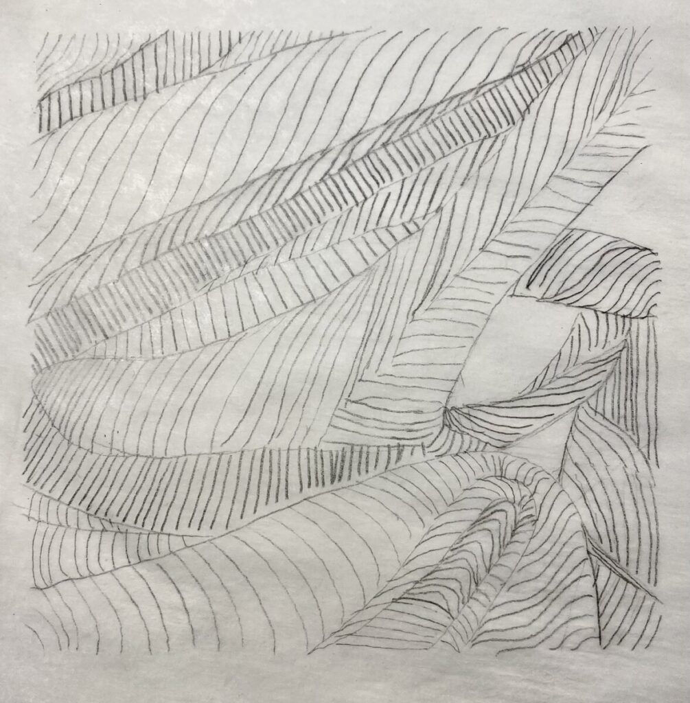
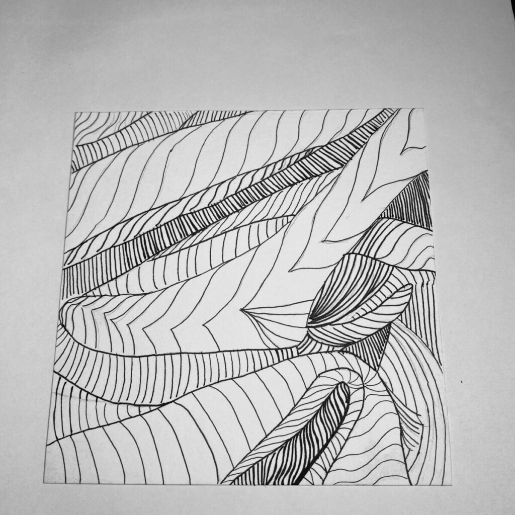


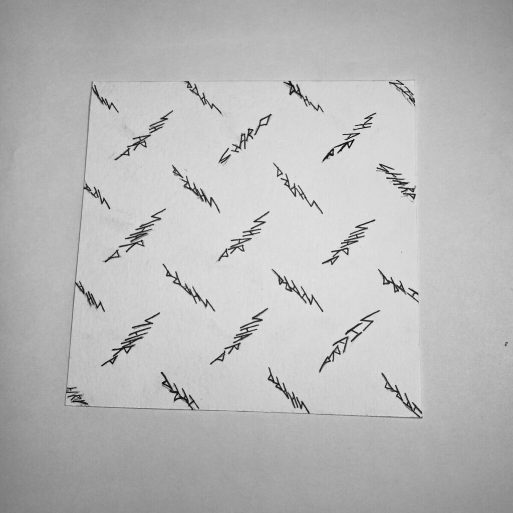
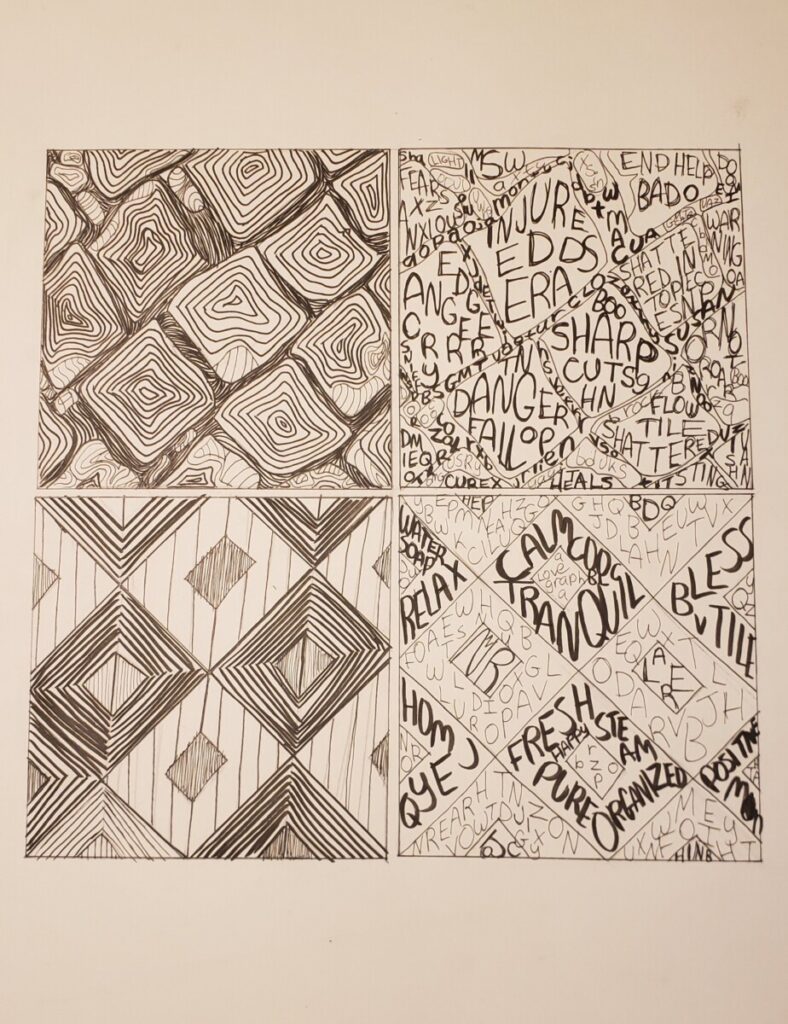
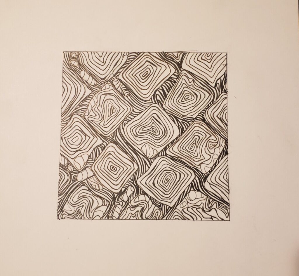

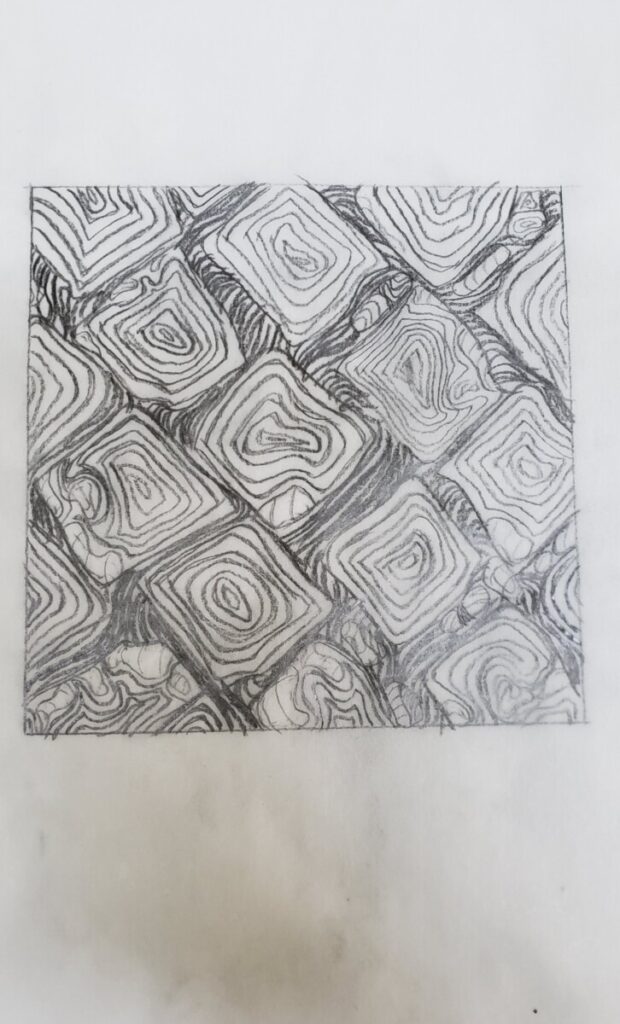
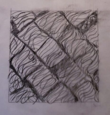
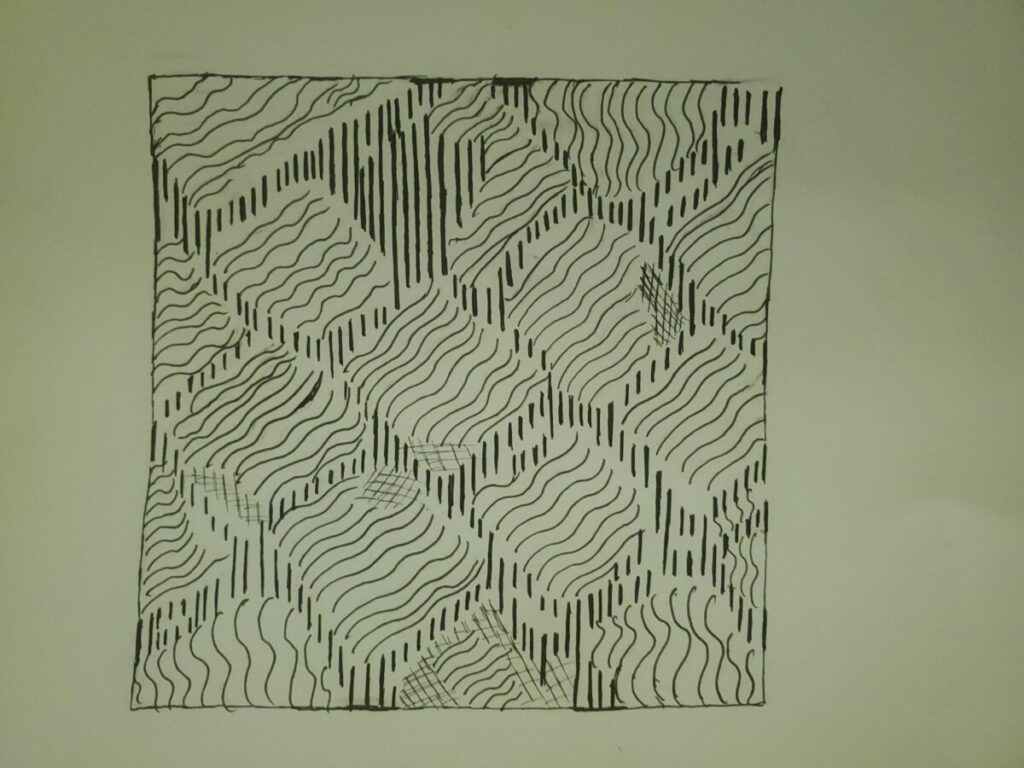
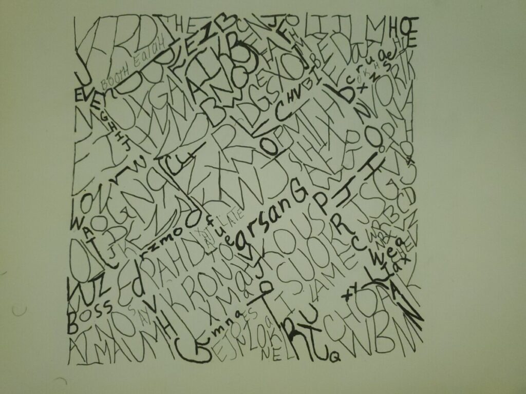
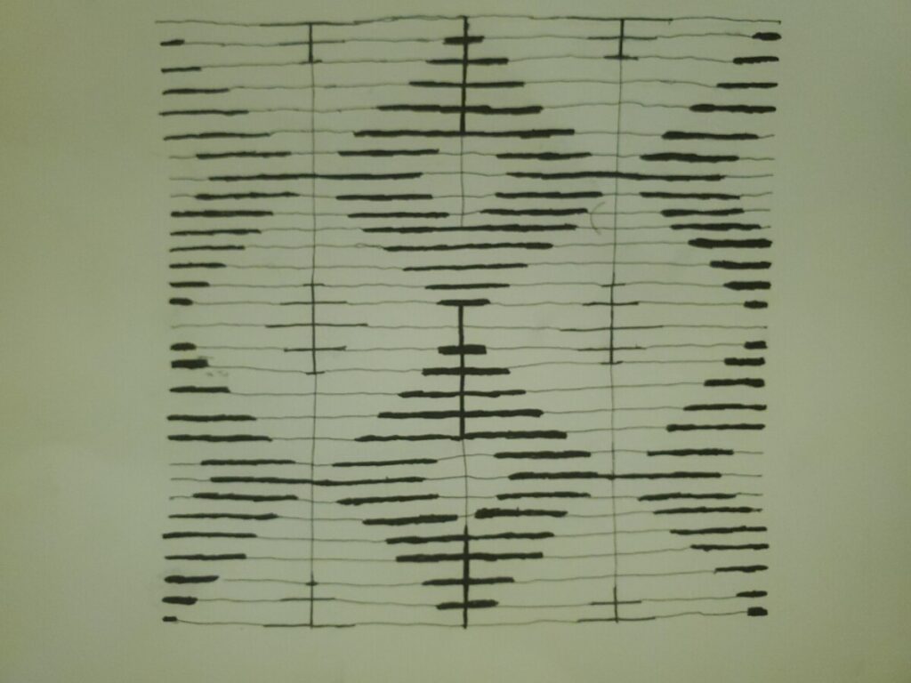
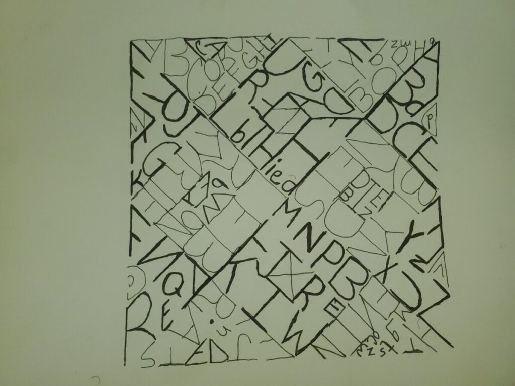
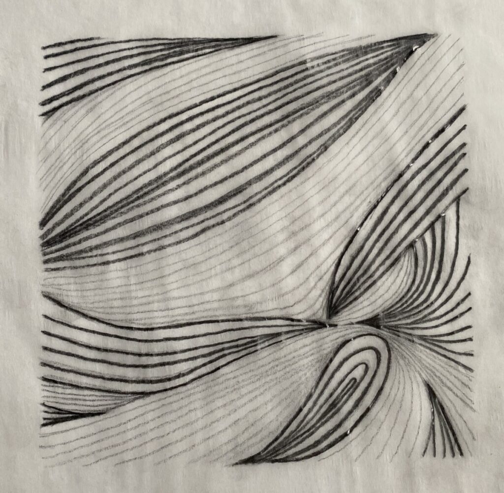
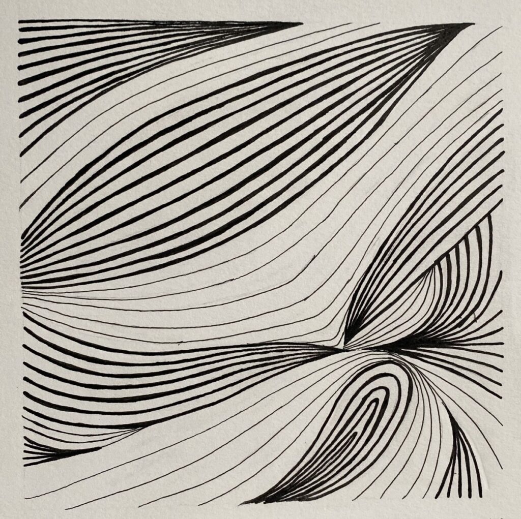
The Texture Image I selected to work on is the Stone Street Image I choose to describe is the Stone Street Texture. This Image gave me a negative feeling to it because of how shattered these stones looked. If I were to feel the Stones, I would feel very uncomfortable and nervous to pick up the stones or lay my finger on them. Either because they look sharp. To define it in Black and White Composition Lines, There will be organic shapes flowing around inside the Stones with a flow of smaller 0.5mm ink lines in lighter white spots the stones have. Also, for the Background, would also have a flow of lines but thicker and Darker to give a heavier contrast. But Defining with Type, The light contrast would have lower case alphabet or words in a 0.5mm ink, the stones would be a size 0.7 or 0.8mm with words to give a slightly gray tone. The Background would give a lowercase alphabet with the darkest contrast to it. This Texture was described primarily organically as the shapes, lines, and text would flow as easygoing.
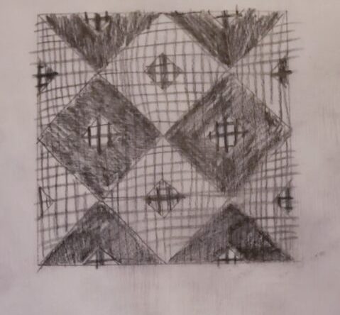
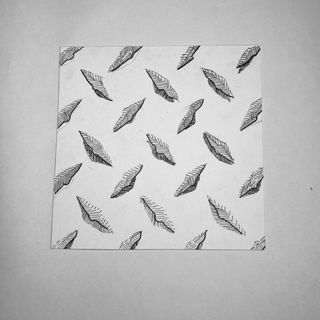
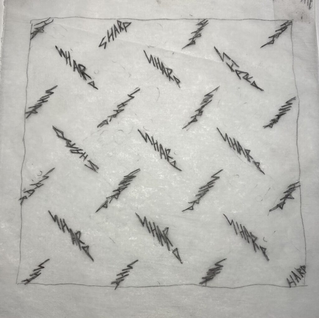
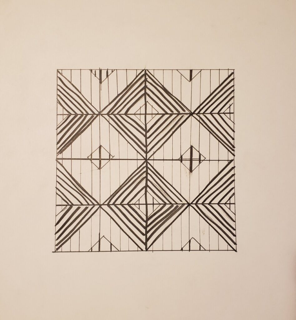
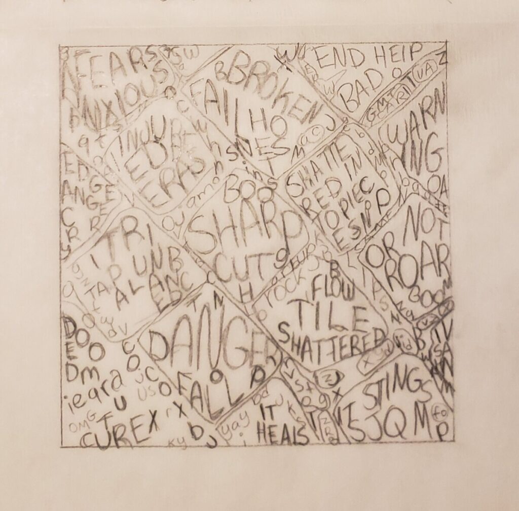
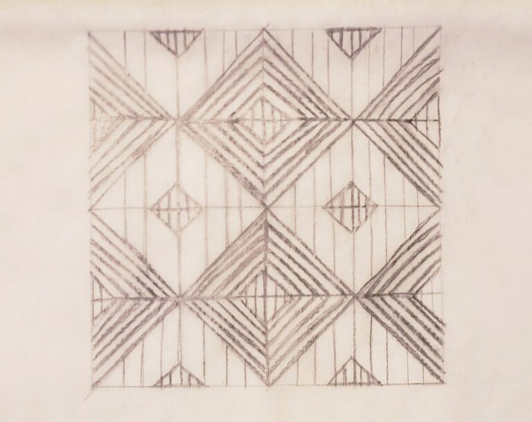
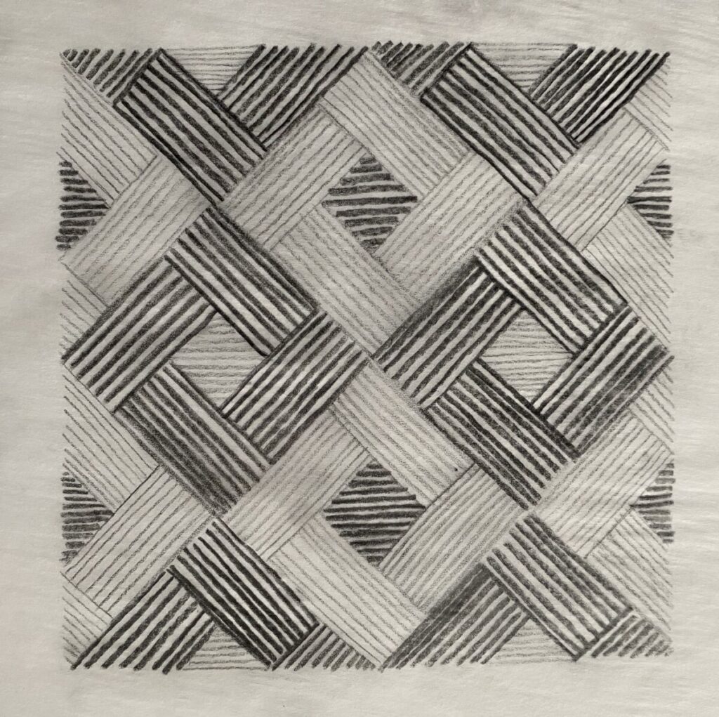
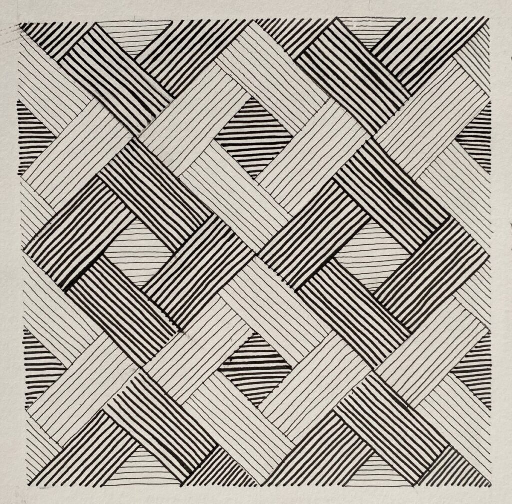
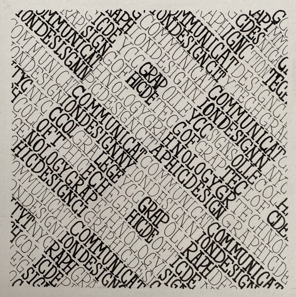
The Pattern Image I selected to work on for Project 2 is the Tile 2 Pattern. Unlike the Stone Street Texture’s mood, I was feeling before, and This Image gives me a positive feeling because it reminds me of the Tile Pattern at my bathtub I see when I’m taking a bath, and it also reminds me of home so that I can relax and calm myself. When defining in Lines, It would most likely be in Geometric Shapes like on the Darkest Diamond Areas with Thick Line Strokes Flowing around the Diamonds. For the gray area, There will be multiple lines flowing either up or down in a 0.1mm size to give it a shade of gray. Last but not least, the lightest area of the tiles would be given about 5 to 6 lines flowing to give the light contrast. For most of this Linework, I would be given a Repetition, but for Type, The Characters would be in Bold to define the darkest contrast, the gray area’s characters would have semibold letters inside, and for the light contrast, I would give a lowercase regular characters surrounding with a 0.5mm.

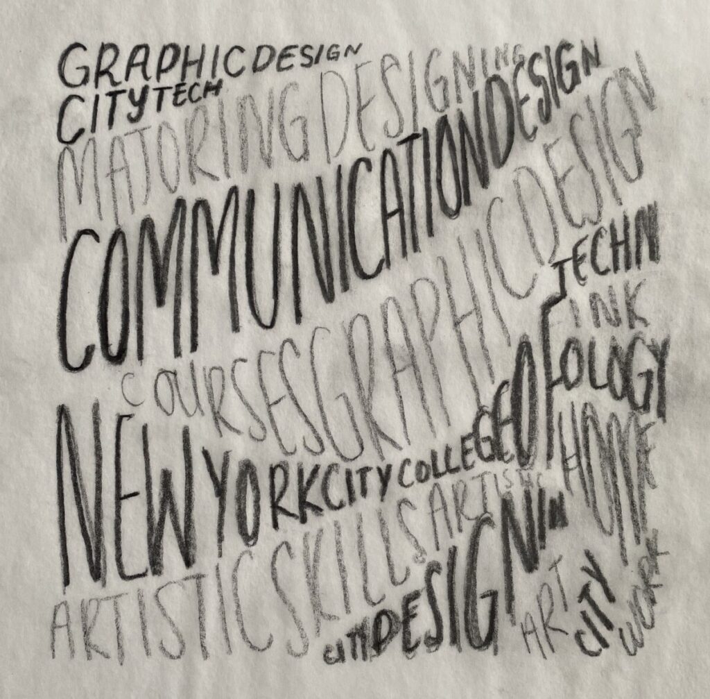

The OpenLab is an open-source, digital platform designed to support teaching and learning at City Tech (New York City College of Technology), and to promote student and faculty engagement in the intellectual and social life of the college community.

