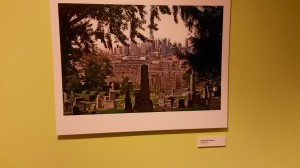
In today’s class we visited the The BHS on Pierrepont St, In Brooklyn. This trip was a different experience that allowed me to see first hand primary resources, as well as photos to go with them. In the wonder exhibit, I applied the things we have learned such as the rule of thirds or a juxtapositions into the pictures that we have seen. There was one particular image that I found interesting during the walk. This frame consists of a cemetery filled with tomb stones and tall city buildings that can be seen in the distance. I immediately saw an overlap. In my opinion, the cemetery represents death were as the buildings in the distance depict civilization or flourishing life. 
The OpenLab at City Tech:A place to learn, work, and share
Support
Help | Contact Us | Privacy Policy | Terms of Use | CreditsAccessibility
Our goal is to make the OpenLab accessible for all users.
top


That’s a great observation about the overlap of the cemetery and the urban building-scape. Could you use some of your vocabulary from design to explain the overlap?
Also, can you add a caption to the photo that includes the author’s name and the semester the work is from? It’s important to give the artist proper credit!