A City Tech OpenLab ePortfolio

Category: Portfolio

Advanced Illustration

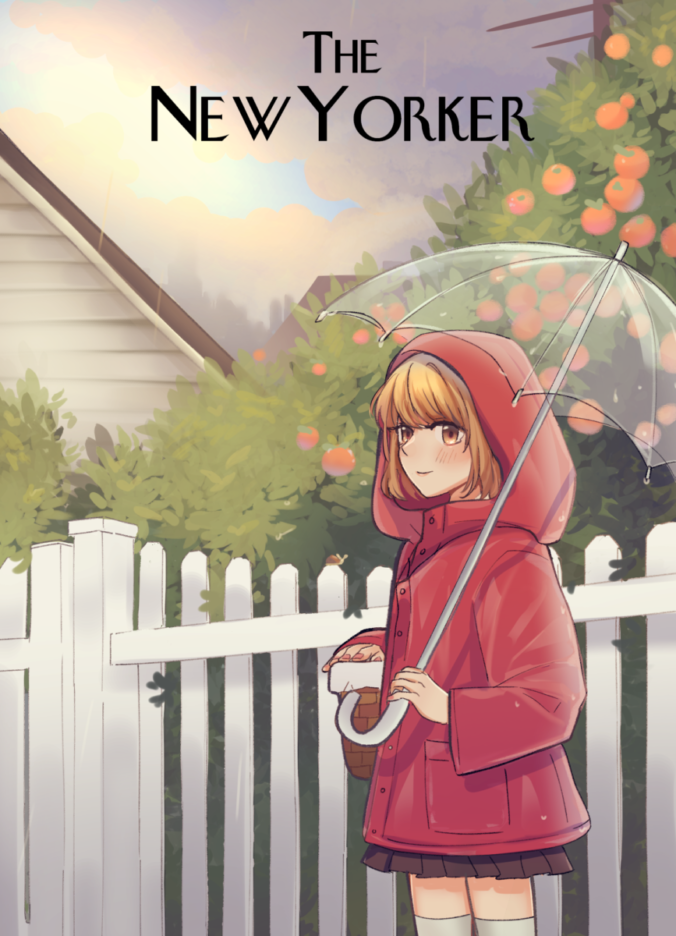
This is one of my favorite illustrations. In the New York Magazine cover the goal of the assignment was to deliver the news that New York is open. We were encouraged to draw our favorite activities of when the city is open and I chose walking in the rain with an umbrella to visit Grandma. The clouds are parting and the rain is stopping which is intended to give a sense that it’s finally over. I added oranges because I usually envision orchards and a warm family meal when arriving at the house. It was suggested that the character would be in a red raincoat so it feels like a red riding hood, I added the basket to add to that theme.
Continue reading

Sweets & Squeak

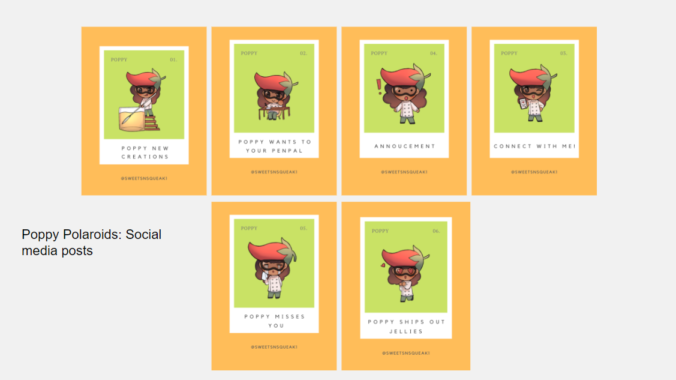
Sweet & Squeaks used the finest peppers and produced them into a unique new creation jam with a bit of kick to the taste to help customers have a new choice of condiments that could compliment any dish. Our goal was to promote the brand’s jelly since it could complement any meal. Collaborated with Tiana Ou to create thank you and menu cards for the character. We rebranded the mascot with my illustrations because as a team we believed that the small business could interact with their community more by featuring fan work and rewarding the ones they like best with their sample jelly jam. Tiana and I chose colors that resembled closely to the mascot to choose animations for the Instagram post that the small business could use since they desired more content for their social media.

Continue reading

Emerging Scholars Program


Collaborated with Professor Woolley, Professor Guzman and Jennie Zhu Pan to create illustrations for a stem manual. The purpose of this project is to create a collaboration between COMD students and STEM faculty mentors to provide a client-artist experience for COMD students. In collaboration, the team will help develop a visually engaging soil mechanics manuscript. By working with one COMD professor and one Civil Engineering professor, COMD students will gain knowledge in the area of soil mechanics and create engaging and visual work for the book. 

Technical information was discussed and exchanged with the client, art director, and students. Students relied on research and creativity to form and shape illustrations that are interactive and fit the subject matter, thus creating a process and finalized pieces that work well together in color and also translate well in black and white for the textbook.

Continue reading

City Tech 101 Banner and Icon

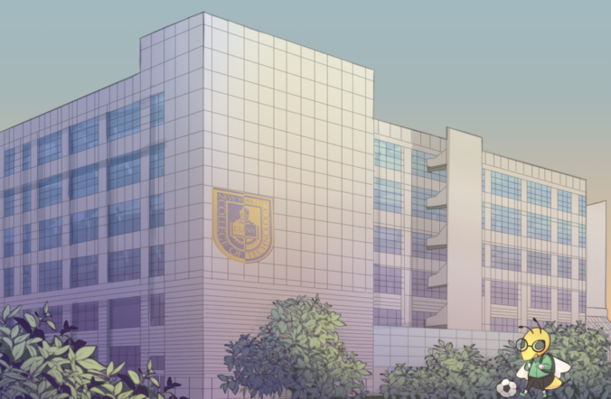
Created banner illustrations for Openlab for the course City Tech 101 for the Spring 2022 semester. This is a course that was taught and created by Professor Paruolo and Professor Goodlad in Summer 2021. Students learn lessons on how to become a college student as well as study strategies and how to navigate college resources. Since they are having four classes I decided it would have been great to represent the four main buildings we have on campus. The process for creating these began with recreating the school mascot, the yellow jacket. Then it was suggested that the mascot should be doing various student activities.

Continue reading

Faculty Commons Internship

Faculty Commons, A Center for Teaching, Learning, Scholarship, and Service coordinates all professional development, grants, and assessment activities of faculty at New York City College of Technology. Faculty Commons adopts a programmatic approach to professional development and operates as a faculty resource and think tank where members collaborate on a variety of projects to shape curriculum, pedagogy, and assessment. Continue reading

T-shirt Illustration

For this illustration, my client wanted a character with white hair, yellow eyes, and wore leather, and had two swords as well as a shadow which represents her other personality. This character is a DnD character that they had created which wields the power of the moon. They asked for a blizzard for background and this was the final result.

Continue reading

Massimo Vignelli Poster

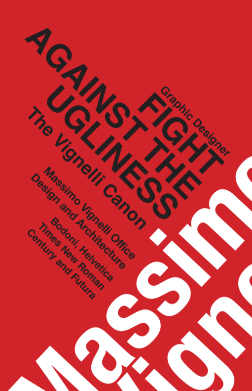
Typography poster inspired by Massimo Vignelli’s colors and grid method. This poster was printed and placed outside on display of City Tech’s library. In our class assignment, we had to pick a quote from our favorite designer and create posters using the grid technique. Originally I was trying to place things to fill the space but still align, at the end of the class I figured that I could tilt the text and still keep it aligned. The interesting shape created by the quote looked similar to a skyline which made it more meaningful and dynamic since Massimo Vignelli moved to New York later to work.

Continue reading

Communication Design 2 Packaging Mockups

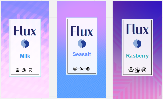
Flux is a bean-to-bar chocolate making company curated to bringing it’s customers the most authentic bar of chocolate. We strive to capture the true authenticity of each possible customer, celebrating a multicultural audience. It’s important to the Flux team that we keep in mind the way the world is constantly changing, and we want to change with you.

Continue reading

Communication design 2 Motion graphics

Please click on the images above for motion.

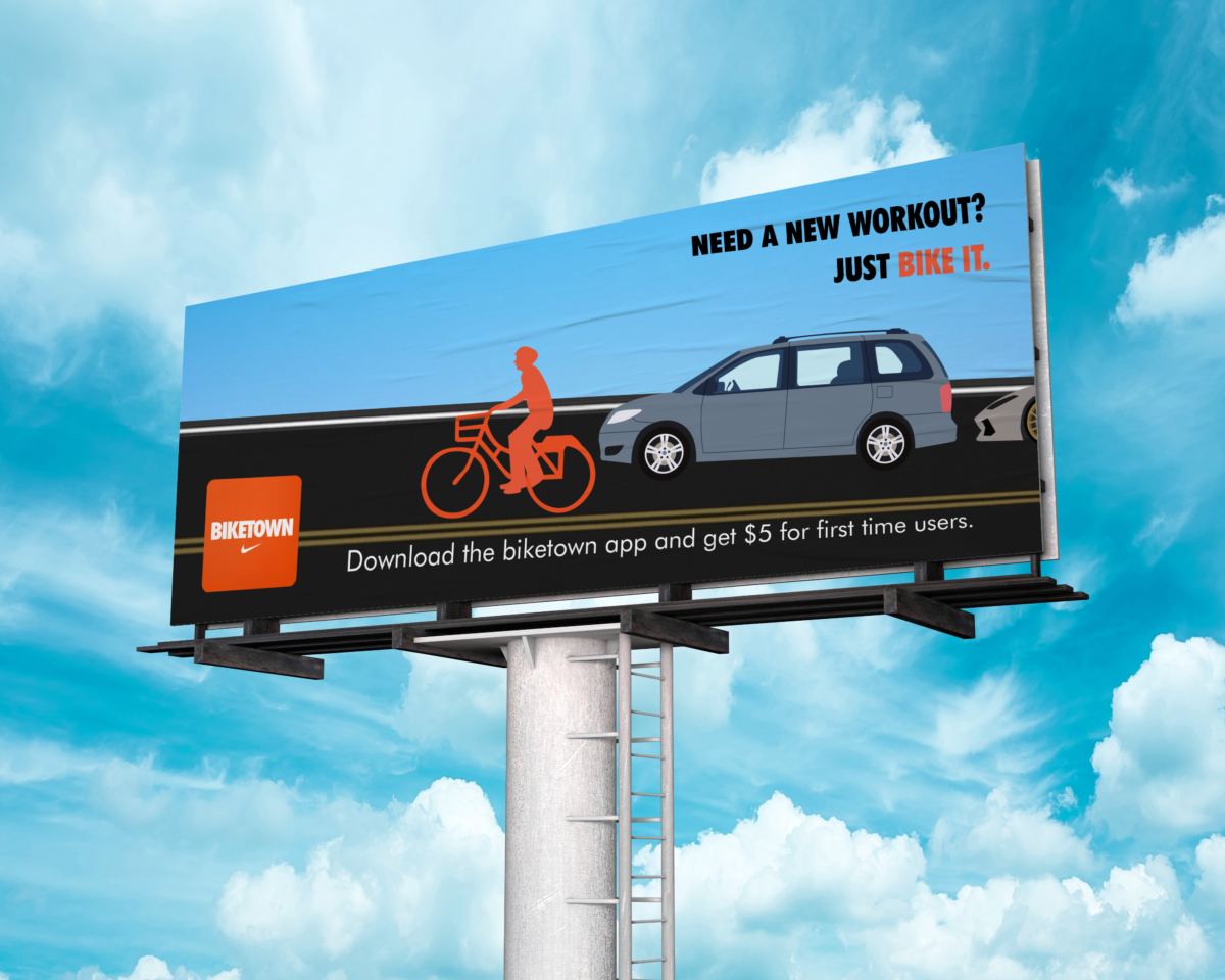
BIKETOWN will always continue to innovate and increase its service, finding better approaches to fill in the gaps of transportation needs of Portlanders. BIKETOWN will provide bike-share benefits that offer flexibility for any day-day activities whether you need to go to a tourist spot or if you just want a healthier life.  Such placement of these Ads in busy foot traffic areas will promote our bike-share experience with QR codes for on-the-go app sharing. For our social media advertisement, we wanted to promote our app by sharing the post and tagging three other people to get a chance to win an annual membership with us for a whole year!

Continue reading