Advanced Illustration
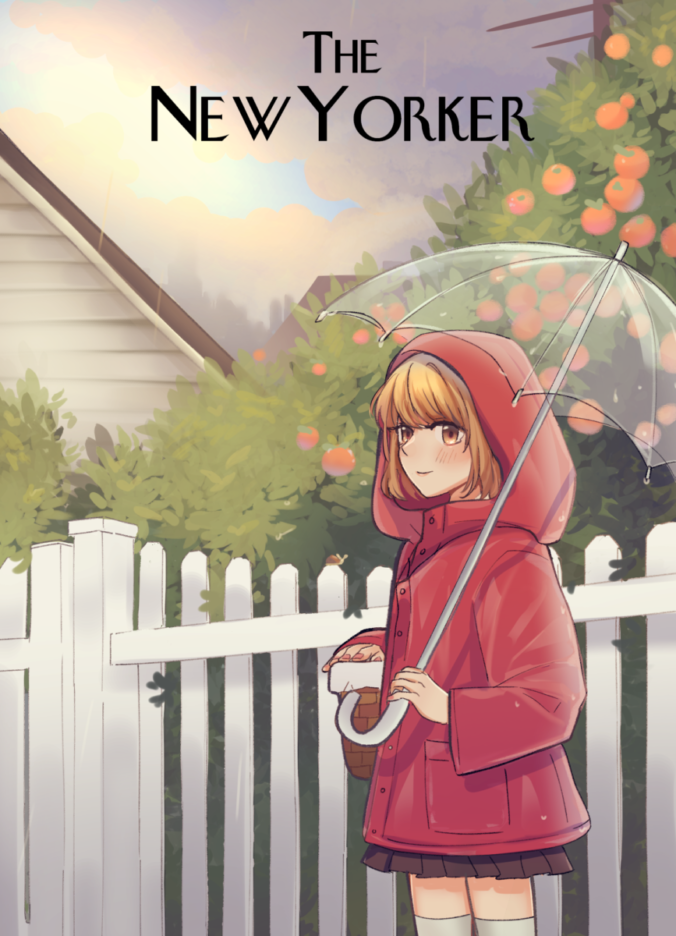
This is one of my favorite illustrations. In the New York Magazine cover the goal of the assignment was to deliver the news that New York is open. We were encouraged to draw our favorite activities of when the city is open and I chose walking in the rain with an umbrella to visit Grandma. The clouds are parting and the rain is stopping which is intended to give a sense that it’s finally over. I added oranges because I usually envision orchards and a warm family meal when arriving at the house. It was suggested that the character would be in a red raincoat so it feels like a red riding hood, I added the basket to add to that theme.
Sweets & Squeak
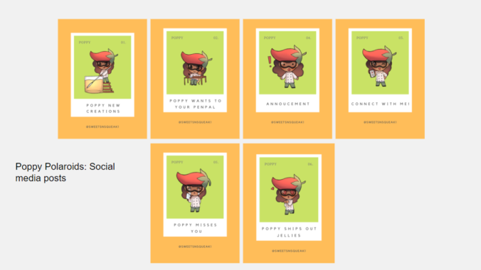
Sweet & Squeaks used the finest peppers and produced them into a unique new creation jam with a bit of kick to the taste to help customers have a new choice of condiments that could compliment any dish. Our goal was to promote the brand’s jelly since it could complement any meal. Collaborated with Tiana Ou to create thank you and menu cards for the character. We rebranded the mascot with my illustrations because as a team we believed that the small business could interact with their community more by featuring fan work and rewarding the ones they like best with their sample jelly jam. Tiana and I chose colors that resembled closely to the mascot to choose animations for the Instagram post that the small business could use since they desired more content for their social media.

Collaborated with Professor Woolley, Professor Guzman and Jennie Zhu Pan to create illustrations for a stem manual. The purpose of this project is to create a collaboration between COMD students and STEM faculty mentors to provide a client-artist experience for COMD students. In collaboration, the team will help develop a visually engaging soil mechanics manuscript. By working with one COMD professor and one Civil Engineering professor, COMD students will gain knowledge in the area of soil mechanics and create engaging and visual work for the book.
Technical information was discussed and exchanged with the client, art director, and students. Students relied on research and creativity to form and shape illustrations that are interactive and fit the subject matter, thus creating a process and finalized pieces that work well together in color and also translate well in black and white for the textbook.
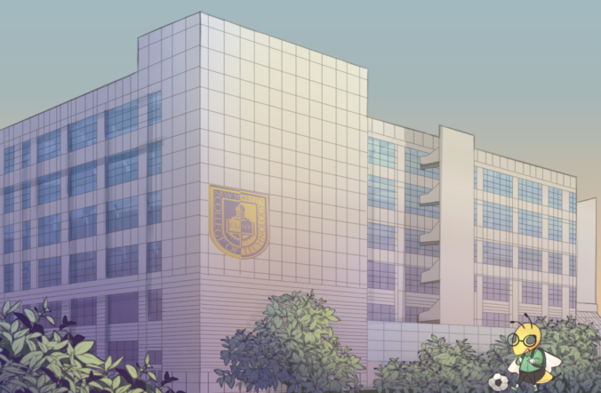
Created banner illustrations for Openlab for the course City Tech 101 for the Spring 2022 semester. This is a course that was taught and created by Professor Paruolo and Professor Goodlad in Summer 2021. Students learn lessons on how to become a college student as well as study strategies and how to navigate college resources. Since they are having four classes I decided it would have been great to represent the four main buildings we have on campus. The process for creating these began with recreating the school mascot, the yellow jacket. Then it was suggested that the mascot should be doing various student activities.
The apps that I have tested out are blender and cinema 4d.
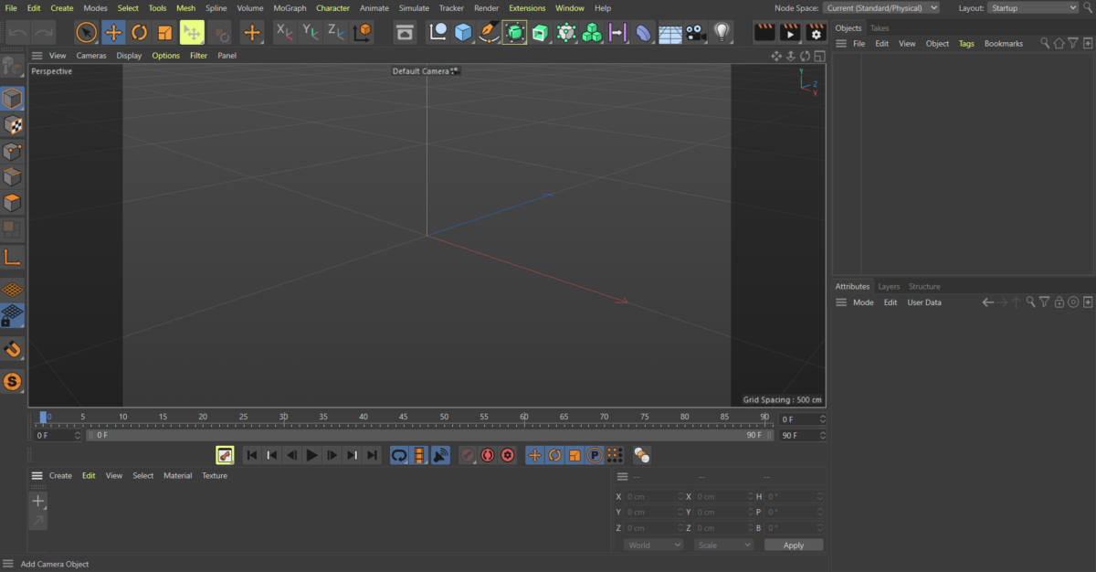
For Cinema 4d when you first open it you will see most of your basic tools on the top of the screen. On the right side, you will see your scene details, and below that are the properties. Cinema 4d does not have a basic scene set up and is blank when you first open it. On the bottom of the live preview is the timeline where you can view materials you have downloaded. This program is similar to blender in the sense that it has its scene on the right side and its tools on the left. The shortcuts are quite different as well as the mouse buttons. This program is paid and so far I have been able to use this program to sculpt and do a simple rendering of characters and items. I would assume blender would have the same feature as well. What stands out about this program over blender is the readily available materials that are searchable through the content browser in the middle of the program which looks like a box. You can drag and drop the material you want and apply it to your object by dropping it directly on the layer.
Animation is interesting in this program, you can view things through the lens of the camera and also get a preview of your render before you download it. I learned how to use a scalable vector graphic and create it as a 3d text by importing it into illustrator and saving it as an illustrator file. It has to be the older version because cinema 4d cannot read the newer version of illustrator. You can also paint the models you sculpt and also deform. All the necessary tools and options are on the top which I like but the scene organization can get confusing when you dabble into skies and formulas. You can use a formula to animate objects to float a certain way on repeat.
For Blender when you first open it up you will be brought to a scene with a basic cube, lighting, and camera. There are tools on the left side and on the top, you will see the different modes. On the right side, you will be able to organize your scene by placing objects in folders. I have not figured out how to color my models yet but this is similar to Cinema 4d as you can scale, rotate and duplicate. What makes this program more unique to me is that you can create low poly quite easily. Cinema4d has options to make text look more interesting by using caps, and the lighting is easy to use but if I want to model low poly I would prefer a blender. Both blender and cinema4d look confusing at first glance, it takes a lot of tutorials to learn both programs in my opinion because so many options are hidden between tiny steps that are easy to miss. But I think Blender is preferable since it’s free and tutorials are readily available as a lot of game devs turn to this program.
Faculty Commons Internship
Faculty Commons, A Center for Teaching, Learning, Scholarship, and Service coordinates all professional development, grants, and assessment activities of faculty at New York City College of Technology. Faculty Commons adopts a programmatic approach to professional development and operates as a faculty resource and think tank where members collaborate on a variety of projects to shape curriculum, pedagogy, and assessment. Continue reading
-
- Web banner
-
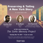
- Soho Memory
-
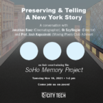
- Draft 1
-
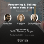
- Draft 2
I finished my work for Professor Hellman with Philip as my mentor. Everyone was very nice and insightful with their suggestions and I appreciate the long-distance I’ve come as a graphic designer. In this project, I learned that I should communicate frequently with my mentor and do my best to give out updates as soon as something happens so that they are aware I am still working on things. I also learned various things such as dimming down something is not the way to go. I should play around with color more and always give everything headspace and room as I would with my illustrations. I enjoyed this project very much! I only had one professor and one mentor to communicate with here. It was a successful meeting since Phil helped me create a timeline since I wasn’t too sure what to ask.
-
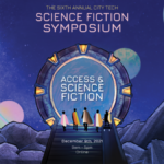
- Science Fiction Video Card
-
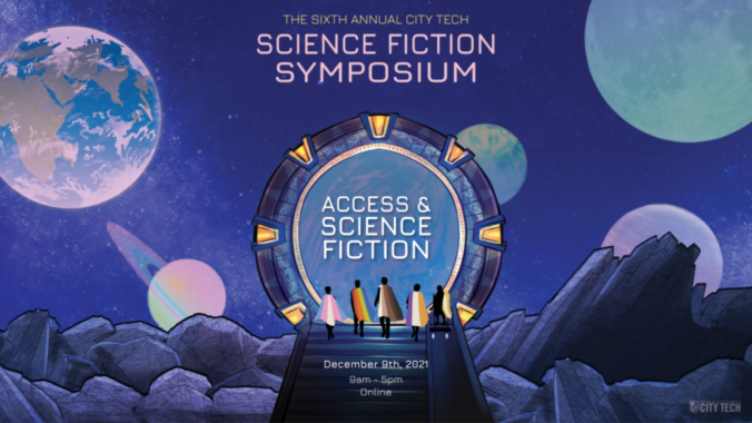
- Science Fiction VideoCard
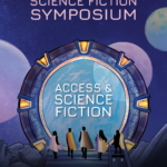
This is the poster finished working on with Professor Porter, Professor Ellis, and Professor Kwong. The theme is science fiction and access. My mentor is Or and she has helped me greatly with the suggestion of adding a stargate, the ramp as well as font options. Prof Biehl suggested that I had put Access and science fiction in the stargate and also helped me fit the text in. So far I am enjoying my time here at Faculty Commons since I feel like the suggestions I receive are very clear unlike some of the classes I’ve taken here at City Tech. I communicated with a mentor as well as three professors, it was successful because Or was able to help me break the silence.
As a self-evaluation, I think I performed okay in this internship. I need to work on asking meaningful questions so I can avoid the silence in the meetings. Our internship doesn’t have many virtual events, we hold weekly meetings every week and I’ve met very skilled people and seen their works. In my internship, we work with Anai, Cherise, June, and I had a mentorship opportunity with Or and Phil. I really appreciated learning the alignment tool and clicking the corners of the boxes to readjust the size from Phil, and measuring the space between objects with shapes and using ctrl c, ctrl alt shift v, clicking on an image with ctrl and then ctrl x to cut shortcuts from Or. I also learned how to make the title stand out with color, size, and caps. The internship was amazing and I learned a lot.
 Gordon parks created an exhibition of photos about migrant workers. He used his camera to expose the bad things of America such as poverty, racism, and discrimination.
The first piece that stands out to me is Gordon Parks Emerging Man, Harlem, New York 1952. Gelatin silver print, 8 7/16 × 12 7/8″ (21.4 × 32.7 cm). It’s a picture of a man coming out of a manhole cover. The reason why it stands out to me is that maybe this man is on the run and is using manhole covers to escape. It is also a possibility that they may live there since poverty is a big issue. The photo is in black and white and the subject is in the center of the composition. I chose this exhibition because I had designed a poster for it during the grace gallery. Scenes like these where someone may be emerging from a manhole cover are rare shots if it’s not staged. This picture is full of mystery since this man looks wary of the viewer. He doesn’t look comfortable but he does look like he’s been there for a long time and knows how to navigate.
The second piece that stands out to me is Gordon Parks Harlem Gang Wars 1948, Gelatin silver print, 10 15/16 × 10 1/2″ (27.9 × 26.7 cm). It’s a verticle composition of a couple of people fighting on the street. Gordon Parks used his camera to take multiple pictures of what life is like in a neighborhood with gang wars and some publishing agencies took these photos and printed them out. This photo is in black and white as well and it makes me remember that New York used to be a very dangerous place, and it still is. It makes me think that a lot of crime is not talked about as well. People don’t mention the gang activities that happen elsewhere in the school, nor do they look back at the somewhat recent lootings of Manhatten when riots broke loose. Without photographers like Gordon Parks, a lot of truth is buried since people rely on the news and their perspective too much. Photos to me are more of an unbiased thing that allows the viewer to make their own judgments.
Another one that stands out to me is Gordon Parks Untitled, Harlem, New York 1948. Gelatin silver print 10 5/16 × 13 1/4″ (26.2 × 33.7 cm). This one stands out to me because it’s a picture of trash on the streets. On the right side is a trash can that’s full and next to another staircase are two that are full with some litter on the floors. It’s not much different now and then with the trash on the streets. In modern life in New York, there is somewhat less trash depending on what location you are in but it does come across that not everyone cares about the city’s condition. The more trash a neighborhood has it gives off the idea of poverty, filth, and danger to me at least. I feel like an exhibition online is way different than when I visited the poster house for Alphonse Mucha. Seeing things for their real size lets you see all the little things added that you may have missed online unless you zoomed up and stared long at them. However, I do prefer the option of a virtual visit given the circumstance.
• For each of the three artworks you select, be sure to include the name of the artist, the size of the piece, and the medium (oil painting on canvas, bronze sculpture, print etc.). The subject should be discussed also–abstract or representational, etc.
• Color, type, texture, composition should all be discussed
• Discuss why you selected the piece and your response to it. It could be either a positive or negative response.
• You can also discuss how a virtual experience of an exhibit compared to visiting a museum in person and write about whether you felt the virtual tour was effective, providing a rationale for that opinion.

T-shirt Illustration
For this illustration, my client wanted a character with white hair, yellow eyes, and wore leather, and had two swords as well as a shadow which represents her other personality. This character is a DnD character that they had created which wields the power of the moon. They asked for a blizzard for background and this was the final result.

