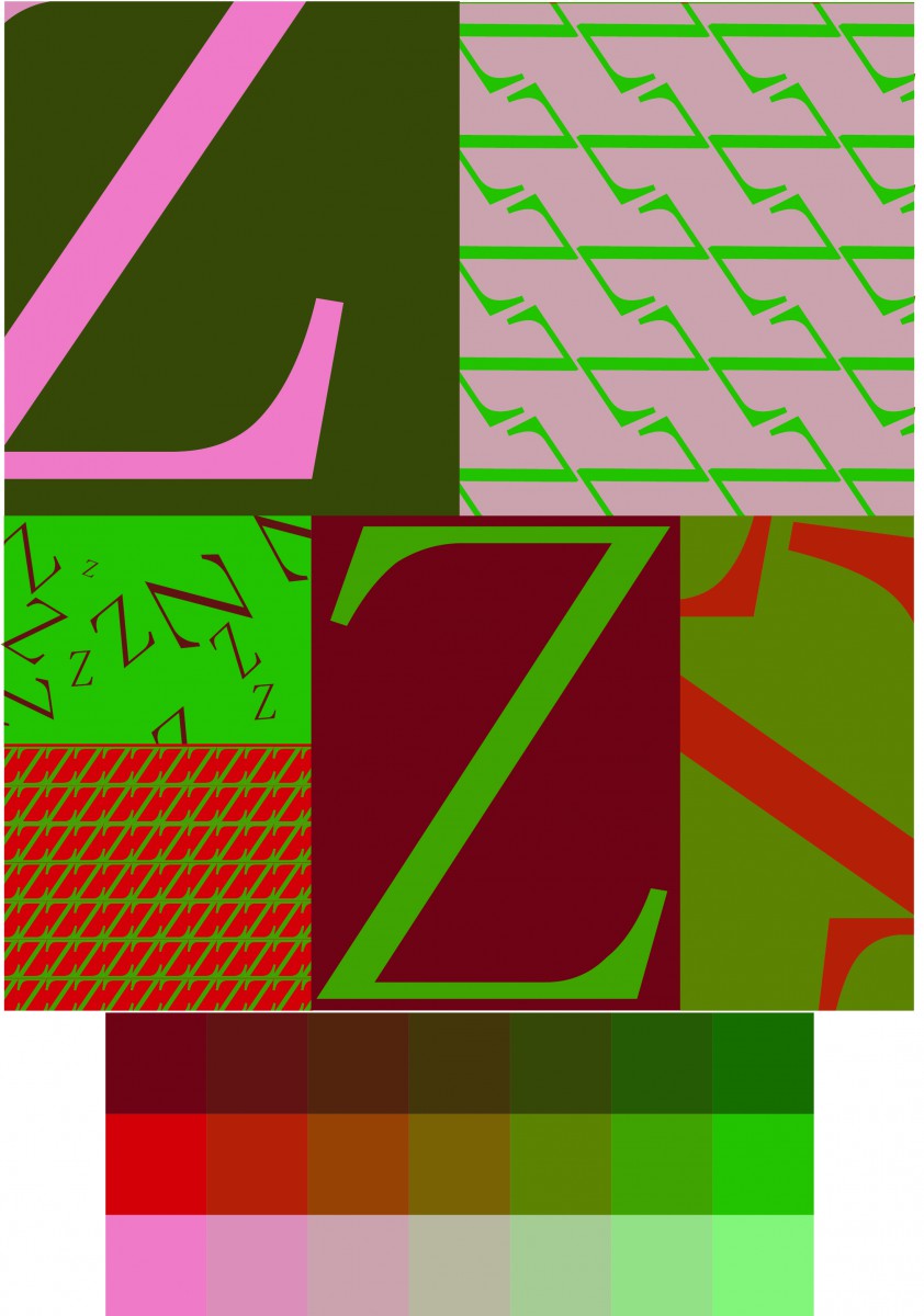
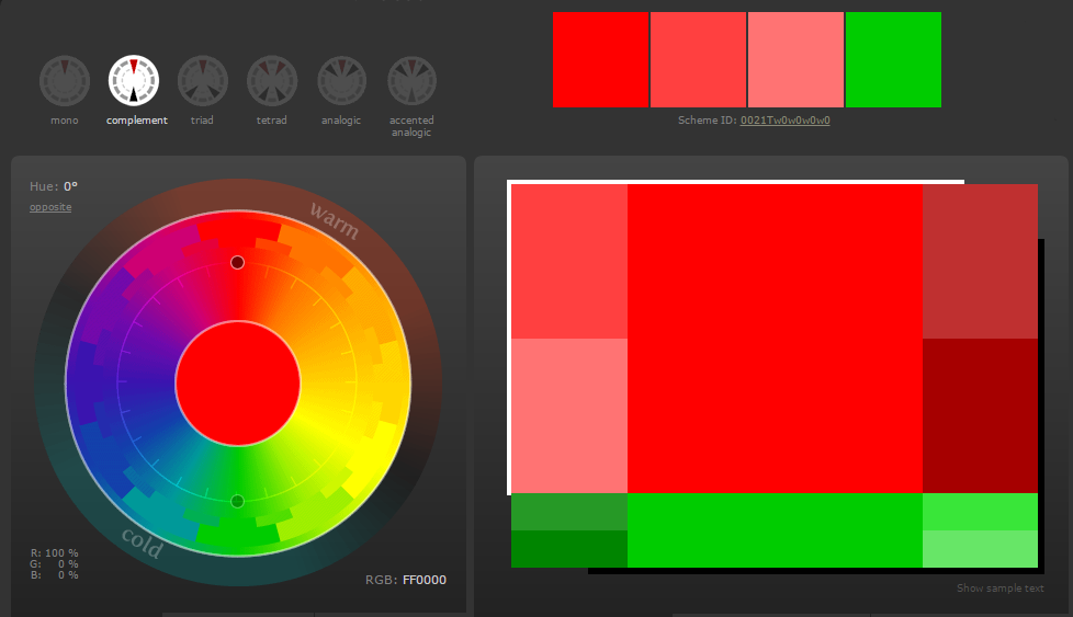
For this assignment students were encourage to utilize complimentary color, colors that contrast with eachother, this colors are found in opposite sides on the color wheel, also know as contrasting colors.
After choosing the complimentary colors that are gonna be apply in the painting, both colors were used in three different values, which where altered by having a tint (adding white) and a shade (Adding Black).
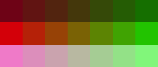
By combining the two complimentary colors I was able to create 5 more colors with different intensity. this was approach by using the blender tool on Illustrator.
The letter that I decided to used was the letter Z, and by creating patterns and small designs without modifying the letter in any major way than just cutting it so its able to fit inside the rectangular canvas.

By using the complimentary colors in different intensities, the background must be complimentary from the letter or designs in it. Background has a bright intensity of green, while letter has a low intensity of red making it complimentary, the value of the colors are different.

