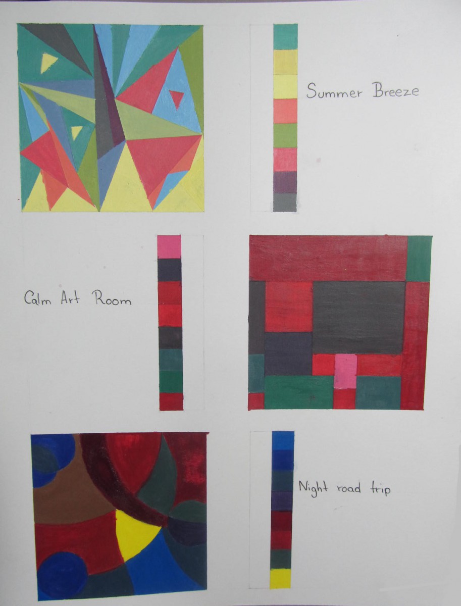
For this assignment we were gave three topics which in which each design was build upon that topic. The topics that were used were nature, comfortable room and night life, making abstract paintings.
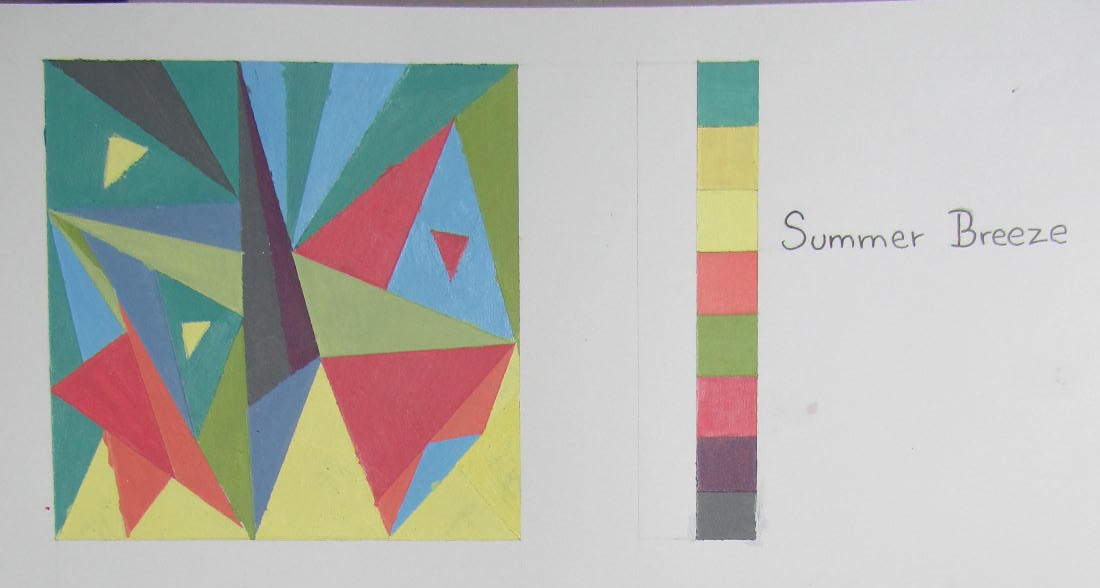
For this peace I base in medium value key, this colors represent nature itself using complimentary colors, the complimentary colors used in this where red and green, purple and yellow, and blue and orange. Utilizing their warm colors to represent summer and cold colors to represent and abstract of the feeling of the breeze.
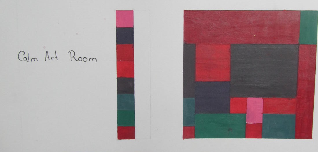
On this piece I implement dark value color, which represent what I consider a calm room in which I feel safe and at the same time helps my creativity grow. this piece also use complimentary colors as well Intensity colors in which I was very fascinating to archive a such a dark value color that is closer to black.
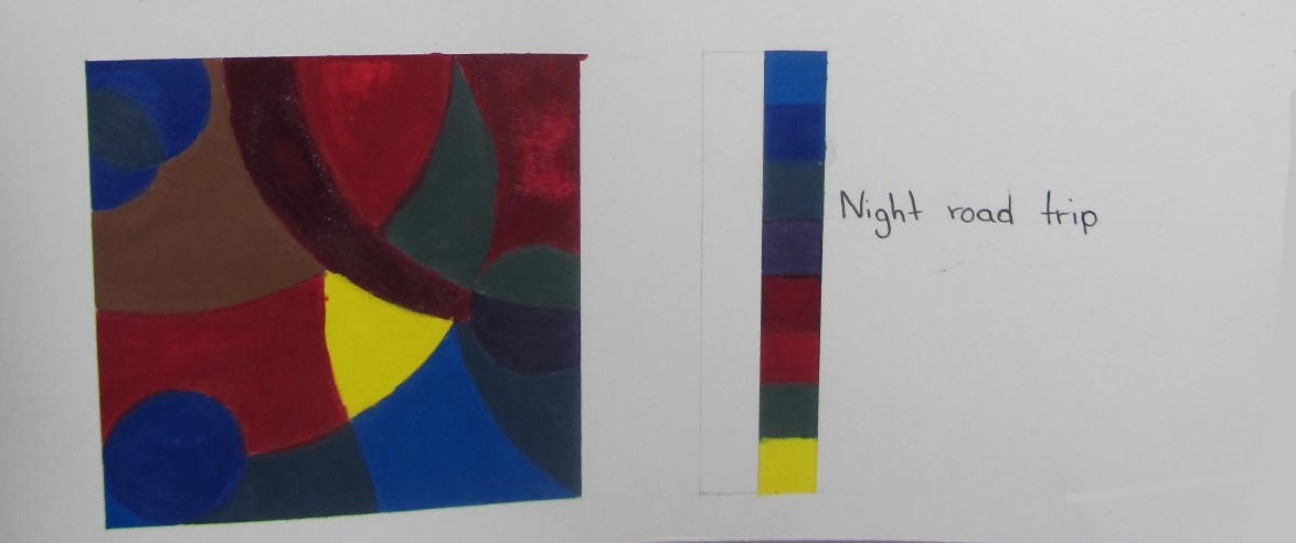
For my final piece I also used dark value colors to represent night life, In this piece I used primary colors to represent the colors that people tent to most likely see during the night.

