The Man Who Designed Manhattan

The Man Who Designed Manhattan

by Anne Binlot


06tmag-bierut-master675

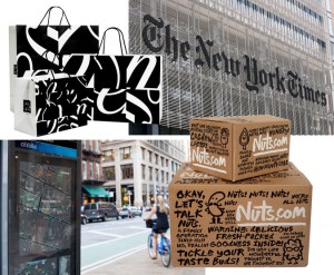
This article in the T-Magazine section of the New York Times website is about graphic designer Michael Bierut. Bierut designed the sign on the new NY Times building. Taking the physicality of the sign as a challenge, for one the people in the offices want to be able to see through their window. “Bierut and the design firm Pentagram found a simple solution: ‘We ended up decomposing the logo itself into 800 plus smaller pieces, each one is shaped like a teardrop” (Bierut). With the sign being broken up into smaller pieces that don’t obstruct the views, it also became a metaphor for “journalism as an enabler of transparency” (Bierut).

Bierut is a very accomplished designer having his hand in many icons in our New York City landscape. There is a retrospective of his work up at the SVA Chelsea Gallery featuring his sketchbooks, which you can flip through in this article. I loved looking at Bierut’s sketchbooks, you can really see him hashing out an idea in thumbnails taking it in different directions.


Layering

Brent Couchman

In this design Couchman deploys layering in two ways in this design. One way is layering simplistic shapes to build objects, buildings and scenery. The second is layering the different scenes to overlap and make a sort of venn diagram that signals to the viewer that these different places have a unifying relationship.

Paul Tebbott

Tebbott layers two silhouettes right on top of the other. There is the human profile which is filled in with a solid yellow, and layered directly on top is a black silhouette of a bird. It’s done very neatly and has a nice contrast of the bird’s sharp beak and the humans organic shape.

Gottschalk + Ash

G + A create dimension with layering, its effect is like blocks stacked or a staircase. I like the contrast of the photo against the shapes without outlines. It’s interesting how the colors vibrate against the black and white.  Found this book cover on this montagueprojects. This blog posts old book covers that they find interesting.

Spatial Depth


Olly Moss’s poster for the movie Rocky

Moss’s design conveys spatial depth through using scale the large man shape at the bottom with rectangles ascending by size. Contrast also helps giving a sense of atmospheric perspective-things in the distance appearing lighter.


Paul Rand poster for UCLA

Spatial depth is achieved by a contrast of scale. Since UCLA 75 is large and center the viewer feels that it is closest. The small 75’s scattered behind feel very far from the viewer.


Paul Rand logo for United Way

In this logo Rand communicates space through scale. The hand appears to be in perspective with the thumb and forefinger closest to the viewer and compared to the small “Y” figure looks far or at the end of the hand. The arch above also gives the viewer something to relate the “Y”-figure.

Current Student’s Work: ALEX LARDARO

Alex Lardaro is a recent graduate of Parsons, earned a BFA in Communication Design. Her project that I found on their student work website is called WELL SPENT. This piece is a website that is an “evolving digital collection of user responses to a series of questions that empowers and encourages users to look at their and others’ time as parts of a whole.”  The idea steams from our society’s expansion of life expectancy, how if life is increased then customary milestones are later. Users are asked what they would do with their extra time, and their answer shows up on WELL SPENT along side others.

I thought that this project is really fun in a way that one can entertain the idea of winning the lottery except with time! It also helps us contemplate the possibility for more time for experiences.

Here’s her website if you want to check out more:

http://www.alexlardaro.com/