In class we learned how to make a spirograph with CS-Illustrator! Here it is in 9 values (black-white) 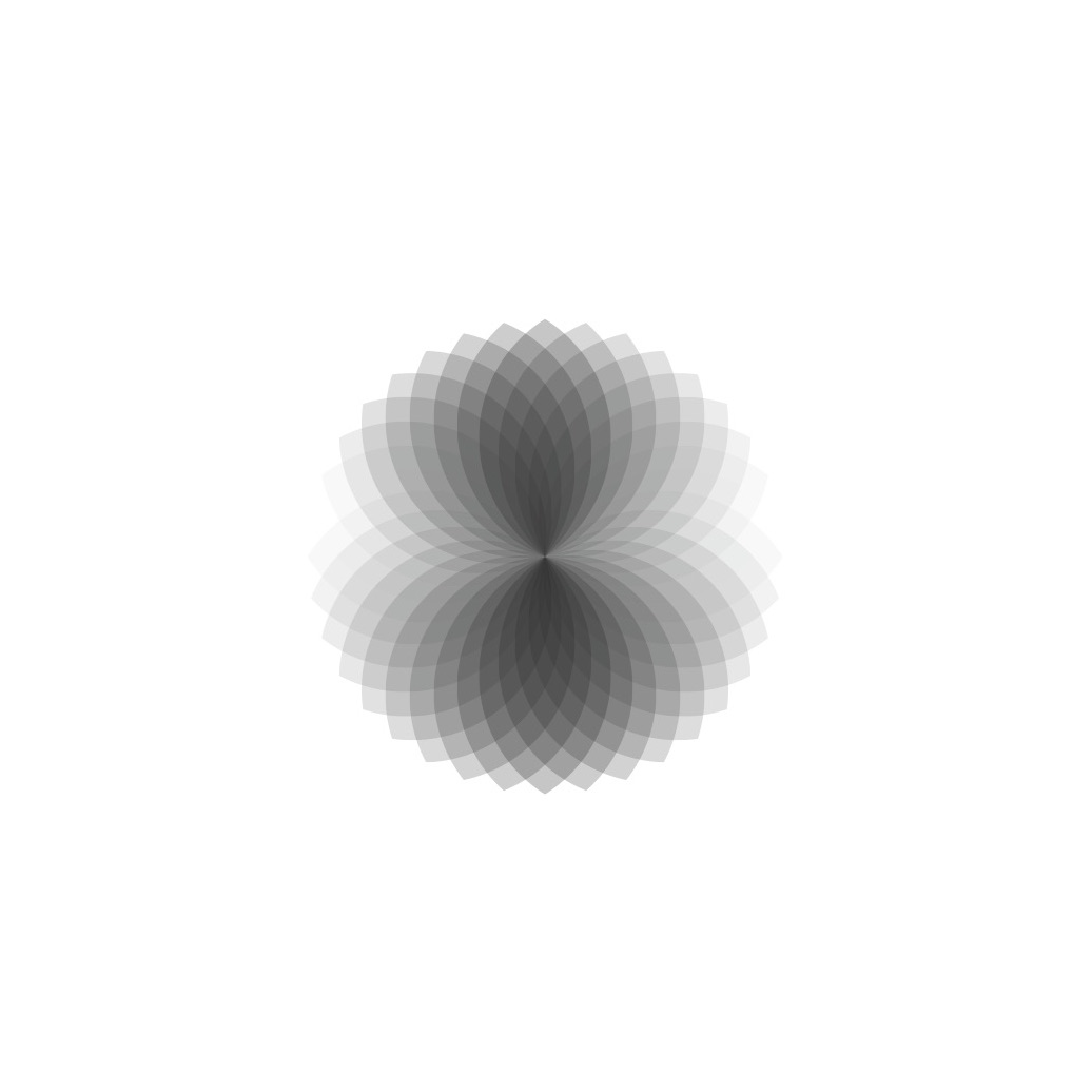
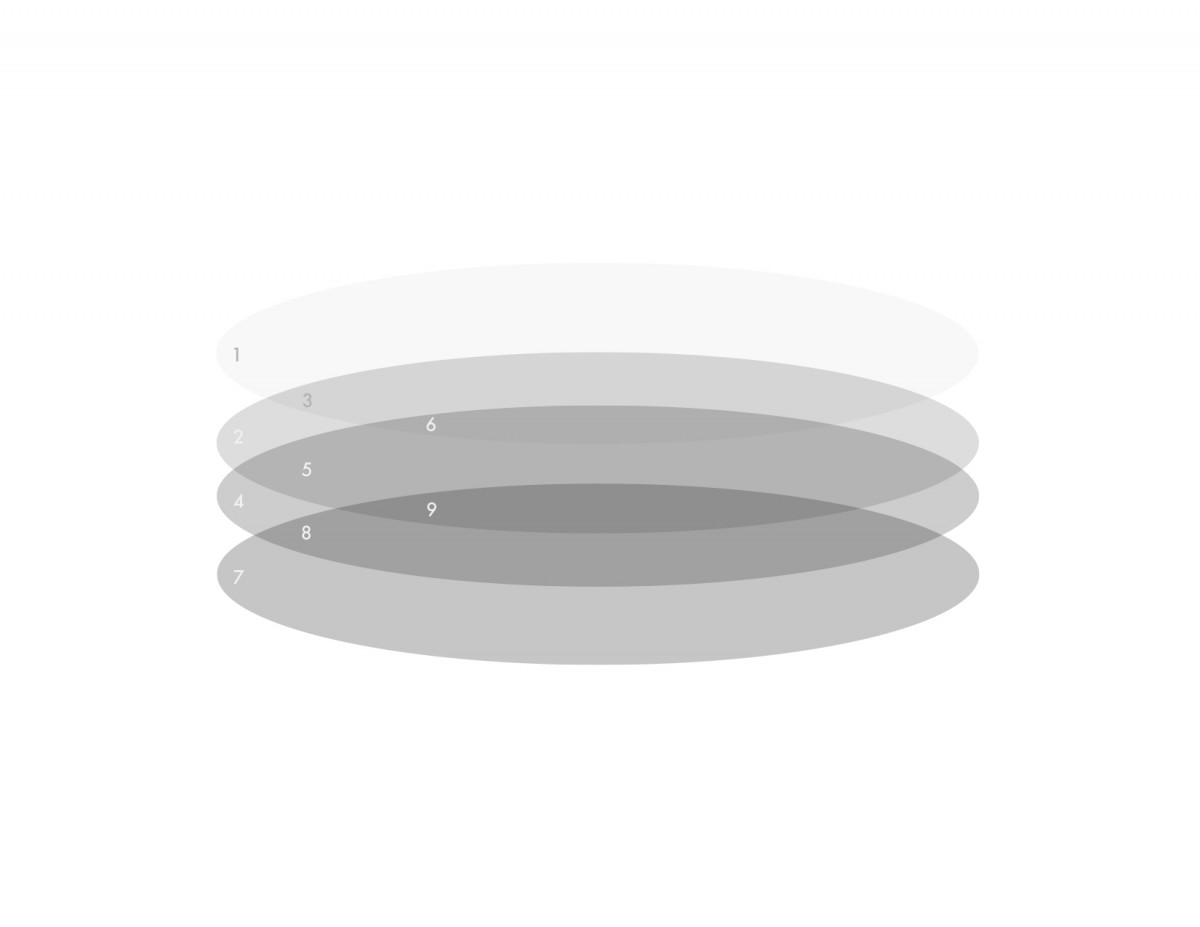
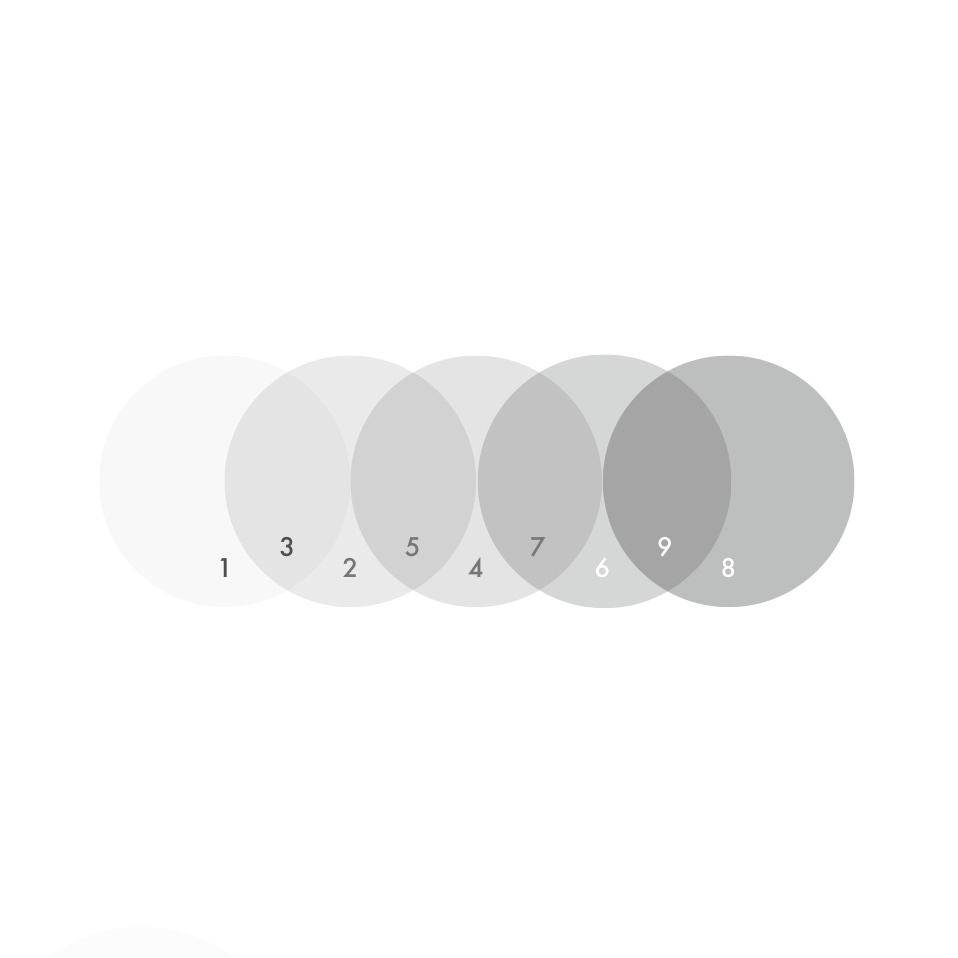
Here are 5 compositions in a 9-Value scale using transparency and layering I made with CS-Illustrator.


In class we learned how to make a spirograph with CS-Illustrator! Here it is in 9 values (black-white)
Here are 5 compositions in a 9-Value scale using transparency and layering I made with CS-Illustrator.

Olly Moss’s poster for the movie Rocky
Moss’s design conveys spatial depth through using scale the large man shape at the bottom with rectangles ascending by size. Contrast also helps giving a sense of atmospheric perspective-things in the distance appearing lighter.

Paul Rand poster for UCLA
Spatial depth is achieved by a contrast of scale. Since UCLA 75 is large and center the viewer feels that it is closest. The small 75’s scattered behind feel very far from the viewer.
Paul Rand logo for United Way
In this logo Rand communicates space through scale. The hand appears to be in perspective with the thumb and forefinger closest to the viewer and compared to the small “Y” figure looks far or at the end of the hand. The arch above also gives the viewer something to relate the “Y”-figure.

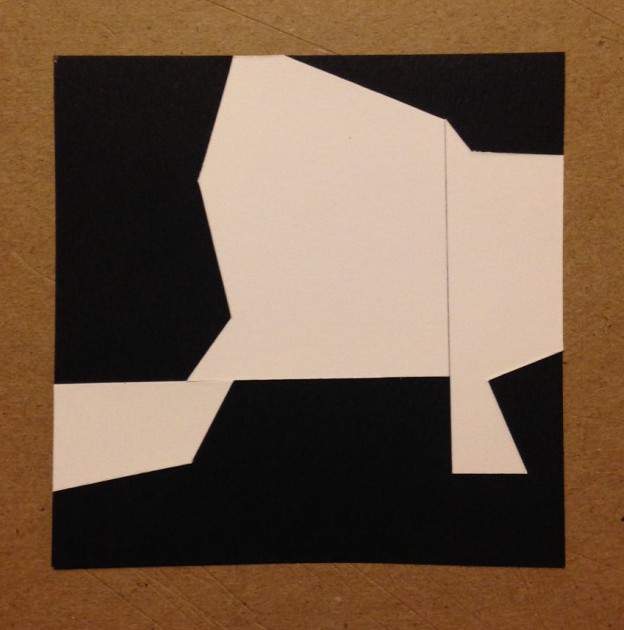
1.


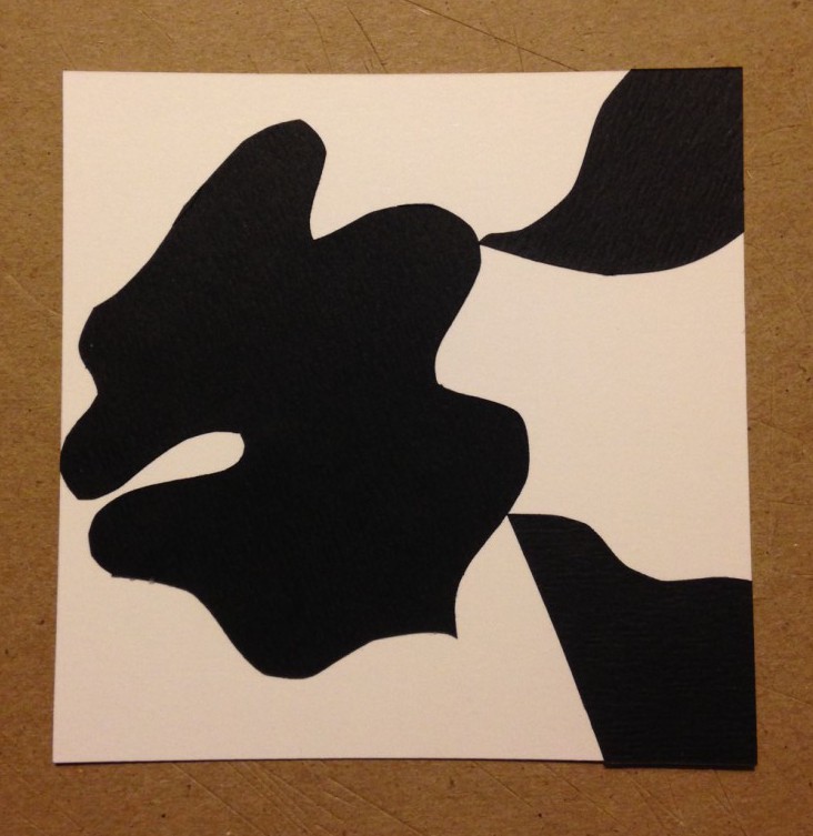
2.


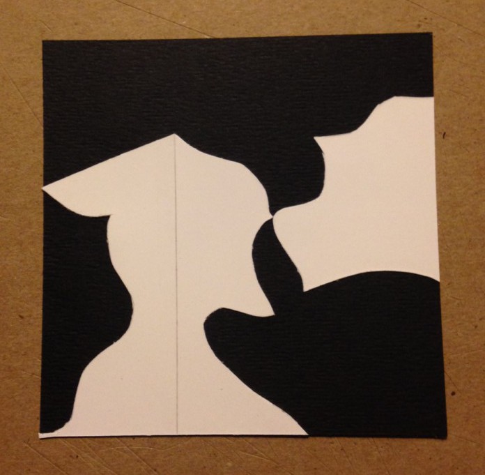
3.

Alex Lardaro is a recent graduate of Parsons, earned a BFA in Communication Design. Her project that I found on their student work website is called WELL SPENT. This piece is a website that is an “evolving digital collection of user responses to a series of questions that empowers and encourages users to look at their and others’ time as parts of a whole.” The idea steams from our society’s expansion of life expectancy, how if life is increased then customary milestones are later. Users are asked what they would do with their extra time, and their answer shows up on WELL SPENT along side others.
I thought that this project is really fun in a way that one can entertain the idea of winning the lottery except with time! It also helps us contemplate the possibility for more time for experiences.
Here’s her website if you want to check out more:
3 websites for Inspiration
1. DESIGN MILK
2. PICDIT
3. MoMA
The OpenLab is an open-source, digital platform designed to support teaching and learning at City Tech (New York City College of Technology), and to promote student and faculty engagement in the intellectual and social life of the college community.

