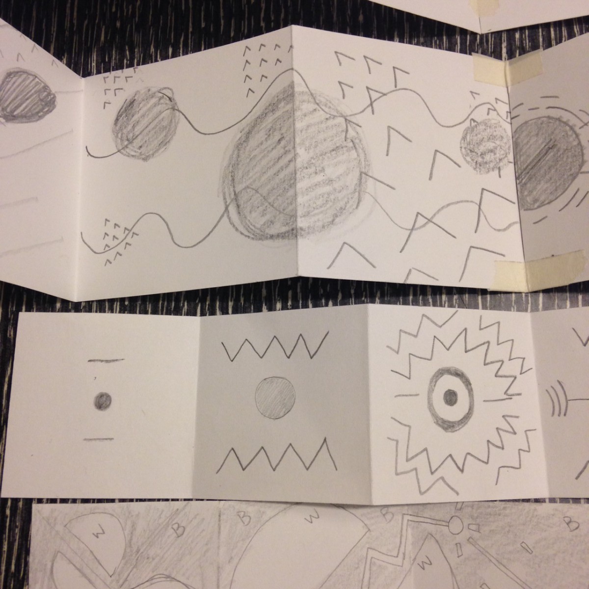
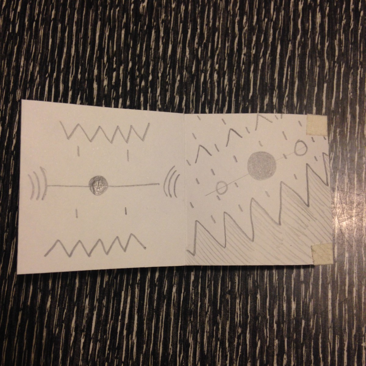
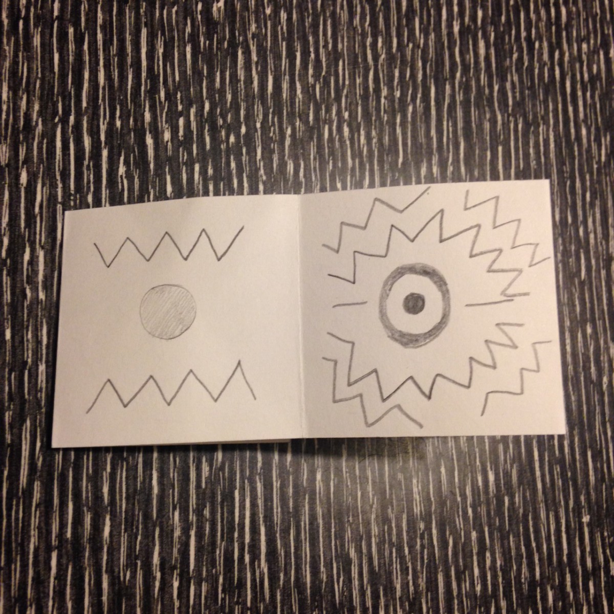
In class we learned how to make a spirograph with CS-Illustrator! Here it is in 9 values (black-white) 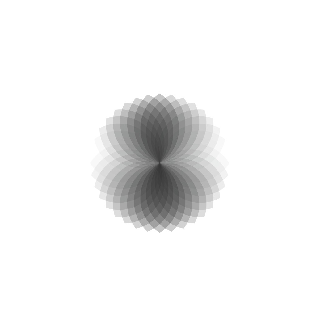
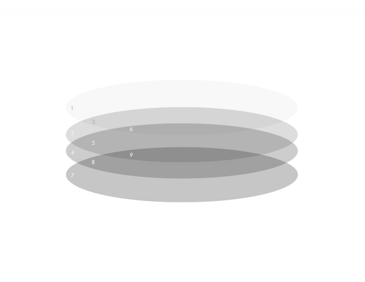
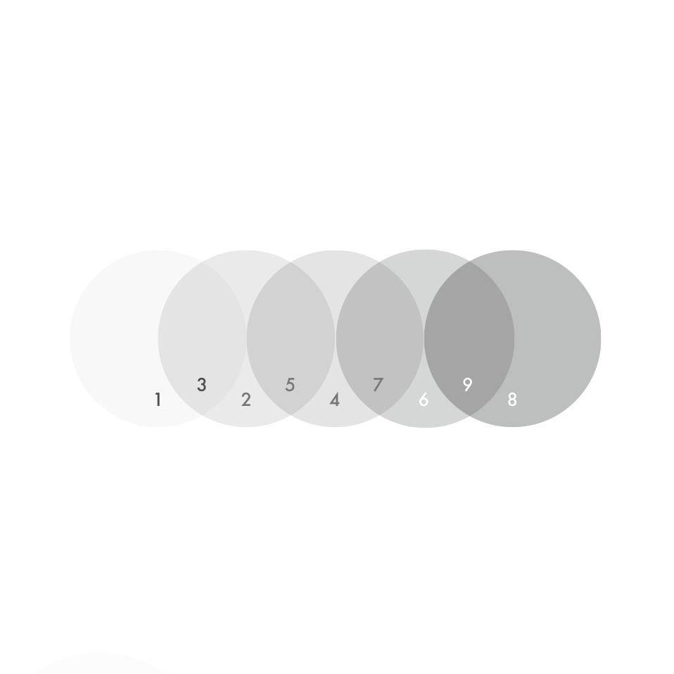
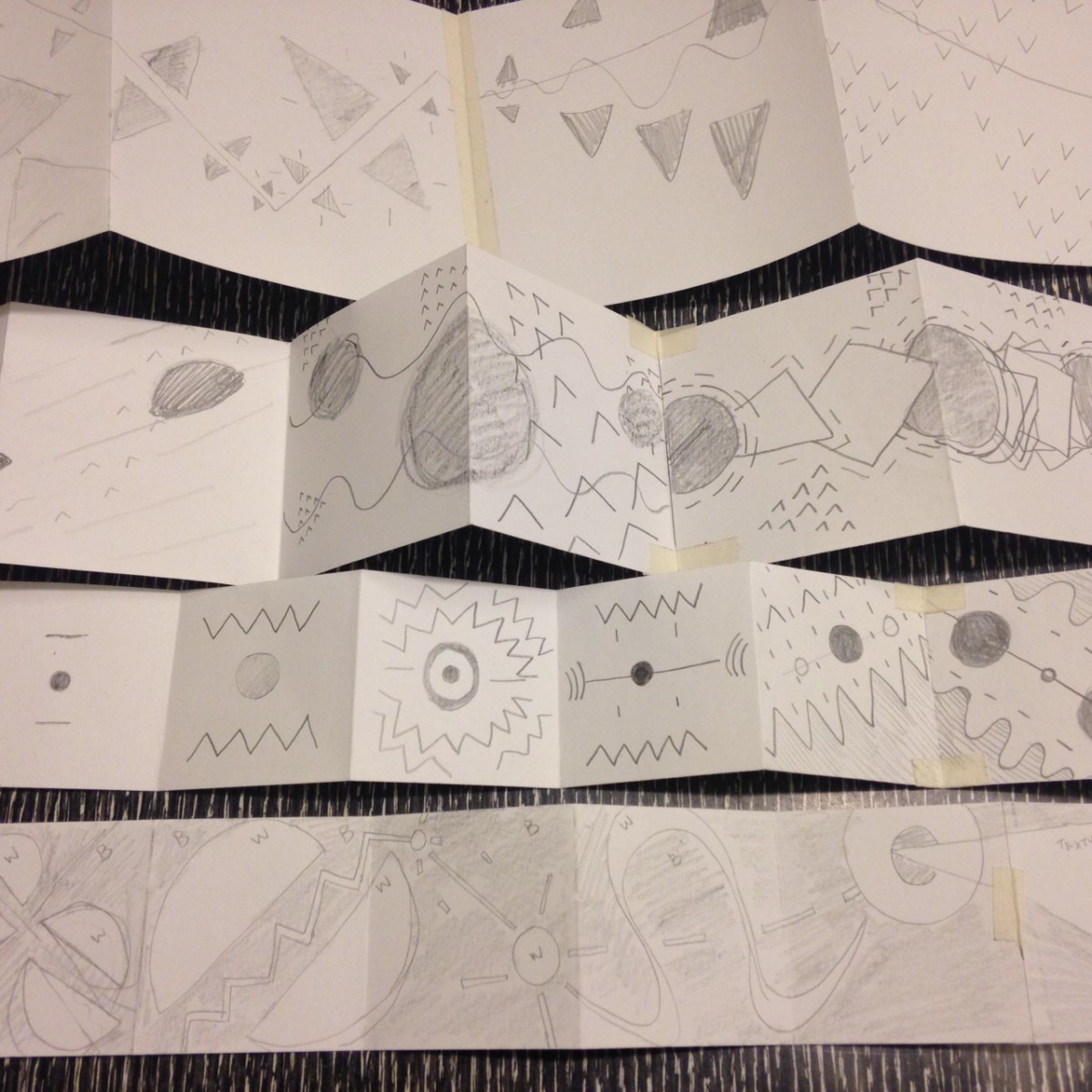
Here are 5 compositions in a 9-Value scale using transparency and layering I made with CS-Illustrator.


In class we learned how to make a spirograph with CS-Illustrator! Here it is in 9 values (black-white)
Here are 5 compositions in a 9-Value scale using transparency and layering I made with CS-Illustrator.

Brent Couchman
In this design Couchman deploys layering in two ways in this design. One way is layering simplistic shapes to build objects, buildings and scenery. The second is layering the different scenes to overlap and make a sort of venn diagram that signals to the viewer that these different places have a unifying relationship.

Paul Tebbott
Tebbott layers two silhouettes right on top of the other. There is the human profile which is filled in with a solid yellow, and layered directly on top is a black silhouette of a bird. It’s done very neatly and has a nice contrast of the bird’s sharp beak and the humans organic shape.
Gottschalk + Ash
G + A create dimension with layering, its effect is like blocks stacked or a staircase. I like the contrast of the photo against the shapes without outlines. It’s interesting how the colors vibrate against the black and white. Found this book cover on this montagueprojects. This blog posts old book covers that they find interesting.

Olly Moss’s poster for the movie Rocky
Moss’s design conveys spatial depth through using scale the large man shape at the bottom with rectangles ascending by size. Contrast also helps giving a sense of atmospheric perspective-things in the distance appearing lighter.

Paul Rand poster for UCLA
Spatial depth is achieved by a contrast of scale. Since UCLA 75 is large and center the viewer feels that it is closest. The small 75’s scattered behind feel very far from the viewer.
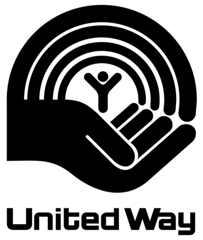
Paul Rand logo for United Way
In this logo Rand communicates space through scale. The hand appears to be in perspective with the thumb and forefinger closest to the viewer and compared to the small “Y” figure looks far or at the end of the hand. The arch above also gives the viewer something to relate the “Y”-figure.
The OpenLab is an open-source, digital platform designed to support teaching and learning at City Tech (New York City College of Technology), and to promote student and faculty engagement in the intellectual and social life of the college community.

