What have I learned in graphic design principles I

All the basic principles were familiar, we all learn about these subconsciously. In this class it made me define and think about each principle and how to combine them to organize visual information in the form of shapes within a composition.

Presenting design journal every class first thing, to first organize a presentation in 10 mins, get up and actually present to the class, was at first very painful, but so helpful. This gives us practice in team work, and how to take initiative to participate. My entire academic career presenting was what I dreaded the most. Now I don’t feel like my heart will explode, which is a big deal for me. I always felt that my anxiety has kept me from expressing my thoughts and ideas at times.

This class was taught in a very interactive way that makes it easier to digest the information. Videos, power points, team/group exercises, design journal, and projects. The projects were really helpful because of the way they corresponded with the principles that we were learning about, they reinforce the principle in my mind. After this class I feel confident that the basic design principles are now in my creative tool belt.

Thank you!


Field Trip: Cooper Hewitt Smithsonian Design Museum

Screen Shot 2015-11-27 at 11.14.35 PM
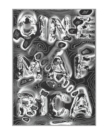
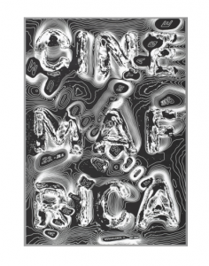
CINEMA AFRIKA FILMTAGE (AFRICAN FILM FESTIVAL), POSTER CREATED BY RALPH SCHRAIVOGEL, 2006
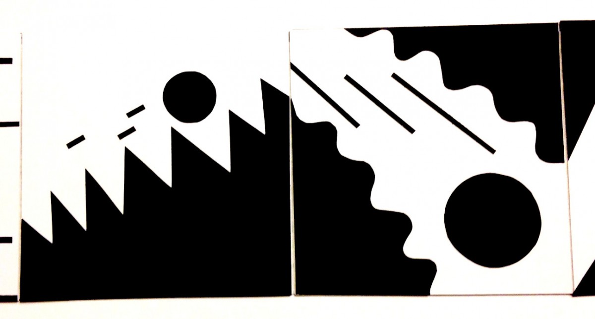
Ralph Schraivogel, a Swiss graphic designer, is known for his astonishing posters for cultural institutions, each one resulting from intensive visual exploration. The linear patterns that radiate from the words “Cinema Afrika” resemble topographic lines on a map. Concentric lines engulf this edgeless, borderless landscape, leaving planes and boundaries uncertain.”(collection.cooperhewitt.org)

This poster is successful in captivating the viewers eye. One could enjoy it’s graphic, map like quality or meditate on its message.

Screen Shot 2015-11-28 at 10.48.29 AM

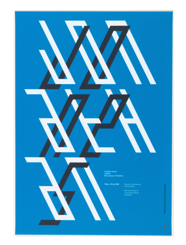
JONATHAN JONES: UNTITLED (THE TYRANNY OF DISTANCE), POSTER, 2008

This poster was designed by Mark Gowing and for the client Sherman Comtemporary Art Foundation in 2008 for the Australian artist Jonathan Jones. Jone’s installation titled UNTITLED (The Tyranny of Distance) consisted of “six free standing walls have been covered in blue tarpaulin and glow with filtered light from fluorescent tubes articulated in a continuous chevron design. The chevrons are derived from elements of traditional Koori (South Eastern Aboriginal) line work and resonate with Western minimalism.”

Jones installations exudes the attitudes of post-colonial art, by reflecting on indigenous culture of his country and translating it into modern materials. I think the graphic designer achieved the perfect poster for the artist’s exhibition without it being literal.

Here’s a link to the exhibition.


Screen Shot 2015-11-28 at 1.34.30 PM 
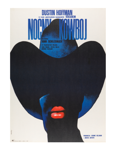
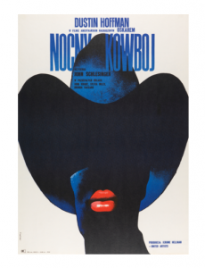
NOCNY KOWBOJ (MIDNIGHT COWBOY) POSTER, 1973

“Under the communist regime in Poland, many artists turned to creative expression via the medium of the poster. The state did not control the visual content of posters as they were typically used to promote cultural events and were therefore not considered advertisements or political propaganda. Waldemar Swierzy’s use of abstract imagery in his movie posters, like this one for the Polish release of American director John Schlesinger’s film “Midnight Cowboy,” took advantage of a greater freedom to communicate potentially controversial topics; in this instance, male prostitution.”  (collection.cooperhewitt.org)

This poster and the history behind it inspires me to look into more polish posters from this time. The American version of the poster is only a picture of Dustin Hoffman and Jon Vioght looking rough on a littered street, it’s not as clear or foreshadow what the movie is about as this Polish version.

Screen Shot 2015-11-28 at 10.13.00 AM

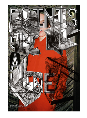
POINTS OF A LINE, A FILM BY SARAH MORRIS, POSTER, 2010

Sarah Morris is s a painter and filmmaker who’s influence and subject is architecture. “She comes to architecture, her primary subject, less from the aesthetic standpoint one might expect and more from a psychological and political perspective; her work subtly mines architecture’s inextricable links to power—to corporations and governments, not to mention the inevitably enormous egos behind its creation in the first place.” (http://www.architecturaldigest.com/)

In Points of a Line, Morris’ art film focuses on The Farnsworth House, Plano, Illinois and the Glass House, New Canaan, Connecticut. 

I like this poster as it is, but after researching what the film and the Artist are about, I don’t think it’s appropriate. It feels like the graphic designer did what they wanted without even caring to interpret what the film was actually about. Here’s a link to the video on vimeo.

The Man Who Designed Manhattan

The Man Who Designed Manhattan

by Anne Binlot


06tmag-bierut-master675

This article in the T-Magazine section of the New York Times website is about graphic designer Michael Bierut. Bierut designed the sign on the new NY Times building. Taking the physicality of the sign as a challenge, for one the people in the offices want to be able to see through their window. “Bierut and the design firm Pentagram found a simple solution: ‘We ended up decomposing the logo itself into 800 plus smaller pieces, each one is shaped like a teardrop” (Bierut). With the sign being broken up into smaller pieces that don’t obstruct the views, it also became a metaphor for “journalism as an enabler of transparency” (Bierut).

Bierut is a very accomplished designer having his hand in many icons in our New York City landscape. There is a retrospective of his work up at the SVA Chelsea Gallery featuring his sketchbooks, which you can flip through in this article. I loved looking at Bierut’s sketchbooks, you can really see him hashing out an idea in thumbnails taking it in different directions.


Layering

Brent Couchman

In this design Couchman deploys layering in two ways in this design. One way is layering simplistic shapes to build objects, buildings and scenery. The second is layering the different scenes to overlap and make a sort of venn diagram that signals to the viewer that these different places have a unifying relationship.

Paul Tebbott

Tebbott layers two silhouettes right on top of the other. There is the human profile which is filled in with a solid yellow, and layered directly on top is a black silhouette of a bird. It’s done very neatly and has a nice contrast of the bird’s sharp beak and the humans organic shape.

Gottschalk + Ash

G + A create dimension with layering, its effect is like blocks stacked or a staircase. I like the contrast of the photo against the shapes without outlines. It’s interesting how the colors vibrate against the black and white.  Found this book cover on this montagueprojects. This blog posts old book covers that they find interesting.

Spatial Depth


Olly Moss’s poster for the movie Rocky

Moss’s design conveys spatial depth through using scale the large man shape at the bottom with rectangles ascending by size. Contrast also helps giving a sense of atmospheric perspective-things in the distance appearing lighter.


Paul Rand poster for UCLA

Spatial depth is achieved by a contrast of scale. Since UCLA 75 is large and center the viewer feels that it is closest. The small 75’s scattered behind feel very far from the viewer.


Paul Rand logo for United Way

In this logo Rand communicates space through scale. The hand appears to be in perspective with the thumb and forefinger closest to the viewer and compared to the small “Y” figure looks far or at the end of the hand. The arch above also gives the viewer something to relate the “Y”-figure.