Bodoni
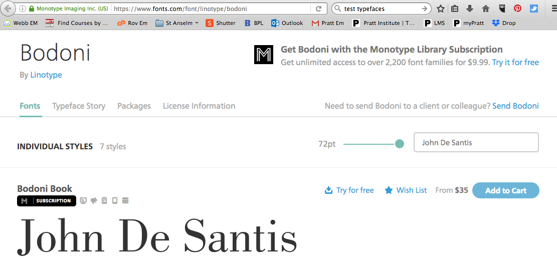

Bodoni
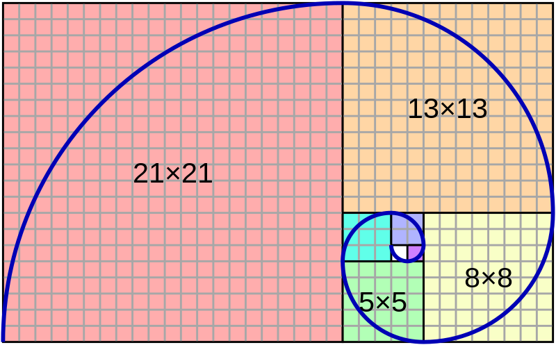
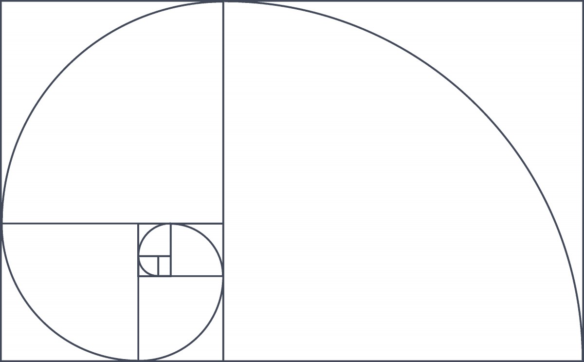
Fibonacci type proportions
Type sizes series you could use for balance with sense of proportion
Fibonacci
https://en.wikipedia.org/wiki/Fibonacci_number
A series of numbers with the pattern of each number being the sum of the previous two.
The sequence:
0, 1, 1, 2, 3, 5, 8, 13, 21, 34, 55, 89, 144…
Fibonacci type proportions
Type sizes series you could use for balance with sense of proportion
5 • 8 • 13 • 21 • 34 • 55 • 89 …
6 • 10 • 16 • 26 • 42 • 68 • 110 ……
In mathematics, the Fibonacci numbers are the numbers in the following integer sequence, called the Fibonacci sequence, and characterized by the fact that every number after the first two is the sum of the two preceding ones:

Often, especially in modern usage, the sequence is extended by one more initial term:
 .
.https://3.7designs.co/blog/2010/10/how-to-design-using-the-fibonacci-sequence/
illustrate how these systems were used.

"Fibonacci number" by wikipedia.org is licensed under CC BY-SA 4.0

"Canons of page construction" by wikipedia.org is licensed under CC BY-SA 4.0
The golden ratio is also called the golden mean or golden section (Latin: sectio aurea).[3][4][5] Other names include extreme and mean ratio,[6] medial section, divine proportion, divine section (Latin: sectio divina), golden proportion, golden cut,[7] and golden number.[8][9][10]
Some twentieth-century artists and architects, including Le Corbusier and Dalí, have proportioned their works to approximate the golden ratio—especially in the form of the golden rectangle, in which the ratio of the longer side to the shorter is the golden ratio—believing this proportion to be aesthetically pleasing. The golden ratio appears in some patterns in nature, including the spiral arrangement of leaves and other plant parts.
Mathematicians since Euclid have studied the properties of the golden ratio, including its appearance in the dimensions of a regular pentagon and in a golden rectangle, which may be cut into a square and a smaller rectangle with the same aspect ratio. The golden ratio has also been used to analyze the proportions of natural objects as well as man-made systems such as financial markets, in some cases based on dubious fits to data.[11]
In graphic design, a grid is a structure (usually two-dimensional) made up of a series of intersecting straight (vertical,horizontal, and angular) or curved guide lines used to structure content. The grid serves as an armature or framework on which a designer can organize graphic elements (images, glyphs, paragraphs, etc.) in a rational, easy-to-absorb manner. A grid can be used to organize graphic elements in relation to a page, in relation to other graphic elements on the page, or relation to other parts of the same graphic element or shape.
The less-common printing term “reference grid,” is an unrelated system with roots in the early days of printing.
Grid section of Ellen Lupton’s book
Thinking with Type
http://thinkingwithtype.com/grid/#golden-section
http://www.markboulton.co.uk/journal/design-and-the-divine-proportion
https://www.smashingmagazine.com/2008/05/applying-divine-proportion-to-web-design/
https://www.creativebloq.com/design/designers-guide-golden-ratio-12121546
http://www.hongkiat.com/blog/golden-ratio-in-moden-designs/
http://www.companyfolders.com/blog/golden-ratio-design-examples

Image By jossi [Public domain], via Wikimedia Commons
The canons of page construction are historical reconstructions, based on careful measurement of extant books and what is known of the mathematics and engineering methods of the time, of manuscript-framework methods that may have been used in Medieval- or Renaissance-era book design to divide a page into pleasing proportions. Since their popularization in the 20th century, these canons have influenced modern-day book design in the ways that page proportions, margins and type areas (print spaces) of books are constructed.
The Van de Graaf canon is a historical reconstruction of a method that may have been used in book design to divide a page in pleasing proportions.[5] This canon is also known as the “secret canon” used in many medieval manuscripts and incunabula.
“Grid (graphic design)” by wikepedia.org is licensed under CC BY-SA 4.0
“Golden ratio” by Wikepedia is licensed under CC BY-SA 4.0
“Canons of page construction” by Wikipedia is licensed under CC BY-SA 4.0
Save
Save
Type Design Portals
Typeroom
Showcasing outstanding typographic works from around the globe
Typofile
Typography community and inspiration.
Typewolf
Typography inspiration.
Grain Edit
Blog on classic design work 1950s-1970s
Incredible Types
Curated collection of nice typography, mostly print work.
Typeverything
Hand lettering inspiration.
1001freefonts.com
fontspace.com
fontshop.com
http://www.dafont.com/
WhatTheFont
Upload an image and it magically tells you the name of the font
Type Sample
Install this bookmark let to identify and save samples of web fonts.
https://openlab.citytech.cuny.edu/
![]() “Typographic Design 3” by Professor john De Santis, OpenLab, New York City College of Technology, CUNY is licensed under CC BY-NC 4.0
“Typographic Design 3” by Professor john De Santis, OpenLab, New York City College of Technology, CUNY is licensed under CC BY-NC 4.0
Save
Save
Save
https://en.wikipedia.org/wiki/Golden_ratio
http://cityte.ch/y9
https://practicaltypography.com/
http://www.oercommons.org/courses/creative-typography/view
https://openlibrary.org/works/OL8247653W/The_universal_penman
https://archive.org/details/ArtOfThePrintedBook14551955
https://archive.org/details/ColesStephen.TheAnatomyOfType2012
https://archive.org/details/StrizverIlene.TypeRules.EnhancedEdition2014
Multi Page Document Design
Design, print and mockup a 20 page booklet plus cover.
Design a 5.5”x 8.5” page booklet using InDesign.
Can be BW or 4/
No Imaging, Just Typography
You will write copy, set up master pages, guides, type style sheets and printer spreads.
19-top-fonts-in-19-top-combinations-chart
1. Define your inside page design :
Finalize your inside page layout design. Each review page will include: Reviewer Name, Name of restaurant
Address , Phone, Website, Review copy 100-150 words; page folio. NO pictures or logos.
Set up your master inside review page as spreads.
Insert 20 pages into document.
Set up a 5.5”x 8.5” document using InDesign.
Name pages files: last_name_first_name_2427eats_P.ind”
Bring print out of one spread and native file
2. Define your text style sheets:
Define you text style sheets for copy. You could have different style sheets for each type element:
Reviewer Name, Name of Restaurant, Address , Phone, Website, Review copy.
3. Flow in text and apply text style sheets:
Place and thread text into document.
4. REFINE FRONT Cover Design
A. Refine your front cover layout, can be 4 color.
B. Set up a cover document 5.5”x 8.5” using InDesign.
Set up with facing pages:
Should have front cover, inside front and back cover/ back cover.
Name pages files: last_name_first_name_2427eats_C.ind”
Bring Print out and File to Next Class
master text file for class to use
“ Master 2427P_D212_ eats.rtf”
Google Drive folder> Project 3 2427 Eats> 2427 Eats Text files
desantis_john_2427eats_Book
desantis_john_2427eats_P
|desantis_John_2427eats_Cover
Imposition layouts
desantis_John_2427eats_Cover_imp
desantis_john_2427eats_Pages_imp
___________
1. Front Cover:
“2427 Eats”
Restaurant Reviews by
COMD 2427, Typographic Design III
Fall 18
“Your Name”
2. Inside Front Cover:
3. Title page:
“2427 Eats”
Restaurant Reviews by
COMD 2427, Typographic Design III
Fall 18
Designed by “Your Name””
4. Review Pages
Copy:
Write a short review of your favorite restaurant.
Your review copy: About 100-150 words; you can include type of place, menu, favorite dishes, drinks, etc.; Location decor service, or any other comments you would like. Save as txt file named “ your last name_firstname_ eats.txt”
Place in Google Drive folder> Project 3 2427 Eats> 2427 Eats Text files
I will compile all reviews into one master text file for class to use.
You will design front cover and master page layout for inside pages then flow in the master text file with text from each classmate.
5. Inside Back Cover
6. Back Cover
Write a short review of your favorite restaurant.
Your review copy: About 100-150 words; you can include type of place, menu, favorite dishes, drinks, etc.; Location decor service, or any other comments you would like. Save as txt file named “ your last name_firstname_ eats.txt”
Place in Google Drive folder> Project 3 2427 Eats> 2427 Eats Text files
Production Note:
You are responsible for your own restaurant text review file format text and correct content. For any missing reviews you will create a Notes Page
Headline “Notes’ with horizontal rules on pages
Name of restaurant
Address
Phone
Website
by Your Name
Review text
SAMPLE
“Barolo
398 West Broadway
New York, NY 10012
212.226.1102
www.nybarolo.com
by John De Santis
Barolo Restaurant transports you to the Barolo wine region of northern Italy. Walk down West Broadway in Soho past the boutiques and art galleries, until you get to the entrance of Ristorante Barolo. As soon as you enter you leave SOHO behind.
Paolo Secondo, the owner of Barolo Restaurant, is from Genoa, Italy. He opened his first restaurant in New York, I Tre Merli in 1989. Buoyed by the success of Tre Merli, Secondo opened Barolo and several other restaurants. If you want to visit Italy with out the air fare try Barolo. Every dish is completely authentic as is the service. No Chicken Parmigiano here!
Step 1: Write your review copy:
About 100-150 words; you can include type of place, menu, favorite dishes, drinks, etc.; Location decor service, or any other comments you would like.
Step 2: Start inside page design/sketches :
5.5”x8.5” page using InDesign. Name pages files: last_name_first_name_2427eats_P.ind”
Step 3: Develop master pages; review page layout, create style sheets
Step 4: Cover Design name cover file: last_name_first_name_2427eats_C.ind
Step 5: Import copy, apply style sheets
Step 6: Set up page imposition/ print outs
Step 7: Assemble book mockup.
Materials:
8.5×11 paper, if you want to do a bleed you will have to output to 11×17 with crop marks and trim down.
Metal ruler, Exacto knife, staples, awl, needle or something to make pin hole in paper, some kind of burnisher. All available at: W C Art & Drafting Supply Co
351 Jay St, Brooklyn, NY 11201
Class Google drive Folder
Class Pintrest Pages
http://pin.it/JuuDSwi
Book Design
http://pin.it/UNyJBlG
Saddle Stitch Mockups
http://pin.it/oP8pFXA
Page Layout And Grid
http://pin.it/IPT_ihg
Page Layout And Grid
Page Design Layout
Page Layout/Harmony
Thinking With Type: GRID
Books on Ipad
Typography Proportion Online
InDesign Multi page Doc Set Up
InDesign Change Doc Set Up
InDesign Page Numbering
InDesign Style Sheet Resources
Set Existing Text to Style Sheet
Print Booklet:
Print Booklet
Print Booklet
Print Booklet
Print two sided
Prepress
Preflight 1
Preflight 2
Basic Guide to Prepress
Package files
Preflight Prepress
https://openlab.citytech.cuny.edu/blog/help/joining-a-course/
https://openlab.citytech.cuny.edu/blog/help/signing-up-on-the-openlab/
https://openlab.citytech.cuny.edu/blog/help/writing-a-post/
https://openlab.citytech.cuny.edu/blog/help/adding-images-to-your-site/
https://openlab.citytech.cuny.edu/blog/help/categories-and-tags/
Adding a Post:
1. In the WordPress Dashboard, click on the tab Posts > Add New to create a new post
2. Add a title in the title box at the top.
3. Add an image (Add > Media) or formatted written content using the Post Editor.
4. Add the relevant Category (choose from the existing list).
5. Click Save Draft for later or click Publish to publish immediately.
Online journal and not-for-profit project dedicated to the exploration of curious and compelling works from the history of art, typography, literature, and ideas.
The focus is on works into the public domain, that vast commons of out-of-copyright material that everyone is free to enjoy, share, and build upon without restriction.

“Public Domain Review” is in the Public Domain
Save
Save
Save
Italian Futurist artist/designer 1892-1960
“The art of the future will be largely advertising.” Fortunato Depero
All pages can be viewed at link below
The book itself is an interesting and unusual design object.
The bolts that hold the book together at can be unscrewed, and the pages taken out;
It is one of the rarest collectable art books around.
The bolted bind let Depero unscrew the book and display pages as a mobile art gallery.
The bolts also did not let book lay flat and if was placed in a “traditional” bookshelf or library the bolts would damage other books or “disrupt the status quo.” The bolt represents the machinery of the “future” used as symbolism for the Futurist Movement.
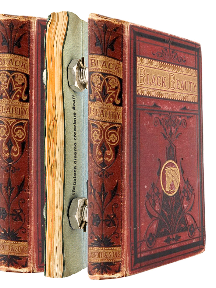
The Bolted Book was a ground breaking typographic experiment and bold exploration in nearly every art and design medium.
The Book was a portfolio, business card, and portable museum (when the bolts were removed, the pages could be pinned up on a wall, exhibition style).
He was the only Futurist ever to live in New York City.
He produced graphic design and covers for Vogue, Vanity Fair, The New Yorker and even pillow designs for Macy’s.
Depero urged artists to market themselves to potential clients.
In a way it could be looked upon as the first internet portfolio of it’s day
New York Public Library Has an Original and Facsimile Version
Facsimile Version Was Published In 2017
It Can Be Read By Appointment Only
Catalog page here
AUTHOR Depero, Fortunato, 1892-1960.
TITLE Depero futurista : 1913-1927 / Dinamo-Azari.
BOOK/TEXT | Edizione della Dinamo | 1927
SASB – Print Collection Rm 308 (Spencer Coll. Ital. 1927 95-354)
SASB – Print Collection Rm 308 Spencer Coll. Ital. 1927 95-354 BY APPT ONLY
Spencer Collection- Regular Hours 1 PM–5:45 PM
Stephen A. Schwarzman Building
476 Fifth Avenue (42nd St and Fifth Ave), Third Floor , Room 308
(212) 930-0817
About the Bolted Book
www.boltedbook.com
Bolted Book Brief
Fortunato Depero at Designboom
Depero exhibition at the Center for Italian Modern Art, 2014
www.typeroom.eu
https://www.architetti.com/depero-futurista-il-libro-imbullonato-va-nuovamente-in-stampa.html
www.lavocedinewyork.com
typostrate.com
formfiftyfive.com
www.nytimes.com
www.nytimes.com
www.newyorker.com
Publications
“Fortunato Depero (1892–1960): A Chronology” in Futurist Depero 1913–1950, catalogue for the 2014 exhibition at the
Fundación Juan March in Madrid (pages 437–440):
Save
Save
Save
Save
Save
Save
Save
Save
Save
Save
Save
Save
Skillshare.com
https://www.skillshare.com/classes/Graphic-Design-Basics-Core-Principles-for-Visual-Design/1539782161/classroom/discussions?via=user-profile&enrolledRedirect=1
https://www.skillshare.com/classes/Graphic-Design-Basics-Core-Principles-for-Visual-Design/1539782161/classroom/discussions?via=user-profile&enrolledRedirect=1
https://www.skillshare.com/classes/Typography-That-Works-Typographic-Composition-and-Fonts/1694217981/classroom/discussions?via=user-profile&enrolledRedirect=1
history of type
https://www.typotalks.com/videos/
Spiekerman
https://www.designative.info/2014/09/25/watch-erik-spiekermanns-type-is-visible-language-talk/
pronuce https://youtu.be/os4lUpj3nvw
Bierut think design
At and copy
Milton Glaser: To Inform and Delight, 2009
https://youtu.be/jZ1YHqgZzGQ
Why Man Creates, 1968
https://youtu.be/ukujYXHhMxQ
bass on titles
https://www.youtube.com/watch?v=DKu6EVKiNbg
Design is one
https://pratt.kanopy.com/playlist/1988360
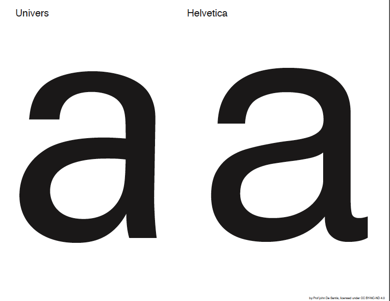
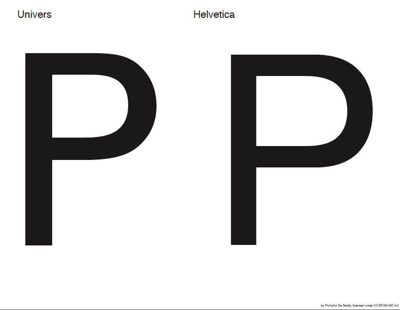
Helvetica
Dieter ram
Design and thinking
https://youtu.be/Tcsh4jCuLt0
No logo
Exit through the gift shop (2010, Banksy) http://youtu.be/oHJBdDSTbLw
Milton Glaser: To Inform and Delight (2008, Wendy Keys) http://youtu.be/zH-o1r7gYgc
Design & Thinking (2012, Mu-Ming Tsai) http://youtu.be/uilcaXYnluU
The Universal Arts of Graphic Design (2012, PBS) http://youtu.be/sTi5SNgxE3U
Graphic means https://vimeo.com/157620840
http://designthinkingmovie.com/
http://www.artandcopyfilm.org/
With new for 2017 Netflix series Abstract: The Art of Design
naked brand
https://www.designernews.co/stories/28774-7-graphic-design-documentary-you-should-be-watching
https://www.creativebloq.com/features/the-top-10-design-related-movies
Skillshare.com
https://www.skillshare.com/classes/Graphic-Design-Basics-Core-Principles-for-Visual-Design/1539782161/classroom/discussions?via=user-profile&enrolledRedirect=1
https://www.skillshare.com/classes/Graphic-Design-Basics-Core-Principles-for-Visual-Design/1539782161/classroom/discussions?via=user-profile&enrolledRedirect=1
https://www.skillshare.com/classes/Typography-That-Works-Typographic-Composition-and-Fonts/1694217981/classroom/discussions?via=user-profile&enrolledRedirect=1
history of type
https://www.typotalks.com/videos/
https://eyeondesign.aiga.org/
The OpenLab is an open-source, digital platform designed to support teaching and learning at City Tech (New York City College of Technology), and to promote student and faculty engagement in the intellectual and social life of the college community.