Review this case study on logotype/typography done by Pentagram’s Michael Bierut. for Poetry Magazine.
Observe the variety way in which the typography is the concept, illustration, only element. It can help to look at these successful solutions for your logotypes
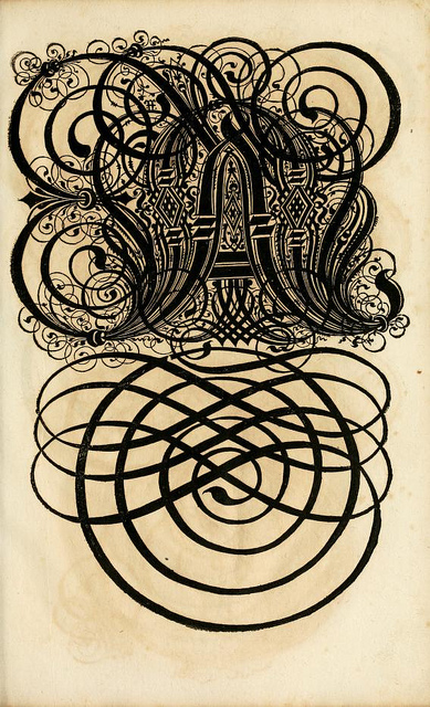
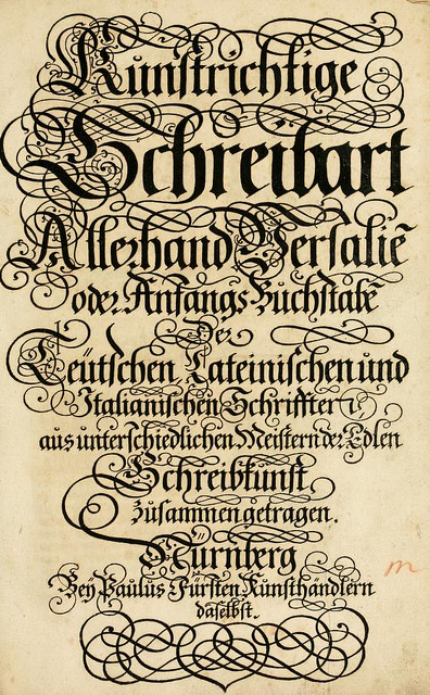
A 17th century German book on the art of writing. The full title (in English) reads The Proper Art of Writing: a compilation of all sorts of capital or initial letters of German, Latin and Italian fonts from different masters of the noble art of writing.
Louis John Pouchée (1782 – 15 March 1845),[1] was a London type founder and entrepreneur.
Career
In 1818 Pouchée established his type foundry in Lincoln’s Inn Fields. He imported Henri Didot‘s mechanical typefounding machine, the machine polyamatype, in 1823[5] which could cast 200 types at once and repeat the process two or three times a minute.[6] Pouchée soon became a major manufacturer of pictorial stock-blocks and printers’ ornaments. Type from Pouchée’s foundry was used to print the Evening Times newspaper.[7]
Pouchée recruited skilled staff and paid high wages, but sold his type more cheaply than other foundries. He was forced out of business in 1830 by the other typefounders, whose prices he undercut.[8] Pouchée sold his typecasting machine to Mr Reed, Covent Garden printer, for £100,[9] however Reed was frontman for a syndicate of type founders, who arranged to have the machine taken out to sea and dumped over board.[10]
Pouchée was a Freemason (he was initiated into the Egyptian Lodge in October 1811) and owned numerous hare coursing greyhounds. Little is known about the later years of Pouchée’s life.
The discovery and reproduction of Pouchée’s Alphabets
Some 23 of Pouchée’s decorated alphabets have survived and are now held at the St Bride Library. They were discovered at the sale of the H. W. Caslon & Co foundry in 1936, at that time identified simply as “Victorian” curiosities; and after spending the World War II in a store in London were transferred for a time to Oxford University Press. It wasn’t until 1966 that they were identified, by St Bride Librarian James Mosley, as being from the foundry of L. J. Pouchée. This finding was afterwards corroborated by the discovery of a type catalogue, Specimens of Stereotype Casting, from the Foundry of L J Pouchée.
These original wooden blocks have since been used by Ian Mortimer for reproduction sets using iron hand presses. Published by I. M. Imprint and St Bride Library, 200 sets were produced over a period of two and a half years.
Characters from one of Pouchée’s alphabets are used on the cover artwork for the Pulp album We Love Life,[12] designed by Peter Saville. Another of Pouchée’s alphabets was used by the street artist Ben Eine to cover shop shutters in London’s East End.[13]
Description of the alphabets
Working with the most richly ornamented letters ever to have been made for letterpress printing,[14] Pouchée’s staff created fat-face style letters featuring flowers, fruit, animals, agricultural implements, musical instruments and Masonic symbols. Up to 26 lines in cap height and made from single blocks of end-grain boxwood, they were intended as eye-catching elements for printed posters.[15]They were described in one of the extra scenes of the documentary film Typeface as the most ambitious and most beautiful types created in wood in any period.[16]