skyfonts.com
The simplest way to try, install, and manage fonts.
Install fonts from participating sites with a single click. Fonts are installed from the cloud on your computer in seconds.

The simplest way to try, install, and manage fonts.
Install fonts from participating sites with a single click. Fonts are installed from the cloud on your computer in seconds.
A curated gallery of posters from around the world
The Best of International visual Communications
play list animation Brooklyn Public Library
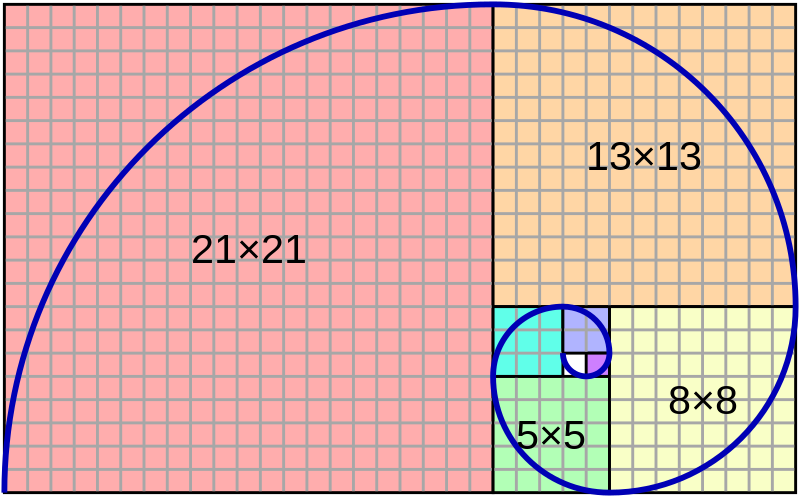
Fibonacci type proportions
Type sizes series you could use for balance with sense of proportion
Fibonacci
https://en.wikipedia.org/wiki/Fibonacci_number
A series of numbers with the pattern of each number being the sum of the previous two.
The sequence:
0, 1, 1, 2, 3, 5, 8, 13, 21, 34, 55, 89, 144…
Fibonacci type proportions
Type sizes series you could use for balance with sense of proportion
5 • 8 • 13 • 21 • 34 • 55 • 89 …
6 • 10 • 16 • 26 • 42 • 68 • 110 ……
In mathematics, the Fibonacci numbers are the numbers in the following integer sequence, called the Fibonacci sequence, and characterized by the fact that every number after the first two is the sum of the two preceding ones:

Often, especially in modern usage, the sequence is extended by one more initial term:
 .
.https://3.7designs.co/blog/2010/10/how-to-design-using-the-fibonacci-sequence/
illustrate how these systems were used.

"Fibonacci number" by wikipedia.org is licensed under CC BY-SA 4.0

"Canons of page construction" by wikipedia.org is licensed under CC BY-SA 4.0
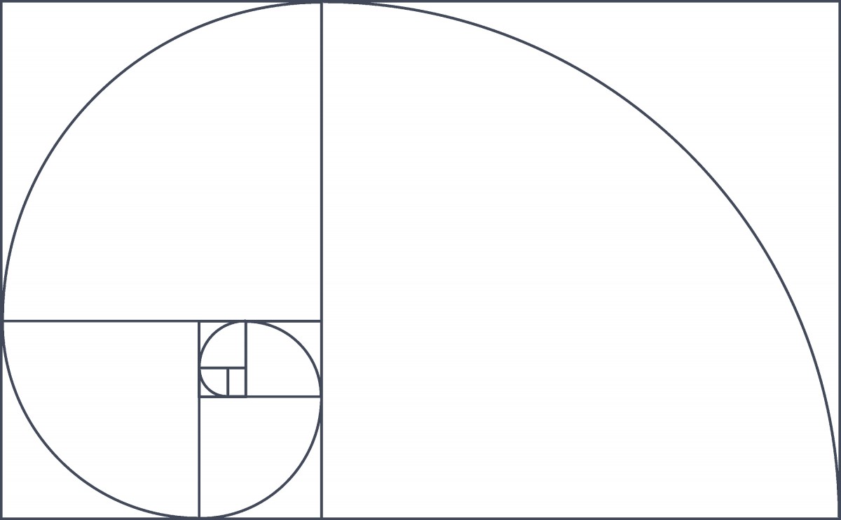
The golden ratio is also called the golden mean or golden section (Latin: sectio aurea).[3][4][5] Other names include extreme and mean ratio,[6] medial section, divine proportion, divine section (Latin: sectio divina), golden proportion, golden cut,[7] and golden number.[8][9][10]
Some twentieth-century artists and architects, including Le Corbusier and Dalí, have proportioned their works to approximate the golden ratio—especially in the form of the golden rectangle, in which the ratio of the longer side to the shorter is the golden ratio—believing this proportion to be aesthetically pleasing. The golden ratio appears in some patterns in nature, including the spiral arrangement of leaves and other plant parts.
Mathematicians since Euclid have studied the properties of the golden ratio, including its appearance in the dimensions of a regular pentagon and in a golden rectangle, which may be cut into a square and a smaller rectangle with the same aspect ratio. The golden ratio has also been used to analyze the proportions of natural objects as well as man-made systems such as financial markets, in some cases based on dubious fits to data.[11]
In graphic design, a grid is a structure (usually two-dimensional) made up of a series of intersecting straight (vertical,horizontal, and angular) or curved guide lines used to structure content. The grid serves as an armature or framework on which a designer can organize graphic elements (images, glyphs, paragraphs, etc.) in a rational, easy-to-absorb manner. A grid can be used to organize graphic elements in relation to a page, in relation to other graphic elements on the page, or relation to other parts of the same graphic element or shape.
The less-common printing term “reference grid,” is an unrelated system with roots in the early days of printing.
Grid section of Ellen Lupton’s book
Thinking with Type
http://thinkingwithtype.com/grid/#golden-section
http://www.markboulton.co.uk/journal/design-and-the-divine-proportion
https://www.smashingmagazine.com/2008/05/applying-divine-proportion-to-web-design/
https://www.creativebloq.com/design/designers-guide-golden-ratio-12121546
http://www.hongkiat.com/blog/golden-ratio-in-moden-designs/
http://www.companyfolders.com/blog/golden-ratio-design-examples

Image By jossi [Public domain], via Wikimedia Commons
The canons of page construction are historical reconstructions, based on careful measurement of extant books and what is known of the mathematics and engineering methods of the time, of manuscript-framework methods that may have been used in Medieval- or Renaissance-era book design to divide a page into pleasing proportions. Since their popularization in the 20th century, these canons have influenced modern-day book design in the ways that page proportions, margins and type areas (print spaces) of books are constructed.
The Van de Graaf canon is a historical reconstruction of a method that may have been used in book design to divide a page in pleasing proportions.[5] This canon is also known as the “secret canon” used in many medieval manuscripts and incunabula.
“Grid (graphic design)” by wikepedia.org is licensed under CC BY-SA 4.0
“Golden ratio” by Wikepedia is licensed under CC BY-SA 4.0
“Canons of page construction” by Wikipedia is licensed under CC BY-SA 4.0
Save
Save
Type Design Portals
Typeroom
Showcasing outstanding typographic works from around the globe
Typofile
Typography community and inspiration.
Typewolf
Typography inspiration.
Grain Edit
Blog on classic design work 1950s-1970s
Incredible Types
Curated collection of nice typography, mostly print work.
Typeverything
Hand lettering inspiration.
1001freefonts.com
fontspace.com
fontshop.com
http://www.dafont.com/
WhatTheFont
Upload an image and it magically tells you the name of the font
Type Sample
Install this bookmark let to identify and save samples of web fonts.
https://openlab.citytech.cuny.edu/blog/help/joining-a-course/
https://openlab.citytech.cuny.edu/blog/help/signing-up-on-the-openlab/
https://openlab.citytech.cuny.edu/blog/help/writing-a-post/
https://openlab.citytech.cuny.edu/blog/help/adding-images-to-your-site/
https://openlab.citytech.cuny.edu/blog/help/categories-and-tags/
Adding a Post:
1. In the WordPress Dashboard, click on the tab Posts > Add New to create a new post
2. Add a title in the title box at the top.
3. Add an image (Add > Media) or formatted written content using the Post Editor.
4. Add the relevant Category (choose from the existing list).
5. Click Save Draft for later or click Publish to publish immediately.
Online journal and not-for-profit project dedicated to the exploration of curious and compelling works from the history of art, typography, literature, and ideas.
The focus is on works into the public domain, that vast commons of out-of-copyright material that everyone is free to enjoy, share, and build upon without restriction.

“Public Domain Review” is in the Public Domain
Save
Save
Save
Italian Futurist artist/designer 1892-1960
“The art of the future will be largely advertising.” Fortunato Depero
All pages can be viewed at link below
The book itself is an interesting and unusual design object.
The bolts that hold the book together at can be unscrewed, and the pages taken out;
It is one of the rarest collectable art books around.
The bolted bind let Depero unscrew the book and display pages as a mobile art gallery.
The bolts also did not let book lay flat and if was placed in a “traditional” bookshelf or library the bolts would damage other books or “disrupt the status quo.” The bolt represents the machinery of the “future” used as symbolism for the Futurist Movement.
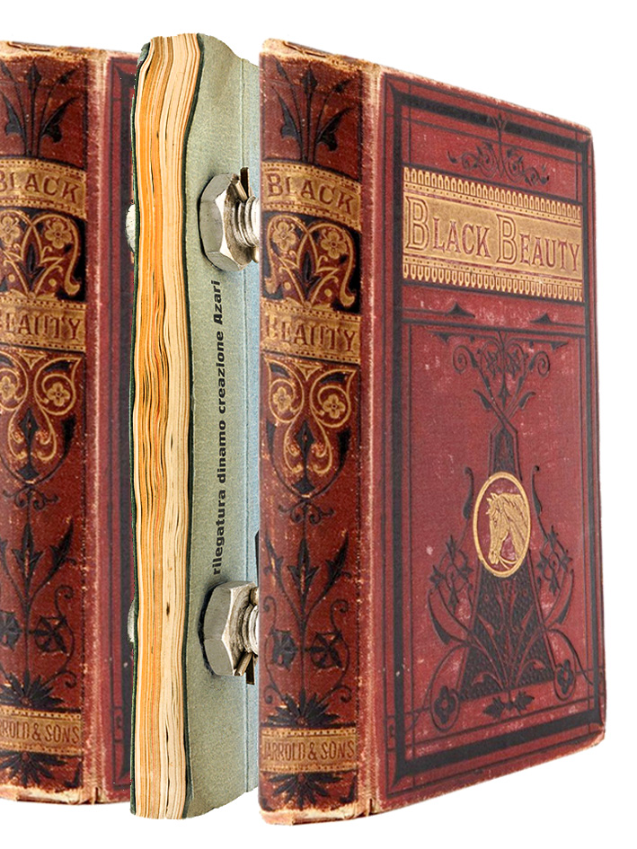
The Bolted Book was a ground breaking typographic experiment and bold exploration in nearly every art and design medium.
The Book was a portfolio, business card, and portable museum (when the bolts were removed, the pages could be pinned up on a wall, exhibition style).
He was the only Futurist ever to live in New York City.
He produced graphic design and covers for Vogue, Vanity Fair, The New Yorker and even pillow designs for Macy’s.
Depero urged artists to market themselves to potential clients.
In a way it could be looked upon as the first internet portfolio of it’s day
New York Public Library Has an Original and Facsimile Version
Facsimile Version Was Published In 2017
It Can Be Read By Appointment Only
Catalog page here
AUTHOR Depero, Fortunato, 1892-1960.
TITLE Depero futurista : 1913-1927 / Dinamo-Azari.
BOOK/TEXT | Edizione della Dinamo | 1927
SASB – Print Collection Rm 308 (Spencer Coll. Ital. 1927 95-354)
SASB – Print Collection Rm 308 Spencer Coll. Ital. 1927 95-354 BY APPT ONLY
Spencer Collection- Regular Hours 1 PM–5:45 PM
Stephen A. Schwarzman Building
476 Fifth Avenue (42nd St and Fifth Ave), Third Floor , Room 308
(212) 930-0817
About the Bolted Book
www.boltedbook.com
Bolted Book Brief
Fortunato Depero at Designboom
Depero exhibition at the Center for Italian Modern Art, 2014
www.typeroom.eu
https://www.architetti.com/depero-futurista-il-libro-imbullonato-va-nuovamente-in-stampa.html
www.lavocedinewyork.com
typostrate.com
formfiftyfive.com
www.nytimes.com
www.nytimes.com
www.newyorker.com
Publications
“Fortunato Depero (1892–1960): A Chronology” in Futurist Depero 1913–1950, catalogue for the 2014 exhibition at the
Fundación Juan March in Madrid (pages 437–440):
Save
Save
Save
Save
Save
Save
Save
Save
Save
Save
Save
Save
Complete Online Volume 1 • Complete Online Volume 2
His fame became comparable to that of today’s rock star. Visitors flocked to his print works on the banks of the river Parma, wanting a glimpse of him working in his studio.
Benjamin Franklin, a printer himself, wrote a fan letter. In 1805, even emperor Napoleon and empress Josephine visited the city and asked to see him.
The manual compiles Bodoni’s lifetime of work and his first successful modern typefaces. Bodoni’s typefaces emanate warmth and humanity; they are still used to evoke elegance and strength.
Margherita Dall’Aglio Bodoni five years after Bodoni died, published the Manuale typografico of 1818, the specimen book to end all specimen books.
Published in two volumes, it was over 600 pages long and contained 265 pages of roman characters, “imperceptibly declining in size, romans, italics, and script types, and the series of 125 capital letters; 181 pages of Greek and Oriental characters; 1036 decorations and 31 borders; followed in the last 20 pages by symbols, ciphers, numerals, and musical examples
“Manuale-Tipografico1.jpg” by Giambattista Bodoni is in the Public Domain
Giambattista Bodoni February 16, 1740 [1813 iwas an Italian typographer, type-designer, compositor, printer and publisher in Parma.
He first took the type-designs of Pierre Simon Fournier as his exemplars, but afterwards became an admirer of the more modelled types of John Baskerville; and he and Firmin Didot evolved a style of type called ‘New Face’, in which the letters are cut in such a way as to produce a strong contrast between the thick and thin parts of their body. Bodoni designed many type-faces, each one in a large range of type sizes.
There have been several modern revivals of his type-faces, all called Bodoni. They are often used as display faces.
His fame became comparable to that of today’s rock star. Visitors flocked to his print works on the banks of the river Parma, wanting a glimpse of him working in his studio.[9] Benjamin Franklin, a printer himself, wrote a fan letter. In 1805, even the emperor Napoleon and empress Josephine visited the city and asked to see him; alas, that very day Bodoni was confined to bed with a disastrous attack of gout, a disease that was to plague him until the end of his life.
Princeton University Collection
The Morgan Library
Stanford University Library
“Giambattista Bodoni” is licensed under CC BY-SA 4.0
Save
Save
Save
Save
Save
Save
Save
Save
Save
“type dating” game, learn how to pair typefaces.
A game to achieve readable text by kerning. Move the letters, score depends on how close you are to a typographer’s solution.
Shape Type is an addictive letter shaping game
The Art of Design
The OpenLab is an open-source, digital platform designed to support teaching and learning at City Tech (New York City College of Technology), and to promote student and faculty engagement in the intellectual and social life of the college community.