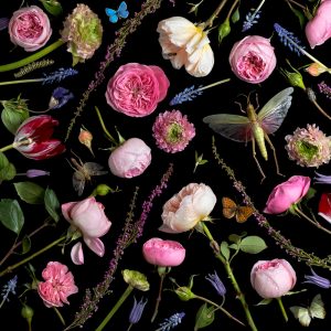
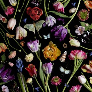
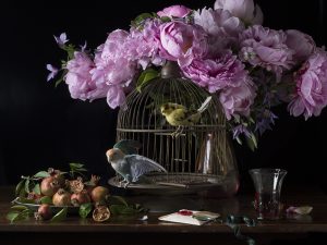
Paulette Tavormina uses still life to inspire her because the way she takes her pictures mostly the frame is cover up with flowers and bugs. But it isn’t clutter, but more filled in with shapes that flowers or bugs make. In a way it’s best describle to be like a jigsaw puzzle. She uses everything to fit in perfectly. I saw like the different colors from each flowers because it’s be to be pop out more because she uses a black background. I also like how picture are able to create this movement but using the stems of the plants or flowers just to make your eye wonder all over the place so wouldn’t focus on one thing. I also like the different sizes of the flowers and bugs. Just to fill in on some of the empty spaces. But also it makes it seem to be more random and more lifely. That’s one of her styles she does. The other ones are mostly like paints are something on the table. In this one she has flowers and bird cage fruits next to the bird cage in this picture can tell that there is two lights one from the left because mostly everything on the left is very lit up. and one in the right because the glass reflection . But the way that it picture is taken I think that left lights are very close. Compare to the right to side where pictures is much darker. But I think that light is much further back.But I think these types of still life is very nature just because we have flowers,bugs,fruits, and animals in her photos. But mostly enjoy her work with the flowers filling up the whole frame of the photo.
Author Archives: Ivan Vargas
Inspiration Gregory Heisler
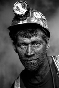
In Gregory Heisler photographer we can see that most of his photos are in black and white. The usage of light are two lights. We have the main light and the over the top light. Can tell by the way the face us light up. And the subjects eyes, we can see by the refection from the eyes. And th light is going directly forward. The second light is over the top light because you can see in the picture that top of the helmet is brighter than the face. I also like how the person is able to give a smile making the picture to not be so serious. Is makes the person to be welcoming. Like this person seem hes’ friendly. I also like the way the person has a weird pose, but seems to be working because it makes him to be a very relax person because of his shoulder is leaning to one side. Also can tell that Heisler wants us to look at this person and focus on him, because the background of this picture is blurry. The man he is very clear and sharp, but the background is blurry and out of focus. Like we’re not suppose to pay attention to it. Also this picture shows the personality of the man. We can tell that he is a construction worker by the way he is dressed. You can tell that he a much older man because he as bread going. But the man smile tells us all that he enjoys he’s job. Because it isn’t force, but it has a naturnal feel. And being a construction worker is very difficult, and hard, and dangerous. But looking at this picture it looks like he really enjoys what he does and he doesn’t regret it or he doesn’t mind the working conditions
Inspiration Andrew Scrivani
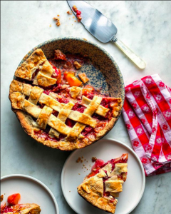
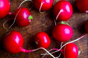
So the two picture I picked from Andrew Scrivani is the apple pie and the radishes. The reason why picked the apple pie because It looks delicious and they picture looks well balance in colors nothing is over powering with the apple pie. I like the red cloth is red and white. Yet that red isn’t very strong. I like how the photographer made the choice to cut one of the pieces out. I even like pie is placed even the silce that is next to it. But it’s not over taking the bigger pie. Also for the image that looks interesting I picked the radishes with it’s dull wooden background and the reason for that is to make radishes to pop out more. In this picture there is only light source. This could be the main light or natural light. The wooden background makes the picture to be more natural just because the brown has a much darker shade.
Inspiration Tim Wallace
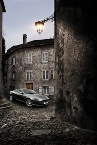
The reason why I picked this picture to talk about is the way the car is taken. Tim said in his video “You want it to have a tone or mood” meaning you a person who is looking or wanting to buy a car to feel something. The way to capture that mood is by working with the lights. Just like in this picture. The car is the brightest thing in picture because that’s what the photographer wants us to focus on because everything is dark. The lamp is giving this illusion that its lighting the whole car. What makes this picture successful is the idea that car is waiting you for you, because it at the bottom of street. Also this street is very narrow so the direction is going in one way. To me it feels of getting a reaward or if I keep going on this path I might get this great car. This pictures tone or mood is excited, hopeful just way the car is parked, the loaction, the way it’s shot and of course the lighting. Now Tim tries different angles in both his lighting and the camera. It’s important to take high-end car photography just to bring mood from the picture. You don’t want the car to be stale or boring. Also keep in mind about the background of the car. Like in this picture I know there is light behind the car to light up the building so it can be lit up in picture. So the surrounds you have to keep in mind with that. Just like this in photos where the building is framing the car. Also keep in angles of the when shooting to keep the photos interesting.
My Final Proposal and Inspirational
I was always drawn into Flower photography or even landscape photography. I like to control the depth of field in during my shoots. I like to see the details of the flowers by zooming in and blur out the background. By foucusing on subject more. I like how these flowers or plants are way be to bring emotion by showing their colors or controling the picture. Even if it’s outside shots or indoor shots, the light something important. A great example is Alan Shapiro flower photography I like how he’s able to pop out the flowers and show the level of details of the flowers. He even makes some of the flowers to show movement by adding patterns.
https://www.alanshapirophotography.com/Portfolio/Trippin-in-the-garden-on/
Inspiration: Celebrities Pregnancy
In these two photos there a theme but from a different perspective from each photographer. It was hard to find where the light was in the Beyonce’s photo shoot. I think the reason for that is because the veil is covering her face. But the way Beyonce is posed in a third quarter view, I think this broad light. I do see some shadows around the neck area but not in her shoulder. As for Demi Moore photo, you can easily see that this broad light. Since she has a third quarter view the light is hitting her left side. From these two shoots I understand Demi Moore had more attention. Around this time Demi’s photo was considered to be very controversial. After all she isn’t wear anything. Compare to Beyonce photo where she is cover but only that but there are too many things going the photo. There’s the background and the veil covering her face. Also the flowers surrounding her. I think all the things makes the picture to be at ease. I think the Demi’s photo is very strong and impactful. Just because there aren’t things covering her and she is the focus of everything and there nothing to distract the viewer. I could understand why Demi’s photo had many reaction and feelings. After all these two photos were shot at different times. I think if these two photos were to switch places in when they were shot. I think the Beyonce photo would be talked about but not as much as Demi’s photo. But if Demi’s photo was shot in 2017, I this would more acceptable, after showing nudity is the norm. We get to see it photos, movies, and even in shows. Such as the most talked and successful show Game of Thrones.
Inspiration 1 Dawoud Bey
Dawoud Bey high school portraits have this consist theme of having the object looking at the camera. Not only that but Dawoud does make us look at the eyes first then the whole picture. His pictures are center so our eyes don’t wander around. We can also see that his portraits display some type of attitude because the way the subjects are posed. So this give us a little of the subject personality of each person. The lighting also what makes this portraits to make the face to pop out more. The usage of shadow in the face aren’t too dark. But soft so none of the photos are focusing in one location by having one area much darker than the other.Also the blurry background. Makes us the auditions to look at the person makes focus on them more than any other place in the photo. But, Bey isn’t making the whole background to be blurry so none it can’t make out what it is. Instead, he want us to know what it is without losing focus on the person. It makes us understand who these people are, and what they do. It gives us a little story to go by. And makes understand who they are as people without having to tell us anything. I also noticed by looking through gallery class portraits, that none of his picture the subject have warm colors. But one is different, which is Shalanta but this photo is different from other is because the background is much darker but her clothes have this light color that is able to make her stand out more. Which something interesting he changed the lighting because the color of clothes have a light color. In the other portraits you can see the other subjects having grey or light colors.

