Many different understandings and questions come to mind when I read Roland Barthes’ article titled “Rhetoric of the Image”, especially with how it looks into the concept of images and meanings within or around it.
What is interesting is how the article discusses Linguistics in terms of how a message within images are read. As well as how signs are utilized as well. Is it the image itself that gives the message, or a combination of other factors such as texts that does so instead? And could there be multiple meanings behind an image, or just a limit amount of possibilities. And could these questions aldo be attributed with how some designs are made in the modern era?
We may create a wonderful design when we design with an aim and include elements that increase efficiency. There are a few areas on which our three designers complied. After reading these texts I learned that designers express themselves by their work.
Jan Tschichold believes that the design should be based on the differences between old typography and the new typefaces. His work is primarily in red and black colors. The goal of old typography was to be appealing and clear, yet Tschichold points out that new lettering was also simple and clear. Tschichold wanted to move away the dull symmetry of old typography and acknowledge the asymmetrical form of new typography. One aspect of asymmetry was its look, which he thought was visually more impressive than symmetry.
Karl Gerstner on the other hand was a designer who combined art and science in his work. He believes a good design requires combinations of different elements. He also stated there are a lot of alternatives to create a quality design. If one doesn’t work, go with a different idea.
According to Josef Muller-Brockmann, a designer’s works should be clear, understandable, usable and attractive to the audience. He suggests using a grid because it demonstrates a certain positive approach to the work. overall designers should be able to clearly articulate the message of their work.
McLuhan discusses how technology has become a sort of extension for humans. Even back then people thought about how machines would eventually replace people at work. It will influence people’s behavior or provide more opportunities. people will look at themselves from a different perspective. A person’s thoughts are no longer isolated from others, they are no longer alone. However, as we know everything has positive and negative sides. Besides all of the benefits of technology and media, it also has a lot of disadvantages. As it can be an extension to an individual by enabling more capabilities, it can also result in a reduction in particular jobs where machines seem more capable of replacing. I strongly agree with his theory about media and technology being extensions of our body. According to McLuhan we give up our senses in order to be the target of media and technology. Media and technology are entirely dependent on what consumers prefer and need. They create content, and we admit it without any inquiry. As a matter of fact, we are more open to manipulation and being influenced.
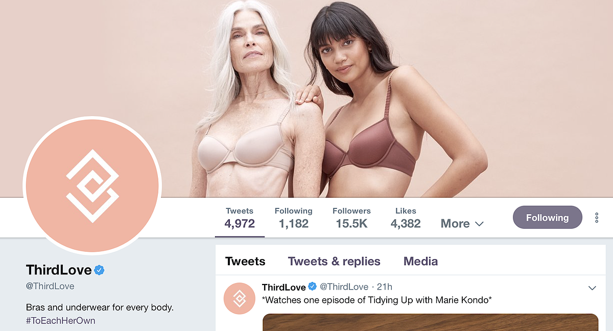
ThirdLove is a women’s undergarments company found by Heidi Zak and her husband David Spector in 2013. The brand is well known for promoting body positivity. Here’s an example of ThirdLove’s Facebook cover, which features an older woman and a younger woman wearing lingerie from the brand’s collection.
Coca-Cola’s aim was to show that even though people can come from different backgrounds, race or ethnicities, everyone has something in common. Coca-Cola has continued to develop campaigns that bring diverse people together through the power of a simple bottle of Coke.
Bumble is a dating app. It also allows searching for friends and business connections rather than just dates. In this video campaign, Bumble explains that the app sees a variety of Bumble users around NYC and the company wanted to celebrate them. To do this, the company sought out some of Bumble’s most interesting New Yorkers and brought them together to tell their stories.
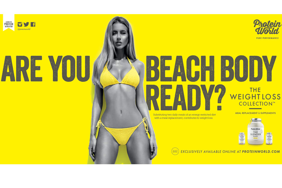
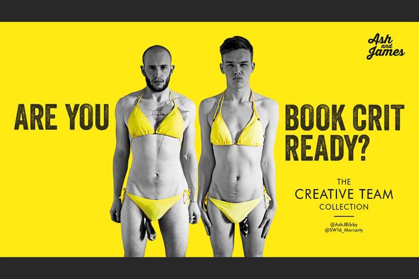
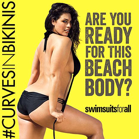
The first ad is an advertisement by Dove for their multicultural campaign. The second is a multicultural ad by Airbnb for Superbowl 51.. The third is a controversial ad by Protein world in which other companies in response to this ad created ads 4 ,5 and 6.
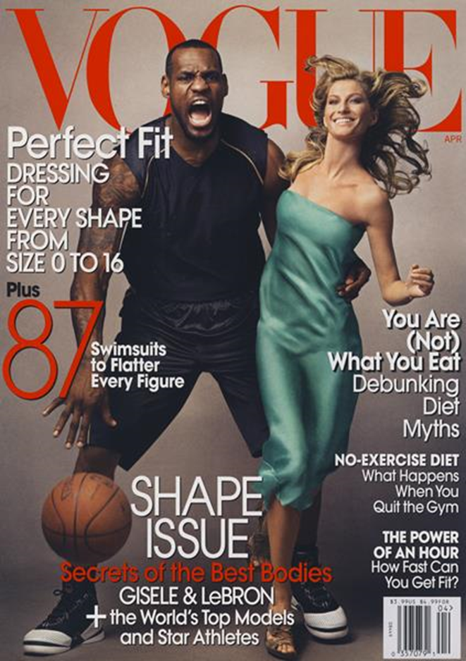
Lebron James and Gisele Bündchen. Lebron was the first African American man that appears on the cover of this magazine. However, this was a very controversial photo because “For many, the Vogue cover, which was shot by renowned photographer Annie Leibovitz, resembled images of “King Kong, casting James as the dangerous (black) gorilla and Bündchen as the helpless (white) damsel.” In other words, it shows how racism is rooted in the subconscious of our society.
Ott, Brian L., and Robert L. Mack. “Cultural Analysis.” Critical Media Studies: An Introduction, Wiley-Blackwell, 2014, p. 153.
Vogue Cover April 2008
Adidas “Here to Create” shows that no matter the sport, fitness, race, and gender, everyone wears Adidas.
Adidas Here To Create
Google Pixel 2 and the National Suicide Prevention Lifeline raise awareness about depression and suicide by showing multiple kinds of people, doesn’t matter if they look happy, their gender, age, or race everyone can be affected and we should care about our mental health.
Google Pixel 2 The Picture Perfect Life
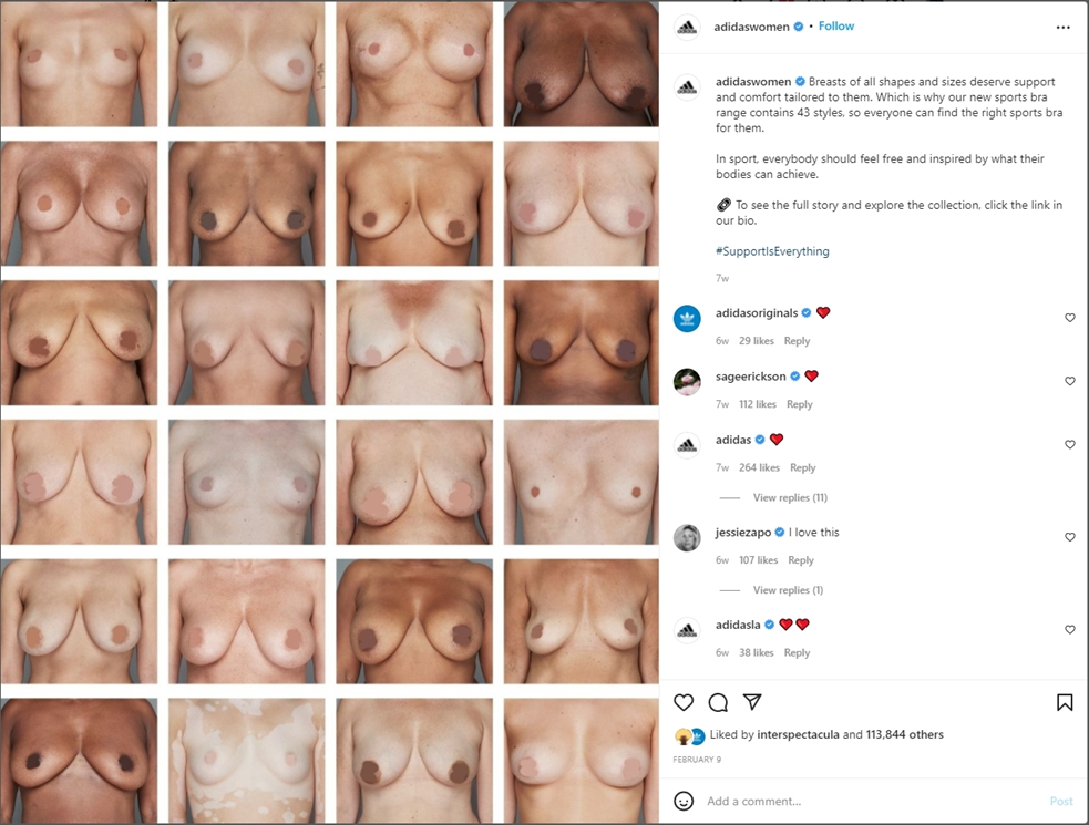
Adidas shows a variety of breast shapes and sizes without sexualizing the woman and without giving importance to physical appearance or race. With the premise, “All women deserve the best support” they want to normalize body diversity saying that Adidas has bras for all kinds of women.
This is an advertisement for Honey Maid which are graham crackers. The ad is representing families regardless of who they are and how they love.
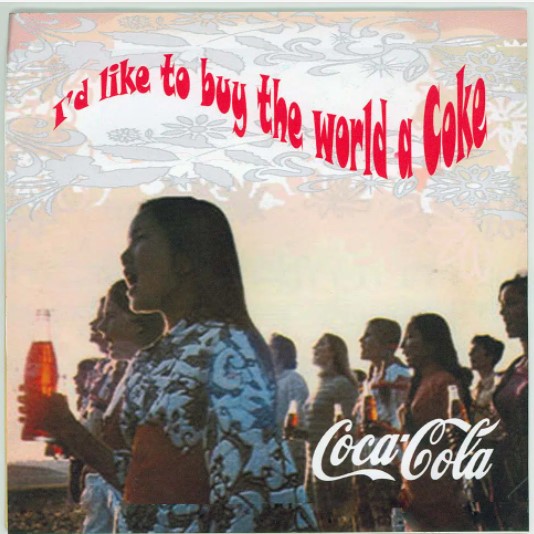
This is an advertisement for Coca-Cola that dates back to 1971. This ad became iconic for how diverse the people are as they all share the same taste for Coa-Cola.
This is an advertisement for Target where we see a small child looking up at an ad were he sees a child that looks like him. The child feels represented.
In this week’s article by Stuart Hall, the ideologies of how statements and concepts are created using different elements of individuals is explored, from mindsets to appearances. It can range from different intentions and range through varying meanings, something that can be seen with many advertisements in the modern era.
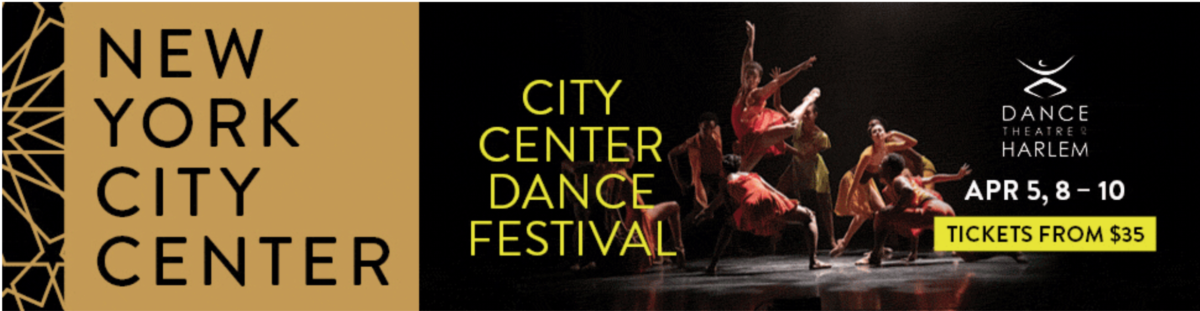
One of the many advertisements I feel can relate to the article’s idea comes from The New York Times’ website, with one of their pop out ads displaying the New York City Center Dance Festival. What makes this ad stand out is the different racial, gender, and cultural representation that its embracement ads to the ad’s call to action. It depicts the gatherings of these different identities in a positive manner not only for an entertainment event, but also to emphasize the event’s idea of a gathering of different groups.
Another advertisement that can also relate to the article comes from The Economist, with a unique design which the call to action may not be as immediate as others. The idea of this ad is to share with consumers the importance of different women’s identities and their history, but instead of using photos, silhouettes and overlapping colors are used to show how diverse these women are. While seemingly done in a more artistic manner, the call to action of showing women of different appearances and background can be examined. Some ads may be explicitly with their ideology of representation, but this one uses the concept in a unique manner.
An advertisement from GAP displays a large groups of individuals varying of age, shape, colors, gender, and backgrounds. Some of them do not appear to be in the same location of each photograph however which does have the focus placed onto each individual exclusively in each of them. It still follows the article’s idea of elements of these individuals being explores and how diverse they can be. It may not emphasize them all as together as a group, but still shows how unique they are all.


Recent Comments