Author: UnphasedEli (Page 3 of 4)
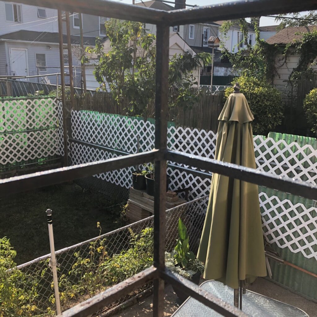
I chose this photo because i really like the way it turned out. It looks like a frame within a frame because of the bars/rails in the forefront of the photo. But it also uses the rule of thirds by the table umbrella being placed mostly in the bottom right/ top right of the photo.
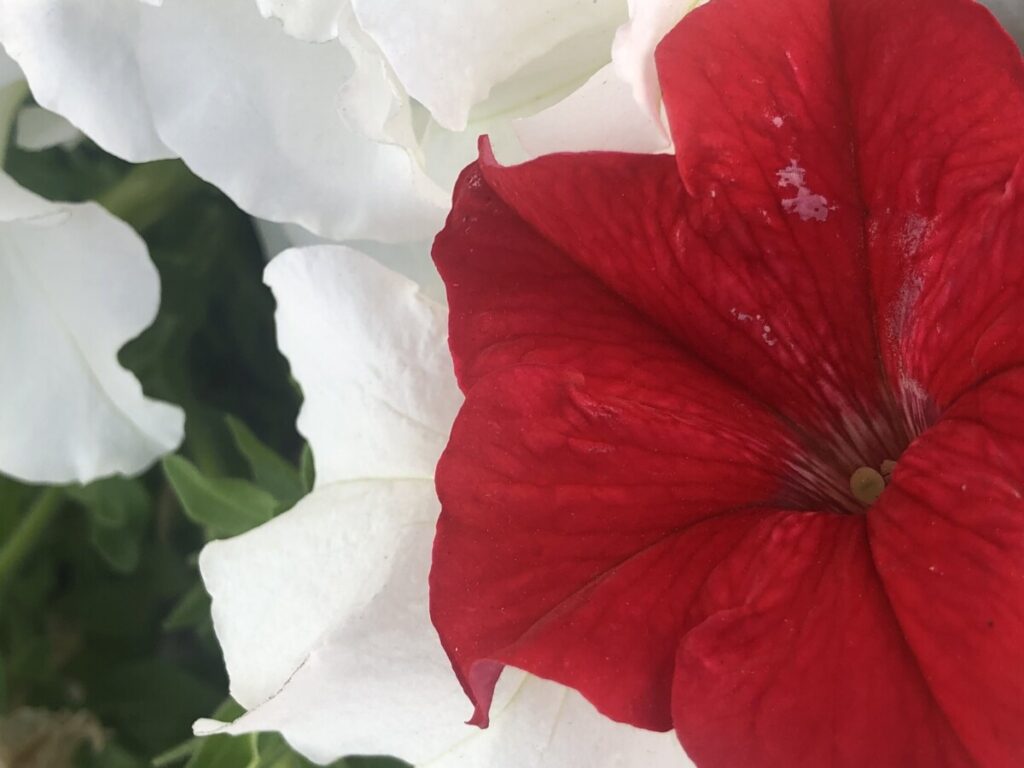
I chose it because i think it looks really nice and also i like how the main focus of the picture is not directly centered within the frame its off to the right side. But it still manages to draw your attention to it and the things surrounding serve as complements towards it. The white really helps the red flower stand out.



Recent Comments